TVC Helium 2024.4.0 Release Information
27 September 2024
1. Installation
1.1. Widget Mode for 3DDashboard
In the previous 2024.3.0 release, for deploying Helium only to be used as widget in 3DDashboard, we introduced the Widget Mode in installation, which installs only the files necessary for deploying Helium as a widget in 3DDashboard.
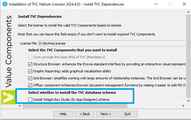
In this release, we’ve added an option to install the Widget Box Studio (In-App Designer) specific schema, enabling users to utilize the In-App Designer features within the 3DDashboard environment.

Refer Installation for more details.
2. Topbar
2.1. Favorite Objects Menu
Favorite objects is a built-in dynamic menu, when configured, displays a list of objects that the user has marked as favorites. This menu allows users to quickly access their favorites items without the need for extensive navigation. Since it is dynamically generated, the content of the Favorite objects menu updates automatically as users add or remove objects from their favorites, providing a personalized and efficient way to interact with favorites items within the application.
The built-in Favorite objects menu utilizes TableConfig for defining and retrieving its data, and a Handlebars template to display that data. Both the TableConfig and the Handlebars template can be overridden if customization is required.
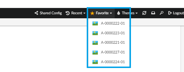
To enable it, add following in the Topbar definition in Helium.xml.
...
<TopBar>
    <Right>
        <Menu>tvc:menu:helium:favoriteobject/Favorite.xml</Menu>
    </Right>
</TopBar>
...| Looking to configure favorite objects in a widget instead? See Favorite Object Widget Configuration for more information. |
3. Widget
3.1. Favorite Objects Widget
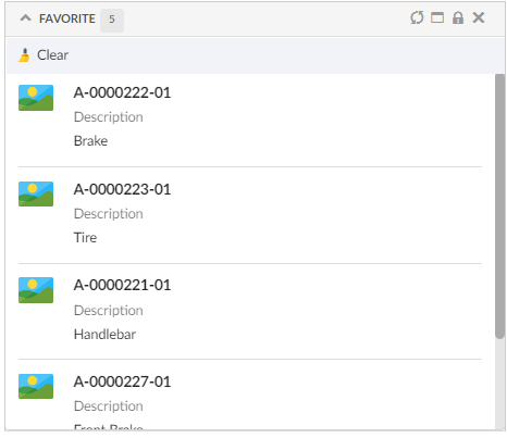
The favorite widget can be used to display a list of objects that the user has added as favorite. The built-in widget uses TableConfig for defining and retrieving its data and a handlebars template to display the data. Both the TableConfig and the Handlebars template can be overridden if customization is required. For example, to fetch additional data or display the favorite objects in a different format.
3.1.1. Options
| Name | Description | Required |
|---|---|---|
Title |
Title for widget, default, 'Favorite' or value returned by i18n key, |
false |
tableConfig |
Reference to a |
false |
template |
Your own handlebars template |
false |
By default, 10 latest added objects as favorite are stored/ displayed. Property, tvc.helium.favoriteObjects.limit can be used to define different limit, e.g.
tvc.helium.favoriteObjects.limit = 30
Below is an example of how a FavoriteObject Widget is configured:
<FavoriteWidget />If you’d like to use your own table for loading data and template for rendering, a sample configuration could be:
<FavoriteWidget>
    <Title>acme.label.favorite</Title> <!-- i18n key  -->
    <OnInitOption name="tableConfig" value="tvc:tableconfig:helium:favoriteobject/Favorite.xml" />
    <OnInitOption name="template" value="helium/templates/favorite/favorite" />
    <OnInitOption name="selection" value="false" />
    <OnInitOption name="onClick" value="App.custom.openObject" />
</FavoriteWidget>
In addition, the com.technia.helium.core.ui.favorite.FavoriteDataObjectService Java class has APIs that can be used to get, add, remove, and clear favorite objects.
Java class com.technia.helium.core.ui.favorite.FavoriteObjectLoader can be used as a dataset to build desired UIs with favorite object list.
| Looking to configure favorite objects within a menu in Topbar instead? See Favorite Object Menu for more information. |
4. Datatable
4.1. Favorite Column
Datatable have inbuilt columnTypes to perform required operations. One such columnType is helium-favorite. This column will display favorite icon which can be used to add or remove respective object from user’s favorite list.
The column can be configured as below:
<Column>
	<ColumnType>helium-favorite</ColumnType>
	<Alt>Favorite</Alt>
	<GroupHeader>Inbuilt Columns</GroupHeader>
</Column>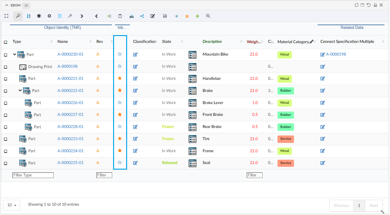
Favorite toolbar commands can be configured like below to handle multiple objects:
<Toolbar>
	...
	<Command>
		<Label>Add To Favorite</Label>
		<Id>addToFavorite</Id>
		<FontIcon>ti-c ti-star-c</FontIcon>
		<OnClick>App.Favorite.addFavoriteObjects</OnClick>
		<OnClickParams>{
			"selectionCriteria": "multi"
		}
		</OnClickParams>
	</Command>
	<Command>
		<Label>Remove Favorite</Label>
		<Id>removeFavorite</Id>
		<FontIcon>ti-f ti-star-f</FontIcon>
		<OnClick>App.Favorite.removeFavorites</OnClick>
		<OnClickParams>{
			"selectionCriteria": "multi"
		}
		</OnClickParams>
	</Command>
	...
</Toolbar>
4.2. Rows Truncation for Files Column
When displaying values in a table column, it is possible to have a large number of values, which can result in many rows within a single cell. To address this, Helium truncates the display if the value count exceeds the specified row limit. Clicking on the ellipses … icon displays the remaining values in modal. This behavior has now been extended to the FilesColumn Files Column as well, and providing users with an intuitive way to view long lists of files without overwhelming the table display.
This can be configured like below :
<Column>
	<Label>emxComponents.Common.Actions</Label>
	<RegisteredSuite>Components</RegisteredSuite>
	<ColumnType>helium-files</ColumnType>
	<Rows>2</Rows>
</Column>
4.3. Context Menu
Context menus in tables allow users to access relevant operations for a specific row with just a right-click.
The commands and menus can be configured within the context menu.
Context Menu can be configured like below :
<DataTable>
	...
	<Toolbar vertical="false">
		...
		<Menu contextMenu="true" ref="tvc:menu:hex:engineering/ContextMenu.xml"/>
		...
	</Toolbar>
</DataTable>
ContextMenu xml can have multiple commands and sub menus like below:
<Menu>
	<FontIcon>icon edit</FontIcon>
	<Command>
		<Label>Edit Part</Label>
		<Id>editPart</Id>
		<FontIcon>icon edit</FontIcon>
		<Setting name="OnClick" value="App.form.edit" />
		<Setting name="OnClickParams">{"formConfigName": "tvc:form:helium/EditPartForm.xml","fullscreen": true}</Setting>
		<ValidFor>
			<Types>
				<Type>type_Part</Type>
				<Type>VPMReference</Type>
			</Types>
		</ValidFor>
	</Command>
	<Command>
		<Label>Quick View2</Label>
		<Id>quickView2</Id>
		<FontIcon>ti-c ti-eye-c</FontIcon>
		<Setting name="OnClick" value="App.hex.openDashboard2InSidePanel" />
		<Setting name="OnClickParams">{
			"dashboardRef":
			"tvc:dashboard:hex:engineering/PartInfoSidePanel.xml"
			}
		</Setting>
	</Command>
	<Menu>
		<Label>Object Actions</Label>
		<Id>objectActions</Id>
		<Command>
			<Label>Promote</Label>
			<Id>promote</Id>
			<FontIcon>icon forward</FontIcon>
			<Setting name="OnClick" value="App.table.action.promote" />
			<ValidFor>
			<Types>
				<Type>type_Part</Type>
			</Types>
		</ValidFor>
		</Command>
		<Command>
			<Label>Demote</Label>
			<Id>demote</Id>
			<FontIcon>icon backward</FontIcon>
			<Setting name="OnClick" value="App.table.action.demote" />
		</Command>

	</Menu>
</Menu>
Read more about Context Menu for more details.
4.4. UIP Table
UIP table is a standalone TECHNIA UI component developed using React. Helium grid browser was already implemented using UIPTable. In this release, we have introduced UIPTable for rendering table data in HELIUM.
This can be enabled in helium now by adding attribute UIPTable to TableConfig element of DataTable widget like below:
<TableConfig UIPTable="true">
    ...
</TableConfig>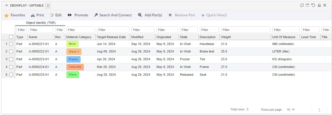
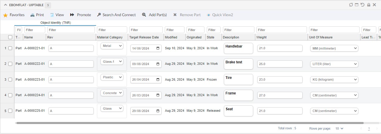
UIPTable provides some improvised features as below:
-
Edit mode - Changes whole table into edit mode, all the cells which are available for edit will change to edit mode.
-
Row count & Selected row count.
-
Indication of editable cells - A small indication will be available on the top left corner of cell if it is editable.
UIPTable supports the following features:
-
Simple columns with an expression.
-
Client side processing only.
-
Column sorting.
-
Column manager - To hide or show columns.
-
Column filter.
-
In-cell edit.
-
Basic actions (commands) involving selected rows.
-
Access check for editing.
-
Group header.
-
Pagination.
-
Persist customization - Customization of resized columns will be persisted.
-
Flat mode only.
| This release has limited feature and not all DataTable features are supported in UIPTable. It will be improved with rest of features in upcoming releases. |
5. Component
5.1. Access Behavior
Each widget supports an toolbar that may contain configured menus/commands (check Command for configuration). In Commands, access check can be added based on user role, group.. etc.,. If user have access then that particular command will be available in toolbar.
In case user doesn’t have access to a command but still would like to have command visible as disabled in the toolbar, the property tvc.helium.toolbar.command.accessBehavior = disable can be configured in tvc.properties file. This will display the command in a disabled state with a tooltip indicating that access is restricted. The tooltip content can be customized through the OnClickParams property.
<Toolbar>
	...
	<Command>
		<Label>Quick View2</Label>
		<FontIcon>ti-c ti-eye-c</FontIcon>
		<OnClick>App.hex.openDashboard2InSidePanel</OnClick>
		<OnClickParams>{
			"dashboardRef":
			"tvc:dashboard:hex:engineering/PartInfoSidePanel.xml",
			"noAccessMessage": "User does not have access"
			}
		</OnClickParams>
		<Access>
		<Group>group_ShippingDepartment</Group>
		</Access>
	</Command>
	...
</Toolbar>
By default the value of this property is hide, where commands with no access to the user will not be displayed in toolbar. Click Access Behavior to read more.
5.2. Rich Text Editor
5.2.1. Configurable Richtext Toolbar
Richtext toolbar options can now be configured using tvc.helium.richtext.toolbarOptions.
tvc.helium.richtext.toolbarOptions=bold italic | bullist numlist outdent indent
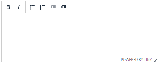
| This feature is currently supported for richtext editors on 3DComments and Forms. |
6. Form
6.1. Dynamic Attribute Field
6.1.1. Include Hidden Attributes
Dynamic Attribute Field can be used to render multiple fields for an object, either from object type, relationship or classification interface.
In case, object has hidden attributes and user would like to have them in the form, an attribute includeHiddenAttributes="true" to be added to DynamicAttributeField tag. This will also display the hidden attributes in the form. Default value is false.
	<DynamicAttributeField includeHiddenAttributes="true">
		...
	</DynamicAttributeField>
Click DynamicAttributeField to read more.
6.1.2. Relationship Support
Dynamic Attribute Field can also be used to render relationships attribute dynamically on form. This feature will be useful with table to display relationship attribute dynamically in form.
A column can be configured in table to view all relationship attribute in form.
<Column usesBusinessObject="false">
    <Name>ViewRelAttr</Name>
    <Label>View Rel Attr</Label>
    <Expression>id</Expression>
    <Setting name="template" value="helium/templates/tablecolumn/rel-attribute-form"/>
    <Setting name="options">{
        "formConfig": "tvc:form:helium/RelAttributeForm.xml"
        }
    </Setting>
</Column>
Click Relationship Attribute Column to read more.
6.2. Help message as modal
A helper message can be added to field/section which can be used to indicate criteria for the field to edit or update. Sometime helper message can be large and in that case it can be shown in modal.
Initially on hover truncated message will be shown. To view whole message user can click on help icon and modal with whole message will be opened. This can be configured by adding a parameter "helperAsModal": true. Default value is false.
<Setting name="options"><![CDATA[{
		...
		"helperMessage": "Help message for this section.",
		"helperAsModal":true
		}]]>
</Setting>
Click HelperMessage to read more.
7. 3DDashboard
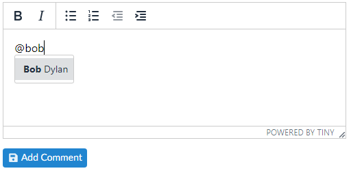
7.1. User Tagging Support for 3DComments
The tagging feature enables users to mention other users within comments by typing "@" followed by the username. An autocomplete suggests potential usernames, and selecting one adds a user tag. Tagged users also get notified.
7.2. OpenWithMenu For Related Objects
Previously, <OpenWithMenu> would display recommended apps relevant to the row. Now, with this enhancement, you get recommendations based on the related data within each column. Simply right-click on a related data link will display a list of apps relevant to the related object. This new feature will help user quickly navigate to the desired apps.

It can also be configured for custom columns, to know more click here.
7.3. Maintain Breadcrumb On Resetting Context Object
Prior to this release, setting a new context object would reinitialize the breadcrumb trail. In this release, we have introduced the ability to preserve the breadcrumb trail when Persist Context Object widget preference is set to false and the context object is not persisted during context resets through the Set Context drop zone.
This ensures that the navigation history remains intact, providing users with a consistent experience when switching contexts.

8. In-App Designer
In-App Designer is a concept that brings the idea of creating, editing, and sharing configurations using the built-in admin user interface. These configurations can be used to define Helium dashboards, widgets, tables, charts, etc. Built-in Admin UI is provided to create, modify and share these configurations. In-App Designer can be used from Helium standalone or Helium widget in 3DDashboard. Once the config-admin is created and shared the configuration with the end-user, then the end-user receives the configuration to accept it. Once accepted, he can select and apply the configuration to his page, dashboard, or widget from UI. For detailed information, please refer In-App Designer.
8.1. Support for Editing Widget’s XML Inline
A config-admin can configure and manage widgets directly from the built-in admin user interface. While it’s possible to create and modify the configuration XML through the Admin UI, config-admins now have the option to edit the configuration XML directly from the Widget UI.
This eliminates the need to navigate away from the current widget page to the Admin UI to make XML modifications. Changes can now be made directly within the Widget UI.
8.2. Controlling Cell Editability for User-Added Columns
In-App Designer enables enduser to add columns to the user table. These columns are editable by default, depending on the user’s access level.
User added columns can be configured to be non-editable by using the property tvc.helium.usertable.addableColumnCell.editable.
This allows organizations to restrict the editability of user-added columns. By default, the property is set to true.
To disable editability for these columns, set the property to false.
| Columns added when this setting is not defined or true will remain editable according to the user’s access level. |
8.3. Create Relationship Expression in Chart Widget
Config-admins can create a chart widget by choosing the chart expression. In this release, a new field "Is Relationship Select Expression" is added to specify whether the chart expression select should be applied on business-object or relationship-object.

 TVC Helium 2024.4.0