TVC Helium 2023.5.0 Release Information
01 December 2023
1. Widget
1.1. Widget header actions menu
While designing heium widgets, you would like to direct the end user’s immediate attention to core features that you want your user notice. Now, all the right sided header icons on widget can be grouped under header actions menu(ham-burger) icon. It allows your widget header to have a neater design, with less clutter on the screen. Other icons will be visible on hovering over the ham-burger icon.
This feature can be configured by using tvc.helium.widget.enableHeaderActionsMenu=true global setting or by using <EnableHeaderActionsMenu> tag for individual widget where priority will be given to <EnableHeaderActionsMenu>.
When header actions menu icon is configured:
When header actions menu icon is not configured:
Refer Widget for more details.
1.2. FontIcon on widget title
Well-designed icons, in combination with text, will enhance usability and readability, and creates a meaningful link between the icons and ideas expressed in the content. Now, an icon can be configured with a widget title using <FontIcon>. It also has the flexibility to position left/right of widget title as per convenience using <IconPosition> tag. The default value for widget icon will be towards right of widget title.
FontIcon when position if left:
FontIcon when position if left:
Refer Widget for more details.
2. Table
2.1. Table Configurator - Reset Table
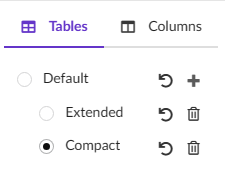
Helium allows end user to customize table according to their requirement. These customizations allow to have preference over column order, size, and column visibility. The widget reset function served to reset both the widget and all tables. Now, with this release, we’ve introduced individual table specific reset functionality. This feature allows you to restore default settings for user preferences in each table independently.

Refer Table Configurator for more details.
2.2. Preview Image for Files Column
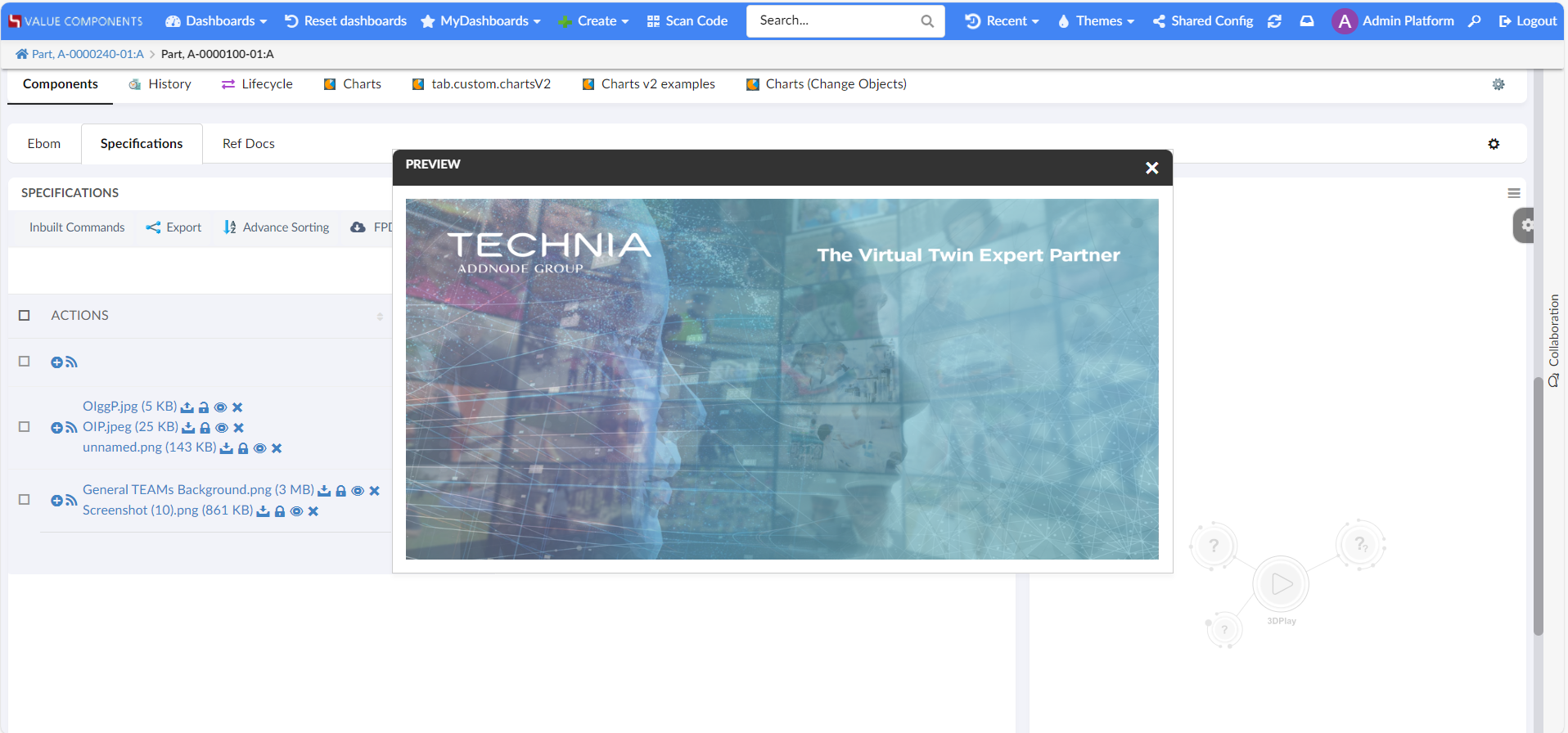
Helium Table have capability to display all data from single view. Like files can be shown in row with respected connected object itself. It would be helpful for end user to show files preview from this view. From this release onwards, Image can be previewed in the modal. Setting tvc.helium.showPreviewFileInModal can be configured to true in 'tvc.properties' file. By default, it’s false.

Refer Files Column for more details.
3. NSX Search Panel
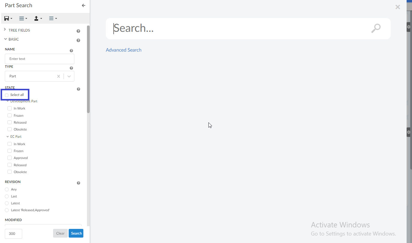
In earlier release, it is enabled to select/deselect all range options and add custom message in NSX Search panel for the search feature. Now we are extending the same features for the Search and connect search panel.
3.1. Select / Deselect All
It is now enabled to select/deselect all the range options in search and connect
Search panel through the setting enableSelectAllCheckboxes.
<Settings>
    <Setting name="enableSelectAllCheckboxes" value="true" />
</Settings>
Default value for enableSelectAllCheckboxes is set to false.
|
3.2. Custom message
It is now enabled to configure custom message on the search and connect search panel through
the Message tag.
<Message color="red" position="bottom">
    Warning : This query can cause performance issues.
</Message>
| position attribute supports top and bottom values. It supports all standard colors. Default color is red and position is bottom. |
4. Form
4.1. Classification Field - Structure Editing UI
From this release onwards, same structure UI is present for the classification form field like we have for table column. The properties are configurable and can be changed as required. The structure UI opens the dashboard in a modal view in case the classification heirarchy is required to show in a structured format. Kindly refer the short video below for more clarification.
Classification Field has been enhanced to display the classification (Library and Family objects ) structure in edit classification modal. From this release, introducing a structured table to display the classification in hierarchy order. This hierarchical view helps to find the required classification and update to the respective field.
Refer Classification Field - Structure Editing UI for more details.
 TVC Helium 2024.1.1