 TVC Helium 2024.1.1
TVC Helium 2022.3.0 Release Information
05 August 2022
Table of Contents
1. InApp Designer
1.1. Enduser Configuration UI
Introduced a new page view Shared Config UI, with different tabs to list self-created configurations and admin shared configurations. This helps enduser to view and manage the configuration objects.
To configure the Shared Config UI page in the standalone application and 3DDASHBOARD widgets, refer to the Configure Enduser UI section.
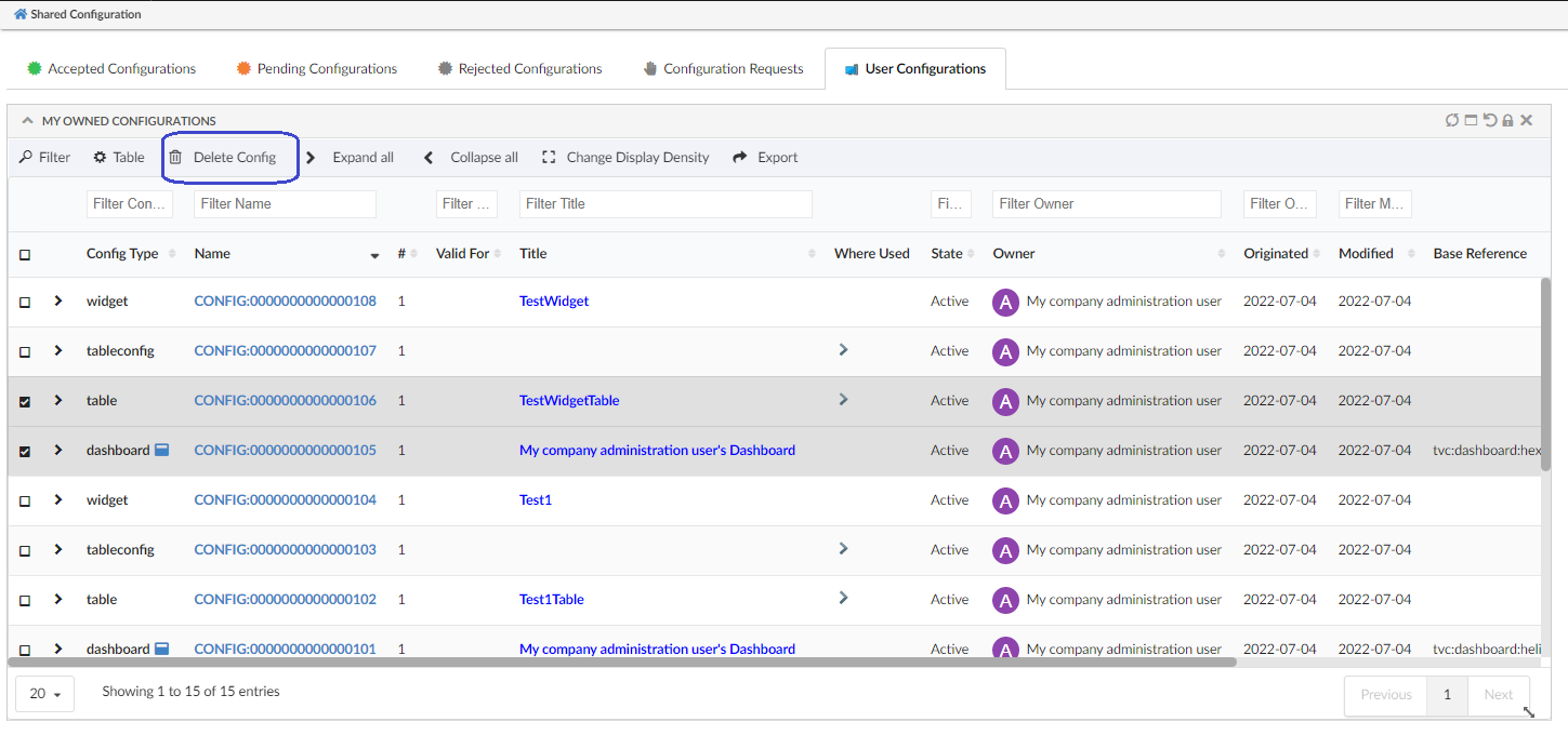
1.2. XML Validation against XSD
In InAppDesigner, the admin can create configurations using admin config UI. Any syntax errors in the configuration will affect the containing components failing to load. It takes more effort to identify the error and update the configuration.
To avoid this situation, we have introduced the Validate option in create/edit form of config. Use this option to validate XML configuration against XSDs available for each component which saves both time and effort for the admin.
Figure 2. Validate Config
Now admin can anytime validate the XML and correct the syntax using the Validate option while writing the XML.
1.3. Structure Mode in TableWidget
Enduser or config-admin were able to configure tablewidget in flat mode only. Now it is extended to support structure mode as well. Please refer to the video where the structure table is configured using the predefined dataset and filter.
If the enduser is configuring the structure tablewidget, the enduser must have the 'shared-and-accepted datasets and filters' already. Enduser can create config requests to config-admin to get the needed datasets and filters. Please refer Configuration Requests section for more details. Once it is shared by config-admin, enduser must accept the shared config from Shared Config UI to make the datasets and filters visible in the Create Widget form.
|
1.4. Valid For support in Table Configurator
Config-admin or enduser can add new columns to a table using the table configurator. It is improved further to choose the columns by valid for and Column Config type. Please refer to the video where config-admin is adding columns to an EBOM table.
1.5. Apply Template to a Column
By applying the template to a column, the user can change the look and feel of a column.
There are some situations where the user likes to see column data more effectively.
-
Identify all the approved tasks by color.
-
Differentiate the priority of an object using the appropriate color.
-
On clicking on the column value, Open the connected object.
-
Show an icon when a part is connected to a specification.
-
Open the side panel and show object information in a dashboard.
Users can address all these situations by applying templates to a column.
Figure 3. Choose Template To Column
A new template field is introduced in advanced column form to choose a template.
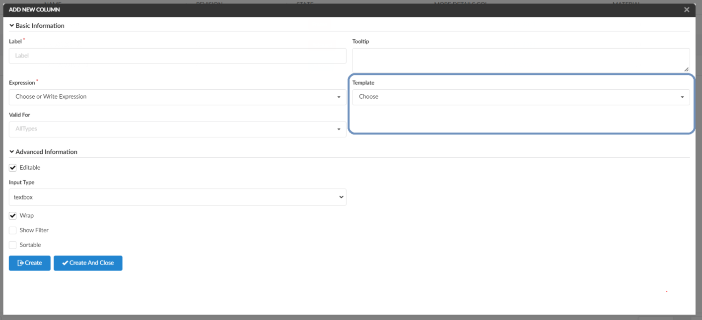
Figure 4. New Template Field
Template Creation: Admin can create any handlebar template and configure it in the TVC_InAppConfigurations.json file.
Refer JSON configurations for InApp to section for more details.
{{!--
  Sample Handlebars template that can be applied to columns in a datatable.

  Available variables are:
  - object
  - row
  - cell

--}}
    <a href="javascript:App.routing.open('{{row.objectId}}');">{{cell.value}}</a>
1.6. Support for File based Configs
Introducing the TVC_InAppConfigurations.json file to configure the existing file-based configs. Many projects or implementations may have existing file-based configs which can be reused to create a widget. Such file-based configs can be configured in the TVC_InAppConfigurations.json file.
In this release, handlebar templates can also be configured in TVC_InAppConfigurations.json. These configured handlebar templates can be used to change the look and feel of a column.
Sample configurations:
//TVC_InAppConfigurations.json
{
  "datasets": {
    "Part": [
      {
        "label": "com.technia.inapp.dataset.label.ebom",
        "value": "tvc:dataset:hex:engineering/EBOM.xml"
      }
    ],
    "Document": [
      {
        "label": "com.technia.inapp.dataset.label.specifications",
        "value": "tvc:dataset:hex:engineering/Specifications.xml"
      }
    ]
  },
  "templates": [
    {
      "label": "ObjectLink",
      "value": "helium/templates/table/object-link"
    },
    {
      "label": "ObjectLinkWithAltOid",
      "value": "helium/templates/table/object-link-with-alternate-oid"
    }
  ]
}| Config Name | Description | Example |
|---|---|---|
datasets |
The file-based dataset configured under the dataset section, will be listed as a datasource in create/edit widget form. |
|
templates |
The handlebar templates which are configured in the template section will be listed in create/edit advanced column for template selection. Refer to End User Defined Columns in admin guide. |
|
| Internationalization Support: In the config file, the label could also be a string resource property key for internationalization. |
1.7. Other UI Improvements
1.7.1. Modifications in open & add widget
Earlier, the open widget section was listing the hidden config-based widgets along with the file-based widgets. From now on, to facilitate managing the unused config widgets, the Open Widget section will list only the file-based hidden widgets. All the config-based widgets will be listed under the Add Widget Config section only.
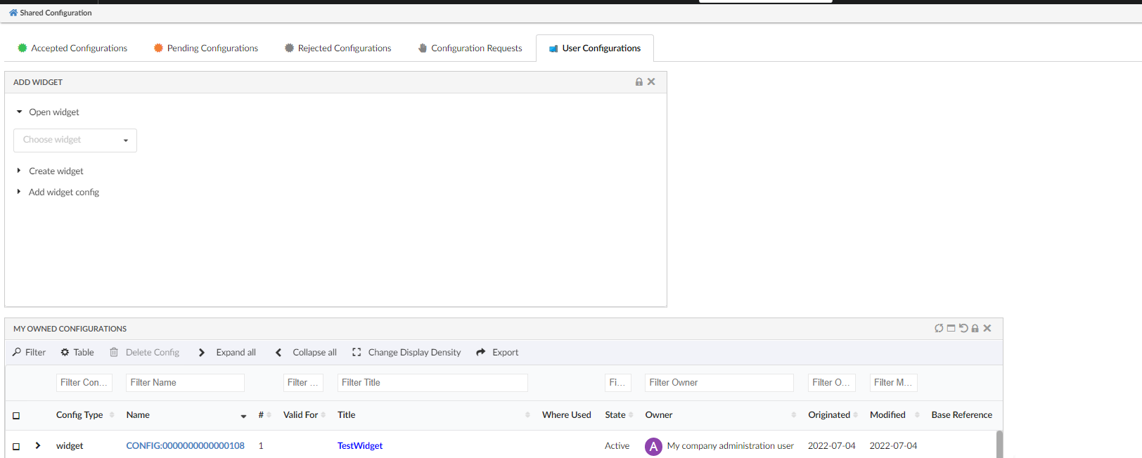
Figure 5. Open & Add Widget
2. Form
2.1. Display delimiter for related object field
In Related Object fields, we can provide multiple display tags to get basic information about the connected object. Earlier, the values of these selectable were separated by a comma. Now with the display delimiter, we can configure the separator. Display delimiter can be configured as below :
    <RelatedObject>
    	...
    	<Display>type</Display>
    	<Display>name</Display>
    	<Display>revision</Display>
    	<Display>current</Display>
    	<DisplayDelimiter> </DisplayDelimiter>
    	...
    </RelatedObject>
Figure 7. Related object field with display delimiter
For more detailed information please refer Related Object
2.2. Support for editable expression in files field
Editable expression is now supported in the files field. Editable expression can be used to make files field conditionally editable. For Example, with the editable expression current!=Review files field will only be editable in a state other than Review.
Editable expression can be configured as below:
    <FilesField>
      <Label>Files</Label>
      <Format>generic</Format>
      <UseCDM>true</UseCDM>
      <Editable>true</Editable>
      <Store>store</Store>
      <EditableExpression>current!='Review'</EditableExpression>
    </FilesField>
For more detailed information please refer Files Field.
3. Datatable
3.1. Classification Column
Classification is an Enovia built-in feature provided by Library Central. Any business-object can be classified as per the concept of Library Central. Classification is maintained as a hierarchy where Library objects act as root objects followed by Family or Classification objects. There can be more Family or Classification objects (also known as Sub Family) beneath a Family or Classification object forming a hierarchy. At the end of the hierarchy, classified items will be present. Thus Library central forms the classification path for any business-object.
Columntype helium-classification enables you to configure a column to view and edit the classification path for the business objects listed in the datatable.
Below XML configuration displays the built-in classification column with options to add and remove classifications for the respective row object.
<Column>
	<Label>Classification</Label>
	<ColumnType>helium-classification</ColumnType>
</Column>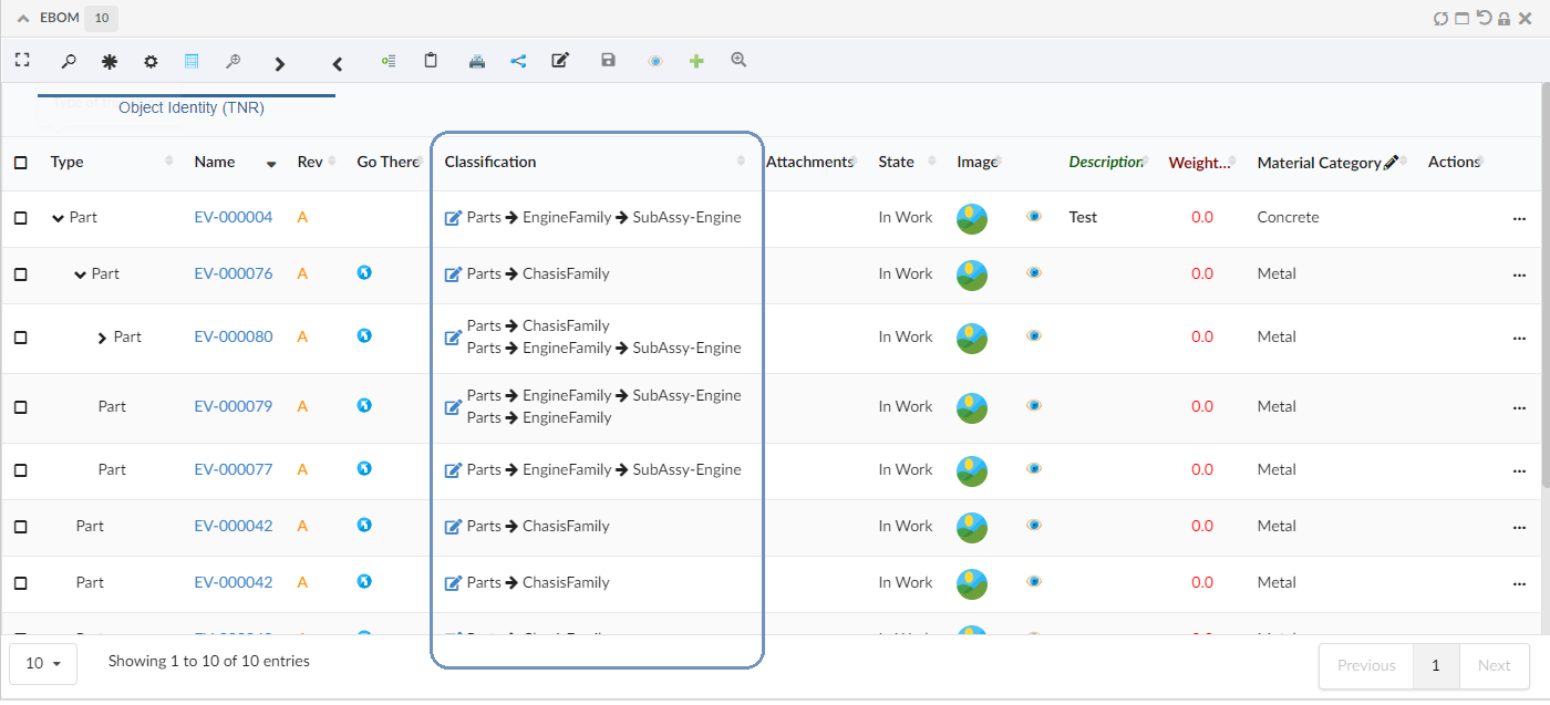
Figure 8. Default Classification column
The edit icon in the classification column opens the default edit form, to update the classification path to the respective row object.
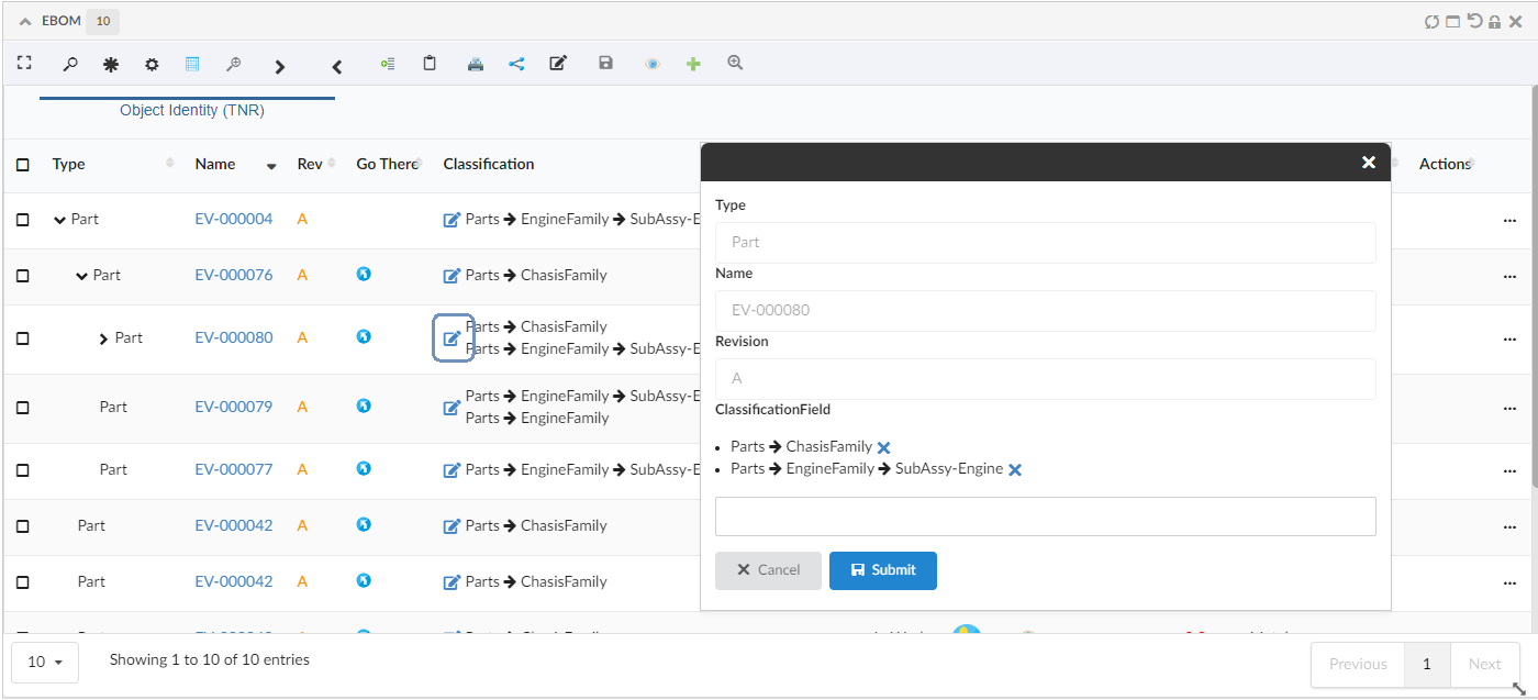
Figure 9. Edit Classification with Default Form
Refer Classification Column section for customization options.