 TVC Helium 2024.1.1
<DataTable>
    <Title>Data Table</Title>
    <TableConfig namespace="helium">TableConfig.xml</TableConfig>
</DataTable>Data Tables
05 May 2016
Table of Contents
- 1. Datatable
- 1.1. Widget
- 1.2. Table Configuration
- 1.3. Column configuration
- 1.4. Progress Column
- 1.5. Files Column
- 1.6. Drop Zone Column
- 1.7. Primary Image Column
- 1.8. User Column
- 1.9. Attachments Column
- 1.10. Version Actions
- 1.11. Go There
- 1.12. Add To Clipboard
- 1.13. Classification Column
- 1.14. Related Object Column
- 1.15. Create and connect row command
- 1.16. Upload File Command
- 1.17. Promote and Demote Command
- 1.18. Print Command
- 1.19. Display Density Command
- 1.20. File Package Download Command
- 1.21. Table Configurator Command
- 1.22. Search And Connect Command
- 1.23. Data Group Command
- 1.24. Pre configure Data Group
- 1.25. Advance Sorting Command
- 1.26. Internationalisation
- 1.27. API
- 1.28. Mass Update
- 1.29. Customization
- 1.30. Styling / CSS
- 1.31. End User Defined Columns
- 1.32. CDM document details widget
- 1.33. Limitations of the date format table columns
- 1.34. Row Highlight Duration
- 1.35. Path Attachment Column type
1. Datatable
The datatable widget presents data in a table. It is possible to interact with data in multiple ways. Some of the things the table supports are.
-
Filtering/Searching
-
Sorting
-
Pagination
-
Inline editing of cells
-
Exporting to PDF, CSV and Excel
-
Custom rendering of cells via either CSS or by applying a Handlebars template
Find the possible configuration options for a table below
1.1. Widget
To create a data table widget you must first create an xml with the following contents:
The <DataTable> element supports the following child elements.
| Name | Description | Example | ||||
|---|---|---|---|---|---|---|
Title |
The title of the data table.
|
|
||||
TableConfig |
Specifies the data table config file |
|
||||
Responsive |
Specifies whether the table should be responsive, i.e adjust it self to small screens. If this element is set to |
|
||||
|
This setting is deprecated and will no longer be supported from Helium release 2019.1.0 onward. The pagination setting provided in table configuration will be used for enabling/ disabling pagination. |
|
||||
Sortable |
Specifies whether the table should support sorting or not. Defaults to |
|
||||
FixedHeader |
Specifies whether the table headers should be fixed or not. Defaults to This can also be enabled at the global level for all the tables by using the key |
|
||||
PersistentExpandState |
Specifies whether the structure will be expanded the same way the next time the same object view is loaded.
|
|
||||
HotKeysNavigation |
Enables user to use arrow keys for navigating from one cell to another while editing, Defaults to
|
or globally
|
1.2. Table Configuration
The <TableConfig> element can have the following children. Full example.
| Name | Description | Example | ||||
|---|---|---|---|---|---|---|
Title |
The title of the table.
|
|
||||
DataLoader |
References to the dataset to be loaded into the table via the child element
|
|
||||
InvokeService |
Whether to consider input of response received from service call or dataset of dataloader. Valid value is either
|
|
||||
ServiceParams |
To load data into table from the response received after making service call. Dataoader will not be needed for this. To pick data from service call it is required have service parameters.
|
|
||||
Table |
References to table configuration file that defines the columns |
|
||||
DisplayMode |
Valid options are |
|
||||
ExpandSettings |
Mandatory element for
|
|
||||
CreateSettings |
Optional. Reference to the CreateAndConnectRow widget command to create and connect a new child row to the selected parent row. CreateSettings supports different child elements to pass values that are required to create and connect new child row object. |
Example: |
||||
ForceReload |
Whether the table is forced to load data from the server each time widget is refreshed. Valid value is either |
|
||||
RowSelect |
Whether the rows in the table should be selectable or not. Valid values |
|
||||
Pagination |
Whether the table should support pagination or not. The element supports the following attributes:
|
|
||||
ClientSideProcessing |
Whether sorting, filtering and pagination should be handled on the client or on the server. The element supports the following attributes:
|
|
||||
EvalCurrentPage |
Whether table columns should be evaluated page wise. It can also be defined globally via structure browser setting
|
|
||||
StructureGUI |
Whether the expand button should be rendered in its own column or in the first configured column.
|
|
||||
ResizeColumns |
Allow table columns to resize from UI. Valid value is either Resize columns feature can also be enabled at the global level for all the tables by using the key While resizing the column if column header or data is truncated, then tooltip automatically enabled on column header and data. This feature can be disabled at the global level for all the tables by using the key |
|
||||
FixedColumns |
Allowing the specified number of left most non reponsive table columns to fix while horizontally scrolling. |
|
||||
RowDragAllowed |
If row drag should be allowed from the table |
|
||||
DropConfigs |
A Drop config defines what happen when a object is dropped on the row.
|
|
||||
AutoSelectContent |
While editing cell content, this enables to auto select contents of cell. This applies to all eligible columns in the table. Defaults to This can be overridden by defining
|
|
1.2.1. Example
<TableConfig>
    <!-- This is the title element -->
    <Title>This is the default title</Title>
    <Title>Table title</Title>

    <DataLoader>
        <DataSet>tvc:dataset:helium/MyParts.xml</DataSet>
    </DataLoader>

    <Table>tvc:table:helium/BasicInfo.xml</Table>

    <DisplayMode>flat</DisplayMode>

    <StructureGUI>default</StructureGUI>

    <RowSelect>multi</RowSelect>

    <Pagination size="15" disabled="false" />

    <ClientSideProcessing enabled="false" threshold="100" />
</TableConfig>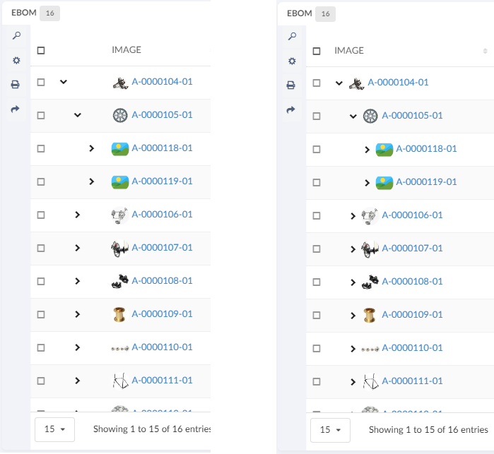
1.3. Column configuration
How to configure columns is described below. This is the file that is referenced above in the Table configuration
The <Table> element supports the following child elements.
| Name | Description | Example | ||
|---|---|---|---|---|
DisplayName |
The display name of the table.
|
|
||
Column |
Creates a column in the table |
See Column specific details below |
1.3.1. Column
The <Column> element describes the properties of a data table column.
The <Column> element supports the following child elements.
| Name | Description | Example | ||
|---|---|---|---|---|
ColumnType |
It is possible to add specific column types. The current supported values are: |
|
||
Description |
The brief details of the column that is rendered as a column header tooltip. |
|
||
Alt |
This setting renders brief details of the column as a column header tooltip. This setting is an alternative to the
|
|
||
Editable |
Whether the cells in the column should be editable or not.
|
|
||
Expression |
The expression that fetches the data from the backend.
If column is populated using data received from response of service call, JSON path expression in the dataSrc is to be specified and additional setting option |
|
||
InputType |
If the column is editable, what input element should be rendered. Allowed values are:
If no input type is given the cell will default to an |
|
||
Label |
The name of the column that is rendered as a table header. |
|
||
Name |
The name of the column
|
|
||
NoWrap |
This setting defines whether the column’s values will be wrapped or not. True False |
|
||
Setting |
Column specific setting. The supported attributes are:
If the ColumnType is set to If the name of the setting is If the name of the setting is If the name of the setting is If the name of the setting is If the name of the setting is |
|
||
AlternateOIDExpression |
This setting can be used to control to which object the user should be routed when the column’s data is displayed as a hyperlink.
|
|
||
Sortable |
Specifies whether the column should be sortable or not. Valid values: |
|
||
SortDirection |
Specifies the sort direction. Valid values: |
|
||
SortOrder |
Specifies what column to make the initial sort on.
Valid values: A positive integer (zero based). For example if
you want the initial sorting to be based on the second column
you would add the value |
|
||
SortType |
Specifies the sort type, i.e |
|
||
TextLength |
Defines number of characters to be displayed before truncation. The rest will be displayed in a tooltip. |
|
||
TruncateDirection |
Defines truncate direction on column, If the number of characters in a cell text exceeds the text length. Valid values:
|
|
||
Rows |
Defines number of rows to be displayed before truncation. The rest will be displayed in a tooltip. |
|
||
usesBusinessObject |
This attribute value on column tag defines if column is for relationship. true false |
|
||
Visible |
This setting defines whether a column should be visible or not. The user is able to define his/her own set of visible columns. |
True False |
||
TargetLocation |
This setting can be used when we are opening routing to emxTree.jsp in 3dspace. |
Content Popup |
||
Href |
Defines the Href |
<Href>/${ROOT_DIR}/SomePage.jsp</Href> |
||
AllowMultipleEdit |
Specifies whether the column should be mass update or not. Valid values: |
|
||
GroupHeader |
Defines a group header for the column. Typically, a group header is used to group several columns together, with a common label. The setting need to be defined on all columns that are part of the group. |
|
||
ColumnWidth |
Defines the column width in pixels. If content is exceeding the defined width, then truncated content will be shown with ellipses and also tooltip will be enabled for the same. |
|
||
ShowTypeIcon |
Specifies if the type icon is shown or not. Default is false.
If you have already defined template then you can add following content to your existing template. |
|
1.3.2. Column template
The default rendering of a column cell can be overridden with a handlebars template.
{{!--
  Sample Handlebars template that can be applied to columns in a datatable.

  <Column>
  ...
  <Setting name="template" value="/path/to/this/template/test" />
  </Column>

  <Setting name="template" value="helium/templates/table/object-link" />
  <!-- If same table column is used in embeded mode, standalone mode and 3dashboard  -->

  <Setting name="template" value="helium\templates\table\object-link-with-alternate-oid" />
    <!-- For the column which has AlternateOIDExpression or columntype path, same table column is used in embeded mode, standalone mode and 3dashboard -->

  Available variables are:
  - object
  - row
  - cell

  To inspect what the content of the variables are, run {{debug variable}} and check your console

--}}
<a href="javascript:App.routing.open('{{objectId}}');">{{value}}</a>
1.3.3. Configurable column CSS classes
It is possible to add configurable CSS classes to columns in the column XML, use <Setting> with class as the name and the custom class names as value, separated by spaces
<Setting name="class" value="col-weight col-bold col-red col-small" />Then in your custom css, you can target column level styling, e.g.
|
Some selectors require higher specificity or the use of !important rule.
|
.col-bold {
    font-weight: bold !important;
}

.col-red {
    color: red;
}

.col-small {
    width: 50px;
}
You can also specifically target a column’s header or body with th/td, e.g.
th.col-weight {
    font-weight: bold !important;
    color: darkred !important;
}

th.col-description {
    font-style: italic;
    color: darkgreen !important;
}

td.col-revision {
    color: darkorange;
}
1.3.4. Client side validation
It is possible to provide a javascript function that performs client side validation. This is achieved by applying the following element to an column:
<Setting name="options">{
    "validator": "App.custom.someJavascriptFunction",
    "validatorMsg": "Error message, either an message or a i18n key"
}</Setting>
The javascript function will be executed when the cell is blurred and with the value of the field passed in. The function must return a boolean,
true if the value is valid and false otherwise.
1.3.5. Column filter
It is possible to add a filter to either the footer or the header of a column by specifying the following setting. Valid values
for position is "footer" and "header". Default value is "footer".
<Setting name="options">{
    "filter": {
        "position": "footer"
     }
}</Setting>
This will render an input field in the column footer, where the user can filter out rows based on the values in that column. User can use multiple queries by using "|" as delimeter in between query.
|
|
It is not supported to have filters in both the header and the footer in the same table. |
Column filter with row filter
It is possible to add a row filter to a column filter by specifying the setting rowFilter. The value should be
a css class that matches the a row that the filter should be applied to. For example to apply the filter to only a certain level
of a structure table add the value ".row-level-n" where n is the level the filter should be applied to.
<Setting name="options">{
    "filter": {
        "position": "footer",
        "rowFilter": ".row-level-1"
    }
}</Setting>
If the filter is applied on a row in a structure table and that row is expanded the child rows will not be affected of the filter.
1.3.6. On Edit
It is possible to configure different behavior on edit of a cell. This can be configured as below :
<Column>
    ...
    <Setting name="onEdit" value="refresh-parents" />
    ...
</Column>
Possible values are refresh-parents, refresh-table, or some custom javascript function.
If onEdit is not configured than only the current row will get refreshed.
In custom js function it will have context of datatable and row jquery element and column instance as arguments.
onColumnEdit : function($rowElement,column)  {
    	    		App.toaster.success("column edit successfully")
},| Name | Description |
|---|---|
refresh-parents |
It will refresh the parent rows of the edited cell. |
refresh-table |
It will refresh the table. |
some custom js function |
It will call the js function passed in the value once the cell is edited. |
1.3.7. headerNoTruncate
ResizeColumns allow table columns to resize from UI. This will allow user to truncate the column below the actual content of the header. This behavior can be controlled using the headerNoTruncate setting i.e. user can not resize the column below the actaul content of the header. This can be configured as below :
<Column>
    ...
    <Setting name="headerNoTruncate" value="true" />
    ...
</Column>
Possible values are true, or false. The default value is false.
This can also be enabled at the global level for all the tables by using the key tvc.helium.datatable.headerNoTruncate.enabled=true in tvc.properties
1.3.8. Autocomplete
All columns which renders an select field have basic autocomplete support. With the options outlined below the behavior can be customized to great extent.
|
For autocomplete to work the <InputType> element must be set to combobox
|
To customize autocomplete provide the following setting:
<Setting name="options"><![CDATA[
{
    "autocomplete": {
        "template": "...",
        "selectize": { ... },
        "handler" : { ... }
    }
}
]]>
</Setting>
Each block, template, selectize and handler is described below.
| template |
Provide an path to an template to customize the dropdown. Example of template: |
| selectize |
The client utilizes Selectize and all options described in
the docs can be used here.
To show selectize dropdown outside the widget boundaries. The global level property |
<Setting name="options">{
        "autocomplete": {
            "selectize" : {
				"showDropdownOutsideFrame" : true
			}
        }
}</Setting>- handler
-
All settings that are described in the core admin guide can be used in the handler block including all predefined handlers.
If you wan’t to create a custom autocomplete handler, follow the admin guide and pass the java class as the value for the name key.
Full example:
<Setting name="options"><![CDATA[
    {
        "autocomplete": {
            "template": "/helium/templates/form/autocomplete",
            "selectize": {
                "preload": true,
                "maxItems": null,
                "labelField": "name",
                "searchField": ["name"]
            },
            "handler" : {
                "name": "dataset",
                "dataset": "tvc:dataset:helium/MyParts.xml",
                "select": ["name",  "current"]
            }
        }
    }
    ]]>
</Setting>
1.3.9. Highlight updated row cross-widget
Datatable rows that have their data updated via another widget will be highlighted to show the changes.
Showing cross-widget object update highlight
|
|
There is a API for highlighting any jQeury element here |
1.3.10. Access Control
The access restriction for table column in Helium can be defined similar to TVC Classic based upon following settings:
-
AccessMask (Access mask for the current object)
-
AccessProgram and AccessFunction (A JPO and a function that evaluates the access rights)
-
AccessExpression (MQL expression that evaluates the access)
The example below illustrates how you can construct the access restriction:
<AccessMask>checkout,modify</AccessMask>Or use an access program and access function:
<AccessProgram>MyAccessProgram</AccessProgram>
<AccessFunction>checkAccess</AccessFunction>
Or use an access expression:
<AccessExpression>policy == 'EC Part'</AccessExpression>Please refer following links of TVC documentation for more details
1.3.11. Example
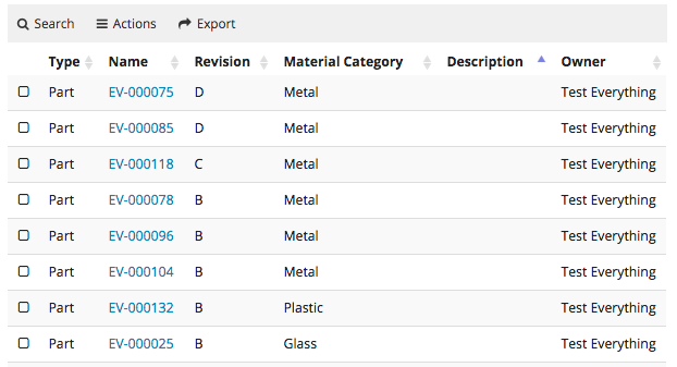
<Table xmlns="http://technia.com/TVC/Table" xmlns:xsi="http://www.w3.org/2001/XMLSchema-instance" xsi:schemaLocation="http://technia.com/TVC/Table http://products.technia.com/tvc/schema/latest/Table.xsd">
    <DisplayName>Basic Information</DisplayName>
    <Column>
        <Name>Type</Name>
        <Expression>type</Expression>
        <Label>Type</Label>
        <Fixed>TRUE</Fixed>
        <ShowTypeIcon>True</ShowTypeIcon>
        <NoWrap>true</NoWrap>
    </Column>
    <Column>
        <Name>Name</Name>
        <Expression>name</Expression>
        <Label>Name</Label>
        <Fixed>TRUE</Fixed>
        <SortDirection>ascending</SortDirection>
        <SortOrder>1</SortOrder>
        <Setting name="template" value="helium/templates/table/test" />
    </Column>
    <Column>
        <Name>Revision</Name>
        <Expression>revision</Expression>
        <Label>Revision</Label>
        <Fixed>TRUE</Fixed>
        <Editable>TRUE</Editable>
    </Column>
    <Column>
        <Name>Material Category</Name>
        <Expression>attribute[Material Category]</Expression>
        <Label>Material Category</Label>
        <AllowShowMore>TRUE</AllowShowMore>
        <Editable>TRUE</Editable>
        <InputType>combobox</InputType>
        <SortType>string</SortType>
        <AccessExpression>policy == 'EC Part'</AccessExpression>
    </Column>
    <Column>
        <Name>Desc</Name>
        <Expression>description</Expression>
        <Label>Description</Label>
        <Description>Describes this object in detail.</Description>
        <AllowShowMore>TRUE</AllowShowMore>
        <Editable>TRUE</Editable>
        <Columns>45</Columns>
        <Rows>5</Rows>
        <InputType>textarea</InputType>
        <SortType>string</SortType>
        <TextLength>40</TextLength>
    </Column>
    <Column>
        <Name>Owner</Name>
        <Expression>owner</Expression>
        <Label>Owner</Label>
    </Column>
    <Column>
        <Name>Weight</Name>
        <Label>Weight</Label>
        <Expression>attribute[Weight]</Expression>
        <Editable>TRUE</Editable>
        <SortDirection>ascending</SortDirection>
        <Setting name="class" value="col-weight col-bold col-red col-small" />
    	<AccessMask>checkout,modify</AccessMask>
    </Column>
</Table>|
|
For Autocomplete functionality with Inquiry Dataset, USERQUERY macro can be used to pass user input to inquiry. |
Example:
<Setting name="options"><![CDATA[
    {
        "autocomplete": {
            "handler" : {
                "name": "dataset",
                "dataset": "tvc:dataset:helium/MyParts.xml",
            }
        }
    }
    ]]>
</Setting>
and Dataset Inquiry is:
<Inquiry>
    <Code>temp query bus Part '*${USERQUERY}*' * where "owner == '${USER}'" limit 100 select id dump |</Code>
    <Format>${OID}</Format>
    <Pattern>*|*|*|${OID}</Pattern>
</Inquiry>
1.3.12. Cell content in modal instead of tooltip
The data in the cell content can be huge and it will be better to such data in the modal as it provides the ability to scroll and makes more user friendly while ready such content.
This can be achieved by adding following configuration.
<Column>
	...
	<TextLength>25</TextLength>
	<Rows>5</Rows>
	<TruncateDirection>right</TruncateDirection>
	<Setting name="class" value="he-tooltip-as-modal" />
	...
</Column>
By default, after text length limit three dot (…) will be rendered on UI. If want to change this three dot then need to configure below properties in translation JSON files.
"dataTable": {
 "column": {
  "textLength": {
   "textToShowTooltip": "... (more)"
  }
 }
}
In some cases user might not want to see the close icon that could be achieved by below configuration.
<Column>
	...
	<UseVersion2>true</UseVersion2>
	<TextLength>25</TextLength>
	<Rows>5</Rows>
	<TruncateDirection>right</TruncateDirection>
	<Setting name="class" value="he-tooltip-as-modal he-without-close" />
	...
</Column>
By default a close icon will be shown on modal, to close the modal. If user doesn’t to see the close icon and wants the modal to close if he clicks anywhere outside the modal. this can be achieved with below config.
<Column>
	...
	<Setting name="class" value="he-tooltip-as-modal he-without-close" />
	...
</Column>
1.3.13. Hide static valued column in Data Grouping
Columns may contain static values, such as icons or images. However, these static values may also appear in the rows where data is grouped, which may not be desirable. To address this issue, a setting called DataGroupHidden can be applied to the column that contains static values. By setting this value to true in the column’s XML code, the static valued column will be hidden in the grouped rows.
Below setting is required for static valued columns to be hidden in data grouped rows
<Column>
	...
	<Setting name="DataGroupHidden" value="true" />
	...
</Column>
1.4. Progress Column
 The progress column will render a progress bar based on the value.
Unlike the progress column in TVC Classic this column is only responsible for rendering the value.
By default it will also show the percentage as text and in tooltip.
This can be controlled with the options setting.
The progress column will render a progress bar based on the value.
Unlike the progress column in TVC Classic this column is only responsible for rendering the value.
By default it will also show the percentage as text and in tooltip.
This can be controlled with the options setting.
<Setting name="options">
    	{
			"showText" : false,
			"showTooltip" : false
		}
</Setting>
<Column>
<Name>progress</Name>
<Label>Progress</Label>
<ColumnType>helium-progress</ColumnType>
<Expression>${attribute[attribute_PercentComplete]}</Expression>
<Setting name="options">
{
"showText" : false,
"showTooltip" : false
}
</Setting>
</Column>1.5. Files Column
|
|
This feature requires the TVC File Manager license. |
In a table displayed in Helium, you may have a column containing links to files related to objects in ENOVIA. There is a built-in column type that simplifies configuring this.
<Table>
	<Column>
		<Label>emxComponents.Common.Actions</Label>
		<RegisteredSuite>Components</RegisteredSuite>
		<ColumnType>helium-files</ColumnType>
	</Column>
</Table>
</Column>
</Table> |
Column type set to helium-files |
This column inherts behaviour from the TVC File Manager component regarding configuration and others.
See this page for more details on how to configure the File Manager.
The screenshot below illustrates the file column
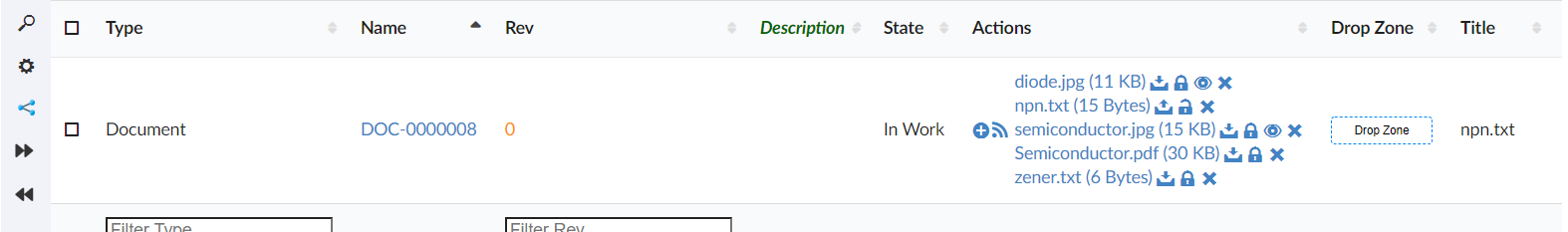
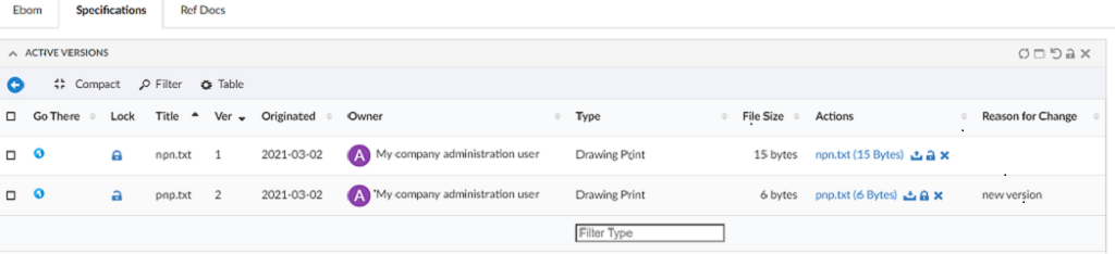
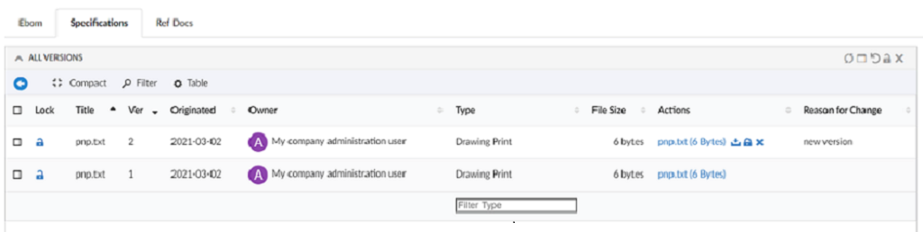
Figure 2. Files Column
Image can be previewed in the modal. Setting tvc.helium.showPreviewFileInModal should be set to true. By default, it’s false.
Also, It is possible to reverse the lock icon to match the file lock status. Ex. When the file is locked, show the lock icon and similarly, when the file is unlocked, show the unlock icon.
This can be achieved by using below system property in tvc.properties.
| Property | Description | Default Value |
|---|---|---|
tvc.core.fileActions.reverseLockIcon |
Reverse the lock icon |
false |
<Expression> tag support for Column type set to helium-files
A column set to Column type helium-files along with <Expression> tag as shown below, will display the file from related object found through the expression value.
And file column with expression will always be non-editable.
<Table>
	<Column>
		<Label>Related Files</Label>
		<RegisteredSuite>Components</RegisteredSuite>
		<ColumnType>helium-files</ColumnType>
		<Expression>${from[relationship_ReferenceDocument].to}</Expression>
        <Setting name="options">
		{
			"excludeFormat":"mxMedium Image"
		}
        </Setting>
	</Column>
</Table>
<Setting name="options">
{
"excludeFormat":"mxMedium Image"
}
</Setting>
</Column>
</Table>As an example in below screen, a part object displays the file from its related object found traversing through relationship "Reference Document"
|
|
All the files from all object found through the expression value will be displayed. For example, out of given expression if 3 objects are found, all files from all 3 objects will be displayed. |
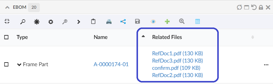
Figure 3. Files Column with Expression
Similarly we can show files that are connected the object using path, this can be achived by below configuration:
    <Column>
		<Label>files</Label>
		<ColumnType>helium-files</ColumnType>
		<PathType>SemanticRelation</PathType>
		<PathDirection>element</PathDirection>
		<PathExpression>from[VPLMrel/PLMConnection/V_Owner].to[PLMDocConnection]</PathExpression>
    </Column>
It might be scenario that some of files with specific format are irrelevant to show on UI. excludeFormat setting allows to exclude specified format files to show on UI.
This behavior can be configured in column as follows :-
<Table>
	<Column>
		<Label>Related Files</Label>
		<RegisteredSuite>Components</RegisteredSuite>
		<ColumnType>helium-files</ColumnType>
		<Setting name="options">
		{
			"excludeFormat":"mxMedium Image"
		}
        </Setting>
	</Column>
</Table>
or can be configured with global setting in tvc.properties as tvc.helium.files.excludeFormat=mxMedium Image,GIF
| Property | Description | Default Value |
|---|---|---|
tvc.helium.files.excludeFormat |
Exclude specified formats to show on UI |
mxMedium Image |
1.6. Drop Zone Column
|
|
This feature requires the TVC File Manager license. |
In a table displayed in Helium, you may have a column containing a drop zone were the user may drag’n’drop files to be checked into ENOVIA™. Helium contains a built-in column type that simplifies configuring this.
<Table>
	<Column>
        <Alt>Drop Zone</Alt>
		<ColumnType>helium-dropzone</ColumnType>
	</Column>
</Table> |
Column type set to helium-dropzone to enable this feature. |
You may include a file-dropzone in many places, as long as you have configured the column regarding what to do with the file depending on what object it is being dropped for. In some cases, you should create a new Document object, connect it with a certain relationship and then check-in the file.
Here is a complete example of how to configure a helium dropzone:
<Column>
    <Name>Dropzone</Name>
    <Label>Dropzone</Label>
    <ColumnType>helium-dropzone</ColumnType>
    <Setting name="dropzone:type_Part">
        relationship=relationship_ReferenceDocument,
        direction=from,
        type=type_Document,
        policy=policy_Document,
        vault=vault_eServiceProduction,
        format=generic,
        oneobjectperfile=true,
        refresh=refresh,
        selectformat=false
    </Setting>
</Column>
Please see file manager chapter for more details on how to configure a Drop Zone using TVC.
1.7. Primary Image Column
Showing a table column with thumbnails of an object’s primary image, is often helpful for identifying a particular object or to get an overview. Helium features a built-in columntype for this.

The tablecolumn uses lazy-loading to only request images that are within the visible area of the web browser, in order to not waste bandwidth. Images that come into the visible screen area after scrolling will be automatically fetched at that time.
<Table>
    <Column>
        <Name>PrimaryImage</Name>
        <Label>Image</Label>
        <ColumnType>helium-primaryimage</ColumnType>
    </Column>
</Table> |
Column type set to helium-primaryimage to enable this feature. |
1.8. User Column
Inbuilt ColumnType for showing an avatar/profile picture in a table cell. Useful for indicating who owns, created, or is assigned to an object. Needs a valid <Expression> to identify the User.

The tablecolumn uses lazy-loading to only request images that are within the visible area of the web browser, in order to not waste bandwidth. Images that come into the visible screen area after scrolling will be automatically fetched at that time.
<Table>
    <Column>
    	<Name>owner</Name>
    	<Expression>owner</Expression>
    	<Label>Owner</Label>
    	<Editable>false</Editable>
    	<ColumnType>helium-user</ColumnType>
    </Column>
</Table> |
Column type set to helium-user to enable this feature. |
1.9. Attachments Column
Showing a column with an attachments icon and clicking on the icon will open all the attachments related to that row in a modal. This can be configured as
<Column>
    <ColumnType>helium-attachment</ColumnType>
	<Setting name="Relationship" value="relationship_ReferenceDocument"/>
	<Setting name="Direction" value="From"/>
</Column>
Default value for Relationship is "Reference Document,Part Specification" and is defined on`tvc.office.server.attachmentRelationships` and for direction is "From".
1.10. Version Actions
This can be used to show the actions available on a particular version objects like download a file, check in, check out e.t.c

1.11. Go There
Shows navigate icon which allows to navigate to a widget. The basic use case can be to show properties or structure of any object. This can be configured as below:
<Column>
	<Label>column.label.goThere</Label>
	<ColumnType>helium-go-there</ColumnType>
	<Setting name="widgetRef" value="tvc:widget:hex:engineering/EBOM.xml" />
</Column>
1.12. Add To Clipboard
Shows add to clipboard icon, which enables user to add an object to clipboard. This can be configured as below:
<Column>
		<Label>Add To Clipboard</Label>
		<ColumnType>helium-addToClipboard</ColumnType>
		<Alt>Add to Clipboard</Alt>
	</Column>
1.13. Classification Column
Classification is a Enovia built-in feature provided by Library central. Any business-object can be classified as per the concept of Library central. Classification is maintained as hierarchy where Library objects act as root objects followed by Family or Classification objects . There can be more Family or Classification objects (also known as Sub Family) beneath a Family or Classification object forming a hierarchy. At the end of hierarchy, classified items will be present. Thus Library central forms the classification path for any business-object.
Columntype helium-classification enables you to configure a column to view and edit the classification path for the businessobjects listing in the datatable.
Below XML configuration displays the built-in classification column with options to add and remove classifications for the respective row object.
<Column>
	<Label>Classification</Label>
	<ColumnType>helium-classification</ColumnType>
</Column>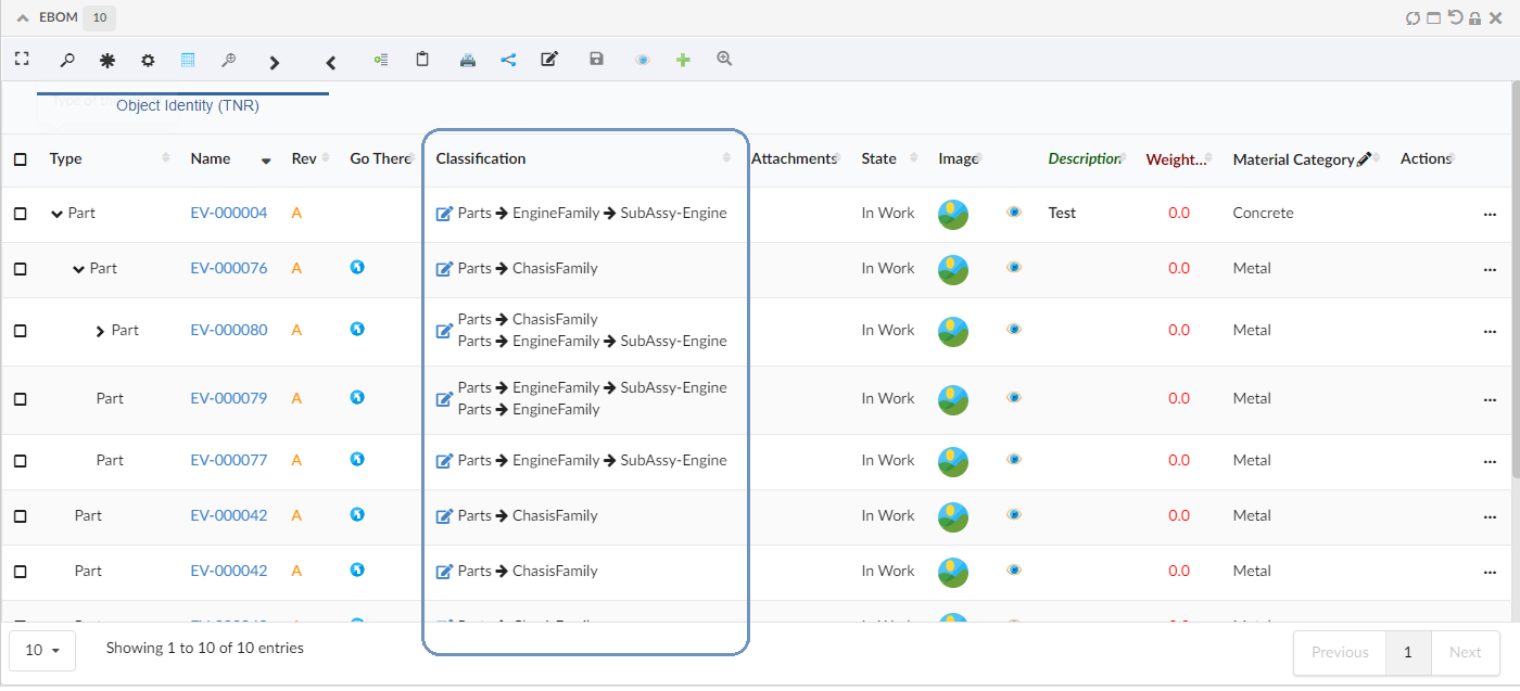
Figure 4. Default Classification column
Columntype helium-classification was introduced in release 2022.3.0, to display a classification column and a icon to edit the classification from table-column. A edit form was opening on clicking the edit icon, to update the classification path by typing-in the known classifications. But there was no option to see all the available classifications.
From 2023.2.0 release, introducing a structure table to display the classification in hierarchy order. The edit icon in the classification column opens the default dashboard with a structure table to display the classification in hierarchy order. This hieraracal view helps to find the required classification and update to the respective row businessobject.
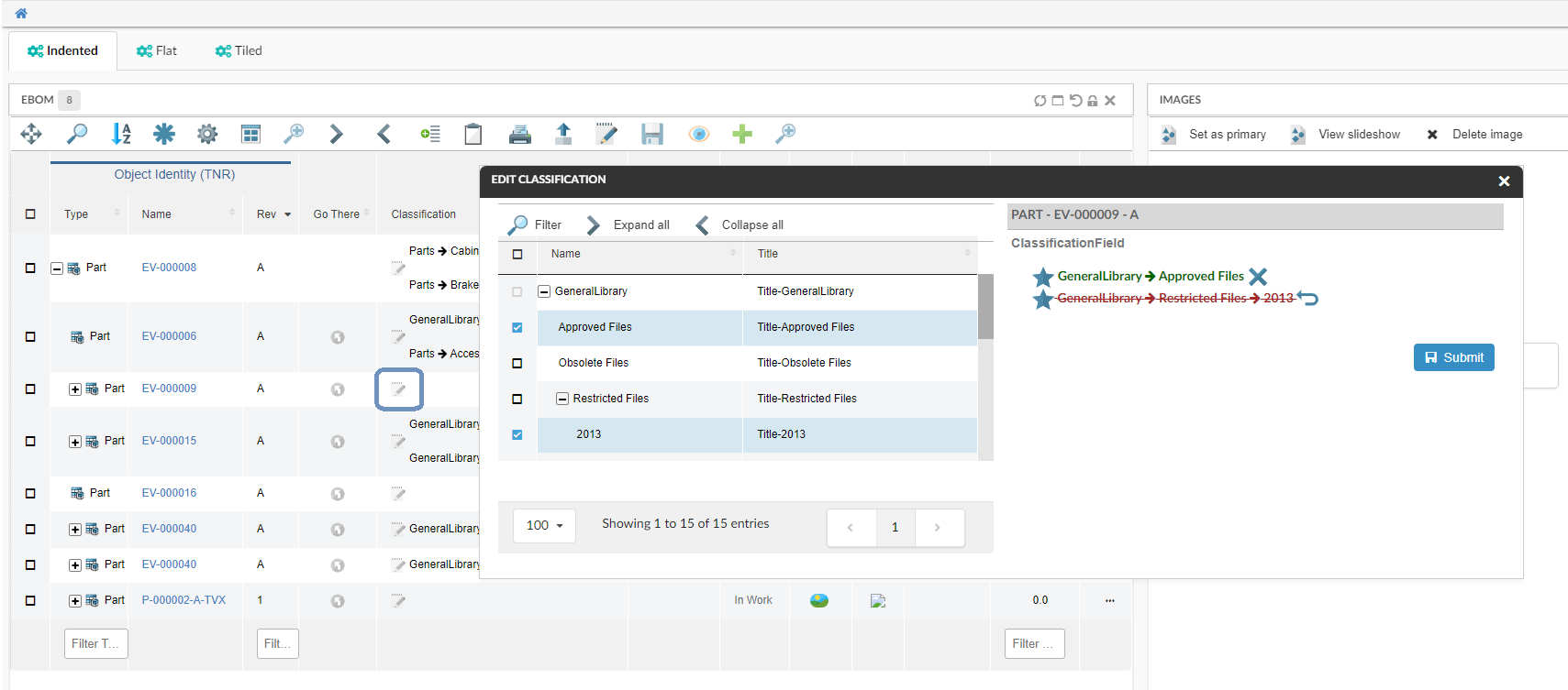
Figure 5. Edit Classification with Default Form and structure table
Refer a short video where a classification is updated to a row object.
Below are the optional settings to override the default behavior or the appearance of the classification column
| Settings | Description |
|---|---|
hideAddClassificationIcon |
By default this setting is
|
editDashboard |
The default dashboard is
|
editDashboardPosition |
you can specify the edit dashboard position using this setting and override the default position.
|
classificationRelationship |
"Classified Item" is the default relationship to get the classification path. This default relationship can be overriden by the below setting in column configuration.
|
classifyFromLevel |
This setting helps to specify from which level of the library heirarcy, the business object must be classified. The default value is 1, meaning that once the library is expanded, business objects can be classified from the first level of the hierarchy.
|
displayExpression |
By default, the name of the classification object is displayed in the classification path. This can be override by the below setting.
|
template |
You can choose to override the default template with you custom template.
|
Below is the sample classification column configuration with all optional settings.
<Column>
	<Label>Classification</Label>
	<ColumnType>helium-classification</ColumnType>

	<!-- Optional Settings -->
	<Setting name="classificationRelationship">relationship_PartClassification</Setting>
	<Setting name="displayExpression">${attribute[attribute_Title]}</Setting>
	<Setting name="template">helium/templates/classification</Setting>
	<Setting name="options">{
		"hideAddClassificationIcon": true,
		"editDashboard":"tvc:dashboard:helium/EditClassification.xml",
		"editDashboardPosition":{
				"left": "25%",
				"right": "25%",
				"top": "25%",
				"bottom": "25%"
			}
		}
	</Setting>
</Column>
1.14. Related Object Column
As the user would like to make connections between object while editing a table cell, for ex connecting a specification to part. Now for such usecase we can configure related object column in helium.
    <Column>
	<Name>Specifications</Name>
	<Expression>${from[relationship_PartSpecification].to}</Expression>
	<AlternateOIDExpression>${from[relationship_PartSpecification].to.id}</AlternateOIDExpression>
	<Label>Specifications</Label>
	<TextLength>10</TextLength>
	<Rows>5</Rows>
	<TruncateDirection>left</TruncateDirection>
	<GroupHeader>Related Data</GroupHeader>
	<Setting name="options">{
				"formConfig":"tvc:form:helium/RelatedObjectForm.xml",
				"formWidth" : "300",
				"formHeight" : "300"
		}</Setting>
    <ColumnType>helium-relatedobject</ColumnType>
</Column>
As can be seen in the above config in settings we can pass a formconfig reference which would have all the details about the field which need to be edited.
1.15. Create and connect row command
In a structure table it is possible to create and insert a new row at a chosen depth. Select a row and click the "Create and connect row" command to add a child row to the selected parent row.
1.16. Upload File Command
|
|
This feature requires the TVC File Manager license. |
This feature is similar to the "Dropzone above table" in the file manager chapter. Creates a row/new rows when a file is uploaded. The row will not be created until the file is uploaded successfully.
Currently supports the following options:
The table below shows and explains what parameters that you can use:
| Parameter | Value | Notes / Description |
|---|---|---|
createSettings |
String or Object |
The id of a predefined createSettings or the createSettings can be defined inline here. See the following createSettings: parameters. |
createSettings:type |
String type |
The type of object that will be created. Can be a symbolic name or real name |
createSettings:policy |
String policy |
The name of the policy to be used for the object that will be created. Can be a symbolic name or real name |
oneFilePerObject |
True or False |
Whether or not to create one document object per file that is dropped. E.g. if the user drops three files, if this setting is set to true, three document objects will be created. Default is false. |
badChars |
String/JS function |
Chars that are not allowed in the file name. [1] |
validFileExtensions |
Array of Strings/JS function |
Valid file extensions. [1] |
maximumFileSize |
Number/JS function |
The maximum allowed file size in bytes. [1] |
preProcessor |
JS function |
JS function executed before any table row is created. |
postProcessor |
JS function |
JS function executed after all table rows are created. when not configured, table is reloaded. custom postProcessor can take care of reloading the table or return true to reload. |
-
Can either be a value, or the name of a JS function returning a value
Example:
<Command>
    <Label>Save file</Label>
    <FontIcon>he-save</FontIcon>
    <OnClick>App.file.uploadFileCommand</OnClick>
    <OnClickParams><![CDATA[{
        "oneFilePerObject": true,
        "createSettings": {
            "type": "type_CADDrawing",
            "policy": "policy_CADDrawing"
        },
        "badChars": "App.custom.noSpaceOrComma",
        "validFileExtensions": [".png", ".jpg", ".jpeg", ".bmp", "gif", ".psd"],
        "maximumFileSize": "App.custom.fiveMegaBytes",
        "preProcessor" : "App.custom.validateFileSize",
        "postProcessor" : "App.custom.returnTrue"
    }]]></OnClickParams>
</Command>
1.17. Promote and Demote Command
In order to promote and demote business object(s) from a table widget, the promote and demote methods of App.table.BusinessObject JS API can be used. The API requires a data table reference as the mandatory first argument. After the action is performed, an optional status message can be displayed in the UI, informing whether action was successful or not. To display such message, an optional second argument containing a Toaster instance should be passed..
Example:
new App.table.BusinessObject(this).promote();
new App.table.BusinessObject(this, windows.App.toaster).promote();
new App.table.BusinessObject(this).demote();
new App.table.BusinessObject(this, windows.App.toaster).demote();
Inbuilt promote and demote command.
App.table.action.promote
App.table.action.demote
Example:
<Command>
    <Label>Promote</Label>
    <FontIcon>fa-forward</FontIcon>
    <OnClick>App.table.action.promote</OnClick>
</Command>

<Command>
    <Label>Demote</Label>
    <FontIcon>fa-backward</FontIcon>
    <OnClick>App.table.action.demote</OnClick>
</Command>
1.18. Print Command
To print the content of widget, the print method of App.Widget JS API can be used. Command can be used either in widget toolbar or header actions. In responsive table only visible content can be printed.
|
|
This feature is supported only in View mode. |
Example:
In Widget Toolbar
<Command>
	<Label>Print</Label>
	<OnClick>App.Widget.print</OnClick>
</Command>
In HeaderActions
<Command>
    <Label>Print</Label>
    <Setting name="OnClick" value="App.Widget.print" />
</Command>
1.19. Display Density Command
A built-in command <DisplayDensity /> can be added to a toolbar in a Table widget. This command allows decreasing height between rows resulting in more rows to be visible. User preference is preserved across sessions.
|
|
The user preference will be saved only for the Table widget where this command is used. |
Change Display Density
1.20. File Package Download Command
A built-in command <FilePackageDownload /> can be added to a toolbar in a Table widget. This command allows bulk download of documents from selected objects using native file manager.
<FilePackageDownload>
    <!-- Optional fields-->
    <Label>FPD</Label>
    <FontIcon>cloud download icon</FontIcon>
    <Configuration>tvc:fpd:hex:engineering:homepage/NativeFilesForSelectedModels.xml</Configuration>
</FilePackageDownload>|
|
To use this command, native file manager needs to be installed and enabled in user’s device. |
1.21. Table Configurator Command
A built-in command <TableConfigurator /> can be added to a toolbar in a Table widget. This command allows adding,updating and removing user defined tables and maintaining End User Defined Columns for different tables.
|
|
The addition of new columns can only be done for end user tables and not the default file based table defined for a widget. |
In datatable toolbar :
<TableConfigurator default="columns" excludeInterfacePrefix="true" />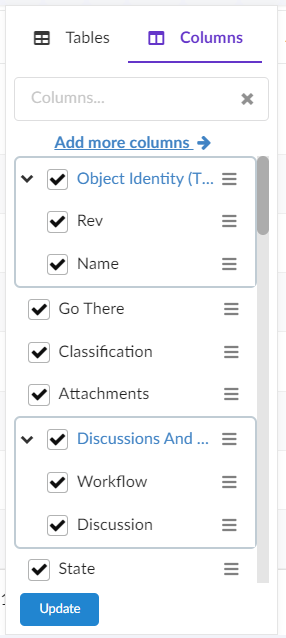
Figure 6. Table Configurator Menu Columns View
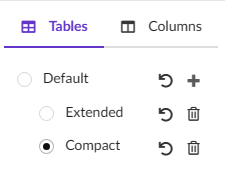
Figure 7. Table Configurator Menu Tables View
The table below shows and explains the available attributes for <TableConfigurator /> command:
| Field | Value | Notes / Description |
|---|---|---|
default |
columns or tables |
The default attribute defines which tab is active by default in menu. Default selected tab is columns. |
excludeInterfacePrefix |
True or False |
Whether the interface attributes should show interface name prefix in available columns' list. Default value is true. |
|
|
It is recommended not to add <ToggleColumnVisibility /> command if <TableConfigurator /> is used as it would be redundant to have both together in a toolbar. |
Table Configurator
1.22. Search And Connect Command
A built-in command <SearchAndConnect></SearchAndConnect> can be added to a toolbar in a Table widget. This command opens a search modal configured with given searchform and relationships and user can select search results and connect to selected object.
In datatable toolbar :
    <SearchAndConnect >
        <Relationships >
            <Relationship default="true">
                relationship_EBOM
            </Relationship>
            <Relationship direction="to">
                relationship_PartSpecification
            </Relationship>
        </Relationships >
        <SearchConfig>tvc:search:hex:common/SearchAndConnect.xml</SearchConfig>
        <ExpandRow>true</ExpandRow>
    </SearchAndConnect>
The table below shows and explains the available tags for SearchAndConnect` command:
| Field | Value | Notes / Description |
|---|---|---|
Relationships |
Relationship[] |
The list of relationships available for connection in search modal. |
Relationship |
string |
Name of the relationship to be added.It has two attributes default (sets the relationship as default selected for connection) and direction(the relationship direction to be used for connection) Default value for direction is false. Default value for default is false. |
SearchConfig |
string |
The search config path for the search modal.For further details see New Search Experience |
ExpandRow |
boolean |
Whether context object in table should be expanded after new objects are connected from the modal. |
OnSubmit |
The |
<OnSubmit>App.hex.doConnections</OnSubmit>. |
SubmitButtonLabel |
This will overide submit button label. Default value is |
<SubmitButtonLabel>Add To Collection</SubmitButtonLabel> |
Connect |
Want to perform custom action which is not dependent on relationship, then this tag can be set |
<Connect>false</Connect> |
SelectionCriteria |
To enable/disable command based on row selection. Valid values are |
<SelectionCriteria>none</SelectionCriteria> |
Improve the Search And Connect command by adding customizable settings like upperSearchLimitValue and enableSelectAllCheckboxes, similar to NSX search.
We can also customize the Search and Connect Form by including a custom message for users.
Search And Connect Objects
1.23. Data Group Command
The data grouping function can be used to group data, based upon column values, into different groups.This function is available from any table page (flat list or structure), and operates on the data within a table/structure.
The data grouping function is launched via a built-in command <DataGroup/>, that can be added to a toolbar in a Table widget.
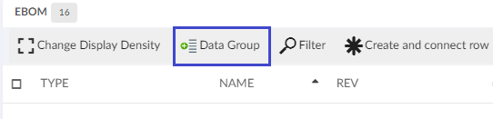
Figure 8. Data Grouping Button
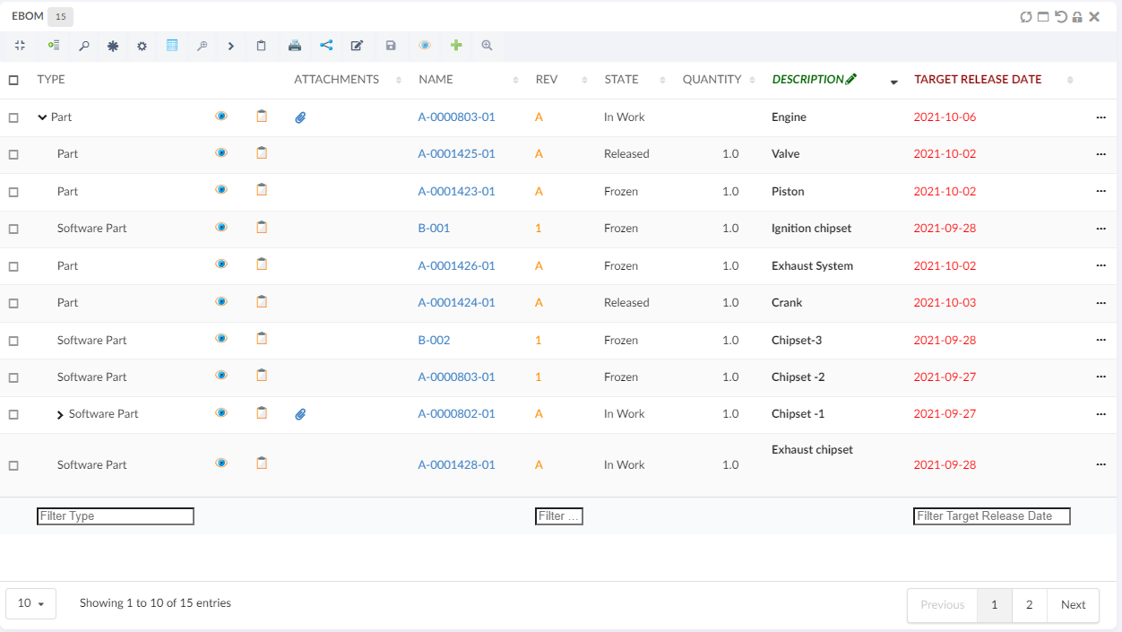
As an example, assume that you have a structure like in the screenshot below.
Launching the data grouping function and define two groups: type + current state, would give a result like the screenshot below.
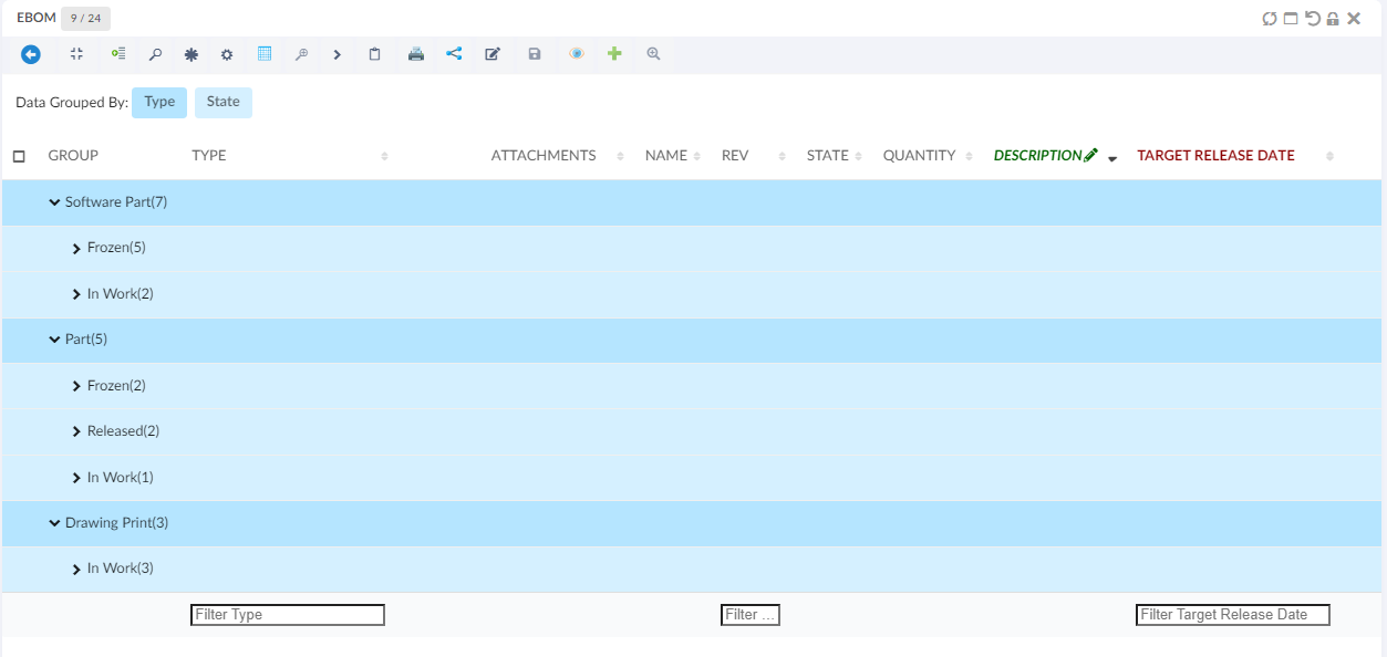
The different groups have different colours, and above the table there is a legend where the colour is mapped to the group. The first column after the structure shows the value (label) and the number of rows that mapped the group.
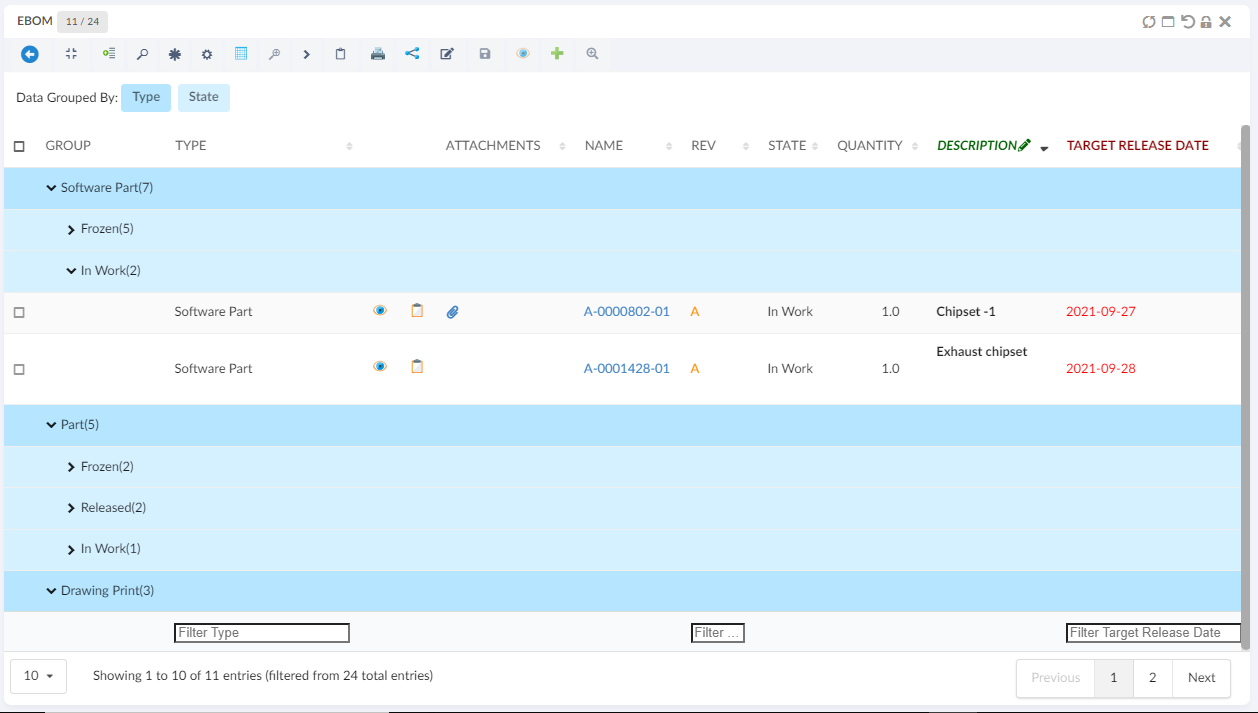
A group can be expanded in order to see the content of a particular group.
Creating data groups based on specific conditions provides a convenient and functional way to meet our data grouping needs.
1.23.1. Light Mode Data Group
This enable user to open a data grouping form inline where user can select the column and apply the grouping even user can cancel the grouping.
This can enable by passing an attribute lightMode value as a true in exiting data group commnad.
<DataGroup lightMode="true"/>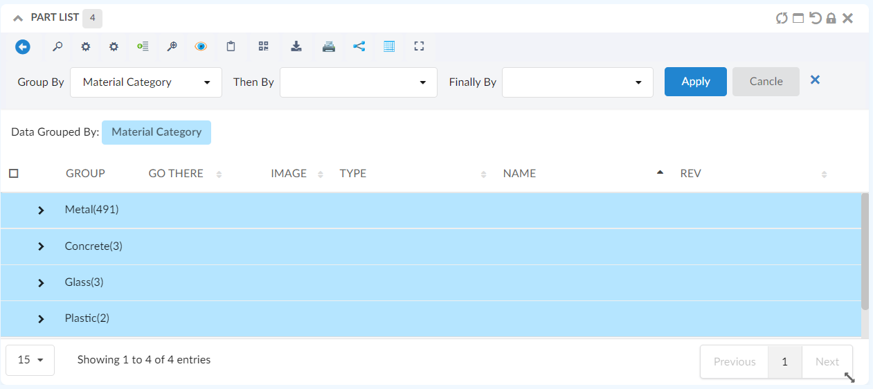
Figure 9. Light Mode Data Group Form
1.24. Pre configure Data Group
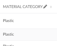
For some tables user might want to see the preconfigured datagroups, the data can be grouped when the tabe is loaded initially loaded by providing simple configurations in the table config as follows :
 <DataGroup>
    <GroupBy>
        <Name>Material Category</Name>
		<Group condition="match" value="Glass" />
	</GroupBy>
	<ThenBy>
	    <Name>owner</Name>
	</ThenBy>
	<FinallyBy>
		<Name>State</Name>
	    <Group condition="match" value="In Work" />
	</FinallyBy>
	<GoBackAllowed>true</GoBackAllowed>
</DataGroup>
1.25. Advance Sorting Command
<AdvanceSorting/> built-in command can be added to toolbar in table widget.
This command enable the user to sort the table. By clicking on this command, a UI will appear which enable user to choose desired sorting column and direction. Only sortable column will be appear in dropdown with which the user can choose to sort on up to three columns at same time.
When 'Save Sorting' is checked, the sorting preferences will be retained for future sessions or interactions with the application, providing consistency and convenience. If users prefer to sort temporarily for the current session without affecting future interactions, they can sort without checking the checkbox.
1.26. Internationalisation
The data table widget supports internationalization. If a translation key is given to an <Label> element
the translation for that key will be rendered. If no value is found for that key the actual value of the <Label> element
will be rendered.
1.26.1. Customize messages
The following messages is defined in the default.json language file.
{
    "dataTable": {
        "messages": {
            "decimal":        "",
            "emptyTable":     "No data available in table",
            "info":           "Showing _START_ to _END_ of _TOTAL_ entries",
            "infoEmpty":      "Showing 0 to 0 of 0 entries",
            "infoFiltered":   "(filtered from _MAX_ total entries)",
            "infoPostFix":    "",
            "thousands":      ",",
            "lengthMenu":     "_MENU_",
            "loadingRecords": "Loading...",
            "processing":     "Processing...",
            "search":         "Search:",
            "zeroRecords":    "No matching records found",
            "paginate": {
                "first":      "First",
                "last":       "Last",
                "next":       "Next",
                "previous":   "Previous"
            },
            "aria": {
                "sortAscending":  ": activate to sort column ascending",
                "sortDescending": ": activate to sort column descending"
            }
        },
        "editor": {
            "messages": {
                "create": {
                    "button": "New",
                    "title":  "Create new entry",
                    "submit": "Create"
                },

                "edit": {
                    "button": "Edit",
                    "title":  "Edit entry",
                    "submit": "Update"
                },

                "remove": {
                    "button": "Delete",
                    "title":  "Delete",
                    "submit": "Delete",
                    "confirm": {
                        "_": "Are you sure you wish to delete %d rows?",
                        "1": "Are you sure you wish to delete 1 row?"
                    }
                },

                "error": {
                    "system": "A system error has occurred (More information)"
                },

                "multi": {
                    "title": "Multiple values",
                    "info": "The selected items contain different values for this input. To edit and set all items for this input to the same value, click or tap here, otherwise they will retain their individual values.",
                    "restore": "Undo changes"
                }
            }
        }
    }
}
It is possible to override the each message in your own language file by providing a key that matches one of the above. For
example to override the dataTable.messages.emptyTable key you would add the following to your language files.
    {
        "dataTable": {
            "messages": {
                "emptyTable": "Currently no rows"
            }
        }
    }
Many translations for the tables can be found on here
1.27. API
The table javascript api can be found here
1.28. Mass Update
When <AllowMultipleEdit> has been set to true on a table column, the column is editable, and the
user has access to edit at least one cell in the column, an icon will appear on the column header
that the user can click in order to edit multiple cells in a single column to the same value.
Figure 10. Mass Update icon
The mass update form is shown in modal. If there is more than one column allowed for mass updating, the user can easily change the working column from the drop down list showing the column. The user can choose whether to edit the selected rows or all rows.
User can check "Keep Selection" to retain selection for further mass updating other columns.
By default "Keep Selection" is unchecked.
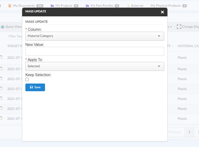
Figure 11. Mass Update form
1.29. Customization
The end user can change certain settings of a TableWidget, and automatically persist those customizations. Settings that are customizable include:
-
Column visibility (hide/show)
-
Data grouping (show/hide)
-
Column order (reorder the initial order from configuration)
-
Pagination length (number of table rows displayed per page)
-
Last sorted column (The column based on which the table should be sorted. Overrides the default/configured sort order)
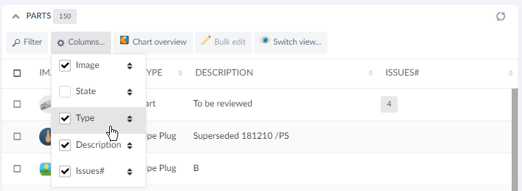
Figure 12. Checkbox indicates column visibility. Drag-and-drop to reorder.

Figure 13. Pagination
Changes to the above settings are stored per TableWidget, and remembered across page changes and browser sessions, as long as the Dashboard Customization property is enabled.
To reset any customizations for a TableWidget, you can use the Widget Customization reset icon.
1.30. Styling / CSS
1.30.1. Offline available table rows
If dynamic caching of object pages has been enabled, the TableWidget now automatically applies a CSS class .offline-available on every <tr> element that has a cached entry.
This opens up for conditional styling, that helps the user understand which objects are cached and thereby possible to open while offline.
Below example is achieved with CSS:
tr.offline-available {
	background-color: #9fd39f !important;
}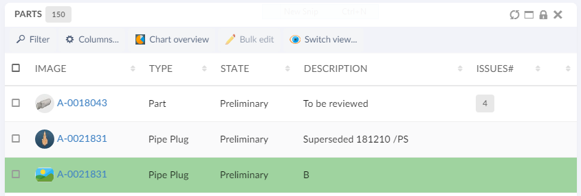
Figure 14. Specific styling of offline-available objects
1.31. End User Defined Columns
Users can add, remove and update columns in a table from the existing list of attributes based on objects present in table including the unified type and interface attributes.
It is also possible to exclude some attributes from the addable list by adding following init-param in web.xml:
tvc.core.attributes.excludedAttributesIt accepts comma-separated attribute names to be excluded. Furthermore, attribute labels support localization through framework properties.
In datatable toolbar :
<TableConfigurator />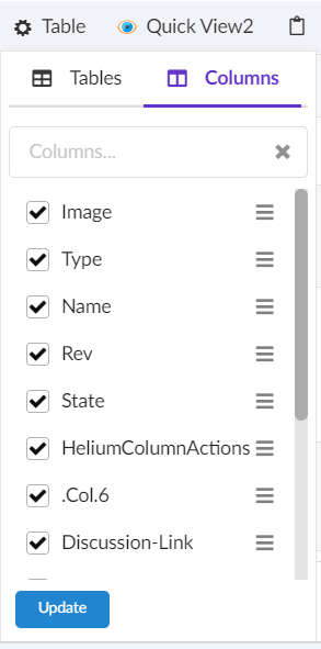
Figure 15. Columns menu
There are two ways of adding a new column to the existing table. User can simply check one/more columns from the existing list or use Add Advanced Column icon to add column with more custom settings.
The table below shows and explains the available settings in advanced mode:
| Field | Value | Notes / Description |
|---|---|---|
Name |
String |
The name appears as table column header |
Description |
String |
The description acts as tooltip for column header. |
Expression |
String |
The expression field provides a list of attributes to select from for the column data. |
Template |
String |
The list of templates if configured. Refer Choose template to a Column section. |
Valid For |
String |
The list of types to specify the column belongs to which type. |
Is Editable |
True or False |
Whether the column should be editable or not. Default is false. |
InputType |
String |
List of input types to select from in case of editable field. E.g. If the attribute is of date format, you can select date as input type which will present a date picker to choose from in edit mode. |
No Wrap |
True or False |
Whether the content of column should be wrapped. Default is true. |
Filter |
True or False |
Whether column should have its own column filter. Default is false. |
Sortable |
True or False |
Whether column should be sortable or not. Default is true. |
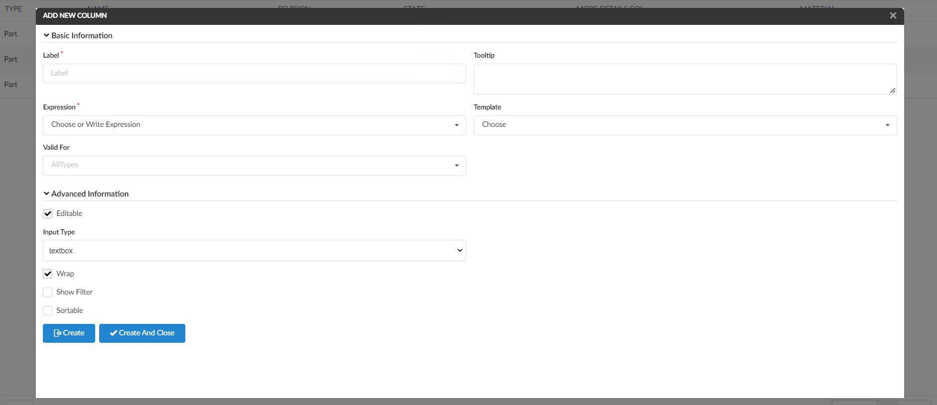
Figure 16. Add Advanced Column form
After addition user can delete the column by unselecting it and update by using the pencil icon next to column item in the menu. Edit form provides same properties as add advanced form.
1.32. CDM document details widget
We can view the versions of the document object by configuring the columntype helium-go-there as given below:
<Column>
	<Label>Go There</Label>
	<ColumnType>helium-go-there</ColumnType>
	<Setting name="widgetRef" value="tvc:widget:helium:cdm/CDMDocumentVersions.xml" />
</Column>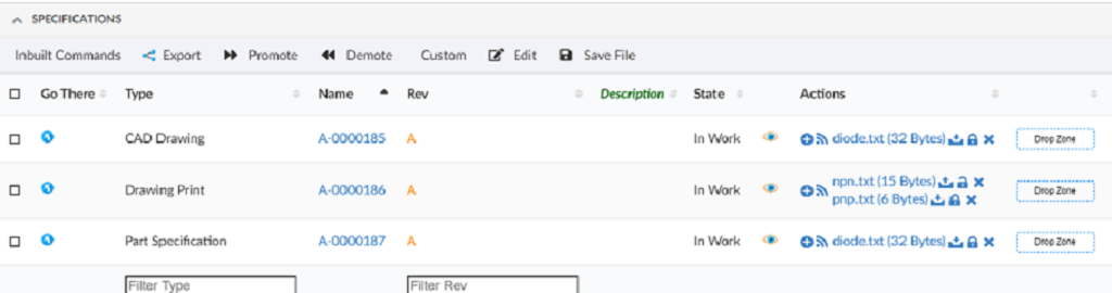
If a document object would have several files checked in, you will first see the active version objects for each file checked in.
By simply clicking the go-there again for a particular file, you will then see all the versions of that file.
1.33. Limitations of the date format table columns
When ClientSideProcessing is disabled, then the search performed using the column filter on date format columns will not give expected results if the date format specified with the tag DateFormat in Helium.xml is identified as invalid by the standard java class java.text.SimpleDateFormat.
For example, if the date format specified with the tag DateFormat in Helium.xml is MMMM Do YYYY, then the SimpleDateFormat Class consider this as an illegal pattern by logging error Illegal pattern character 'o'. In this case, the search results won’t be accurate.
1.34. Row Highlight Duration
Row highlight duration post actions such as promote, demote, row refresh e.t.c can be configured as below :
tvc.helium.row.highlightDuration= 5000 //1000 is default value
1.35. Path Attachment Column type
The File column type is useful to display the related document(s) and their files in the side panel. However, the File column type will only display the related document(s) connected via the given/default relationships.
There might be cases when the table row object can have the document(s) connected via path (A virtual relationship).If there are document(s) related to the object, a paper clip icon will be displayed and the user can click the icon to get the list of files in the modal.
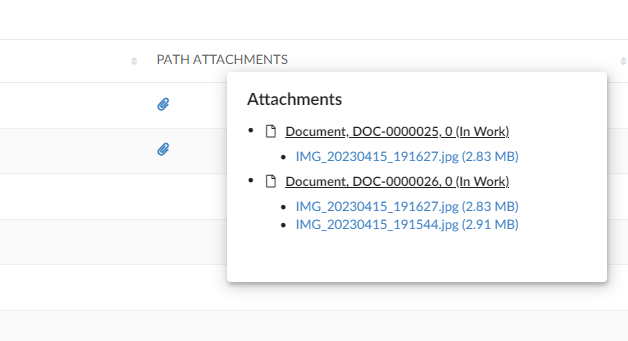
The list will show all related document(s) and the files related to each document.
For the document(s), the user will be able to check-in new files if user has access to do so, see basic properties of the document or open the document object in a popup window.
Also, per file, the user will be able to download, view, checkout, unlock, lock or update the file (again, depending on access rights, all actions might not be available).
Unless you provide any settings at all to this data handler, it will default look for "Reference Documents" and "Part Specifications" connected from the object in the table. You can change the behaviour by changing the following settings:
| Setting | Value | Description | Required |
|---|---|---|---|
Column Type |
helium-pathattachment |
This setting defines what type of column a particular column is. |
Yes |
Direction |
From |
The direction of the connection |
No |
Relationship |
relationship_PartSpecification |
A comma separated list of relationship names (or symbolic names) |
No |
PathDirection |
owner or element |
defines the direction for retrieving the path info for owner/element |
No (default is owner) |
PathType |
Proposed Activity.Where |
The Path type |
No |
PathExpression |
An expression |
The expression to retrieve the information in the context of path owner or to retreive the path owner in case of fetching the element information |
No. |
The example below illustrates how user/admin can construct the column of helium-pathattachment column type:
<Column>
	<ColumnType>helium-pathattachment</ColumnType>
	<Setting name="Relationship" value="SpecificationDocument" />
	<Setting name="Direction" value="from" />
	<PathType>SemanticRelation</PathType>
	<PathDirection>element</PathDirection>
	<PathExpression>from[VPLMrel/PLMConnection/V_Owner].to[PLMDocConnection]</PathExpression>
	<CardTitle>launchpad.ups.table.card.specDocs.Label</CardTitle>
	<CardID>ups_specdocuments</CardID>
	<Description>launchpad.ups.table.column.specDocFile.tooltip</Description>
	<Setting name="Render as Row Action" value="true" />
</Column>