TVC Helium 2021.4.0 Release Information
01 October 2021
1. Post Installation Configuration
1.1. Security Context in Helium
Default security context can be set for users in helium standalone mode. This can be enabled by below setting in tvc.properties or as init-param in web.xml.
tvc.core.login.useSecurityContext = true
| When helium is used in embedded 3dspace or 3ddashboard, this step is not needed as security context will be set from 3dspace or 3ddashboard. |
2. In-App Designer (End User Definition)
In-App Designer (previously known as End User Definition/ End User UI) is a concept that brings the idea of creating, editing and sharing configurations using the built-in admin user interface. These configurations can be used to define Helium dashboards, widgets, tables, charts, etc. Built-in Admin UI is provided to create, modify and share these configurations. In-App Designer can be used from Helium standalone or Helium widget in 3DDashboard. Once an admin has created and shared the config with end user, end user can use a built-in chooser UI to select and apply the configuration to his page, dashboard, or widget. For detailed information, please refer In-App Designer.
In this release, we have enhanced this feature further, by adding the capability to preview the draft dashboard and configure widgets in the draft dashboard from UI.
2.1. Role Change
Introducing a new role TVC Config Admin to view and manage all admin config. From this release, person assigned with TVC Admin Config alone can view or edit admin configs
2.2. Preview dashboard
In the earlier release, only active dashboards were allowed to be previewed. From this release, an admin can preview draft dashboards also. This is to facilitate an admin to make changes on the draft dashboard as required before promoting to active state and sharing with the end user.
2.3. Create widget on draft dashboard
Admin can now create a widget on a draft dashboard by select a required dataset. This works similar to end user creating a widget.
When an admin adds a widget to a draft dashboard or changes the position of widgets, the respective changes will be captured in the dashboard’s config object. And admin can preview the changes made on the dashboard and choose to share them with end user.
| Widget created on the draft dashboard will be in an Active state by default. |
3. Datatable
3.1. Data Grouping
Helium tables represent a huge collection of data. It would be useful for the user to have grouped representation of data-based of some columns value. Now Helium tables can also be shown in grouped representation.
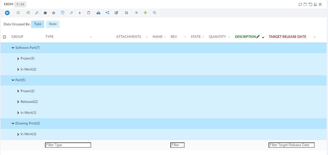
Data Grouping can be achieved with built-in command. For more details see here Data Group Command
3.2. Mass Update
While working in helium tables, it might be required that a user want to update the value of the same column in different rows. This can be achieved now with mass update functionality. For more details see here Mass Update
3.3. Reversible Lock Icon for File action columns
As per the existing design, the file actions column shows actions that can be performed. So, for a locked file unlock action is shown and for unlocked file lock action is shown. However, this can be confusing to some users as they expect to see the state of the file.
Now it is possible to reverse icons on Action columns so that it shows the state of the file/object i.e. lock icon when a file is already locked and unlock icon when a file is already unlocked.
This can be done using below setting.
| Property | Description | Default Value |
|---|---|---|
tvc.core.fileActions.reverseLockIcon |
Reverse the lock icon |
false |
For more details see here Files Column
4. Form
4.1. Override Templates and Validation in Files Field
Similar to other field types, the files field also supports overriding templates and validation.
Below are the settings introduced to the files field.
| Name | Description | Example |
|---|---|---|
Validation |
What client side validation rules should be applied to the field. The following child elements are supported
|
|
Template |
A path to an handlebars template that is responsible for rendering the field. |
|
OptionTemplate |
A path to an handlebars template that is responsible for rendering the selected field option. |
|
For more details see here Files Field
5. Chart
5.1. New Chart Library
Apex chart is a modern charting library that helps to create a beautiful and interactive visualization of data. It comes with some easy-to-configure features like the ability to show combination charts, ability to configure colors for different series e.t.c.
The new chart library can be enabled at widget level as mentioned below :
<ChartWidget>
	...
	<UseVersion2>true</UseVersion2>
	...
</ChartWidget>
Or this can be configured globally in tvc.properties :
tvc.helium.widget.chart.useVersion = true // default is false
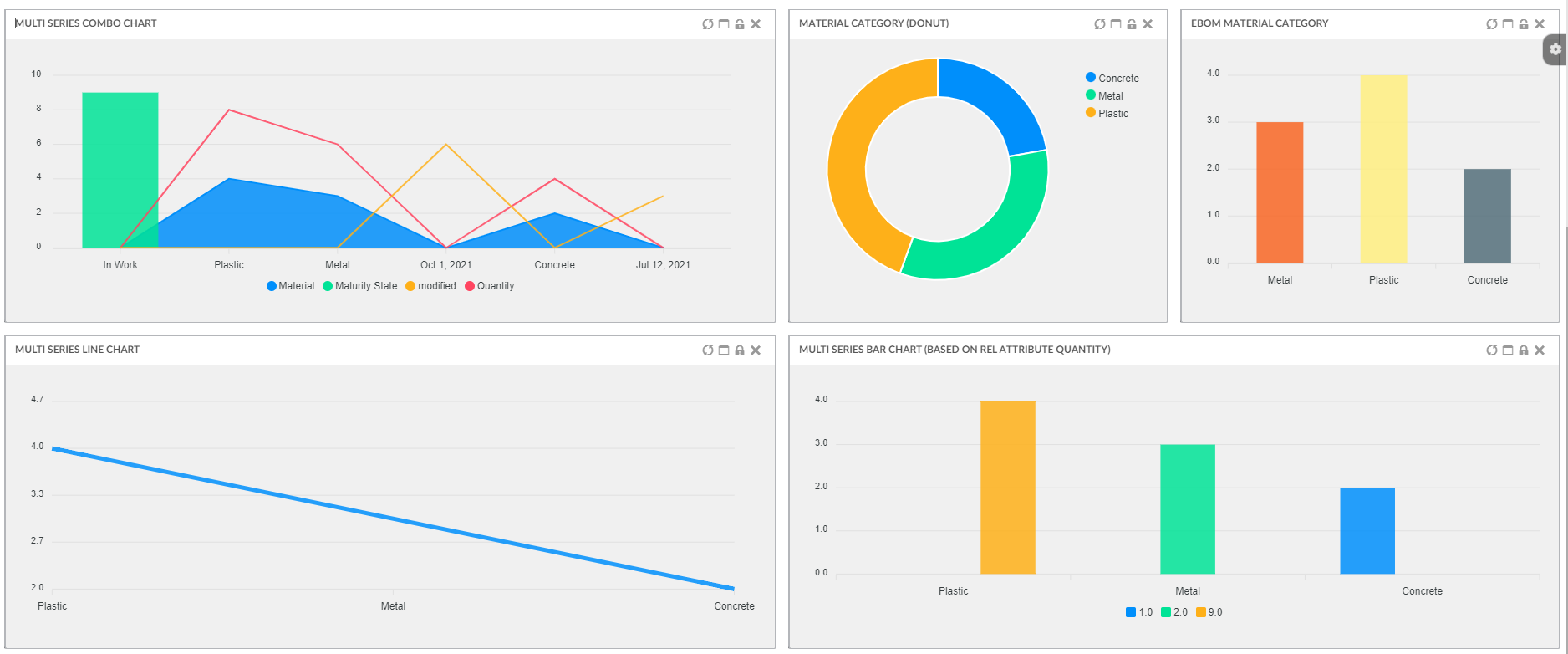
5.2. Combination Charts
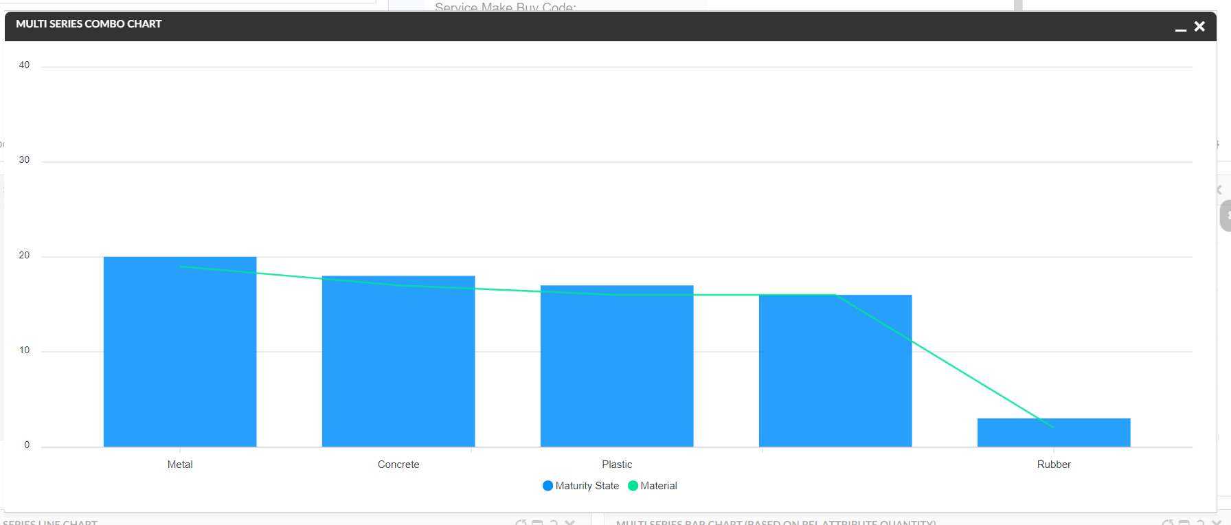
The combination chart is a visualization that combines the features of the bar chart and the line chart. The combination chart displays the data using a number of bars and/or lines, each of which represent a particular category.
Combination Charts can be configured as below :
<ChartWidget>
	<Title>Multi Series Combo Charts</Title>
	<ChartConfig namespace="hex:engineering:homepage">CombinationCharts.xml</ChartConfig>
	<UseVersion2>true</UseVersion2>
</ChartWidget>
<Chart>
<DataSeries>
<Serie>
<Name>bar</Name>
<DataLoader>
<DataSet>tvc:dataset:hex:engineering:homepage/Dataset3.xml</DataSet>
</DataLoader>
<Expression>current</Expression>
<ChartType>line</ChartType>
</Serie>
<Serie>
<Name>column</Name>
<DataLoader>
<DataSet>tvc:dataset:hex:engineering:homepage/Dataset1.xml</DataSet>
</DataLoader>
<Expression>current</Expression>
<ChartType>bar</ChartType>
</Serie>
</DataSeries>
</Chart>The combination can be different depending upon the use case with multiple series representing line or bar charts.
6. Toolbar
6.1. Customizing UIP Toolbar
The end user might want to reorder the commands in toolbar or rotate the toolbar. This can be enabled by adding attribute isCustomizable to Toolbar element as below :
<Toolbar showUipToolbar="true" isCustomizable="true">This can be configured globally as
tvc.helium.widget.toolbar.isCustomizable=true //false .
| This feature is only supported with UIP Toolbar |
7. Embed mode
7.1. Breadcrumb
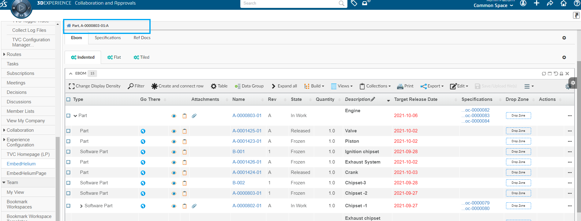
A breadcrumb is always helpful to know your current page’s position in the application hierarchy. While using helium in embed, it might be required to have breadcrumb. This can be achieved now by defining tvc.helium.embedded.showBreadcrumb in tvc.properties.
7.2. Skipping stacked mode
Helium is responsive by design. Helium widgets adjusted to view port size and arranged up in vertical stacked mode, however in embed mode it might not be required beacause of limited space availability. To enable this behavior,
use tvc.helium.embedded.disableMobileMode=false in tvc.properties. The default value is true.
8. NSX
8.1. Date Picker
8.1.1. Introduce a new datepicker for better user experience
NSX datefield now has a new datepicker which provides better user experience. The users can still use the old depreciated datepicker.
To enable the old legacy datepicker, use below setting in datefield.
<Settings>
    <Setting name="useOldDatePicker" value="true" />
</Settings>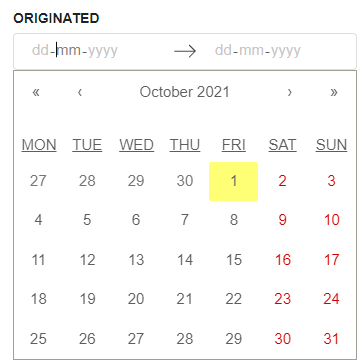
For more details see here Date Picker
| The old date picker using the setting useOldDatePicker is depreciated and might get removed in future releases. |
8.2. Auto setting default value on field
The New Search Experience (NSX) in TVC allows user to find objects of interest by configuring the search within a page. NSX comes with side panel for search and the results are displayed in a flat table. NSX supports search providers - Enovia, Exalead or other data source.
When NSX form gets loaded, the fields can be pre-populated with their default values.
However, it might be needed that these default values are not pre-selected but can be added with a single click.
As an example for a person field, the default value could be the logged in user; but the user may want to set the value on click of an icon instead of prefilling it. We have now added a new feature of setting the default value by clicking an icon. This feature is only applicable for an auto-complete field. This can be enabled by using the below settings :
<Settings>
    <Setting name="currentUserDefault" value="true" />
    <Setting name="setToDefaultOnIconClick" value="true" />
    <Setting name="populateDefaultValueIcon" value="ti-c ti-person-c" />
    <Setting name="populateDefaultValueIconTooltip" value="Click to set context user" />
</Settings>
The icon and its tool tip are configurable. The tooltip also supports localization.
8.3. Configurable upper search limit value
When user enters the large value in the search limit input box, it takes more time to get the result and the application becomes non responsive. To handle this situation, we have introduced the maximum value for upper search limit so in case if user tries to input the larger number than the defined upper search limit value, search does not get initialize and system throws the error message to the user to enter appropriate value.
| upperSearchLimitValue can be used to limit the maximum search results. Default value is set as 1000. Limit can be only between 1 and the upperSearchLimitValue. |
| For Index based searches like Exalead, search limit becomes page size and hence this upper search limit will become maximum page size. |
<Settings>
	<Setting name="upperSearchLimitValue" value="1000" />
</Settings>9. Filemanager
9.1. Web extension published to edge store
Filemanager web extension is published on Microsoft edge store. Earlier, microsoft edge was using extension from google chrome store. This extension can also be side loaded into microsoft edge browser. Alternatively, file manager extension can be added by opening Microsoft Edge and navigating to the below URL:
10. 3DDashboard
10.1. Support for Drag n Drop for True Widget in 3DDashboard Widget
Helium True widget in 3DDashboard now supports Drag and Drop for table Columns.
To enable this the below configuration need to be provided in the helium table column.
<Draggable>true</Draggable>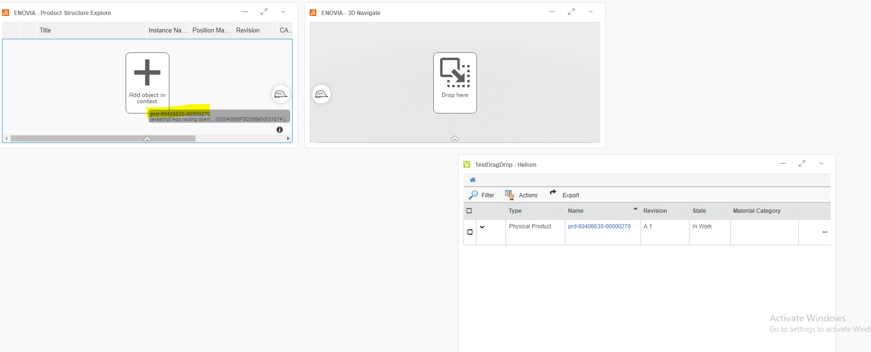
For more details see here Drag and drop support for True widget
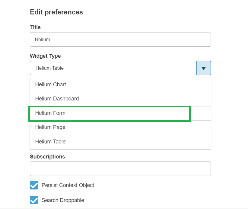
10.2. Supporting Helium Form Widget type
Earlier Helium Table, Chart, Dashboard and Page config were supported to load into the Helium True Widget. Now new Widget Type is added Helium Form Widget. User can use this widget type to load existing FormWidget into the 3DDashboard widget.
 TVC Helium 2023.3.0
