TVC Helium 2021.1.0 Release Information
12 February 2021
1. User defined UI
| The last release 2020.5.0, feature 'User defined UI' was released as an experimental feature. From this release 'User defined UI' is a stable and supported feature. |
End user definitions/configurations concept brings idea of creating, editing and sharing configurations using in-built admin user interface. These configurations can be used to create Helium Dashboards, Widgets, Tables, Charts, etc. Built-in Admin UI is provided to create, modify and share these configurations. Admin UI can be loaded in Helium standalone or in Helium widget in 3DDashboard. Through config chooser UI, user would be able to select and apply a configuration to his page, dashboard or widget. For detailed information, please refer End User Definition.

1.1. Teams
In this release we have introduced the concept of team. Team can be a logical group of people, of same or different department within organization. Admin can share UI configs to teams. This will be useful as admin will not have to share the configuration to individual users. Once a user is added to team, he/she will have access to all the configurations shared with that team. If user is removed from team, he/she will no longer have access to team shared configuration
1.1.1. Team Management Widget
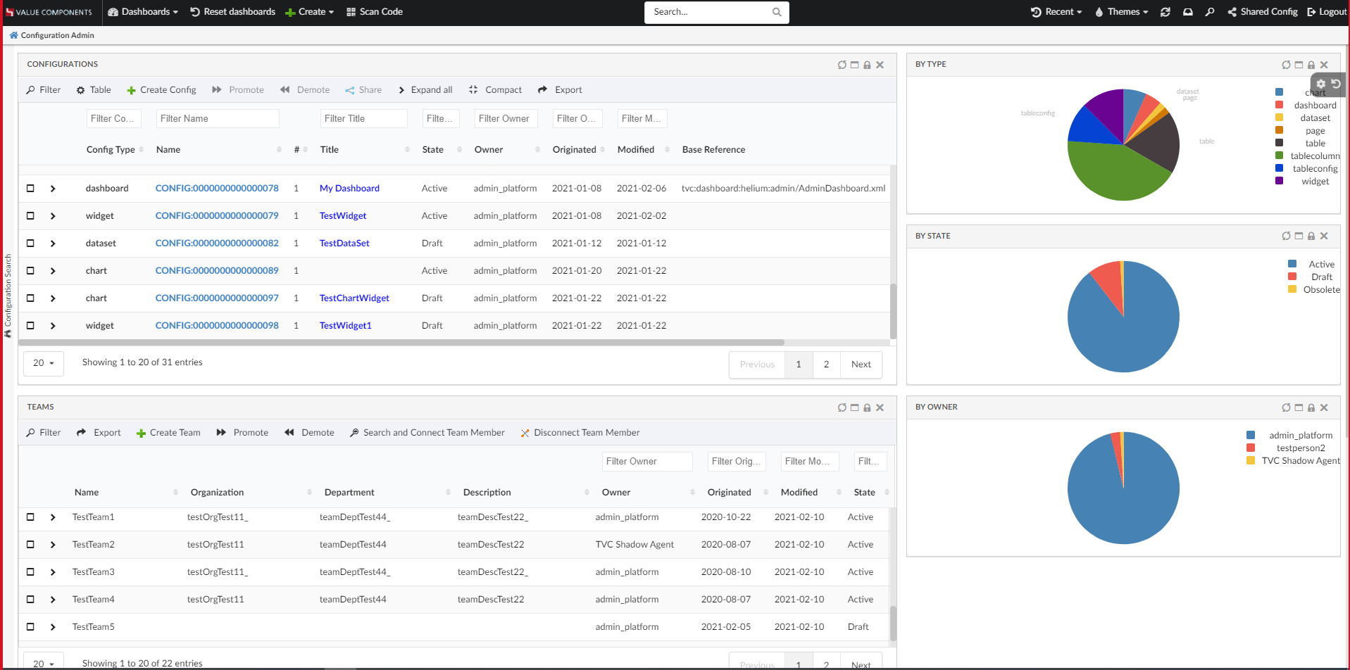
Once admin user has created a configuration as per the request from end user or team of end users. Admin needs to define a team, and he will use this widget to create and manage a team. For managing teams a new widget called 'Teams' is added to Helium admin page with below functionalities.
-
Create a Team
-
Promote a Team
-
Demote a team
-
Connect with team members to a team
-
Disconnect team members from a team
Please refer the below video for more details on Teams widget functions.
1.2. Table Configurations
1.2.1. Expression
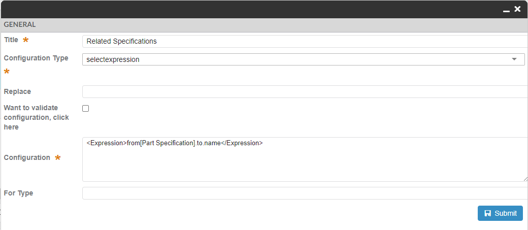
User or admin can add new columns to a table from attributes available on objects present in table. However, it might be needed to add advance column based on related object data like related specification state from part object. This will require a multi level select expression like - from[Part Specification].to.name.
Now admin can create such multi level select expression by choosing selectexpression as a Configuration Type. These expression config can then be shared with end user. End user can use these shared expression config to create column to show the related object data.
These expressions can also be used to create charts in create chart wizard.
Expression example:
<Expression>from[Part Specification].to.name</Expression>

Read Expression for more details.
2. Page
2.1. Access Control at page level
Previously, access restriction can only be applied to the contextual page like for a Part or Document. With this release, access control can also be applied for noncontextual pages like Parts or Document dashboards. These pages can be more advanced admin pages like change management. For example for the change management page, only a person having change coordinator role should have access.
<Page> element will now supports the <Access> child element which will defines Access Rules.
The access restriction for Page can be defined based upon the following:
-
Role Assignment
-
Group Assignment
-
Person (A named user)
-
Access Program (A JPO that evaluates the access rights)
-
Access Expression (MQL expression that evaluates the access)
The example below illustrates how user/admin can construct the access restriction:
<?xml version="1.0" encoding="UTF-8"?>
<Page>
    <Access>
        <Role>role_DesignEngineer</Role>
    </Access>
</Page>
Read Access Control chapter for more details.
3. Table
3.1. Different behavior on edit of a cell
The end-user would want a refresh of parent rows, table on an edit of a cell as certain cells in the table might get affected. This can be achieved by configuring as below :
<Column>
    ...
    <Setting name="onEdit" value="refresh-parents" />
    ...
</Column>
Possible values are refresh-parents, refresh-table or some custom javascript function.
If onEdit is not configured than only the current row will get refreshed.
In the initial part of the video, it can be noticed when weight is modified the rollup is reflected on all the rows as the whole table is refreshed, in the next part when the weight is edited then the parent-rows are refreshed and highlighted.
Read On Edit for more details.
3.2. Navigate helium datatable using arrow keys
Earlier to edit next table cell, user will have to use two clicks one for moving out of last table cell and another to open next table cell. Now using arrow keys user can move from one cell to another. This will reduce the number of clicks for the end user. This feature can be enabled for a specific table widget xml as below :
<DataTable>
    ...
    <HotKeysNavigation>true</HotKeysNavigation>
    ...
</DataTable>
Or
globally this feature can be enabled by configuring `tvc.helium.datatable.hotKeysNavigation= true // default is false `
|
Please note this feature is currently supported only for non responsive tables with client side processing true on modern browsers. |
|
In order to move within a text or select field, user can use arrow keys with ctrl. |
Read Hot Keys Navigation for more details.
3.3. Multi value select column
The end user would want to select multiple values inside column. This would be helpful for user to select/deselect multiple values in one go.
No additional configuration will be needed and select column will auto render with selectize if column definition attribute is defined as multivalue in OOTB schema.
4. Widget
4.1. Alternate icon for widget action lock and unlock
Previously the icons shown on UI for widget lock and unlock would reflect the action available for user.
For example :
-
If widget is locked it would show unlock icon.
-
If widget is unlocked it would show lock icon.
Incase user might want to see the icons that would reflect the current state of the widget.
For example :
-
If widget is locked, show lock icon.
-
If widget is unlocked, show unlock icon.
This can be enabled globally as init param tvc.helium.widget.lock.showAlternateIcon = true //defaults to false
Read Widget Lock Unlock Icon for more details.
5. Search
5.1. Apply filter on structure node expand
The search side panel is used to load objects in the table widget and it might be needed to apply the same search criteria on expanding the node. For example, once the user performs a search to load parts specific to RDO, it might be needed that on expanding the part only child parts belonging to that RDO should be shown. This can be achieved by keeping one on one mapping between columns in the table and search field.
This feature can be enabled at table configuration level by using below setting in table config:
<ApplySearchFilterOnExpand>true</ApplySearchFilterOnExpand>
<TableConfig>
...
    <ApplySearchFilterOnExpand>true</ApplySearchFilterOnExpand>
</TableConfig>
Additional setting is needed on searchform field to indicate the field should be considered for applying filter on expanded node.
| Setting Name | Description | Example |
|---|---|---|
applyOnTableRowExpand |
Whether the field should be considered for applying filter on expanded node |
|
tableExpandKey |
Special case when field |
|
For more details see here Apply filter on structure node expand
6. 3DDashboard
6.1. Drag and drop support for Helium widget
When the Helium widget is used in 3DDashbaord, an object from the Helium table widget can be dragged and dropped into TVC / OOTB widgets and vice versa.
To enable this the below configuration need to be provided in the helium table column.
<Draggable>true</Draggable>
For more details see here Drag and drop support for Helium widget
 TVC Helium 2023.3.0