TVC Helium 2020.5.0 Release Information
04 December 2020
1. User Defined UI’s - An experimental feature
|
This feature is released as an experimental feature, which means that we will continue developing it and it is subject to change. In future releases with added functions, it would be released as a standard feature. |
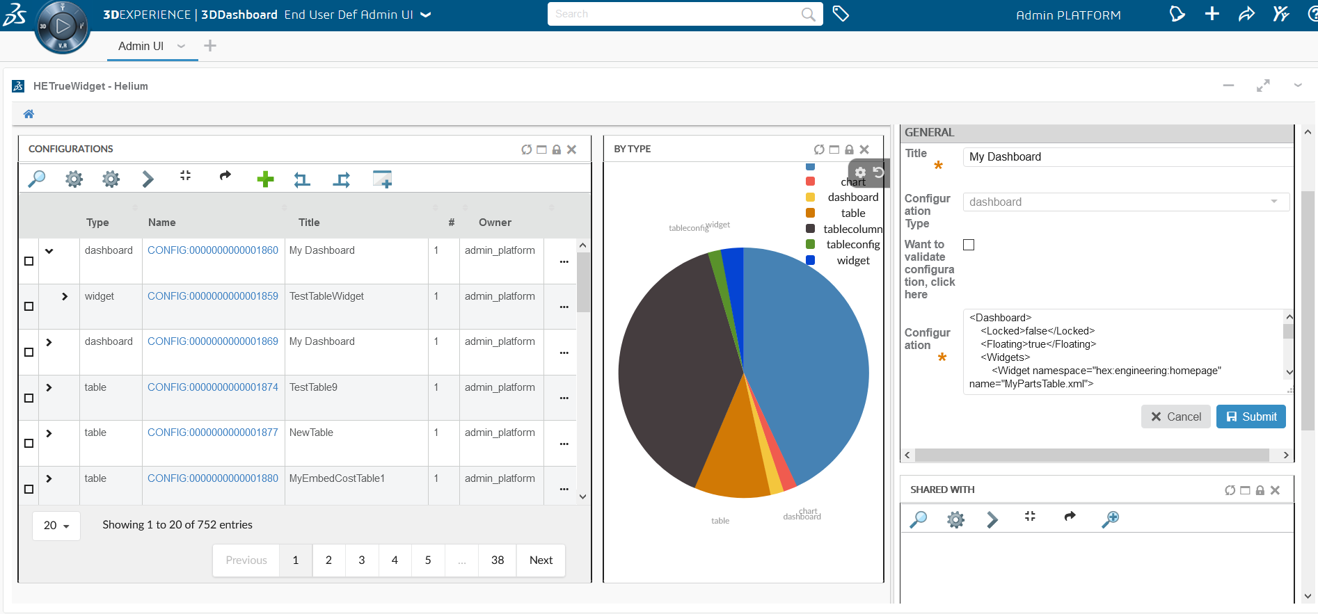
User defined definitions/configurations concept brings idea of creating, editing and sharing configuration using in-built admin user interface.
In TVC and Helium configurations like widgets, tables, table columns, dataset needs to be defined in XML within webapp. Any change to these configuration will require some sort of development and deployment cycle.
With help of end user definitions, many of these configurations can be created and managed using in-built Admin UI. Admin UI can be loaded in Helium standalone or in Helium widget in 3DDashboard. End user configurations can be shared with multiple end users and end users can use config chooser UI to accept and start using these configurations. For example, admin can create new Part’s table widget with additional columns and share this with multiple users. There are two types of users who will perform actions.
1.1. Admin user
Admin can create, edit, validate and share config definitions. While creating and editing config definitions admin can validate that definition against defined XSDs. Please refer below screenshots for the same.

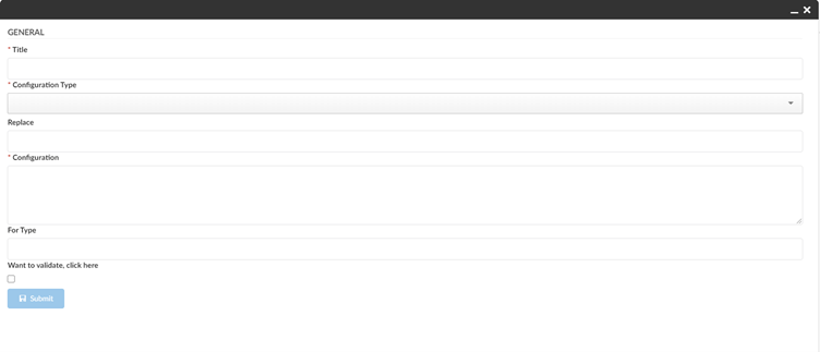
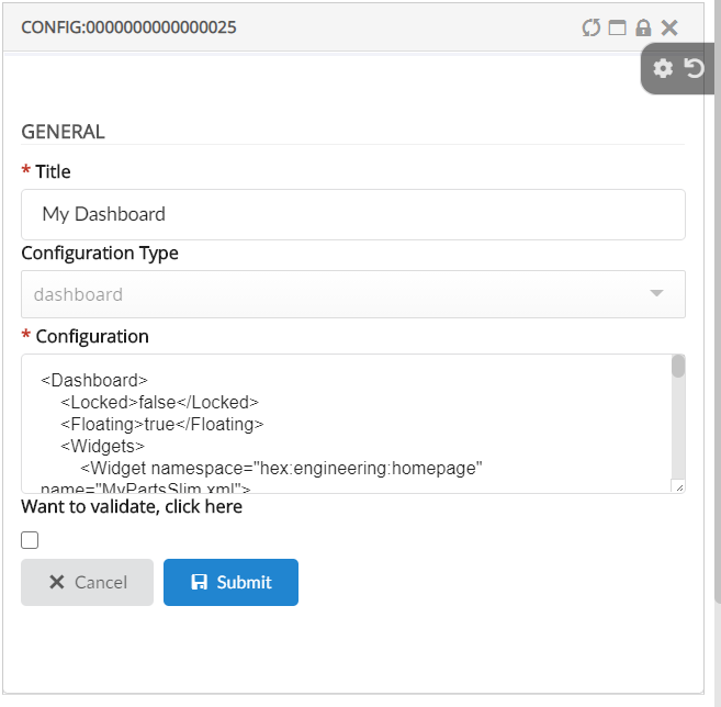
Admin user would share created config definitions with end user and teams.
1.2. End user
End user will see all shared configurations in pending tab of shared config widget. Once it is accepted or rejected that will move to accepted or rejected tab. User can apply shared dashboard or table using widget wizard and table configurator. Please find below scenario where user configuration is applied.
In above video admin user choose a configuration to share with demo1 and demo2 users. Demo1 user sees and accepts the configuration from shared config widget. Accepted configuration becomes avaiable in widget wizard menu 'add the dashboard', where he applies the dashboard to the current page.
1.2.1. End User Customization
Enables the user to customize how the content/information is displayed in the application.
Edit Widgets
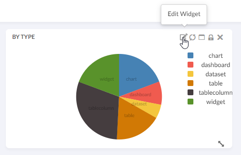
Now editing a user created widget is possible. Let’s say for example if you want to change your chart widget from a pie chart to a line chart or change the name of the widget, this is now possible using the new edit function.
Drilldown
End user created chart widgets are now drillable to the same dashboard they are created on.
For more information, please refer End User Definition.
2. 3DDashboard
2.1. True widget
Previously, the Helium page or widget needs to be loaded into 3DDashboard inside a secondary iframe. Now Helium can be run directly inside the 3DDashboard widget iframe, like a standard 3DDashboard widget. It will support all the functionalities supported by tvc widget. It is highly recommended to use this when using helium in 3DDashboard as it is more compatible and aligned with 3DDashboard design. User can create widget using source code URL like "https://19xdev.technia.com/3dspace/webapps/HETrueWidget/heliumWidget.html?parameter=value"
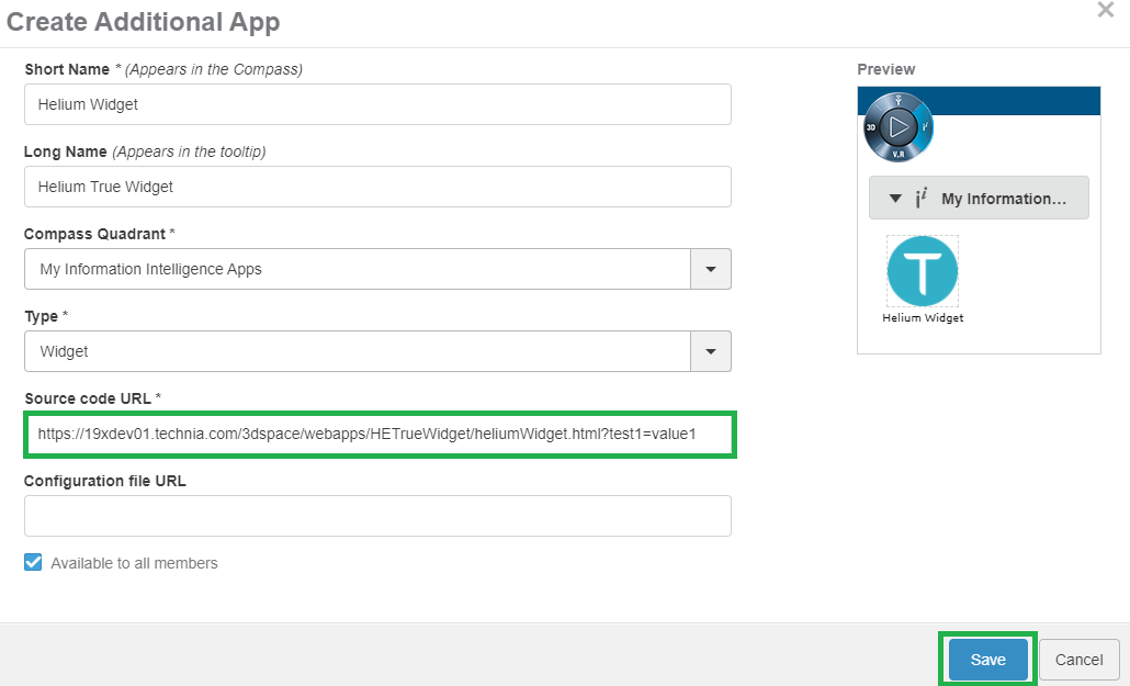
Read more about it here True Widget in 3DDashboard.
3. Search
3.1. Internationalization support in search forms
Searchform provides the capability to perform parameterized search with an intuitive user interface supporting various field types. Previously, Search criteria values supported i18 internationalization and this is now extended to searchform fields and sections. I18 internationalization can be configured using the standard Helium approach as shown below:
<Tooltip>
	<Title>searchv2.tooltip.title.partSpecification</Title>
	<Content>searchv2.tooltip.content.partSpecification</Content>
</Tooltip>
<Label>searchv2.field.partSpecification</Label>
Read the internationalization chapter for more details.
4. Custom Translations (i18n)
4.1. Subfolder supported in translations directory
It might be desired to maintain translation based on modules, so that not all translations are present in one big file.
Now translations can be put inside subfolders of custom translations directory (/helium/custom/lang).
It will help in maintaining transaltions modules wise.
-
/helium/custom/lang/projects/default.json
-
/helium/custom/lang/projects/en_us.json
-
/helium/custom/lang/projects/en.json
-
/helium/custom/lang/projects/sv_se.json
-
/helium/custom/lang/parts/default.json
-
/helium/custom/lang/parts/en_us.json
-
/helium/custom/lang/parts/en.json
-
/helium/custom/lang/parts/sv_se.json
-
…
Read the Custom Translations chapter for more details.
5. Chart
5.1. Path Support
In 3dexperince, more and more of the data model is moving towards path-based. Change Process is one good example and there is a need to be able to visualize the path-based data model by config only.
Now the path related object/relationship information can be used to generate charts. This can be done using the path query dataset in chart config.
Below example generates a chart based on the attribute Severity of Change Orders related to context part EBOM structure. In this case, the loader must point to Path Query which will return change order ids and the Expression should point to selects on those change order id’s, in this case, attribute 'Severity'.
<?xml version="1.0" encoding="UTF-8"?>
<Chart>
	<DataSeries>
		<Serie>
			<DataLoader>
				<DataSet>tvc:dataset:hex:engineering/ChangeObjects.xml</DataSet>
			</DataLoader>
			<Expression><![CDATA[$<attribute[attribute_Severity]>]]></Expression>
			<ChartType>donut</ChartType>
		</Serie>
	</DataSeries>
</Chart>
Below is the loader definition used in the above example.
<?xml version="1.0" encoding="UTF-8"?>
<PathQuery>
	<PathType>Proposed Activity.Where</PathType>
	<PathSelect>owner.to[Proposed Activities].from.to[Change Action].from.id</PathSelect>
	<Expand>
		<From>true</From>
		<To>false</To>
		<Depth>1</Depth>
		<RelationshipPattern>
			<Relationship>relationship_EBOM</Relationship>
		</RelationshipPattern>
	</Expand>
</PathQuery>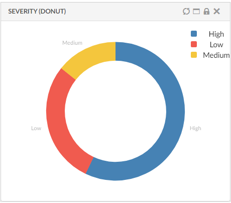
Read the Path Support chapter for more details.
6. Form
6.1. Viewable support for FilesField:
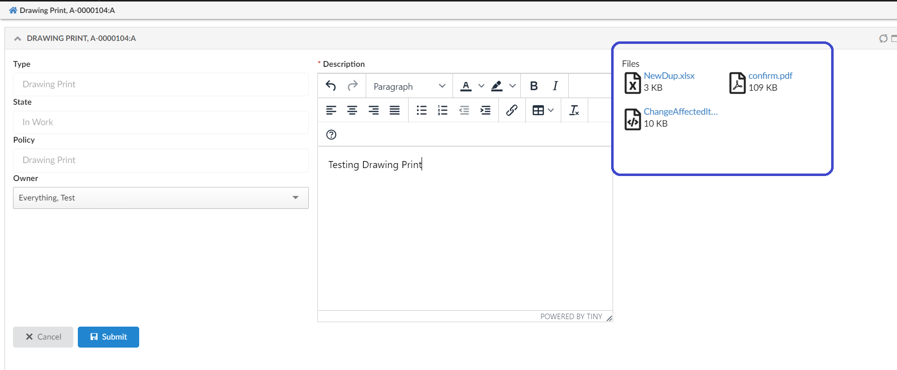
FilesField are editable by default. From this release, FilesField can be made viewable (non editable) by adding <Editable>False</Editable> tag explicitly. If Editable tag is not specified, filesfield will be editable by default.
Sample FilesField XML with Editable setting:
<FilesField>
	<Label>Files</Label>
	<Format>generic</Format>
	<Editable>false</Editable>
	<UseCDM>true</UseCDM>
	<Store>store</Store>
</FilesField>6.2. Related Object Files support on 'FilesField' and 'helium-files'
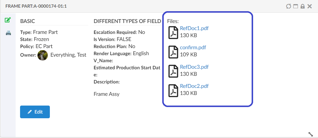
From this release, form’s FilesField and helium-files column type can be used to display the files from its related objects.
Adding the Expression tag (eg: <Expression>${from[relationship_ReferenceDocument].to}</Expression>) in form 'FilesField' or in table ColumnType helium-files,
will display the files from related object found through expression value. And these fields will always be non-editable.
|
All the files from all object found through the expression value will be displayed in files field. For example, out of given expression if 3 objects are found, all files from all 3 objects will be displayed in these files field. |
6.2.1. Table ColumnType helium-files with Expression:
<Table>
	<Column>
		<Label>Related Files</Label>
		<RegisteredSuite>Components</RegisteredSuite>
		<ColumnType>helium-files</ColumnType>
		<Expression>${from[relationship_ReferenceDocument].to}</Expression> (1)
	</Column>
</Table>
7. File Manager
7.1. Column type Helium Attachment
It is now possible to show the attachment/documents connected to the table row object. For example, showing files checked in to Part Specifications or Reference Documents connected to a Part (table row). It will open attachment in a single click and file actions like checkin, checkout , lock, or unlock can be performed. This can be achieved by configuring a column type "helium-attachment" that will show a paperclip icon if there is any object connected with a file based on the relationship and direction configured. Below is an example :
<Column>
    <ColumnType>helium-attachment</ColumnType>
	<Setting name="Relationship" value="relationship_ReferenceDocument"/>
	<Setting name="Direction" value="From"/>
</Column>
Relationship and direction settings are optional default value for relationship is "Part Specification" and "Reference Document" and it is specified in tvc.office.server.attachmentRelationships and for direction is "From".
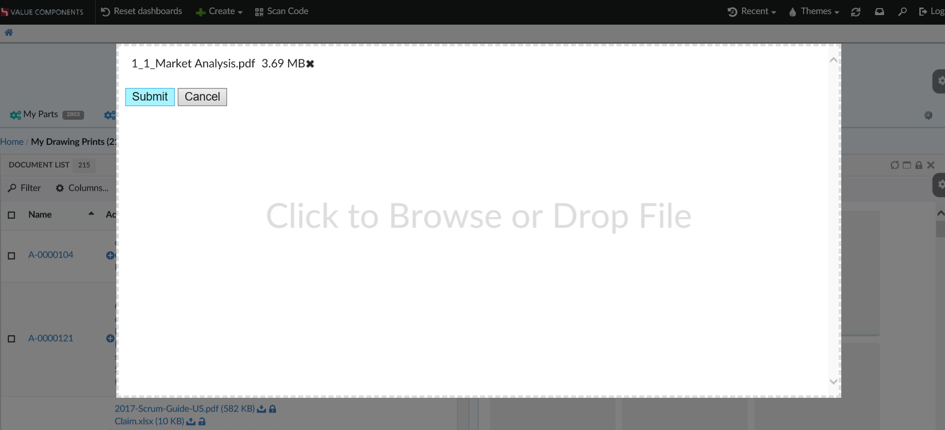
7.2. HTML5 UI support
In the absense of native file manager, helium will now open fallbaack HTML5 UI like TVC, for managing basic operations like checkin/checkout/update.
7.3. More default file actions in Files Column.
To support more file action capabilities following default commands have been added to files column.
| Name | Description |
|---|---|
Preview |
Preview will open the jpeg, jpg, png files in sidepanel, so that user can view the file before performing any actions on it. |
Delete |
Delete command will delete the file version. |
Subscribe |
Subscribe command will open OOTB window in popup for subscribing to the document object. |
8. Table
8.1. Invoke Service
The helium table can be utilized for functionalities like EBOM, change management with all built-in features available in Helium. This adds good business value and provides an improved end-user experience. However, it also becomes necessary to create toolbar actions to perform actions available in 3DExperience and some actions like create and add change objects may involve complex and unique business logic. This will require rewriting complex business logic already available in 3DExperience into Helium. With invoke service, it is possible to reuse 3DExperience business logic directly in Helium commands by calling 3DExperience service.
Built-in javascript function App.dataTable.invokeServiceAndCreateObject can be used to launch 3DExperience services, which can be configured using parameter config. It requires that the result from the service config is in form of objectId/physicalid that is used with refreshBehavior.
	<Command>
		<Label>Invoke Service</Label>
		<FontIcon>icon ti-c ti-plus</FontIcon>
		<OnClick>App.dataTable.invokeServiceAndCreateObject</OnClick>
		<OnClickParams>{
			"config": "tvc:service:ups:classic:18x/CreatePartV5.xml",
			"resultExpression": "id",
			"from": "true",
			"selection": "single",
			"refreshBehavior": "add"
		}</OnClickParams>
	</Command>
For more configuration details see Invoke Service
9. Collections
9.1. Manage collection
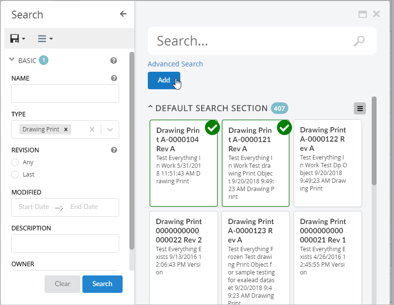
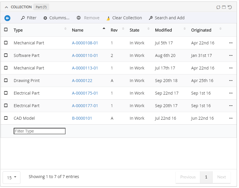
In this release, we are introducing a default toolbar commands to manage individual collections as in TVC.
-
Search and Add
-
Remove
-
Clear Collection
10. Light My Way
Identifying forms is made easier in the LMW browser extension with the help of added meta-data.
 TVC Helium 2023.3.0
