<DataTable>
	<Title>Part list</Title>
	<TableConfig namespace="hex:engineering:homepage">MyParts.xml</TableConfig>
	<Toolbar>
		<Collection />
	</Toolbar>
</DataTable>TVC Helium 2020.3.0 Release Information
26 June 2020
1. Toolbar
1.1. Clipboard
A new built-in feature like classic called Clipboard is added. The clipboard can be used to hold objects, selected by the user.
It is possible to add objects to clipboard and view clipboard from Table toolbar. This can be enabled by adding a Collection tag in the table toolbar. When added following two commands will show in the table toolbar.
-
Add To Clipboard
-
View Clipboard
Example:
Refer Toolbar-Custom action handler for more information.
2. Widget
2.1. Single-child Widget Layout
We have improved single-child widget layout. Now it is possible to provide all available height to a widget by configuartion.
This can be achieved by defining the following Height inside the Widget element.
<Height adjustHeight="fill"></Height>Refer Detailed Widget Config for more details
2.2. Widget Builder
| This is currently experimental functionality, which means that we will continue developing it and that it is subject to change. |
Users might want to create their own widgets, displaying information about objects and their attribute values which maybe are of interest only to them.
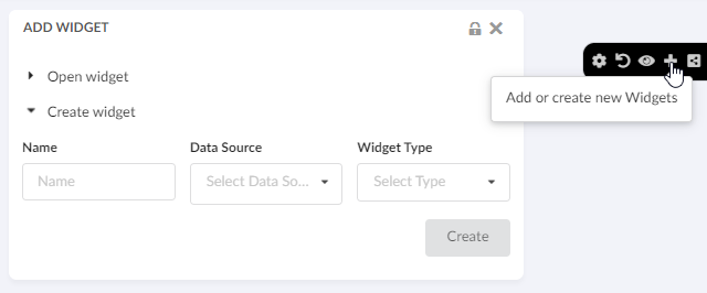
Now there is a fast way to create simple chart and table widgets directly from the UI with the help of the added "Create Widget" form.

Click here for more information on creating widgets
3. Datatable
3.1. Alternate OID Expression
It may be useful to redirect/route the user to the specified object when the column’s data is displayed as a hyperlink.
| While using Alternate OID Expression, the default template is used and no custom template is supported. |
The value for this setting should be a valid select expression that returns object-ids.
Example:
$<to[relationship_DesignResponsibility].from.id>
$<to[relationship_EBOM].from.id>
Refer Detailed Table Column Config for more information.
3.2. Evaluate Expandable Nodes
The table can be configured to evaluate whether a node is a leaf node and make it non-expandable.
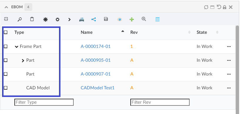
This will improve usability as leaf nodes are indicated without an expand symbol (plus sign).
This evaluation will make an extra expand which may affect performance (often very little). This feature is by default off.
This evaluation can also be controlled globally through the init-param tvc.core.structure.evaluate.expandable.node (default false) in web.xml, or can choose to apply on particular tables alone through 'EvaluateExpandableNodes=true/false` under expandSettings element in tableConfig as shown below
<TableConfig>
    ...
    <DisplayMode>structure</DisplayMode>
    `<ExpandSettings>
        <Filter namespace="hex:engineering">EBOMFrom.xml</Filter>
         <Filter namespace="hex:engineering">SpecFrom.xml</Filter>
        <InitialExpandDepth>1</InitialExpandDepth>
        <EvaluateExpandableNodes>true</EvaluateExpandableNodes>
    </ExpandSettings>
    ...
</TableConfig>
Below is the sample screen when EvaluateExpandableNodes is true

4. More built-in Components
4.1. Clipboard Widget
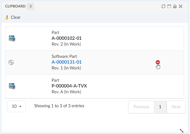
A new built-in widget, <ClipboardWidget /> has been added that can be used to hold objects, selected by the user. The content of the clipboard is remained between sessions.

Refer Clipboard Widget Configuration for more information.
| Clipboard widget is not supported with offline pages. |
5. Chart
5.1. Chart based on relationship attribute
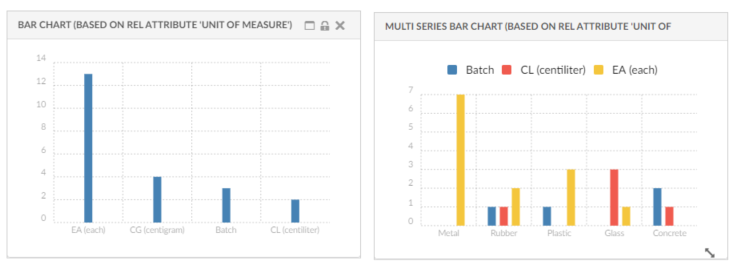
It is now possible to prepare charts using relationship attributes. For example, If a user wants to show a chart based on EBOM on the relationship attribute Unit of Measure then usesBusinessObject can be used.
-
true: Expression is object selectable . This is default behaviour.
-
false: Expression is relationship selectable.
| If usesBusinessObject attribute is used, then DataSet need to be defined in such a way that it will remove the root object. |
Example:
<Expression usesBusinessObject="false">${attribute[attribute_UnitofMeasure]}</Expression>
<SeriesExpression usesBusinessObject="false">${attribute[attribute_UnitofMeasure]}</SeriesExpression>
Expression or SeriesExpression value in case of custom DataType can be get like below
const expression = serie.expression.name;
const seriesExpression = serie.seriesExpression.name;

Refer Serie Configuration for more details.
6. End User Table Builder
6.1. Tables defined by end users
In addition to end user columns feature released in previous version, End users can now add, remove and switch between different tables in a table widget, with no need to involve an administrator nor changing underlying XML configuration files. This empowers users to set up their tables the way they prefer, with the columns for different views.
What this means in practice - users can now have multiple tables for a single widget!
This feature is configured by adding the Toolbar command <TableConfigurator />
Refer Table Configurator for more configuration details
 TVC Helium 2023.3.0