TVC Helium 2022.2.0 Release Information
20 May 2022
Table of Contents
- 1. In-App Designer (End User Definition)
- 1.1. Admin UI in Tabs
- 1.2. Improved XML Editor for advance configuration
- 1.3. Save Search Criteria as Admin/End-user Dataset
- 1.4. File-based Datasets Configuration with Valid-For Type
- 1.5. Preselected Valid-For in Add Widget
- 1.6. Config Requests
- 1.7. Draft Dashboards in 3DDASHBOARD Widget preference
- 1.8. Cache mechanism to avoid XML re-parsing
- 2. 3DDASHBOARD
- 3. Form
- 4. Widget
- 5. Chart
- 6. Datatable
- 7. Search
- 8. Performance
- 9. Other
1. In-App Designer (End User Definition)
In-App Designer (previously known as End-User Definition/ End-User UI) is a concept that brings the idea of creating, editing, and sharing configurations using the built-in admin user interface. These configurations can be used to define Helium dashboards, widgets, tables, charts, etc. Built-in Admin UI is provided to create, modify and share these configurations. In-App Designer can be used from Helium standalone or Helium widget in 3DDashboard. Once the config-admin is created and shared the configuration with the end-user, then the end-user receives the configuration to accept it. Once accepted, he can select and apply the configuration to his page, dashboard, or widget from UI. For detailed information, please refer In-App Designer.
In this release, we have enhanced this feature further as stated below.
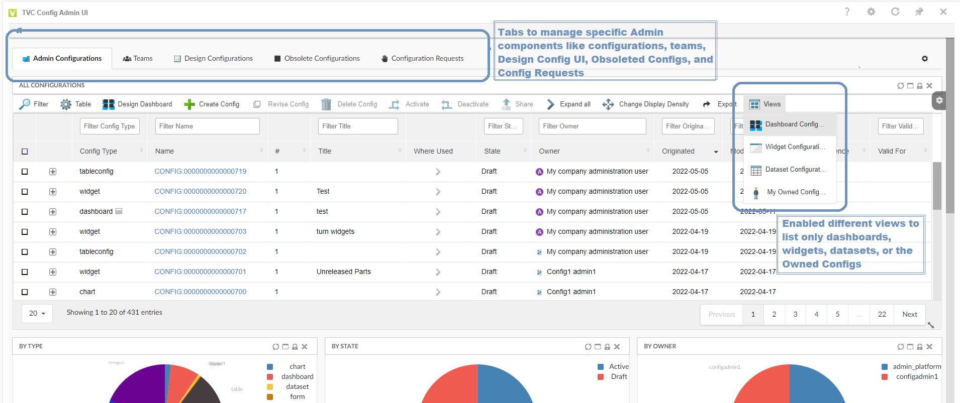
1.1. Admin UI in Tabs
Now admin can switch between tabs to view and manage the admin configurations. This is done to allow segregation of different configs, and admin to easily navigate.
| Tab name | Description |
|---|---|
Admin Configurations |
Lists all admin created configurations, And it has different views to list only dashboards, widgets, datasets, or the owned configs |
Teams |
Team view where admin can create teams and share the configs with the created teams. |
Design Configurations |
Using the available configurations, the admin can design the dashboard |
Obsolete Configuration |
Can manage all obsolete configurations |
Configuration Request |
Configuration requests created by end-users will be listed in this tab. |
Figure 1. Config Tabs
1.2. Improved XML Editor for advance configuration
In-App designer allows the admin to define a config in XML format using all the available tags.
A UI-based built-in eclipse like XML editor can make it easy for the admin to define these configs.
1.3. Save Search Criteria as Admin/End-user Dataset
Datasets are used to retrieve data for the table and chart widgets. In-App-Designer supports all the existing tags and configuration of Dataset.
NSX search form provides an easy way in UI to define a dataset. This allows users to directly use search/search results as datasets. Admin can create admin dataset configs which can be used for designing the widget in draft state.
1.4. File-based Datasets Configuration with Valid-For Type
Valid For allows segregation of configs based on business type and makes it easy to structure and find configs. Business object-based configs support Valid For via an attribute.
For XML-based configs Valid For can be defined as mapping in a TVC_3DDConfig.json file. This allows the admin to decide which all XML-based configs can be used as In-App configs.
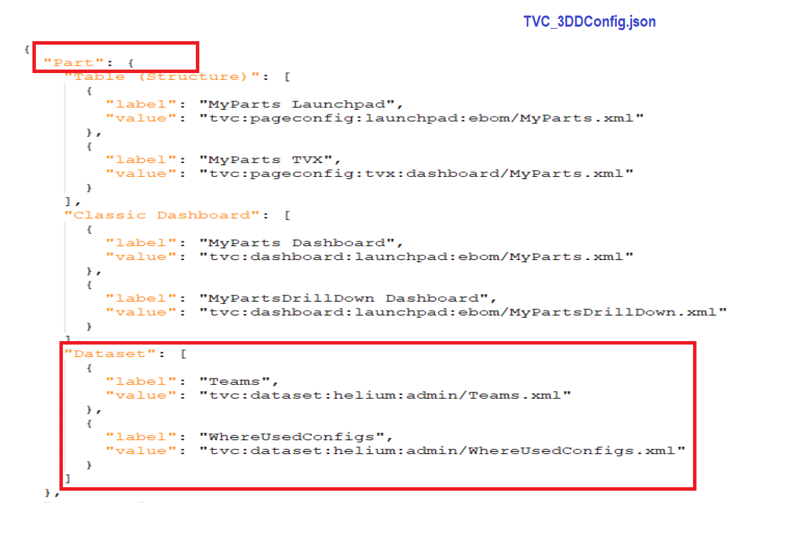
Figure 2. TVC_3DDConfig.json
In this release, the concept of Valid For is extended to datasets. Using JSON mapping, the file-based dataset can be listed in the create Widget form.
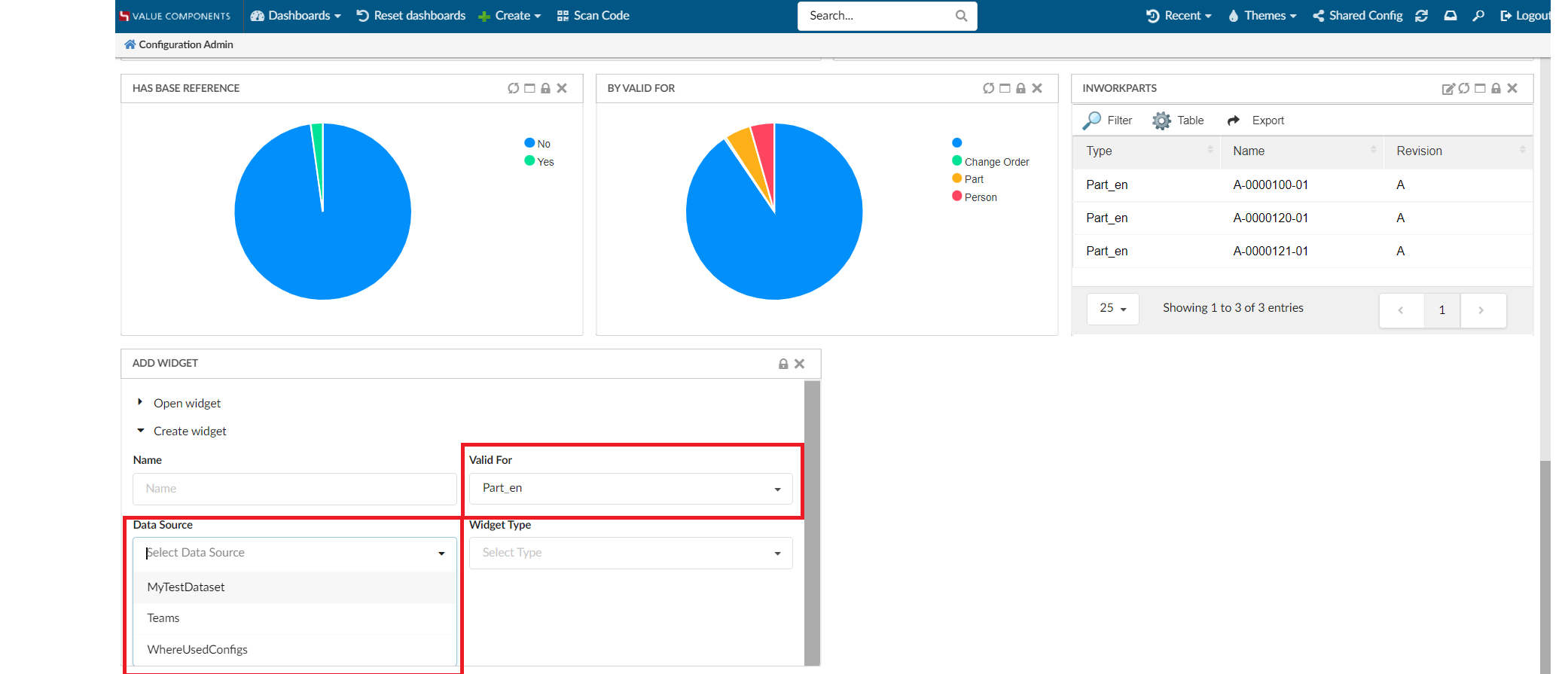
Figure 3. Dataset Results based on validFor
1.5. Preselected Valid-For in Add Widget
For context pages like Part or Product, the widget will show related information. Therefore, it is good to pre-populate valid for with the context object type.
When the user is in the context of any object, the valid For field is preselected with context object type.
It is also possible to change Valid For to any other value.
This helps to eliminates the unrelated configs from the config list.
1.6. Config Requests
The purpose of In-App-Designer is to allow admin to create new configs (like dashboard, widget, table, chart, dataset) for end-user.
Now end-user can make a request for a new config from admin within the In-App-Designer UI.
End-user can create a config request from the "Request" tab in Shared Config UI. In the request create form, the end-user can write a detailed description of the required new configuration.
Admin can create new config and share with the end-user. Once the configuration is created and shared with the end-user, the admin can reply by adding the admin comment to the request object.
1.7. Draft Dashboards in 3DDASHBOARD Widget preference
Now it is allowed to list the admin created draft dashboards in 3DDASHBOARD Widget preference as shown in the image. This enables admin to load draft dashboards in 3DDASHBOARD widgets. Admin can further update the draft dashboard with new widgets.
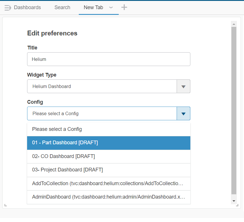
Figure 4. Config Tabs
1.8. Cache mechanism to avoid XML re-parsing
Now we have introduced the cache mechanism for config-based business objects. Config-based business objects holds the XML configuration in its attribute. Each time when the config is loaded, the XML stored in the attribute is parsed. Now we are storing the parsed XML data in cache and reusing when the same config-based business object is called again. Until the config-based business object is modified, the cached parsed XML configuration wil be used.
2. 3DDASHBOARD
2.1. Including custom resources in HETrueWidget/TVCWidget.
Previously when the user wanted to add any custom resources (JS and CSS) files in HETrueWidget/TVCWidget, the user has to modify the source HTML file of the existing widget. This forces user to create a new widget using the updated source HTML file or need to drag-drop the same widget to fetch/cache the newly added custom resources and do all the configuration once again.
To avoid such scenarios this new feature gives the ability to include custom resources (JS and CSS) files in HETrueWidget/TVCWidget without updating the source HTML file of the existing widget.
The custom folder needs to be specified in tvc.properties file.
tvc.3ddashboard.heTrueWidget.custom.resources = /webapps/HETrueWidget/helium/custom/launchpad
tvc.3ddashboard.tvcWidget.custom.resources = /webapps/tvc/custom
2.2. 6WTag and Search in the current tab support for JSON based widget.
JSON-based widgets or predefined widgets are, where the admin can predefine the configuration needed by the widget in the JSON file. This can be used to create the widgets directly. No need to select config after adding a widget to the dashboard.
Previously there was no support to use 6WTags in JSON-based widgets. From this release, we have extended the support for 6Wtags integration to JSON-based widget.
2.3. Widget Preferences Internationalisation.
Widget preferences are used by TVCWidget and HeTrueWidgets to save / load various configurations, like config to load, drag and drop support, etc.
For widget preferences, internationalisation is now supported.
To enable internationalisation, the admin must place a translation file in the webapps/tvc/asset/nls folder with the format TVC_3DDTranslation_lang.json.
Sample file for German language. TVC_3DDTranslation_de.json
{
    "Title": "Titel",
    "Search And Drop": "Suchen und ablegen",
    "Search Droppable": "Droppable suchen",
    "Widget Type": "Widget-Typ",
    "Persist Context Object": "Persistenz-Kontextobjekt",
    "Subscribe OOTB": "Abonnieren Sie OOTB",
    "Table Link Publish": "Tabellenlink veröffentlichen",
    "Config": "Konfig",
    "Search Config": "Konfig suchen",
    "Type To Drop": "Geben Sie zum Ablegen ein",
    "Please select a Type To Drop": "Bitte wählen Sie einen zu löschenden Typ aus",
    "Please select a Config": "Bitte wählen Sie eine Konfig",
    "Widget List": "Widget-Liste",
    "Select 6W Category": "Wählen Sie die 6W-Kategorie",
    "Subscriptions": "Abonnements",
    "Type not allowed": "Typ nicht erlaubt",
    "Drop Zone": "Abwurfgebiet"
}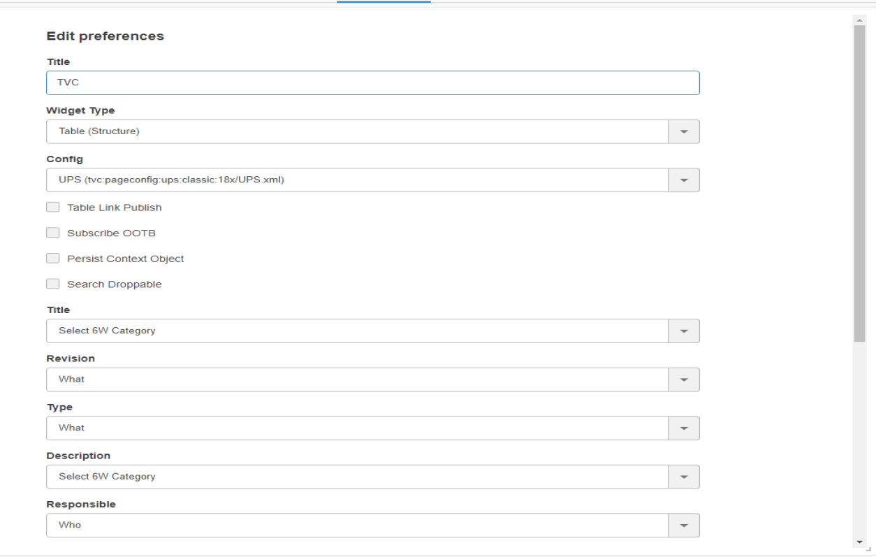
Figure 5. Widget Preferences in English
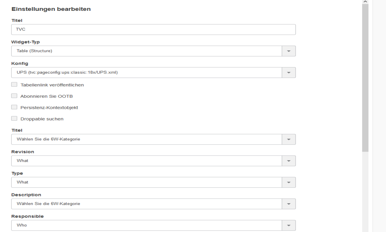
Figure 6. Widget Preferences in German
3. Form
3.1. Configure default relationship attributes on related object field
Now, it is possible to set default relationship attribute when object is connected using RelatedObject field. This can be achieved by adding the below two settings in the field definition.
Set Relationship Attribute Names: Can pass a comma or any delimiter separated list of attribute names for updating multiple attributes at once.
Set Relationship Attribute Values: Can pass a comma or any delimiter separated list of attribute values for updating multiple attributes at once.
Also, there might be a case where the attribute values contain a comma, so in that case, Delimiter can be configured and the attribute names and values should be separated with the delimiter.
The example below illustrates how user/admin can construct the column definition:
<RelatedObject>
    ...
    <Setting name="Set Relationship Attribute Names" value="Quantity|Usage" />
    <Setting name="Set Relationship Attribute Values" value="1|Standard" />
    <Delimiter>|</Delimiter>
    ...
</RelatedObject>

    or

<RelatedObject>
    ...
    <Setting name="Set Relationship Attribute Names" value="Quantity,Usage" />
    <Setting name="Set Relationship Attribute Values" value="1,Standard" />
    ...
</RelatedObject>
For more detailed information please refer Related Object Field
3.2. Autocomplete
3.2.1. selectize
Helium selectize already supporting options described in the docs. Apart from those settings, now it also supports a custom setting called cache, which will clear the cached options after an autocomplete dropdown close if its value is false. This setting is only applicable with RelatedObject. The valid value is either true or false and the default value is true. For more detailed information please refer Autocomplete.
4. Widget
4.1. Customization
If a dashboard has a single widget, then that widget can be expand and collapse. Now, this behavior also persists so that next when user access that dashboard widget will open either in an expanded or collapsed mode based on the last status. For more detailed information please refer Widget Customization
5. Chart
5.1. Version2 charts enabled by default
Currently, we have 2 chart libraries in helium i.e Chartists and Apex Charts, since Apex Charts comes with some really good features it will be enabled by default.
If you want to keep using chartist, this can be achieved by configuring as below in tvc.properties.
tvc.helium.widget.chart.useVersion2=false
For more detailed information please refer Chart
5.2. Custom JS functions as options in version2
There could be some use cases like events etc. to configure custom js function as documented in apex charts library, this can be achieved by using below configurations :
<Chart>
    ...
    <FunctionOptions>{
        	"chart": {
			"events": {
			"animationEnd": "App.hex.customEventListener",
			"beforeMount": "App.hex.customEventListener",
			"mounted": "App.hex.customEventListener",
			"updated": "App.hex.customEventListener",
			"mouseMove": "App.hex.customEventListener",
			"mouseLeave": "App.hex.customEventListener",
			"click": "App.hex.customEventListener",
			"legendClick": "App.hex.customEventListener",
			"markerClick": "App.hex.customEventListener",
			"selection": "App.hex.customEventListener",
			"dataPointSelection": "App.hex.customEventListener"
      }
		}
    }</FunctionOptions>
    ...
</Chart>
5.3. External source data provider
Now we can load helium charts with the data provided by some external source, this could be useful to view data from other applications.
This can be configured as below:
<?xml version="1.0" encoding="UTF-8"?>
<Chart>
	<Options>{
		"labelPosition": "outside",
		"labelDirection": "explode",
		"labelOffset": 30
		}
	</Options>
	<DrillDown>tvc:dashboard:hex:engineering/EBOMDrillDownV2.xml</DrillDown>
	<Tooltip>true</Tooltip>
	<Legend>true</Legend>
	<DataSeries>
		<Serie>
			<ChartType>donut</ChartType>
		</Serie>
	</DataSeries>
	<ExternalSource>https://demo.free.beeceptor.com/data</ExternalSource>
	<ExternalSourceDataFunction>some javascript function</ExternalSourceDataFunction>
</Chart>
As can be seen in the above configuration a new ExternalSource is provided where we can provide a URL or some js function that returns a URL or an object with request options.
Additionally, if needed we can configure ExternalSourceDataFunction which would convert the external source response data format into the format expected by the chart library. This could be useful if we have a single web service used by multiple applications which are using different libraries for data visualization.
6. Datatable
6.1. Column
6.1.1. ColumnWidth
Some time few columns take too much width as their content is large. Now user can control the width using the tag ColumnWidth. If content is exceeding the defined width, then truncated content will be shown with ellipses and also tooltip will be enabled for the same.
<Column>
	<Name>Desc</Name>
	<Expression>description</Expression>
	<Label>emxFramework.Common.Description</Label>
	<Description>Describes this object in detail</Description>
	<Editable>true</Editable>
	<RegisteredSuite>Framework</RegisteredSuite>
	<InputType>textarea</InputType>
	<SortType>string</SortType>
	<ColumnWidth>50</ColumnWidth>
</Column>
6.1.2. Configurable ellipsis
By default, after the text length limit, three-dot (…) will be rendered on UI. Sometimes users want to change these three-dot (…) to something else based on some business requirement. If want to change these three dots then need to configure the below properties in Translation JSON files.
"dataTable": {
 "column": {
  "textLength": {
   "textToShowTooltip": "... (more)"
  }
 }
}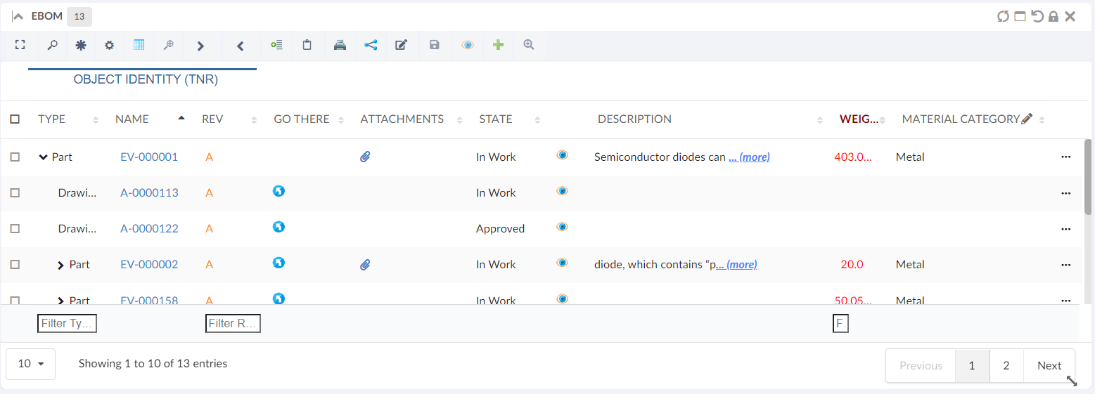
Figure 7. Show More
For more detailed information please refer Cell content in modal instead of tooltip
6.2. Toolbar
6.2.1. Collapse All
On the structure table, sometimes the user wants to collapse all nodes in that case user has to visit each node and collapse it one by one. Now users can collapse all nodes in a single click toolbar command using CollapseAll.
<DataTable>
	........................
	........................
	<Toolbar vertical="false">
		............
		............
		<CollapseAll />
		..............
		..............
	</Toolbar>
</DataTable>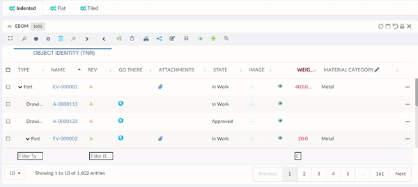
Figure 8. Collapse All
6.2.2. File Package Download
We can have many documents/files in each row/object of table widget. Now user can bulk download documents from selected objects using native file manager. A new command <FilePackageDownload /> in toolbar can be configured for same purpose.
<FilePackageDownload>
    <!-- Optional fields-->
    <Label>FPD</Label>
    <FontIcon>cloud download icon</FontIcon>
    <Configuration>tvc:fpd:hex:engineering:homepage/NativeFilesForSelectedModels.xml</Configuration>
</FilePackageDownload>
7. Search
7.1. Multivalued Text Field
During search, users might want to look for multiple text matches in different objects at once. A multivalued text field can be used for that purpose. Users can now configure nsx text field to be multivalued using below setting:
<Field>
	........................
	........................
	<UIType>text</UIType>
    <Settings>
        <Setting name="allowMultipleValues" value="true" />
    </Settings>
	........................
</Field>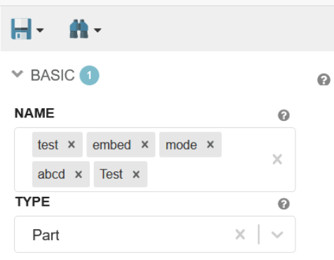
Figure 9. Multivalued Text Field
8. Performance
8.1. Enable HTTP/2
In a few words, we can say HTTP/2 enables our page to load faster with fewer data transferred over the wire. To enable http2 in your windows environment by adding the below lines in apache folder /conf/vhosts
    LoadModule http2_module modules/mod_http2.so
    <IfModule http2_module>
        ProtocolsHonorOrder On
        Protocols h2 h2c http/1.1
    </IfModule>
Also few good blogs which provide much more depth knowledge, can be followed by below links.
To take advantage of HTTP/2 we can load the vendor files in split which helps us in decreasing the size of network response. this can be enabled by adding the below line in tvc.property :
tvc.helium.isHttp2Enabled=trueSome key performance improvements have been made related to various scenarios like performing an in-cell edit operation in table or forms, performing actions like expand and collapse in structure tables.