 TVC Helium 2021.5.0
TVC Helium 2021.5.0 Release Information
17 December 2021
1. In-App Designer (End User Definition)
In-App Designer (previously known as End-User Definition/ End-User UI) is a concept that brings the idea of creating, editing and sharing configurations using the built-in admin user interface. These configurations can be used to define Helium dashboards, widgets, tables, charts, etc. Built-in Admin UI is provided to create, modify and share these configurations. In-App Designer can be used from Helium standalone or Helium widget in 3DDashboard. Once the config-admin is created and shared the configuration with the end-user, then the end-user receives the configuration to accept it. Once accepted, he can select and apply the configuration to his page, dashboard, or widget from UI. For detailed information, please refer In-App Designer.
In this release, we have enhanced this feature further as stated below.
1.1. Admin: Configuration in 3DDashboard
Now, In-App designer related apps can be configured easily in 3DDashboard by using Helium True Widget.
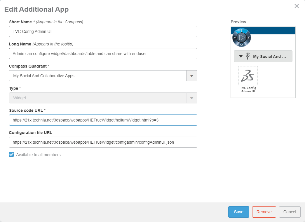
1.1.1. Configuration for adding "Config Admin UI" app in TrueWidget:
Configuration file URL: https://domain-name/app-name/webapps/HETrueWidget/configadmin/configAdminUI.json
Figure 1. Configure Admin UI in Truewidget App
1.1.2. Configuration for adding "TVC Shared Configs" app in TrueWidget:
Configuration file URL: https://domain-name/app-name/webapps/HETrueWidget/configuser/sharedConfigsUI.json
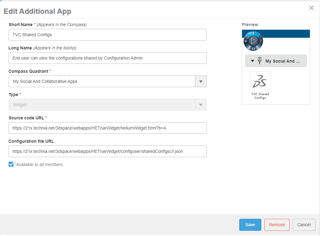
Figure 2. Configure Shared config UI in Truewidget App
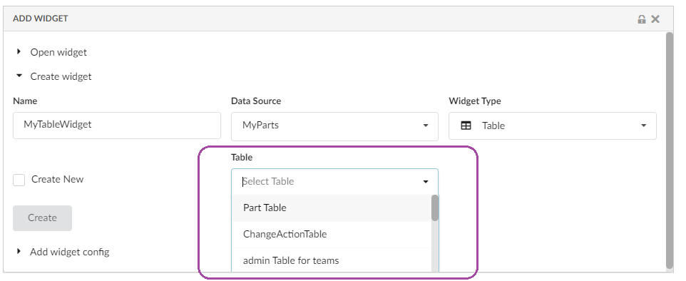
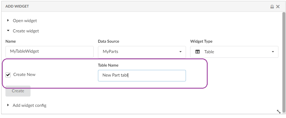
1.2. Admin: Configure TableWidget
Now Config-Admin can configure table widget by selecting dataset and table from UI itself. Config-Admin can create a draft dashboard and add a table widget on the dashboard by selecting an existing table or by choosing to create a new table. And then, columns can be added to the table using table configurator.
1.3. Admin: Configure ChartWidget
Similar to the table widget, Config-Admin can configure the Chart widget by choosing the required dataset from the dropdown.
1.4. Admin: Autopromote Child Configs
When the Dashboard is activated, all its child components like widgets, tables, tablecolumns, and datasets will be auto promoted to an active state.
1.5. Admin: Delete Draft Configs
Config-Admin can choose to delete the draft configs if it is no more required.
| Only the draft configs are allowed to delete. |
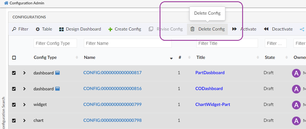
Figure 3. Delete Config
1.6. Admin: Notifications
End-user will be notified through email when Config-Admin shares or unshares the configurations. Similarly, End-user will receive an email notification when the already shared and accepted config is revised.
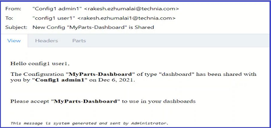
Figure 4. Email notification
Read Notifications for more details and configuration support for notifications.
1.7. EndUser: Create Widget
Now, end-users can create a table widget by pointing to an existing table. This will allow the end-user to reuse any previously created table. For example, if the end-user has already created a table for Parts, the same table can be used to create a different widget that can list the Released Parts or My InWork Parts, etc. This will only require changing the dataset.
1.8. EndUser: Expression support in advanced column
Now end-users can write an expression in the advanced column. This feature will facilitate end-user to write their expression to display the related object information in a table column. This can be enabled by adding the property tvc.helium.tableconfigurator.writeExpression.enabled = true in TVC.properties file. The default value for this property is false.
| This feature needs to be enabled with caution and it is expected that the user knows the concept of Enovia MQL selects to use this feature. |
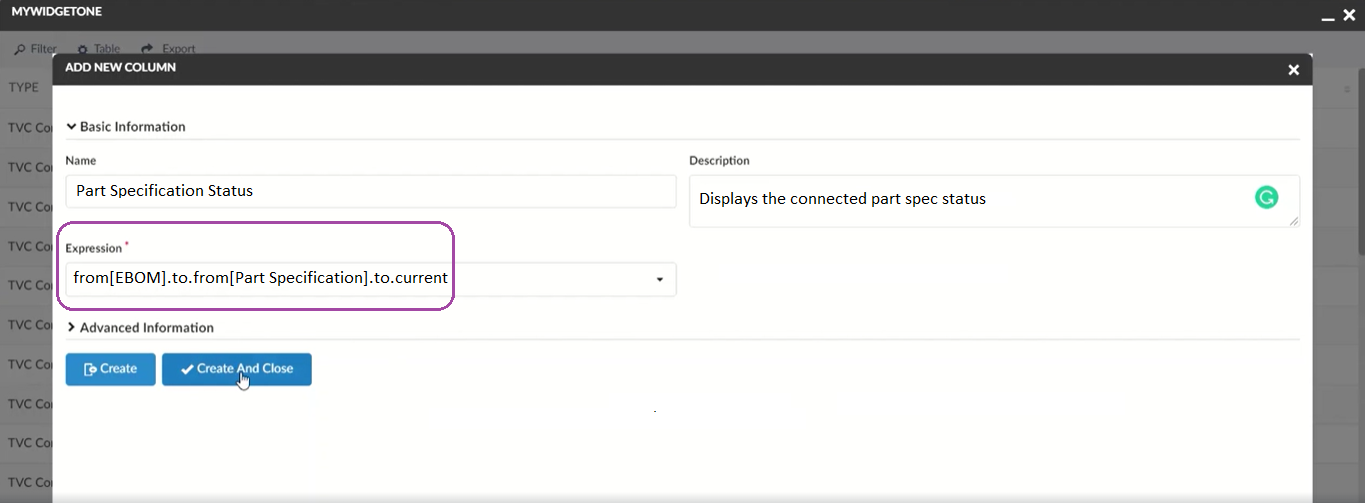
Figure 7. Write expression for Column
2. 3DDashboard
2.1. File Manager
Earlier File Manager operations were only supported in TvcWidget in 3DDashbaord. Now it is supported in TrueWidget in 3DDashboard.
For more details about TrueWidget read here.
To use fallback mechanism use tvc.3ddashboard.settings.useNativeFileManager = false property in tvc.properties.
|
2.2. Publish-Subscribe with OOTB widget.
Earlier Publish-Subscribe feature were only supported in TvcWidget in 3DDashbaord with OOTB. Now Publish-Subscribe with OOTB feature is also supported to TrueWidget in 3DDashboard.
| cross highlighting is only supported with root object, in near future it will be supported with child objects as well. |
3. Datatable
3.1. Fixed Header
Fixed Header provides a better view when displaying tables data. As by default, FixedHeader is not enabled, if user wish to enable fixed header for all tables then user need to update FixedHeader setting with value true for each table.
Now fixed headers can be enabled for all tables by configuring global setting tvc.helium.datatable.fixedHeader=true in tvc.properties. The default value is false.
Also this global setting can be overridden by individual widget level FixedHeader setting like below:
<DataTable>
	<Title>Fixed Header table</Title>
	<FixedHeader>false</FixedHeader>
	......... Other Settings .......
</DataTable>
For more detail see here FixedHeader
3.2. Cell content in modal instead of tooltip
The data in the cell content can be huge and it will be better to show such data in the modal as it provides the ability to scroll. It also makes more user-friendly and easy to read content.
This can be achieved by adding following configuration.
<Column>
	...
	<TextLength>25</TextLength>
	<Rows>5</Rows>
	<TruncateDirection>right</TruncateDirection>
	<Setting name="class" value="he-tooltip-as-modal" />
	...
</Column>
In some cases user might not want to see the close icon, that could be achieved by below configuration.
<Column>
	...
	<UseVersion2>true</UseVersion2>
	<TextLength>25</TextLength>
	<Rows>5</Rows>
	<TruncateDirection>right</TruncateDirection>
	<Setting name="class" value="he-tooltip-as-modal he-without-close" />
	...
</Column>
3.3. Resize Columns
While resizing the column sometimes column header or data gets truncated resulting in loss of information. Now tooltip is automatically enabled on column header and data to show full content. This feature is default enabled and it can be disabled at the global level for all the tables by using the key tvc.helium.datatable.tooltip.onResizeColumns=false in tvc.properties.
For more detail see here Resize Columns
3.4. No Header Truncation
Resize column allows users to truncate the column to any extent from UI. It might be desired that the column should not get truncated beyond the header content. This can be achieved using the headerNoTruncate setting. This can be configured as below :
<Column>
    ...
    Setting name="headerNoTruncate" value="true" />
    ...
</Column>
Possible values are true, or false. The default value is false.
3.5. Light Mode Data Group
Some time user wants simple data grouping based on the only column criteria. By using light mode data grouping, users can achieve simple grouping inline. An inline data group form will be open where the user can select the column and apply the grouping.
This can enable by passing an attribute lightMode value as a true in existing data group command.
<DataGroup lightMode="true"/>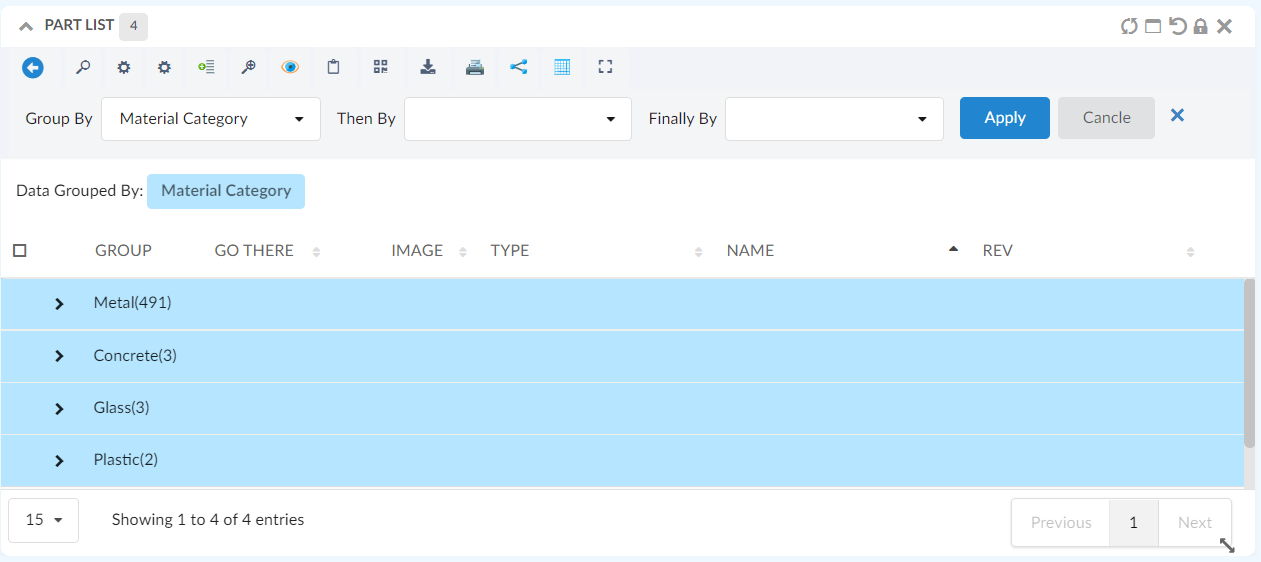
Figure 8. Light Mode Data Group Form
3.6. Pre configure Data Group
For some tables, the user might want to see the preconfigured data groups. The data will be grouped by providing simple configurations in the table config as follows :
 <DataGroup>
    <GroupBy>
        <Name>Material Category</Name>
		<Group condition="match" value="Glass" />
	</GroupBy>
	<ThenBy>
	    <Name>owner</Name>
	</ThenBy>
	<FinallyBy>
		<Name>State</Name>
	    <Group condition="match" value="In Work" />
	</FinallyBy>
	<GoBackAllowed>true</GoBackAllowed>
</DataGroup>
Read more Data Grouping.
4. Toolbar
4.1. Valid for on row select
Some commands in the toolbar might be valid based on certain types of objects or in some state, for example, a promote command is not needed in the final state of an object, or demote command is not needed when the object is already in its initial state. Another scenario could be a table which is showing all subtypes of part but certain commands are valid for a few subtypes only. Such a scenario can be achieved by adding the following configurations.
<Command>
    ...
    <ValidFor>
        <Types>
            <Type>type_Part</Type>
            <Type>type_AnotherType</Type>
        </Types>
        <States policy="policy_DevelopmentPart">
            <State>state_Create</State>
            <State>state_AnotherState</State>
        </States>
        <States policy="policy_ECPart">
            <State>state_Preliminary</State>
        </States>
    </ValidFor>
    ...
</Command>| It is allowed to omit the "policy" value and just specify state names. If this is done, you cannot use symbolic names for the state names as these cannot be resolved unless the policy is defined. |
4.2. Internationalization support in UIP Toolbar
Now internationalisation is also supported in uip toolbar for inbuild toolbar command like reset, switch orientation etc.
Read more UIP Toolbar.
5. Toaster
5.1. Increase the toaster message duration
Currently the toaster message are shown for 8 seconds, but user might want to see it for longer duration. This can be achieved by adding below configuration in tvc.properties
tvc.helium.toaster.timeout = 25000 // default is 8000
As per the above example the toaster message throughout the application will be shown for 25 seconds.
5.2. Add behaviour to toaster
In order to enrich the user experience we can add different behaviours like prevneting duplicates,showing close button, progress bar, or position etc. to the toastr message shown in the UI.
For more info read this
6. Page
7. Search
7.1. Required Field
Searches can be resource extensive and it might put a lot of strain on the system when a search is performed with empty fields. It is now possible to mark fields as mandatory for search. For example, in a general search, it might be needed that type must be specified for starting a search. This can be configured in the search form field using the tag Required.
<Field>
    ...
   <Required>true</Required>
    ...
</Field>
8. 3DDashboard
8.1. File Manager
Earlier File Manager operations were only supported in TvcWidget in 3DDashbaord. Now it is supported in TrueWidget in 3DDashboard.
For more details about TrueWidget read here.
To use fallback mechanism use tvc.3ddashboard.settings.useNativeFileManager = false property in tvc.properties.
|
8.2. Publish-Subscribe with OOTB widget.
Earlier Publish-Subscribe feature were only supported in TvcWidget in 3DDashbaord with OOTB. Now Publish-Subscribe with OOTB feature is also supported to TrueWidget in 3DDashboard.
| cross highlighting is only supported with root object, in near future it will be supported with child objects as well. |
8.3. User settings
8.3.1. Search On Criteria Update
User Setting to enable/disable Search On Criteria Update for Search
End-user can now control whether the search is submitted when the search criteria is updated. Earlier this feature was limited to search config and it was not possible to enable or disable for a specific user.
A built-in command is added to allow users to enable or disable search on criteria updates. This built-in command needs to be added to the search form toolbar.
<Toolbar>
  <SaveSearchUserSettings />
</Toolbar>
Please refer below link for searchOnCriteriaUpdate https://products.technia.com/app/docs/tvc-helium-documentation-2021.4.0/helium/admin/components/searchv2.html#:~:text=ShowMoreHitsCount%3E50%3C/ShowMoreHitsCount%3E-,SearchOnCriteriaUpdate,-Controls%20if%20the
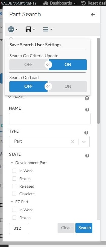
Figure 9. Usersetting search for criteria udate
8.4. Tree Field
Tree fields in searchform can be used to present nodes/values in hierarchical order like type/subtypes or part family classification. Earlier it was possible to auto-select child nodes once the parent node is selected. However, it was not allowed to deselect the child node while the parent is still selected. Now it is possible to deselect a child node when the parent node is selected. This can be enabled using the setting allowDeselectingChildNode on the tree field. Once a child node is deselected, its parent node will also get deselected.
<Settings>
	...
	<Setting name="allowDeselectingChildNode" value="true" />
    ...
</Settings>
This setting is applicable only when selectChildren is set to true.
|
8.5. Non Indexed Search Based Loader
Search Based loader can be used to load data directly into the Helium table. This feature was initially limited to indexed searches to support page by page result retrieval from indexed search. Now it is possible to use Search Based loader for non indexed search (default MQL based search) searches also.
indexedSearch tag needs to be set to false when using with non indexed search -
<TableConfig>
	<Title></Title>
	<DataLoader>
		<SearchBasedLoader indexedSearch="false"/>
	</DataLoader>
    ...
</TableConfig>
Read more Search Based Loader.
9. Chart
9.1. New chart types
Now all the chart types available in Apex Charts are supported in helium, they can be configured by using below config :
<ChartWidget>
	<Title>EBOM Start Eff date to End Effectivity Date</Title>
	<ChartConfig namespace="hex:engineering">TimelineChart.xml</ChartConfig>
	<UseVersion2>true</UseVersion2>
</ChartWidget>

<Chart>
    <DrillDown>tvc:dashboard:hex:engineering:homepage/MyDocumentsDrillDown.xml</DrillDown>
    <Tooltip>true</Tooltip>
    <Legend>true</Legend>
    <Tooltip>true</Tooltip>
    <Stack>false</Stack>
    <DataType>App.custom.getTimelineChartData</DataType>
    <DataSeries>
        <Serie>
            <Name>Drawing Prints</Name>
            <DataLoader>
                <DataSet>tvc:dataset:hex:engineering/EBOM.xml</DataSet>
            </DataLoader>

            <Expressions>
            	<Expression>${attribute[attribute_StartEffectivityDate]}</Expression>
                <Expression>${attribute[attribute_EndEffectivityDate]}</Expression>
                <Expression>${name}</Expression>
            </Expressions>
            <ChartType>rangeBar</ChartType>
        </Serie>
    </DataSeries>
    <Options>{
    	"xaxis": {
          "type": "datetime"
        },
        "plotOptions": {
          "bar": {
            "horizontal": true
          }
        }
    }</Options>
</Chart>
Since every chart types expects data in different format so a js method can be passed in DataType which returns the data in the required format, refer below example.
var getTimelineChartData = function(config) {
		var objectIds = config.series[0].objectIds;
		var chartData = []
		var data = App.ObjectStore.getByIds(config.series[0].objectIds);
		objectIds.forEach(function(objectId){
			var objectData = data[objectId];
			var startDate = objectData.data['attribute[Start Effectivity Date]'].values[0].value;
			var endDate = objectData.data['attribute[End Effectivity Date]'].values[0].value;
			if(startDate ){
				endDate = endDate ? endDate : new Date();
				chartData.push({
				"x" : objectData.data['name'].values[0].value,
				"y" : [
					new Date(startDate).getTime(),
					new Date(endDate).getTime()
				]
			})
			}


		})
        return {
        	'dataType' : "version2",
            'series': [{"data" : chartData}]

        };
    }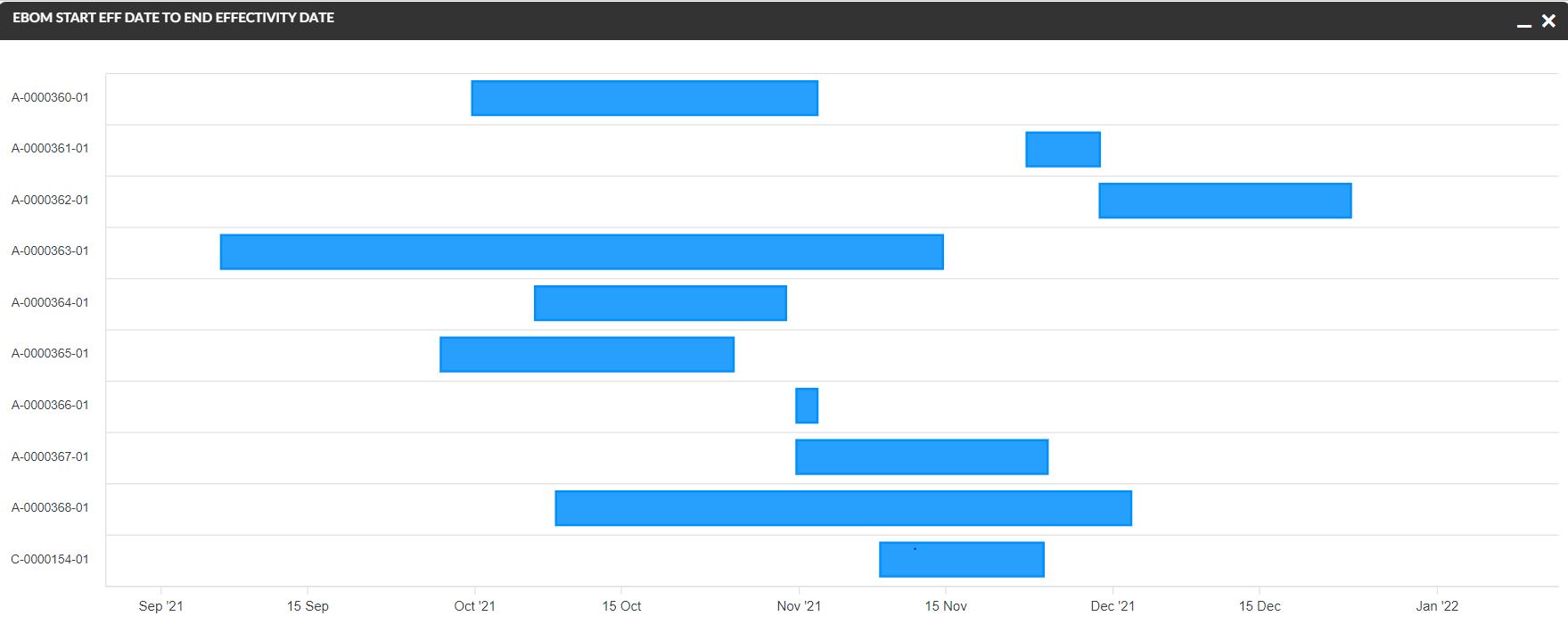
Figure 10. TimelineChart