TVC Helium 2019.5.0 Release Information
08 November 2019
1. Core
1.1. Dark Theme
Dark theme is now supported. Dark theme makes it easier for users to use the application in low-light environment and improves visibility. On mobile devices, it can also save battery life.
User can switch to dark mode by using Native OS dark theme or explicitly select from Themes Menu. For more information please see Dark Theme.
1.2. Saving object pages for offline access
New API/ functionality is added that enables a user to save object pages so that they can access these saved objects even while offline.
| The above demo has elements (e.g. column indicating tick mark) from Launchpads examples. When configured in OOTB product, the spinning icon in Topbar will indicate count of objects as they are successfully saved |
For more information, please see Saving object pages for offline access.
2. Table
2.1. Highlight updated row cross-widget
Datatable rows that have their data updated via another widget will be highlighted to show the changes.
2.2. Swipe to change pagination
On touch device, it is now possible to jump between datatable pages by swiping left or right on the table.
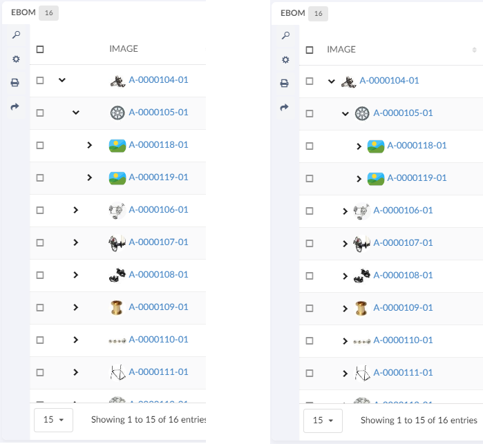
2.3. Structure Mode
Datatable can now render the expand button in the first configured column instead of a separate column. See Table Configuration.
2.4. Change Display Density
A built-in command can be added to the toolbar in Table widget which when clicked can decrease height of rows thus resulting in more content to be visible within the table.
For more information, please see Display Density.
3. Form
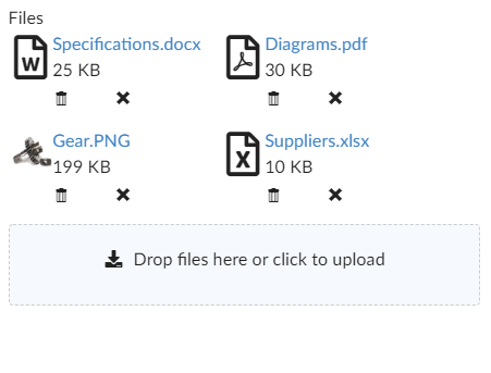
3.1. Files field with graphic template
The rendering of Files Field in Form Widget is now improved to show rich content, for e.g. file size, file type Icon (in case of image, it renders a thumbnail).
4. Mobile
4.1. Breadcrumb
Now breadcrumb is also available on stacked/mobile mode. For more information, see Breadcrumb.
5. Search
5.1. Export Search
Search criteria present on search form can now be exported as URL, which can be shared as copied text. Exported URL can then be directly be used to launch search in overlay mode. When a search is launched via URL, a default empty homepage is shown in the background to avoid loading heavy homepage impacting performance. However, it is possible to load a custom homepage via configuration tag <HomePage> on search config.
For details please see Export Search
5.2. SearchForm Toolbar
Search form now has a configurable toolbar with some in-built commands and also provides ability to add more commands and menus. It is possible to configure a custom toolbar via configuration tag <Toolbar> on search form.
For details please see SearchForm Toolbar
5.3. Quick Search Table View
Quick Search now has a table view in addition to existing tile views. It is possible to configure a table view using <UI> on search config.
For details please see Section UIs
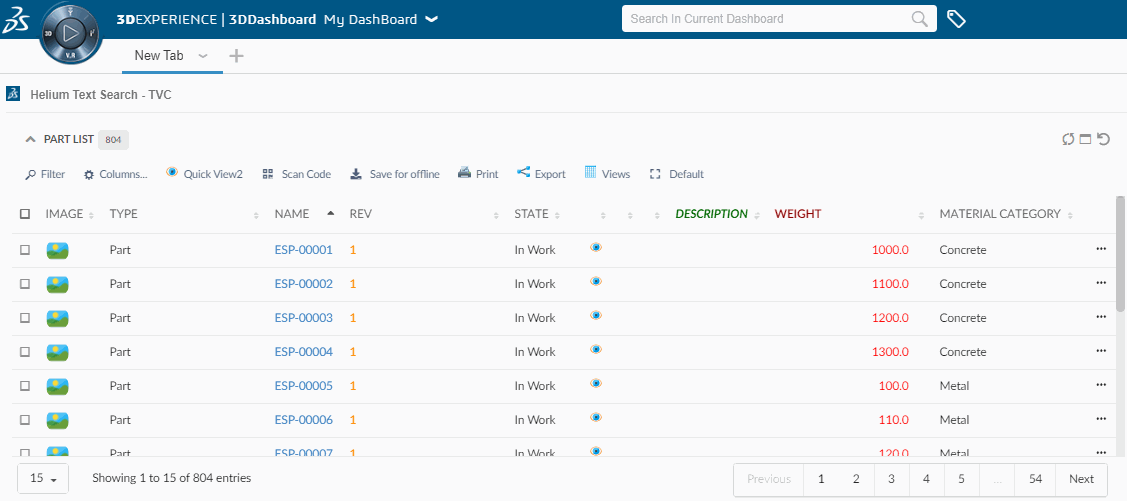
6. Support for 3DDashboard search
Helium table widgets embedded in 3DDashboard, will now be targeted by 3DEXPERIENCE "Search in Current Dashboard".
i.e If we have widgets with table data then we can filter the data in all tables using Search in current dashboard.