
TVC Helium 2019.2.0 Release Information
03 May 2019
1. Core
1.1. Show weeks in datepicker
Datepickers for both Tables and Forms now support configuration parameter "showWeekNumber" that defaults to false. The settings are described here
Figure 1. Calendar, showing the week numbers
2. Widget
2.1. Widget customizations
Just like for dashboards, an end user can do certain customizations on widget level. Exact customizations available will depend on the type of widget. For example, in a Table widget the end user can customize the pagination size, column visibilities and column order (see below section).
To simplify reverting any customizations done, the standard Widget template now shows a reset icon in the header section, if the Widget has been customized compared to the original state.
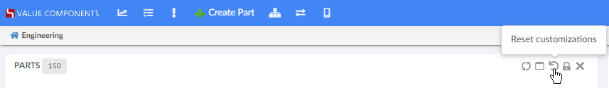
Figure 2. Resetting widget customizations
After deleting a widget customization, the widget will refresh.
3. Dashboard
3.1. Load Related Widgets
In addition to opening dashboard in sidepanel, new APIs are added on widget and dashboard instances to reload related widgets within a dashboard with potentially new data.
Figure 3. Load Related Widgets
For more information, see Load Related Widgets section
4. Forms
4.1. DynamicAttributeField
DynamicAttributeField now supports a <FromInterface> element, defining how to load dynamic attributes from a specific Interface. For more details, see Dynamic Attribute Field.
5. Table
5.1. Column reordering
The end user can now use the Column command to reorder the initial order of table columns.
Figure 4. Drag-and-drop to reorder.
The customized order of columns will be persisted and automatically apply the next time you load the widget. The column order will also apply for exports into Excel, CSV or PDF format.
6. Search
6.1. Sections in search form
Search form fields can now be grouped into sections. End user can expand and collapse sections. See Section Configuration Format and Form Configuration Format for details.
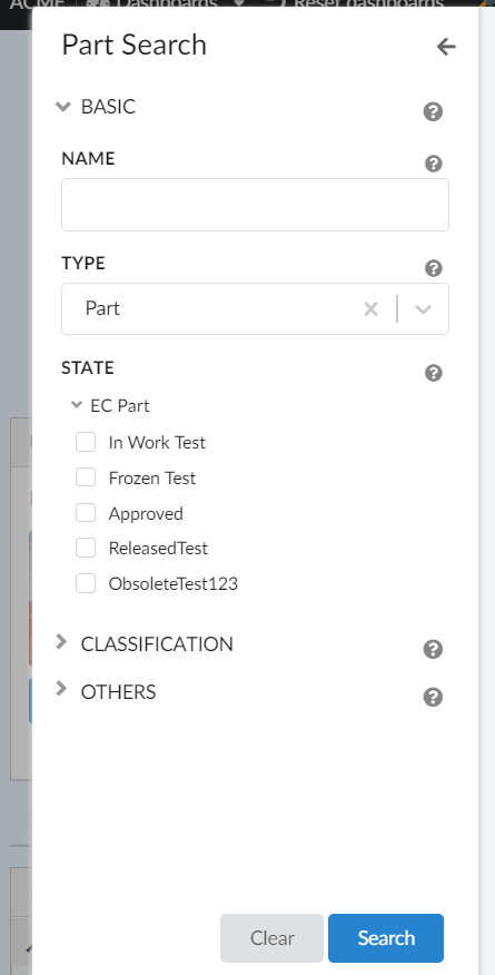
Figure 6. Sections in search form
6.2. Multiple selections on autocomplete field
Multiple values can be selected on autocomplete fields.
To enable, isMulti setting should be set to true using the <Setting name="reactselect"> element as shown below.
<Setting name="reactselect">
     {
         "isMulti": "true"
     }
</Setting>
See Autocomplete for more details.
6.3. Enable zero count range
Range with zero count on range field can be configured to be hidden or enabled (default). Use hideRangesWithZeroCount setting on field to hide zero count range.
<Settings>
    <Setting name="hideRangesWithZeroCount" value="true" />
</Settings>
See Ranges settings for details.
6.4. Search with hidden field
It is possible to hide a field on searchform and still include it in search criteria. Set attribute includeWhenHidden to true on field Visible tag to enable this feature.
<Visible includeWhenHidden="true"/>See Field Visibility settings for details.