 TVC Classic - 2025.2.0
TVC 2025.2.0 Release Information
16 May 2025
1. Top Panel
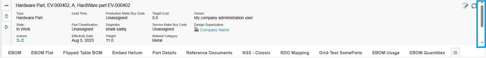
1.1. Scrollbar to top panel
When fields contain large amounts of content in the Top Panel form, it can sometimes impact the visibility and accessibility of the main content. To enhance usability, a scrollbar can now be added, allowing users to navigate through extensive field data more easily while keeping the main content visible.
This can be enabled using the property tvc.core.topPanel.enableFixedHeight. By default the value of this property is false.
Figure 1. TopPanel Scrollbar
1.2. Default expand
When the page content is loaded for first time user, top panel is in collapsed mode. Once user expands it remains expanded or collapsed on next user login based on last user action. However, for fisrt time user also it can now be configured to load top panel in expanded mode with setting tvc.core.topPanel.expandTopPanel=true. By default the value of this property is false.
NOTE : Irrespective of the setting value, top panel will remain expanded or collapsed on next user login based on last user action.
Refer Top Panel chapter for more details.