 TVC Classic - 2024.3.0
TVC 2024.1.0 Release Information
09 February 2024
1. General
1.1. V6R2024x support
Value Components are qualified and compatible with the 3DEXPERIENCE 2024x Platform.
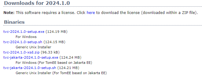
1.2. New TVC installer for Apache TomEE based on Jakarta EE
Since Enovia V6R2024x FD01, the web server utilized has transitioned to Tomcat 10+, incorporating Jakarta EE.
This shift is a consequence of the migration from Java EE to Jakarta EE within the framework of transferring Java EE to the Eclipse Foundation. Consequently, the primary package for all implemented APIs has transitioned from javax.* to jakarta.*.
This transition likely necessitates code adjustments for applications to seamlessly migrate from Tomcat 9 and prior versions to Tomcat 10 and subsequent releases.
To facilitate the support of TVC on Tomcat 10 and beyond, we have introduced a new installer labeled as tvc-jakarta-<tvc-version>-setup. Installation of this installer is imperative starting from Enovia V6R2024x FD01 onwards.
Figure 1. TVC Jakarta installer
2. TVC Core
2.1. Configurable default limit on Autocomplete field
The autocomplete makes it easier to enter values in fields. It can be used for example when specifying what kind of Part the user wants to create or enter the Responsible Design Organization (related object) for a part.
The AutoCompleteHandler (handler) on the server side was tasked with supplying available values for a field.In previous releases, The default value count was fixed at 50 and was not customizable.
Starting from this release, users have the flexibility to configure the default values count using the following system property key. This enhancement provides greater control over the autocomplete feature, allowing for a more tailored and efficient user experience.
<init-param>
    <param-name>tvc.core.autocomplete.defaultLimit</param-name>
    <param-value>50</param-value>
</init-param>
3. 3DDashboard
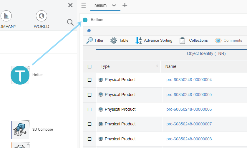
3.1. Widget icon to resemble the App icon
From this release onwards, The Widget icon will mirror the icon used for App creation. When creating an app, an uploaded icon represents the application. Subsequently, when generating a widget for the same app, the identical icon will be prominently featured in the upper-left corner of the widget.
This approach ensures a seamless visual connection between the app and its associated widget, offering users a consistent and recognizable experience. The use of the same icon reinforces the relationship between the app and widget, facilitating user understanding and navigation.
Figure 2. Using Widget icon from Application icon