 TVC Classic - 2024.3.0
TVC 2023.2.0 Release Information
11 April 2023
Table of Contents
1. Core
1.1. In-App Designer
In-App Designer is a concept that brings the idea of creating, editing, and sharing configurations using the built-in admin user interface. These configurations can be used to define Helium dashboards, widgets, tables, charts, etc. Built-in Admin UI is provided to create, modify and share these configurations. In-App Designer can be used from Helium standalone or Helium widget in 3DDashboard. Once the config-admin is created and shared the configuration with the end-user, then the end-user receives the configuration to accept it. Once accepted, he can select and apply the configuration to his page, dashboard, or widget from UI. For detailed information, please refer In-App Designer section in helium documentation.
In this release, we have enhanced this feature further as stated below.
1.1.1. In-App created Helium-Page in Classic tabs
In this release, the In-App Designer feature is enabled to use Helium-Page under TVC Classic tabs. Config-admin can create a helium-page configuration which can be configured under the TVC Classic tabs.
By default, the helium-page config is disabled to create. This feature can be enabled by adding tvc.enduser.page.enableToCreate = true setting in TVC.properies file. By default, this property is set to false
|
Config-admin can design a helium-page by configuring dashboards in it and add the helium-page to the classic or Enovia commands to view from the TVC classic tabs.
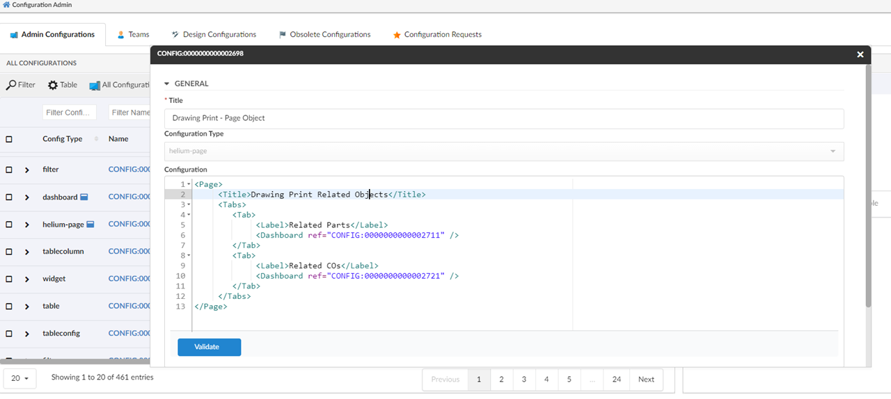
For example, to view the drawing print object’s related parts and the related part’s change order, config-admin can configure two dashboards to display the related parts and the part’s related change order, and then config-admin can add the created dashboards to the helium-page object in tabs as shown in the image.
Figure 1. Configure helium-page with the created dashboards
Once the helium-page is created, config-admin can configure an enovia command or TVC command by pointing to the helium-page object in the HREF as shown below. And then the command can be added to the drawing print object’s tree menu.
| The URL parameters used in the href are case-sensitive. |
print command DrawingPrintInAppView

command DrawingPrintInAppView
  description config admin configured dashboard view for drawing print type
  label 'Helium View'
  href '${ROOT_DIR}/goto/foo.jsp?embed=true&inAppPage=CONFIG:0000000000002698/Active'
  setting Target Location value content
  nothidden
Once the command DrawingPrintInAppView is configured in menu type_DrawingPrint, the helium-page can be seen as shown in the below image
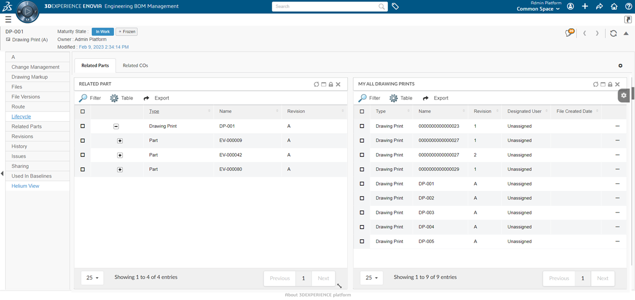
Figure 2. helium-page view configured for Drawing Print
1.2. Discussion
1.2.1. Consolidated email notification for discussion
When Email Notification Handler is enabled, email notifications are sent out to each recipient as an individual email. The following property can be set to send a single email notification for a message to all the users.
| Property | Description | Default Value |
|---|---|---|
tvc.collaboration.discussion.consolidatedNotify |
Set |
false |
2. Structure Browser
2.1. Editable Classification Attribute column
The user is allowed to configure the classification attribute as a column through config or table configurator. To make the classification attribute column cell editable where the value is blank then the following column setting could be configured.
<Setting name="Classification Attribute">true</Setting>| Setting | Description | Default Value |
|---|---|---|
Classification Attribute |
It is used along with the editable setting for the interface attribute column. When the interface attribute is used for expression and its default value is blank then this setting is required to be true to make the column editable. |
True / False (Default) |
If the user adds a classification attribute as a new column through the table configurator, the Classification Attribute checkbox needs to be checked.
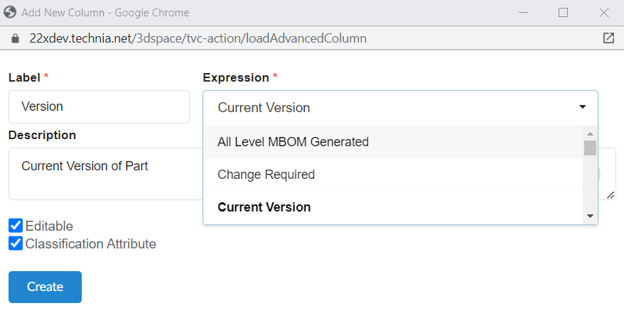
Figure 3. End User Defined Table Column Add Form
3. Search
3.1. Select all in range field
Range field is used to present multiple select values in form of checkboxes. In this release, we have introduced the capabilities to select and unselect all ranges on one click.
This can be enabled by a configurable setting enableSelectAllCheckboxes. Once enabled, a common checkbox Select all to select/deselect all the checkboxes is added.
default value for enableSelectAllCheckboxes is set to false.
|
<Settings>
    <Setting name="enableSelectAllCheckboxes" value="true" />
</Settings>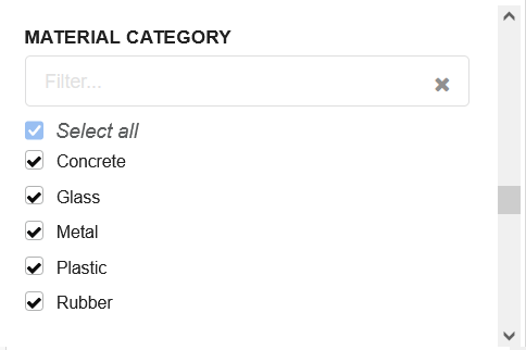
Figure 4. select all checkbox
3.2. Configurable warning message
For some usecases, a general message/warning is required to display in search form. Admin can configure a custom message to display some instructions / information to users.
<Message color="red" position="bottom">
    Warning : This query can cause performance issues.
</Message>| position attribute supports top and bottom values. It supports all standard colors. Default color is red and position is bottom. |
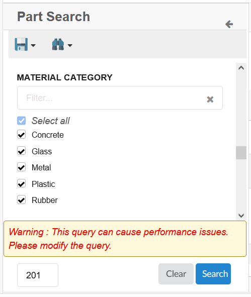
Figure 5. custom message