Structure Browser - Administration Guide : Forms
21 March 2016
Table of Contents
- 1. Structure Browser Forms
- 1.1. Create/Edit Forms
- 1.2. Sample form
- 1.3. Command
- 1.4. Resource Location
- 1.5. Create/Edit Form Elements
- 1.6. Custom fields
- 1.7. Manual Sorting of Dynamic Attributes
- 1.8. Validation Element
- 1.9. Include Element
- 1.10. Templates
- 1.11. Rendering modes
- 1.12. Column Type
- 1.13. Reserve On Edit
- 1.14. Create New
- 1.15. Global Validation
- 2. Helium form for Global Create
- 3. Helium Form in Classic (Create/Connect - Sidepanel)
1. Structure Browser Forms
1.1. Create/Edit Forms
In the Structure Browser, functionality exists for administrators to create forms that allow the users to create or edit (modify) business objects. These forms are defined as XML documents.
The fields in these forms are categorized into tabs, which the user can switch between without losing the data that was entered in another tab.
There are some built-in fields, which handle more complex logic – for example the type-, revision-, and vault fields, in addition to more generic fields that map to a specific attribute or a basic value, such as the description of an object.
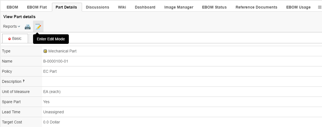
Forms can be configured to be used in several different modes. The current built-in modes are Create, Edit or View. Which mode is used will be determined by the command.
When used in a structure browser environment, it can also be used as a create/connect tool.
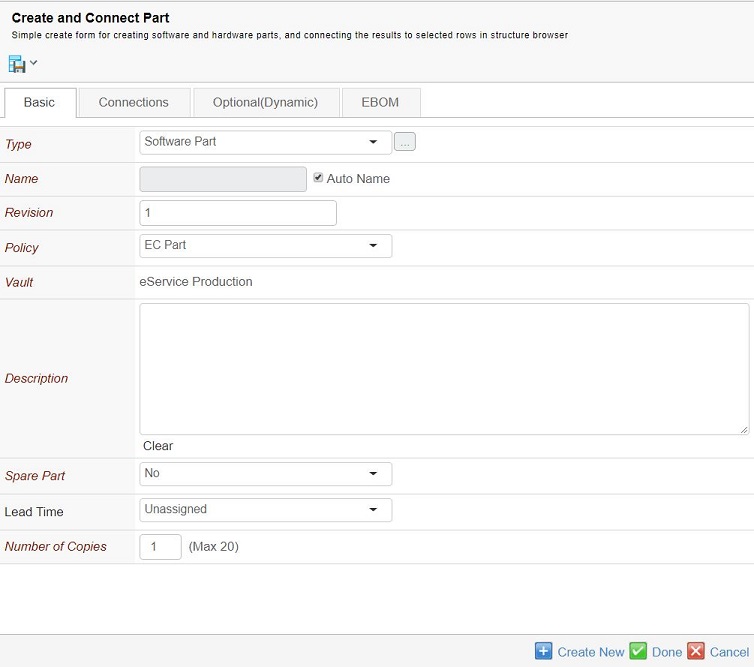
1.2. Sample form
<?xml version="1.0" encoding="UTF-8"?>
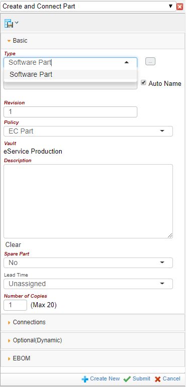
<Form id="CreateConnectPart">
<Header>Create Part</Header>
<SubHeader>Simple create form for creating/connecting parts</SubHeader>
<RunOncePerSelection>true</RunOncePerSelection>
<Connect>
<Relationship>relationship_EBOM</Relationship>
<Direction>from</Direction>
</Connect>
<Tab>
<Label>Basic</Label>
<TypeField>
<Required>true</Required>
<DefaultValue>type_HardwarePart</DefaultValue>
<TypePattern>type_SoftwarePart</TypePattern>
<TypePattern>type_HardwarePart</TypePattern>
</TypeField>
<NameField>
<Editable>true</Editable>
<Required>true</Required>
<AutoName>true</AutoName>
</NameField>
<Include ref="tvc:formfield:tvx:enc/Revision.xml"/>
<PolicyField>
<Required>true</Required>
<DefaultValue>policy_ECPart</DefaultValue>
</PolicyField>
<VaultField>
<Required>true</Required>
<ReadOnly>true</ReadOnly>
<DefaultValue>vault_eServiceProduction</DefaultValue>
</VaultField>
<Field>
<Label>Description</Label>
<MapsTo>description</MapsTo>
<Required>true</Required>
<Multiline>true</Multiline>
<ClearEnabled>true</ClearEnabled>
<Validation>
<MinChars>10</MinChars>
</Validation>
</Field>
<Field>
<Label>Unit of Measure</Label>
<MapsTo>attribute_UnitofMeasure</MapsTo>
<Required>true</Required>
<Validation>
<InvalidValue>Please Select</InvalidValue>
</Validation>
</Field>
<QuantityField>
<Required>true</Required>
<DefaultValue>1</DefaultValue>
<Limit>20</Limit>
</QuantityField>
</Tab>
<Tab>
<Label>Connections</Label>
<ConnectField>
<Label>Part Specification</Label>
<Editable>false</Editable>
<Relationship>
<Name>relationship_PartSpecification</Name>
<Direction>from</Direction>
</Relationship>
<SearchForm>tvc:searchconfig:office/AddReferenceDocument.xml</SearchForm>
<Create>
<TypePattern>type_CADDrawing</TypePattern>
<Policy>
<DefaultValue>policy_CADDrawing</DefaultValue>
<ShowHidden>true</ShowHidden>
</Policy>
<ShowQuantity>true</ShowQuantity>
</Create>
<ClearEnabled>true</ClearEnabled>
</ConnectField>
</Tab>
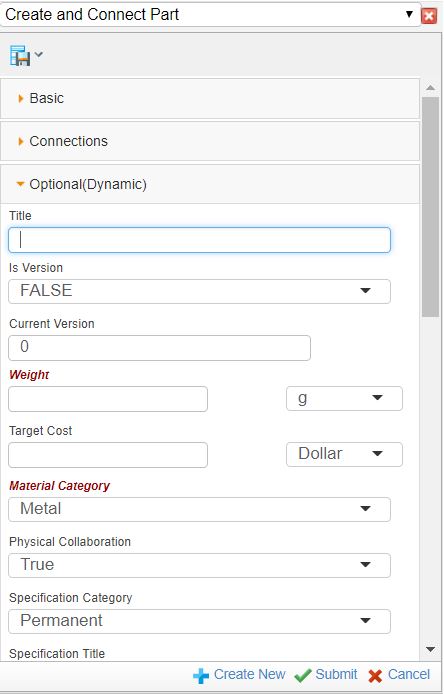
<Tab>
<Label>Optional</Label>
<DynamicAttributesField>
<Filter>
<Exclude>attribute_AlternateID</Exclude>
<Exclude>attribute_Originator</Exclude>
</Filter>
</DynamicAttributesField>
</Tab>
<CloseOnDone>true</CloseOnDone>
</Form>1.3. Command
To use a form, a command needs to be created to initialize it.
The URL for such a command is shown below:
${ROOT_DIR}/tvc-action/initForm
This URL supports the following parameters:
| Parameter | Description | Example |
|---|---|---|
formName |
This parameter should define the XML based resource for a form. This parameter is mandatory. |
tvc:form:tvx:enc/CreateConnectPart.xml |
formMode |
Defines the mode of the form. Create, edit and view modes are currently supported. If not provided, create is the default mode. |
create / edit / view |
renderMode |
This parameter controls which rendering type will be used. Forms are rendered differently depending on the value specified on this parameter. See this chapter for more information. |
dialog / sidepanel / content |
allowEdit |
This parameter specifies if the Edit button is rendered or not. Only applicable it formMode=view. Default is false. |
true /false |
An example command, defined in XML, is shown below:
<Command>
    <Label>Create/Connect Part</Label>
    <URL action="initForm" submit="true">
        <Param name="formName" value="tvc:form:tvx:enc/CreateConnectPart.xml"/>
        <Param name="formMode" value="create"/>
        <Param name="renderMode" value="dialog"/>
    </URL>
    <WindowWidth>800</WindowWidth>
    <WindowHeight>700</WindowHeight>
    <PopupModal>true</PopupModal>
    <TargetLocation>popup</TargetLocation>
    <RowSelectType>multiple</RowSelectType>
</Command>
An example command for an edit form displayed in sidepanel:
<Command>
    <Label>Edit Part</Label>
    <URL action="initForm" submit="true">
        <Param name="formName" value="tvc:form:tvx:enc/EditPart.xml"/>
        <Param name="formMode" value="edit"/>
        <Param name="renderMode" value="sidepanel"/>
    </URL>
    <TargetLocation>card</TargetLocation>
</Command>
1.4. Resource Location
Forms and fields are defined as XML based resources.
| Resource Type | Name Prefix |
|---|---|
Form |
tvc:form/MyForm.xml |
FormField |
tvc:formfield/MyForm.xml |
See this document for more details on XML resources in general.
1.5. Create/Edit Form Elements
The root element within a create/edit form is called "Form".
<Form id="CreateConnectPart">
The attributes that can be used on this element are:
Name |
Description |
Example |
id |
This defines the id of the form. In order for templates (described later) to work correctly, this needs to be unique |
CreateConnect001 |
The sub-elements that are allowed inside the root element are:
| Element Name | Description | Cardinality | Example |
|---|---|---|---|
Header |
Defines the header displayed on top of the form page. These can be localized by specifying a "locale" attribute. This can also contain select expression macros that will be evaluated on the current business object. It also supports localization using string resources. |
Zero or More |
Or using macros: |
SubHeader |
Defines a sub-header displayed below the header in smaller print. These can be localized by specifying a "locale" attribute. This can also contain select expression macros that will be evaluated on the current business object. It also supports localization using string resources. |
Zero or More |
Or using macros: |
Menu |
Defines a menu, either defined as a TVC XML resource or a standard database menu. Note that menus are only displayed if renderMode is set to "content". |
Zero or One |
Or
|
RunOncePerSelection |
When the form is used as a create/connect form, this determines if the form will run once per each selected row in the table. If specified, the form will be executed once per selected row. For example, creating and connecting one new part for each selected row in a table. |
Zero or One |
|
Connect |
When a form contains this element, the sub-elements will specify a relationship and direction to perform a connection between the objects created as a result of the form, and the objects selected in the table calling the form. |
Zero or One |
|
Tab |
The Tab element defines a tab |
One or More |
|
PostProcessor |
Run post process logic |
Zero or More |
|
ReserveOnEdit |
Defines if objects should be reserved when being edited in a form. Default is false. |
Zero or One |
|
ReserveOnEditComment |
Defines a custom message to be shown when an object is reserved by another user. |
Zero or One |
|
ReserveOnEditExpiration |
Defines the expiration time of an object reservation. The format can use weeks, days, hours, minutes and seconds. For example, 1w 3d 1h 55m 10s. Default value is 10m. |
Zero or One |
|
GlobalValidation |
Defines a global validation to be used for the form |
Zero or One |
|
GlobalJSFunction |
Defines a global javascript function called when validating the form. Please note that the function needs to receive one parameter. This parameter will be a javascript object containing the id’s and names of all the fields in the form. More info can be found in the developer documentation. |
Zero or More |
|
AddToTable |
Defines if the newly created and connected object will be added to the table (if present). Default is True |
Zero or One |
|
CloseOnDone |
Defines if the sidepanel should auto-close on successful creation or on edit of an object. Default is false. |
Zero or One |
|
Editable |
Specifies that the form is editable and the "Edit" button
will be available. Default is true. It also allows either an expression
or a java class to evaluate access. _If a java class is specified, it
needs to implement the interface |
Zero or One |
|
IncludeResources |
It is possible to include javascript or stylesheet resources on a form. In the case of a javascript, it can be used for validation. In the case of a stylesheet, it can be used to change the look and feel of the form. Multiple resources of each type can be included if needed. |
Zero or One |
|
ShowWarningForUnsavedForm |
Specifies whether a warning should be shown, when the user tries to click another tab without saving the current form. Can also be defined for all forms using global setting By default value is false |
Zero or One |
Global Setting |
1.5.1. Tab elements
The tab elements are the containers of the fields in a form. There can be as many tabs as wanted, however at least one is needed.
The sub-elements that are allowed inside a Tab are:
| Element Name | Description | Cardinality | Example |
|---|---|---|---|
Label |
Defines the label of the tab. These can be localized by specifying a "locale" attribute.It is also possible to use string resource keys. |
Zero or More |
Or, if using string resources:
|
Include |
Defines a reference to an external Field XML definition. Please see this chapter for more details |
Zero or More |
|
1.5.2. Field Elements
Create/Edit Forms contain a number of pre-built fields that can be used. Many of the sub-elements for these are reused (where applicable), but some are unique to a specific field.
The following sub-elements can be used in all field types:
| Element Name | Description | Cardinality | Example | ||
|---|---|---|---|---|---|
Label |
Defines the label of the field. These can be localized by specifying a "locale" attribute. It is also possible to use string resource keys. |
Zero or More |
Or, if using string resources:
|
||
TooltipLabel |
This specifies the label for the tooltip. If specified the tooltip will be displayed with a title header. |
Zero or One |
|
||
TooltipContent |
This specifies the content of the tooltip. This can be text or HTML to allow for more advanced formatting. Please note that to use HTML, the CDATA tag needs to be used. |
Zero or One |
Or with HTML content: |
||
Required |
Specifies that a value is required for the field in order for the form to be valid. Default is false. |
Zero or One |
|
||
ReadOnly |
Specifies that the field cannot be edited. Default is false. |
Zero or One |
|
||
Editable |
Specifies that the field is editable. Default is true. It
also allows either an expression or a java class to evaluate access. _If
a java class is specified, it needs to implement the interface
|
Zero or One |
|
||
DefaultValue |
Specifies a default value |
Zero or One |
|
||
DefaultValueHandler |
Specifies a class for performing custom logic. Can be used for example when setting a default value to a ConnectField. The class must implement the interface
|
Zero or One |
|
||
Visible |
Specifies if a field is shown or not. Fields that are not visible will still be processed, but they are not shown and are not editable by the user. Default value is true. It also allows either an expression or a java class to evaluate access.
_If a java class is specified, it needs to implement the interface
|
Zero or One |
|
||
ClearEnabled |
Enables a link to clear the field of the set value. Default value is false. |
Zero or One |
|
||
Validation |
This element enables specific validation logic to be used. See this chapter for more details.
|
Zero or One |
|
||
FieldRendererClass |
This element can be used to specify a custom java class to render the field. For more detailed information, see the developer documentation. |
Zero or One |
|
||
RangeLoader |
This element specifies either a Java class, inquiry or dataset that is responsible for loading the ranges for a field. A Java class must extend:
|
Zero or One |
The syntax for a Java class is:
For an Inquiry:
For a dataset:
|
||
RangeDisplay |
Specifies what is shown in the drop-down list for each range. |
Zero or One |
Macro-format that can only be used for a Java class or an Inquiry that loads a list of business objects as ranges. For example: |
||
RangeSaveValue |
Specifies what is saved when a range value is selected. Default is the name of the object. |
Zero or One |
Macro-format that can only be used for a Java class or an Inquiry that loads a list of business objects as ranges. For example: |
||
RangeSeparator |
When using a multi-select list, values are saved using a separator. This is by default the | character, but can be specified using this element. |
Zero or One |
|
||
SortRangeValues |
Specifies if range values should be sorted or not. Default value is true. |
Zero or One |
|
||
PostProcessor |
Run post process logic |
Zero or More |
|
||
FocusFirst |
The Field which needs to be focused on tab load. It will work on Tab basis, so one tab should have only one field with FocusFirst. If there is not any field have, first input field will be focused automatically. |
Zero or One |
|
||
AutoComplete |
Specifies if autocomplete is enabled. Not all field supports autocomplete. Read more in the chapter about the specific field. Autocomplete is enabled by default but can be disabled globally with the setting:
|
Zero or One |
|
||
AutoCompleteHandler |
Specifies which AutoCompleteHandler (handler) to use. Many fields come pre-configured with a handler, e.g. type field uses the type handler and owner field uses person handler. |
Zero or One |
|
||
AutoCompleteSettings |
Settings for AutoCompleteHandler. See Autocomplete chapter in TVC Core Admin guide for more details. |
Zero or One |
|
||
VisibleIf |
Specifies if a field should be visible depending on another field’s value. This element must have the attribute if set to a specific field id. VisibleIf element has a sub element called Value. The value-element contains the value it should be visible for. This feature only works for:
|
Zero or One |
|
||
Templatable |
Specifies that the field can participate in save template. Default is true. Not applicable for Type Field |
Zero or One |
|
||
Allow Multi Value Duplicates |
Specifies that a multi value attribute field can have duplicate values |
True or False |
|
The attributes that can be used on this element are:
Name |
Description |
Example |
id |
This defines the id of the field. The id must be unique within the form. |
theTypeField |
TypeField
The "Type field" is used to specify the type of an object. This field supports autocomplete.

<TypeField>
    <Required>true</Required>
    <!-- <DefaultValue>type_Part</DefaultValue>  !deprecated! -->
    <TypePattern default="true">type_Part</TypePattern>
</TypeField>
The sub-elements that are specific inside a TypeField are:
| Element Name | Description | Cardinality | Example |
|---|---|---|---|
SelectAbstractTypes |
Specifies that abstract types can be chosen. Default is false |
Zero or One |
|
DefaultValue |
Specifies the type that should be default. This configuration is deprecated. |
Zero or One |
|
TypePattern |
These elements define the types that should be selectable |
One or More |
|
Size |
Specifies the size (in number of characters) of the field (Or, if the field is showing ranges, it specifies the number of rows to show simultaneously in the select list) |
Zero or One |
|
ShowTypeIcon |
Specifies if the type icon is shown or not. Default is true |
Zero or One |
|
The attributes that can be used on TypePattern element are:
Name |
Description |
Example |
default |
Boolean that defines if this TypePattern is the default value for TypeField. Default is false. |
|
root |
Boolean that defines if this TypePattern should be shown as a selectable type in the TypeChoser. Default is true. This attribute can be used when we want to use TypePattern only as default value without showing it separately in the type chooser. |
|
NameField
The "Name field" is used to specify the name of an object.

<NameField>
    <Editable>true</Editable>
    <Required>true</Required>
    <AutoName>true</AutoName>
</NameField>
These are the sub-elements that are specific to NameField:
| Element Name | Description | Cardinality | Example |
|---|---|---|---|
AutoName |
Specifies that autonaming should be enabled. This element has an optional attribute "useTVC" that can be set to "true" if TVC Number Generators should be used. |
Zero or One |
|
Size |
Specifies the size (in number of characters) of the field |
Zero or One |
|
RevisionField
The "Revision field" is used to specify the revision of an object.

<RevisionField>
    <Label>Revision</Label>
    <Required>true</Required>
    <DefaultValue>1</DefaultValue>
</RevisionField>
These are the sub-elements that are specific to RevisionField:
| Element Name | Description | Cardinality | Example |
|---|---|---|---|
Size |
Specifies the size (in number of characters) of the field |
Zero or One |
|
PolicyField
The "Policy field" is used to specify the policy for an object. This field supports autocomplete.

<PolicyField>
    <Required>true</Required>
    <DefaultValue>policy_ECPart</DefaultValue>
    <ShowHidden>true</ShowHidden>
    <Filter>
        <Exclude>policy_Version</Exclude>
    </Filter>
</PolicyField>
These are the sub-elements that are specific to a <PolicyField> element:
| Element Name | Description | Cardinality | Example | ||
|---|---|---|---|---|---|
Filter |
A Filter element can be used to exclude one or several policies that should not be selectable. |
Zero or One |
|
||
ShowHidden |
This element can be used to force hidden policies to be shown. Default is false. |
Zero or One |
|
||
Size |
Specifies the number of rows in the select list that will be shown simultaneously. |
Zero or One |
|
||
DefaultValue |
Specifies a default value.
|
Zero or One |
|
VaultField
Vaultfields are used to specify the vault for an object. This field supports autocomplete.

<VaultField>
    <Required>true</Required>
    <DefaultValue>vault_eServiceProduction</DefaultValue>
</VaultField>
Pre-defined logic includes hiding the vault "TVC Administration" as well as "eService Administration".
Element Name |
Description |
Cardinality |
Example |
Size |
Specifies the number of rows in the select list that will be shown simultaneously. |
Zero or One |
|
OwnerField
An owner field can be used to allow for changing the owner of an object. This field supports autocomplete.

<OwnerField />These are the sub-elements that are specific to OwnerField:
| Element Name | Description | Cardinality | Example |
|---|---|---|---|
Size |
Specifies the size (in number of characters) of the field |
Zero or One |
|
CheckinField
A CheckinField enables the form to checkin files to the main form object(s).
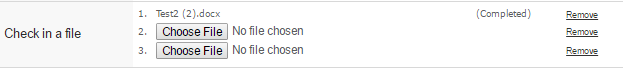
<CheckinField>
    <Label>Check in a file</Label>
    <Format>generic</Format>
    <MaxFileCount>3</MaxFileCount>
</CheckinField>
If applicable (object type supports it), and not disabled, the "Common Document Model" functionality will be used for files being checked in. Meaning version objects will be created along with the file being checked in.
These are the sub-elements that are specific to a CheckinField element:
| Element Name | Description | Cardinality | Example | ||
|---|---|---|---|---|---|
CheckinField |
The main element of the field. This has an optional attribute "useCDM", which specifies if the "Common Document Model" functionality will be enabled for the field or not. Default is true. |
Zero or more |
|
||
Format |
Specifies the format to use when checking in the file |
Zero or One |
|
||
MaxFileCount |
Specifies the maximum number of files to allow for check in. |
Zero or One |
|
||
ShowFormatChooser |
Alows user to select format for each file. Overrides the <Format> field.
|
true/false |
|
Enable direct FCS upload
Files can directly be uploaded to FCS server using attribute enableDirectFCSUpload on CheckinField tag. When set to true, files will not be uploaded to a temporary location on the server but once the form is successfully submitted, files will be uploaded to FCS directly.
<CheckinField enableDirectFCSUpload="false">
    ...
</CheckinField>
This feature uses File Manager APIs for upload and useCDM option is not valid when this is enabled. CDM will be enabled based on type definition as it works in File Manager.
|
ConnectField
Connectfields are fields that can be used to:
-
Create and connect one or more objects to the main form object
-
Connect an existing object to the main form object
-
Check in files to the object
-
Show an existing connected object (In view mode) and disconnect/replace it (In edit mode)
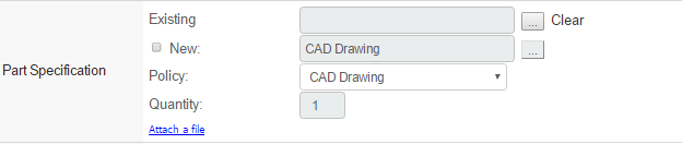
For example, if a "Create Part"-form includes a ConnectField, it can create and connect new Part Specifications to the part that is created. It can also be used to connect existing RDO’s to the part.
If the field is being used in view or edit mode, it is only possible to show or edit ONE existing connected object. If multiple connections are found, the first one found will be used.
<ConnectField>
    <Label>Part Specification</Label>
    <Relationship>
        <Name>relationship_PartSpecification</Name>
        <Direction>from</Direction>
    </Relationship>
    <SearchForm>tvc:searchconfig:office/AddReferenceDocument.xml</SearchForm>
    <Create>
        <TypePattern>type_CADDrawing</TypePattern>
        <Policy>
            <DefaultValue>policy_CADDrawing</DefaultValue>
            <ShowHidden>true</ShowHidden>
        </Policy>
        <ShowQuantity>true</ShowQuantity>
    </Create>
    <Checkin>
        <Format>generic</Format>
        <MaxFileCount>3</MaxFileCount>
    </Checkin>
    <ClearEnabled>true</ClearEnabled>
</ConnectField>
This field has support for autocomplete. Enable autocomplete by setting AutoComplete to true. The AutoCompleteHandler defines which handler to use and settings are defined in AutoCompleteSettings. Note that the field must be editable in order to make it possible to use autocomplete.
<ConnectField>
    <Label>ECO to release</Label>
    <Relationship>
        <Name>relationship_AffectedItem</Name>
        <Direction>to</Direction>
    </Relationship>
    <AutoComplete>true</AutoComplete>
    <AutoCompleteHandler>dataset</AutoCompleteHandler>
    <AutoCompleteSettings><![CDATA[{
        handler : {
            dataset : 'tvc:dataset:tvx:enc/ECOs.xml'
        }
    }]]></AutoCompleteSettings>
</ConnectField>
In View/Edit mode, fewer/other elements are used:
<ConnectField>
    <Label>Part Family</Label>
    <Relationship>
        <Name>relationship_ClassifiedItem</Name>
        <Direction>to</Direction>
    </Relationship>
    <Object>
        <Where><![CDATA[$<type.kindof[type_ECO]> == TRUE]]></Where>
    </Object>
    <SearchForm>tvc:searchconfig:tvx:enc/AddToPartFamily.xml</SearchForm>
    <ClearEnabled>true</ClearEnabled>
    <LinkEnabled>true</LinkEnabled>
    <Link>${ROOT_DIR}/tvc-action/loadTopPanel?panel=tvc:toppanel:tva:engineering:eco/Toppanel.xml</Link>
</ConnectField>
These are the sub-elements that are specific to a ConnectField element:
| Element Name | Description | Cardinality | Example |
|---|---|---|---|
Relationship |
Specifies the relationship name and direction to be used |
Zero or One |
|
SearchForm |
Specifies a TVC Search Configuration to use when connecting existing objects. |
Zero or One |
|
DisplayExpression |
Specifies selectable / expression that should be used to display the field value of the connected object. If no display expression is configured, it will continue to show object name by default. |
Zero or One |
|
Checkin |
This element specifies the details for checking in files. Sub-elements are the same as for a CheckinField. See chapter CheckinField for more details. |
Zero or One |
|
Create |
This element contains sub-elements specifying the details for creating new objects. Described below |
Zero or One |
|
Link |
This element can contain a URL that should be used when user clicks on an existing connected object. |
Zero or One |
|
LinkEnabled |
This element specifies if the existing connected object should have a link or not. Default is true. |
Zero or One |
|
Object |
This element contains sub-elements specifying details on what mechanism to use for filtering out existing connected objects in View and Edit modes. Described below. |
Zero or One |
|
The Object element is only used in Edit and View mode for the forms. The sub-elements for the Object element are:
| Element Name | Description | Cardinality | Example |
|---|---|---|---|
Where |
Specifies a where expression that will be evaluated against objects that are found using the specified relationship and direction from the Relationship element. |
One or Zero |
|
The Create element is only used in Create mode for the forms. The sub-elements for the Create element are:
| Element Name | Description | Cardinality | Example |
|---|---|---|---|
TypePattern |
These elements define the types that should be selectable |
One or More |
|
DefaultValue |
Specifies the default type to use. |
Zero Or One |
|
ShowQuantity |
Specifies if the quantity field is shown. This allows the user to create multiple objects. |
Zero Or One |
|
Policy |
This element contains policy details. Described below… |
Zero Or One |
|
ReuseCreated |
Specifies if the newly created objects should be reused when connecting with parent objects |
Zero or One |
|
AutoName |
Specifies that autonaming should be enabled. This element has an optional attribute "useTVC" that can be set to "true" if TVC Number Generators should be used. |
Zero or One |
|
SelectAbstractTypes |
Specifies that abstract types can be chosen. Default is false |
Zero or One |
|
The Policy element is only used in Create mode for the forms. The sub-elements for the Policy element are:
| Element Name | Description | Cardinality | Example |
|---|---|---|---|
DefaultValue |
Specifies the default policy to use. |
One or More |
|
ShowSelector |
Specifies if the select list should be shown. Default is true |
Zero Or One |
|
ShowHidden |
Specifies if hidden policies are shown. |
Zero or One |
|
QuantityField
The Quantity field can be used to allow the user to create multiple objects at the same time.

<QuantityField>
    <Required>true</Required>
    <DefaultValue>1</DefaultValue>
    <Limit>20</Limit>
</QuantityField>
Please note that in order for the user to be allowed to create more than 1 object, Auto Name needs to be selected on the name field.
These are the sub-elements that are specific to a a QuantityField element:
| Element Name | Description | Cardinality | Example |
|---|---|---|---|
Limit |
Specifies an upper limit for how many objects can be created. |
Zero or One |
|
DynamicAttributesField
A DynamicAttributesField creates fields for all the attributes that exist on the chosen type (or existing object when in edit mode). Using this field is useful when standard fields should exist for all attributes on a type. Not wanted attributes can be manually excluded in the configuration.
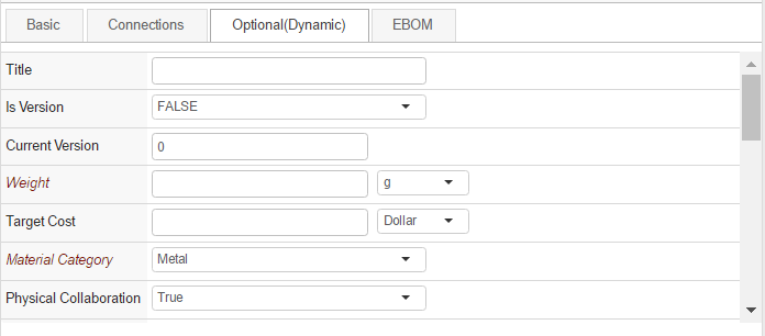
<DynamicAttributesField fromInterface="true">
    <Filter>
        <Exclude>attribute_AlternateID</Exclude>
        <Exclude>attribute_Originator</Exclude>
    </Filter>
</DynamicAttributesField>
Attribute "fromInterface" is optional. Default value is false. When the value is true, interface attributes attached on the businessobject is show in DynamicAttributeField grouped by Interface name. The interface name can be hidden globally by using the following init param where value is comma separated interface name.
<init-param>
    <param-name>tvc.structurebrowser.form.dynamicAttributesField.interface.hiddenHeaders</param-name>
    <param-value>Material Compliance</param-value>
</init-param>
The setting can be applied at field level using
<HiddenInterfaceHeader>Material Compliance</HiddenInterfaceHeader>Fields with ranges are by default using autocomplete. This can be changed by setting autocomplete to by default be disabled. This is done with the setting tvc.structurebrowser.form.autocomplete.enabled.
These are the sub-elements that are specific to a DynamicAttributesField element:
| Element Name | Description | Cardinality | Example |
|---|---|---|---|
Filter |
Specifies Exclude elements to exclude attributes. |
Zero or One |
|
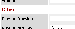
SortProperty |
Specifes a property to be used for categorization of attributes. This will sort the fields into categories with the property value as header. Attributes that do not have the specified property, will be given the header "Other". |
Zero or One |
|
SortOrderConfig |
Adds a reference to a formsortconfig. See this chapter for more info. |
Zero or One |
|
FocusAttribute |
Specifies the attribute field to focus on form load in edit mode |
Zero or One |
|
RetainUnsaved |
Specifies if the unsaved dynamic attribute modifications have to be retained when type is changed while editing |
Zero or One |
|
HiddenInterfaceHeader |
Specifies the interface name for which the header should be hidden. |
Zero or One |
|
ClassificationField
The ClassificationField can be used to display or edit a Library Central classification. Enovia Library Central is required for this field to work.
Each classification field defines one or more libraries to find classifications either by navigating the library hierarchy and/or by typing the classification name with auto-completion support.
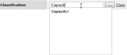
The classification field could link to a dynamic attribute field to dynamically display classification specific attributes.
This field supports autocomplete.
<ClassificationField>
    <LinkWith>MyClassDynaAttrField</LinkWith>
    <Library>
        <Type>type_PartLibrary</Type>
        <Name>Engineering 1</Name>
        <Revision>-</Revision>
    </Library>
    <Library>
        <Type>type_PartLibrary</Type>
        <Name>Engineering 2</Name>
        <Revision>-</Revision>
    </Library>
</ClassificationField>
...
<DynamicAttributesField>
    <Name>MyClassDynaAttrField</Name>
</DynamicAttributesField>
<ClassificationField>
    <LibraryLoader>inquiry:tvc:inquiry:tvx:lbc/GeneralLibrary.xml</LibraryLoader>
</ClassificationField>
These are the sub-elements that are specific to a ClassificationField element:
| Element Name | Description | Cardinality | Example |
|---|---|---|---|
Library |
Libraries can be loaded in two ways. Either by specifying one or more libraries by their Type, Name and Revision or by using a loader. Only one of the two ways can be used for a ClassificationField. |
One or More |
|
LibraryLoader |
A loader specifies a Java class or an Inquiry that is responsible for loading the libraries. A Java class must extend:
|
One |
or
|
ChooserPageConfig |
Page config to be used when the chooser is launched. |
One |
|
DisplayExpression |
Select expression to be applied on Classification for display instead of default behavior of showing name. |
One |
|
PersonField
The PersonField can be used in cases where attributes or basics should be populated with one or multiple person names, separated with a given character. This field supports autocomplete.
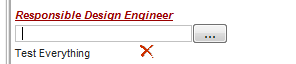
The user can choose users by typing their names, or by using a popup chooser. Results can be limited by role/group. Selecting multiple persons is possible if enabled, in which case the names are added beneath the text field.
<PersonField>
    <MapsTo>attribute_ResponsibleDesignEngineer</MapsTo>
    <!-- Optional Settings -->
    <Setting name="pageConfig" value="tvc:pageconfig:sb:search/FindPersonPageConfig.xml"/>
    <Setting name="role" value="role_DesignEngineer|role_AnotherRole"/>
    <Setting name="selection" value="multiple"/>
    <Setting name="separator" value="|"/>
</PersonField>
These are the sub-elements that are specific to a PersonField element:
| Element Name | Description | Cardinality | Example |
|---|---|---|---|
MapsTo |
Specifies an expression describing either an attribute or a basic value, such as description. |
One Required |
|
Setting (pageConfig) |
Specifies a page configuration to use in place of the default one. |
Zero or One |
|
Setting (role) |
Specifies one or multiple roles separated by a pipe (|) character. Only users having any one of the specified roles will be choosable. |
Zero or One |
|
Setting (assignment) |
Specifies one or multiple assignments (role/group) separated by a pipe (|). Only persons having any one of the specified assignments will be choosable. This setting will take precedence if both assignment and role settings are present. |
Zero or One |
|
Setting (selection) |
Specifies if single or multiple users should be choosable. Default is single. |
Zero or One |
|
Setting (separator) |
Specifies the separator to use on the attribute or basic to separate the person names. Default is pipe (|). |
Zero or One |
|
GeoLocationField
A GeoLocationField can be used to store the location of the user at the time when the form is committed, for example when creating an issue. This field is an extension of the regular Field that is used for attributes and basics. As such, it needs a MapsTo element in order to know where to store the longitude and latitude values.
This field is never shown in the user interface, it is always hidden.
<GeoLocationField>
    <MapsTo>attribute_TVXGeoLocation</MapsTo>
</GeoLocationField >
MultiSelectField
A field can be configured to display range values in a list where multiple values can be selected and stored on a regular attribute, separated by a specified character.
This can be achieved by configuring a regular field with the following settings:
<Field>
    <MapsTo>attribute_MyAttribute</MapsTo>
    <MultiSelect>true</MultiSelect>
    <RangeLoader>dataset:tvc:dataset:tvx:enc/Organizations.xml</RangeLoader>
    <RangeDisplay><![CDATA[$<name>,$<current>]]></RangeDisplay>
    <RangeSaveValue><![CDATA[$<name>]]></RangeSaveValue>
    <RangeSeparator>|</RangeSeparator>
</Field>
This example loads range using a dataset that finds Organizations in the database, formats the display value in the select list to show the name and current state. Finally, it is configured to save the selected values with the name of the object, separated by |. The result looks like this:
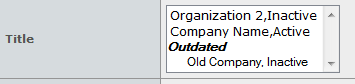
| Should a value exist in the current value of the attribute that is no longer loaded by the range loader, it will be put in a separate section in the select list called "Outdated". These values are still selectable, but if they are deselected and the form is submitted, they won’t appear the next time the object is edited. |
SelectField
In cases where there is a need to display values that are not present on the object that is currently viewed (or relationship), there is the option to use a select field. This type of field can use an expression that is evaluated against the context object to display information.
<SelectField>
    <Label>Related EBOM description</Label>
    <Expression><![CDATA[from[$<relationship_EBOM>].to.description]]></Expression>
</SelectField>
These are the sub-elements that are specific to a SelectField element:
| Element Name | Description | Cardinality | Example |
|---|---|---|---|
Expression |
Specifies an expression that will be evaluated against the context object. |
One Required |
|
| this field type can only be used to view information, not edit it! |
Other Fields
The regular Field element is used for attributes and basics.
<Field>
    <Label>Description</Label>
    <MapsTo>description</MapsTo>
    <Required>true</Required>
    <Multiline>true</Multiline>
    <ClearEnabled>true</ClearEnabled>
    <Validation>
        <MinChars>10</MinChars>
    </Validation>
</Field>
<Field>
    <Label>Unit of Measure</Label>
    <MapsTo>attribute_UnitofMeasure</MapsTo>
    <Required>true</Required>
    <Validation>
    <InvalidValue>Please Select</InvalidValue>
    </Validation>
</Field>
<Field usesBusinessObject="false">
    <Label>Quantity</Label>
    <MapsTo>attribute_Quantity</MapsTo>
</Field>
<Field fromInterface="true">
    <Label>Size</Label>
    <MapsTo>attribute_Size</MapsTo>
</Field>
These fields use the MapsTo element to specify an attribute or a basic. If the field should apply to a relationship attribute, the optional attribute "usesBusinessObject" needs to be set to false.
If the field applies to attribute attached via interface, the optional attribute "fromInterface" should be set to "true"
Autocomplete is supported for attributes with ranges. It can either be an attribute with ranges or ranges loaded with a rangeloader.
These are the sub-elements that are specific to a Field element:
| Element Name | Description | Cardinality | Example |
|---|---|---|---|
MapsTo |
Specifies an expression describing either an attribute or a basic value, such as description. |
One Required |
|
Multiline |
Specifies if the field is shown as a multiline text input |
Zero or One |
|
MultiSelect |
Specifies if multiple values should be selectable in the field. Note: This can be used in conjunction with the Size element, to configure how many rows to show. |
Zero or One |
|
ChooserURL |
This element will generate a chooser button that will open up the specified URL in a popup window. The field id will be passed as a parameter to this page, allowing for a customized chooser that can update the field with a chosen value. Width and height of the popup can also be set. |
Zero or One |
|
Columns |
Specifies the number of columns in a multiline text input. The default is 26. |
Zero or One |
|
Rows |
Specifies the number of rows in a multiline text input. The default is 7. |
Zero or One |
|
RichText |
If needed, a field can be rendered in a rich text editing mode, enabling more advanced formatting of the input text. Please note that the data being saved in this type of fields will contain formatting information. |
Zero or One |
|
Size |
Specifies the size (in number of characters) of the field. Should the attribute contain ranges, and thus being rendered as a select list, this setting specifies the number of rows to show simultaneously in that select list. |
Zero or One |
|
Fields that have the rich text feature enabled also support some additional settings to control which features that are enabled in the toolbar. These settings are then used by Tiny MCE editor, which is used to render the field. Here is the default layout if no settings are used:
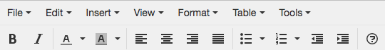
Example for hiding the first row, changing the available buttons on the second row and reducing the editor height:
<Field>
    <Label>Description</Label>
    <MapsTo>description</MapsTo>
    <RichText>true</RichText>
    <Setting name="tmce_menubar" value="" />
    <Setting name="tmce_toolbar" value="bold italic" />
    <Setting name="tmce_height" value="200" />
</Field>| All setting names have to start with the prefix "tmce_" followed by the TinyMCE setting name |
This configuration will change the layout into this:
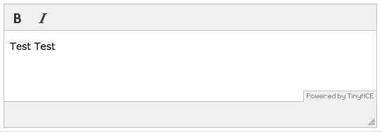
For available value settings, see this page:
Note: Certain features that are present in the normal HTML fields like traversing in/out or within the editor using the 'Tab' key are not applicable for the Tiny MCE Editor.
1.6. Custom fields
If none of the existing field types are sufficient, it is also possible to write your own custom fields, or extending any of the existing ones; this is described in detail in the developer documentation.
1.7. Manual Sorting of Dynamic Attributes
In some cases, there is the need to sort the dynamic attributes that are added to the form using the DynamicAttributesField. This is supported by specifying a separate resource type called "formsortconfig". By adding a reference to this resource type in a DynamicAttributesField, the attributes loaded will be sorted according to the specified sorting resource:
<DynamicAttributesField>
    ...
    <SortOrderConfig ref="tvc:formsortconfig/MySorting.xml" />
    ...
</DynamicAttributesField>
The sorting order itself is defined in the XML file being referenced. The format allows for sorting attributes for certain types or classifications differently. For example, if choosing the type "Screw Part" in a form, the attributes should be sorted differently than when choosing the type "Bolt Part". The XML is structured so that each specified type or classification contains its own sort order. In addition, it is also possible to specify if a certain attribute is required or not. Here is an example:
<FormSort>
<Type name="type_SoftwarePart">
<Attribute>attribute_Title</Attribute>
<Attribute>attribute_IsVersion</Attribute>
<Attribute>attribute_CurrentVersion</Attribute>
<Attribute required="true">attribute_Weight</Attribute>
<Attribute>attribute_TargetCost</Attribute>
<Attribute required="true">attribute_MaterialCategory</Attribute>
</Type>
<Type name="type_ScrewPart">
<Attribute>attribute_Height</Attribute>
<Attribute required="true">attribute_Weight</Attribute>
<Attribute required="true">attribute_Length</Attribute>
<Attribute required="true">attribute_EndItem</Attribute>
</Type>
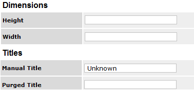
</FormSort>If the sorting is to be done on classifications (In cases where the DynamicAttributesField is linked to a ClassificationField), the sort XML should use the Classification element instead of the Type element:
<FormSort>
    <Classification name="Part Family01">
        <Attribute>attribute_Attr3</Attribute>
        <Attribute>attribute_Attr1</Attribute>
        <Attribute>attribute_Attr2</Attribute>
    </Classification>

    <Classification name="Part Family02">
        <Attribute>Height</Attribute>
        <Attribute required="true">Length</Attribute>
        <Attribute>Width</Attribute>
    </Classification>
</FormSort>
1.8. Validation Element
In certain cases, some additional validation logic is needed. The Validation element supports a few basic scenarios (Note: There is also the possibility of Global Validation. See this chapter for more info), as well as the option to write your own java validation logic.
These are the sub-elements that can be used in a Validation element:
| Element Name | Description | Cardinality | Example |
|---|---|---|---|
MinChars |
Specifies that a minimum number of characters must be used. |
Zero or One |
|
MaxChars |
Specifies the maximum number of characters. |
Zero or One |
|
InvalidValue |
Specifies that one particular sequence of characters is invalid |
Zero or More |
|
InvalidChars |
Specifies one or more invalid characters . |
Zero or One |
|
Java |
Specifies one or more java classes that contain custom validation logic. These classes must implement the interface com.technia.tvc.structurebrowser .form.model.ValidationHandler |
Zero or More |
|
JSFunction |
This element specifies a reference to a javascript function that will be executed upon form submittal. The function itself needs to be included in a javascript resource (See this chapter for more info). The function needs to receive one parameter, which will be the id of the field being validated. It should return true or false to control if field is valid or not. Returning false will block submittal of the form. |
Zero or More |
Example of a function: |
These sub-elements can also be combined. For example:
<Validation>
    <MinChars>3</MinChars>
    <MaxChars>25</MaxChars>
    <InvalidValue>test</InvalidValue>
    <Java>com.technia.acme.MyValidation</Java>
</Validation>
1.9. Include Element
All field elements can also be defined in separate XML resources. This allows for fields to be reused in several forms. Including an external field in a form is done by using the Include element:
<Include ref="tvc:formfield:tvx:enc/RevisionField.xml"/>
A referred field xml can contain only one field. Below is an example of the above referred RevisionField.xml:
<?xml version="1.0" encoding="UTF-8"?>
<RevisionField>
    <Label>Revision</Label>
    <Required>true</Required>
    <DefaultValue>1</DefaultValue>
</RevisionField>
1.10. Templates
Create Forms have built-in functionality for users to save templates of forms to be used again later on.
Below is a screenshot of the template manager being used to save and load a template to create 2 objects with the same input:
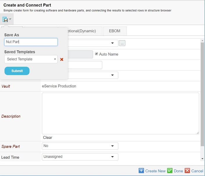
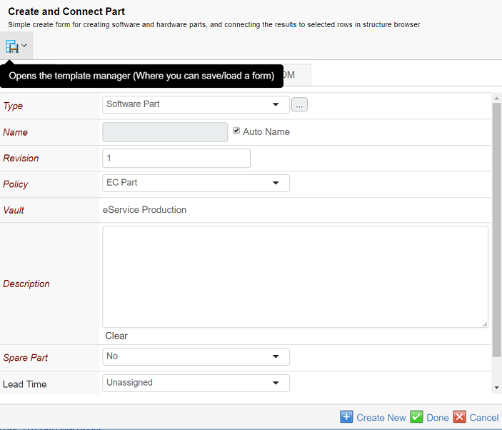
Please note that the templates that are saved on one form can only be loaded on the same form type. Templates are also saved per user, meaning they cannot be shared by multiple users. Templates are currently available on forms in Create and Edit mode.
Templates can be enabled/disabled on individual forms using a configuration:
<Form>
    ...
    <AllowTemplates>false</AllowTemplates>
    ...
</Form>
By default, templates are enabled. By default hidden, read-only, locked form fields are not saved in template.
<Form>
    ...
    <!-- Advance configuration. Default values for the attributes are "false" -->
    <AllowTemplates hidden="true" locked="true" readonly="true">true</AllowTemplates>
    ...
</Form>
They can also be disabled globally for all forms using a system parameter in the web.xml:
<init-param>
    <param-name>tvc.structurebrowser.form.allowTemplates</param-name>
    <param-value>false</param-value>
</init-param>

<init-param>
    <param-name>tvc.structurebrowser.form.template.saveReadonly</param-name>
    <param-value>true</param-value>
</init-param>

<init-param>
    <param-name>tvc.structurebrowser.form.template.saveHidden</param-name>
    <param-value>true</param-value>
</init-param>

<init-param>
    <param-name>tvc.structurebrowser.form.template.saveLocked</param-name>
    <param-value>true</param-value>
</init-param>
Apart from Form level configuration individual form field can be enabled/disabled to participate in template using a configuration:
<Form>
    ...
    <Field>
        ...
        <Templatable>false</Templatable>
        ...
    </Field>
    ...
</Form>
1.11. Rendering modes
Forms have 3 different rendering modes available. Depending on where forms are used, they can be displayed differently. The definition of the form is the same for all 3 rendering modes, so no change needs to be done to render a form in a different mode. To control which mode is used, a parameter called "renderMode" should be added to the command launching the form. The 3 possible values for this parameter are:
-
sidepanel
-
content
-
dialog
Setting this parameter will enable the corresponding rendering mode.
1.11.1. Sidepanel Mode
If forms are being launched from a table page, they can be displayed in either a popup, or a sidepanel. This is determined by the "Target Location" setting on the command (Values "card" or "popup"). However, the "renderMode" parameter is also needed to change the display of the form itself into something better adapted to a sidepanel view.
<Command>
    <Label>Create/Connect Part(Sidepanel)</Label>
    <URL action="initForm" submit="true">
        <Param name="formName" value="tvc:form:tvx:enc/CreateConnectPart.xml"/>
        <Param name="renderMode" value="sidepanel"/>
    </URL>
    <TargetLocation>card</TargetLocation>
    <!-- <CardWidth>800</CardWidth> -->
    <RowSelectType>multiple</RowSelectType>
</Command>
Column Type
When a form is displayed in the sidepanel, the tabs are exchanged for accordion sections. Since sidepanels are more vertically oriented, this approach suits the interface better. The form definition remains the same however, using Tab elements to organize the sections of the form.
1.11.2. Content Mode
This is used when the parameter "renderMode" is set to "content". This renders the form with tabs, and if allowed, with an edit/view icon which makes it possible for the user to switch between edit and view mode. If the form configuration contains a menu definition, this is shown in this rendering mode. Mostly useful for object details pages.
1.12. Column Type
A new column type, formlink, has been added, which will launch a form for the object in that row, either in sidepanel or as a popup:
To use this column, apply the following setting to the table column:
| Column Type | Formlink |
|---|---|
Setting |
The settings element is used to determine which form should be used, and also which form is used for which object type. The name of the setting specifies the object type, while the value points to the form: Name: Value: For example:
|
Example, points to different form configurations for Part and Document objects:
<Column>
    <ColumnType>formlink</ColumnType>
    <Setting name="form:type_Part" value="tvc:form:tvx:enc/EditPart.xml"/>
    <Setting name="form:type_Documents" value="tvc:form:tvx:enc/EditDocument.xml"/>
    <Setting name="allowEdit" value="true"/>
    <TargetLocation>card</TargetLocation>
    <Fixed>true</Fixed>
</Column>
1.13. Reserve On Edit
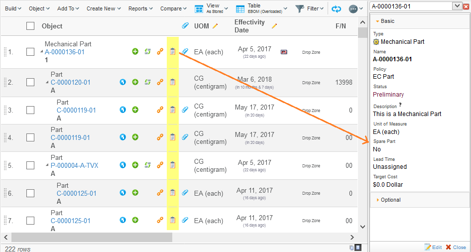
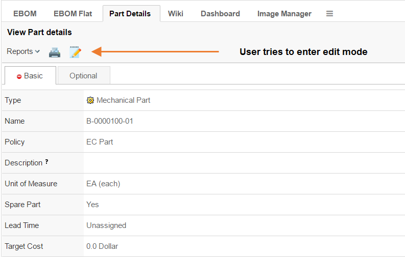
In some cases, it might be useful to have the possibility to prevent objects to be edited at the same time by different users in the system. In Create/Edit forms there is an option to lock/reserve objects while a user is in edit mode.
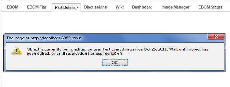
If a user tries to enter edit mode while the same object is being edited by another user, a message will be shown, and the edit mode will be locked until the other user is done editing, or the expiration time has expired. By default, the expiration time is 10 minutes, but this can be configured.
This feature can be enabled globally, making it so that all edit forms will reserve objects while being edited. Or it can be enabled for specific form configurations only(In this case, please see this chapter for more details on configuration elements).
Enabling this feature globally is done by adding the following init parameter:
<init-param>
    <param-name>tvc.structurebrowser.form.reserveOnEditEnabled</param-name>
    <param-value>TRUE</param-value>
</init-param>
If needed, it is also possible to specify the comment and expiration time. This can be specified using the format "w(weeks) d(days) h(hours) m(minutes) s(seconds)" :
<init-param>
    <param-name>tvc.structurebrowser.form.reserveOnEditComment</param-name>
    <param-value>Please wait for edit to finish...</param-value>
</init-param>
<init-param>
<param-name>tvc.structurebrowser.form.reserveOnEditExpiration</param-name>
<param-value>1h 20m 10s</param-value>
</init-param>1.14. Create New
The Create New button present in forms, allows the user to create an object and keep the form open to create another object instantly. When the user clicks on "Create New" button, the form will be submitted, an object will be created, the user will be notified of the new object and the form will remain open for creation of another object. If the user wishes not to create another object, the user can simply submit the form as the user used to previously by using the "Submit/Done" button. This feature is available in both sidepanel and dialog mode.
The Create New button inclusive with forms can as of 2018.6.0 release be configured. The configuration can be global or local for a specific form. Local form configuration will take precedence over the global default.
1.14.2. Global Configuration
The global setting will control if the button should be included by default and is used for all forms without local configuration. The global default is configured using system parameter (web.xml or tvc.properties). Read more on system configuration here.
Setting Name
tvc.structurebrowser.form.showCreateNew
tvc.properties
tvc.structurebrowser.form.showCreateNew = true (default is false)
Web.xml
<init-param>
    <param-name>tvc.structurebrowser.form.showCreateNew</param-name>
    <param-value>true</param-value>
</init-param>
1.14.3. Local Configuration
For specific forms, The Create New button can be controlled by a request parameter.
Param Name
showCreateNew
Example:
<Command>
    <Label>Create/Connect Part(Sidepanel)</Label>
    <URL action="initForm" submit="true" target="card">
        <Param name="formName" value="tvc:form:tvx:enc/CreateConnectPart.xml" />
        <Param name="renderMode" value="sidepanel" />
        <Param name="showCreateNew" value="true" />
    </URL>
</Command>
Note: This feature has certain limitations. The create new feature is not functional in Tiled, Tiled-2, Hierarchy and Flipped views for any particular table.
1.15. Global Validation
Form validation can be performed on a global level as well, not only related to a specific field. This can be useful in cases where fields are dependent on each other. This type of validation is performed upon submittal of the form, and the result can be one of the following types:
-
Warning: Displays a warning message to the user, but still commits the form when clicking ok.
-
Error: Displays an error message to the user, and blocks submittal of the form
-
Confirm: Displays a message to the user, and provides "Ok" and "Cancel" buttons, letting the user decide if the form should be submitted or not
To use this, add an element called "GlobalValidation" to the form configuration. There are 3 possibilities to configure this:
-
As a predefined warning message:
<GlobalValidation>warning:Don’t forget to add adocument!</GlobalValidation> -
As a predefined confirm message:
<GlobalValidation>confirm:Are you sure about this?</GlobalValidation> -
But the most common case is probably where the values of some fields need to be checked to determine if the form submission should be accepted or not. In these cases, a java class needs to be implemented to contain this logic, and the form configuration points out the java class:
<GlobalValidation>java:com.acme.validation.MyValidation</GlobalValidation>The java class to be used for validation needs to implement the interface
com.technia.tvc.structurebrowser.form.model.GlobalValidation. The method validate will retrieve the whole form as input, so that it is possible to retrieve and check values of any field. The return object from this method decides if the validation results in a warning, an error, or a confirm message.The following is a short example that checks if the selected type in a form is of a certain type:
package com.technia.tvc.structurebrowser.form.examples;

import com.technia.tvc.structurebrowser.form.exception.FormException;
import com.technia.tvc.structurebrowser.form.model.Field;
import com.technia.tvc.structurebrowser.form.model.Form;
import com.technia.tvc.structurebrowser.form.model.GlobalValidation;
import com.technia.tvc.structurebrowser.form.model.Response;
import com.technia.tvc.commons.lang.StringUtils;

/**
 * This is an example of a global validation that checks if the selected
 * type in a form is Screw Part. If it is not, a reponse of the type Confirm
 * is returned, resulting in the user having to confirm that the form should be
 * submitted anyway.
 */
public class TypeIsScrewPartConfirmMessage implements GlobalValidation {
    public Response validate(Form form) throws FormException {
        String type = form.getTypeFieldValue();
        if (!StringUtils.equalsIgnoreCase(type, "Screw Part")) {
            return Response.newConfirm("You didn't select a screw, is this correct? Submit form anyway?");
        }
        return null;
    }
}
-
2. Helium form for Global Create
Helium forms in addition to structure browser forms can be used to create business objects. To serve this purpose a new tvc action is created which will embed helium form in a widget through helium’s widget routing. The widget is configured as XML document and is provided as a request parameter to the tvc action. This widget configuration contains reference to helium form configuration.
2.1. Schema Changes
To use helium form, command’s href should point to new tvc action which accepts the widget configuration as a request parameter. Existing OOTB command can be modified or new command can be added to the OOTB toolbar or action menu.
The command to change href is shown below:
mod command <ExistingCreateCommand> href '${ROOT_DIR}/tvc-action/externalForm/foo.jsp?widgetConfigName=/hex/common/CreatePart';
2.2. Widget Configuration
Helium’s widget routing looks for config file inside widget folder, hence widget cofiguration file CreatePart.xml must be placed inside widget folder. For e.g. in this case inside /hex/common/widget/
<?xml version="1.0" encoding="UTF-8"?>
<Widget xmlns="http://technia.com/helium/Widget">
    <Title>Create Part</Title>
    <OnInit>App.external.createNew</OnInit>
    <OnInitOption name="formConfigName" value="tvc:form:hex:common/CreatePart.xml" />
</Widget>
Above configuration supports the following parameters:
| Name | Description | Example |
|---|---|---|
Title |
Form title. |
|
OnInit |
Javascript function that creates the form. |
|
OnInitOption |
Additional options that is to be passed to the OnInit function. |
|
|
You can find more info related to helium form configuration in helium documentation. |
|
Helium form can be opened as popup or slide in using OOTB setting Target Location. |
3. Helium Form in Classic (Create/Connect - Sidepanel)
Helium forms in addition to structure browser forms can be used to create and connect business objects. To serve this purpose a new tvc action is created which will embed helium form in a widget through helium’s widget routing. The widget is configured as XML document and is provided as a request parameter to the tvc action. This widget configuration contains reference to helium form configuration.
|
This functionality exists only for sidepanel mode (for now) and new object can be connected to only one object. |
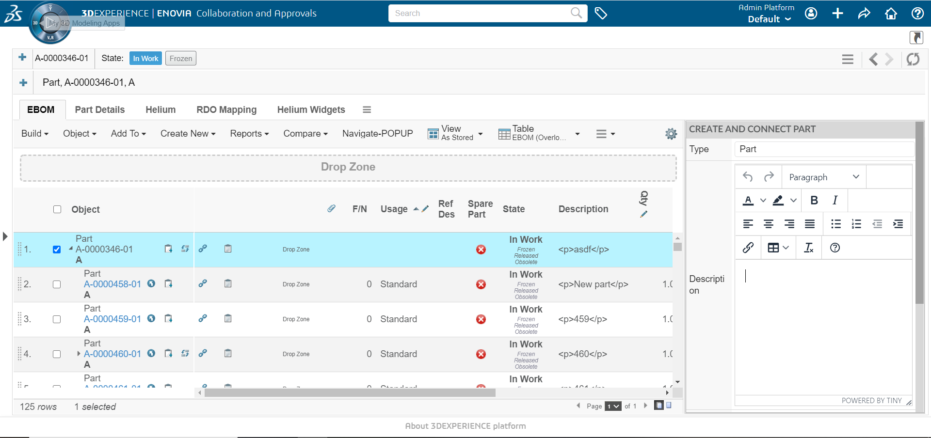
3.1. Command
To use helium form, a command needs to be created to initialize it.
The URL for such a command is shown below:
${ROOT_DIR}/tvc-action/initExternalForm
This URL supports the following parameters:
| Parameter | Description | Example |
|---|---|---|
widgetConfigName |
This parameter should define the XML based resource for helium widget, which contains XML based helium form configuration. This parameter is mandatory. |
tvc:form:tvx:enc/CreateConnectPart.xml |
renderMode |
This parameter controls which rendering type will be used. For now, only rendering in sidepanel is supported. |
sidepanel |
An example command, defined in XML, is shown below:
<Command>
    <Label>Create/Connect Part External(Sidepanel)</Label>
    <URL action="initExternalForm" submit="true" target="card">
        <Param name="widgetConfigName" value="hex:common/CreateConnectPart" />
        <Param name="renderMode" value="sidepanel" />
    </URL>
    <CardWidth>400</CardWidth>
    <RowSelectType>single</RowSelectType>
</Command>|
Notice the param value for widgetConfigName. Helium looks for config file inside |
3.2. Widget Configuration
An example command for widget configuration, defined in XML, is shown below:
<?xml version="1.0" encoding="UTF-8"?>
<Widget xmlns="http://technia.com/helium/Widget">
    <Title>Create and Connect Part</Title>
    <OnInit>App.external.createAndConnect</OnInit>
    <OnInitOption name="formConfigName" value="tvc:form:helium/CreateConnectPart.xml" />
</Widget>
Above configuration supports the following parameters:
| Name | Description | Example |
|---|---|---|
Title |
Form title. |
|
OnInit |
Javascript function that creates the form. |
|
OnInitOption |
Additional options that is to be passed to the OnInit function. |
|
|
You can find more info related to helium form configuration in helium documentation. |