Structure Browser - Administration Guide : Configuration
21 March 2016
1. Configuring the Structure Browser
This chapter contains information on how to configure different aspects of the Structure Browser.
1.1. Configuring the Structure Browser
There are many ways to configure how the Structure Browser appears on a web page. For instance, which views should be available and for each view which system tables and filters should be available. Moreover, what information should be displayed in a table, and in what way it should be displayed. Other configuration possibilities include page header and sub header, which buttons should be visible, toolbar, etc.
The diagram below illustrates the configuration possibilities in the Structure Browser.

At the top level, you have a link or command in the ENOVIA application that launches the Structure Browser. In such link/command you specify the page configuration object to be used (or you can use URL parameters instead, or to overload some parameter in the used page configuration object).
The page configuration defines:
-
Which views that should be available
-
Which buttons / choosers that should be available. For example:
-
Toggle Edit button
-
Table Chooser
-
Filter Chooser
-
…
-
-
Which toolbar and context menu should be available
-
Note: This can be overridden per view also. E.g. changing view can also result in that the toolbar and/or context menu is changed.
-
A view defines:
-
Which tables that should be available
-
In case you use the Structure Browser for navigation of structures, you also specify how to expand the structure via the expand mode setting.
-
Often, you will use filters that defines how to expand the structure
-
In more advanced situations, you can use a custom "Expander", implemented in Java or as a JPO to perform the expansion. It is also possible to use an Inquiry to expand a structure.
-
-
How to display the data (Display Mode)
-
Toolbar / Context Menu
| When you create new administrative objects (e.g., commands, menus, system tables, types, attributes) you should not prefix their names with the letters TVC as that might cause naming conflicts upon upgrading to a newer version. |
| All configuration objects such as system-tables, views, page-configurations, filters etc can either be defined in XML files and stored in the web-application directory, or be defined in the database. It is also possible to mix these two approaches. TECHNIA however recommend storing them as XML files as this will greatly improve and fasten the speed of development as you do not need to manage scripts that updates the database. |
1.1.1. Using the Examples
The database schema for the Structure Browser component includes examples on Views, System Tables, Filters and Toolbars (Menus and Commands that utilize the built-in connect and disconnect functions), etc that you can use in combination with this guide when learning how to configure the Structure Browser. For example, the System Table "TVC EBOM" is an example of how to create a System Table that displays information available in an EBOM structure. However, you should not use these examples in a production environment as they may be modified or removed upon installing future releases of TVC. If you want to use an example in a production environment you should instead create a clone of the example and use the clone in the production environment.
1.2. Page Configuration Objects
A page configuration object acts as a container for common URL parameters that you can use to configure the look and feel of the Structure Browser page, hence this feature supplies an alternative way to configure the Structure Browser. Note that if you use this feature you will still have to configure some parameters on the URL as a page configuration object only supports the common URL parameters described in this section. For instance, you will still have to configure the URL parameter that points to the page configuration object that you intend to use.
${ROOT_DIR}/tvc-action/navigate?pageConfig=My Config
The page configuration object format is described here .
1.2.1. Custom Parameters
Different use cases with the Structure Browser requires passing additional parameters,
these are typically defined within the <Parameters> section of the page configuration
instance OR defined as request parameters on the command/HREF that launches the Structure
Browser instance.
Example:
<PageConfig>
    ...
    <Parameters>
		<Parameter name="structureGUI" value="caret" />
		<Parameter name="evaluateExpandableNodes" value="true" />
		<Parameter name="persistentExpandState" value="true" />
		<Parameter name="navigationColumn" value="true" />
		<Parameter name="rearrange:column" value="FN" />
		<Parameter name="arrowKeyNavigation" value="true" />
		<Parameter name="portalMode" value="true" />
		<Parameter name="tableRenderer" value="com.technia.tvx.enc.render.EBOMTableRenderer" />
		<Parameter name="drag:enabled" value="true" />
		<Parameter name="drop:enabled" value="true" />
		<Parameter name="sidePanelMaximizeRealEstate" value="true" />
		<Parameter name="connection:type_Part:type_Part"value="relationship_EBOM,from,insert,Preliminary|Review|Create|Peer Review" />
		<Parameter name="connection:type_ECO:type_Part" value="relationship_AffectedItem,to,refreshrow" />
		<Parameter name="connection:type_ECR:type_Part" value="relationship_AffectedItem,to,refreshrow" />
		<Parameter name="connection:type_DOCUMENTS:type_Part" value="relationship_PartSpecification,from,insert" />
		<Parameter name="rearrange:column" value="FN" />
		<Parameter name="rearrange:dropenabled" value="false" />
		<Parameter name="renderTableRowActionsCombined" value="false" />
		<Parameter name="inCellEdit" value="true" />
		<Parameter name="finder" value="true" />
		<Parameter name="finder:openOnLoad" value="false" />
		<Parameter name="expand:selectionMaxLimit" value="5" />
		<Parameter name="entryProcessor" value="com.technia.tvx.enc.hierarchy.KindEntryProcessor" />
	</Parameters>
If you provide a parameter within the request that initiated the Structure Browser instance, such parameter will have precedence over any parameter defined within the page configuration instance.
Example:
${ROOT_DIR}/tvc-action/navigate?pageConfig=tvc:pageconfig/MyPageConfig.xml&structureGUI=default
                                                                          ^^^^^^^^^^^^^^^^^^^^^
Portal Mode
The portalMode can be set to true if we want to remove the headers. It also adds an icon on the toolbar which opens current table in a popup window. It can be defined as below:-
<Parameter name="portalMode" value="true" />Default is false.
The below images show result when portal mode is enabled and disabled.
Figure 2. portalMode is true
Figure 3. portalMode is false
1.3. Views
A view defines what data to present for the objects and connections (unless a flat list of object is displayed) by defining the available and default table to apply, but also how to expand the structure (if a structure is being shown). The most common way to expand a structure is through using so called filters, which for example defines the relationship types to follow and the direction of expansion.
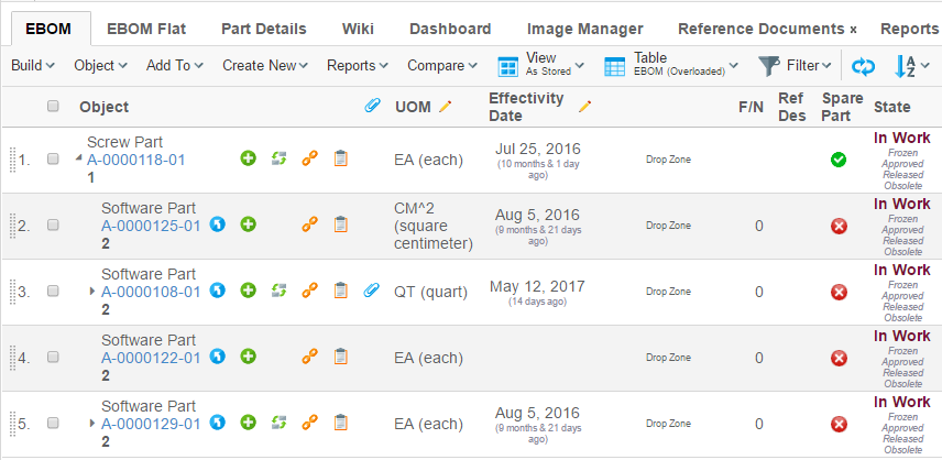
Figure 4. Structure Browser in action
Views used by the Structure Browser are defined either in an XML file or as a business object instances of the type "TVC View". The structure browser instance can be configured to use one or more views, which the user can choose from.
1.3.1. Display Mode
As of TVC release 2010.2, a new configuration parameter was added on the View called "Display Mode". With this parameter, you will be able to configure how the data should be rendered when the view is selected.
By default, a Structure Browser page is displayed as a traditional table with columns.
An alternative display mode has been added as of 2010.2 called "tiled mode", were the objects are displayed in tiled format; for further details regarding this display mode please look at this chapter.
The goal is to provide additional built-in display modes in coming releases, as well as allowing specifying custom display modes to be used.
1.3.2. Expand Mode
As of TVC release 2009.1, you can per view define how to expand a structure. The most common way to expand structures in TVC has been by using so called filters that define how the structure is being expanded.
Other possibilities, like expanding using a JPO or writing a custom StructureBean that implements the expand logic has also been possible. The drawback with that approach has been that you weren’t able to easily mix the expand modes used within the same Structure Browser instance.
The different expand modes to choose from will be presented in the coming chapters.
Moreover, you will be able to decide per view how the filter chooser should behave e.g. if to allow combining multiple filters, or just select a single filter, or not being able to select any filter at all.
Configuration
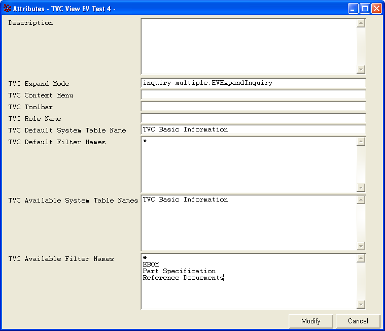
A new attribute has been added to the type: "TVC View". This attribute is called "TVC Expand Mode" and is a string attribute. Exactly what this attribute can contain is described later.
The format of the attribute is:
<mode>:[arguments]
The mode value is a case insensitive string. Some expand modes requires arguments and these are added after the mode value with a colon (':') character as separator. Possible modes are:
| Mode | Arguments | Notes |
|---|---|---|
filter |
No |
Default expand mode, e.g. expansions made with standard ENOVIA filters. |
java |
Required (name of Java class) |
Java class defines expansion logic. |
inquiry |
Required (name of Inquiry) |
Uses an inquiry to perform the expansion |
shadow |
Required (at least list of shadow types) |
This is an extension to the "filter" mode, which allows defining types and/or relationships that are considered as being "shadow" (for example: Feature List objects). |
jpo |
Required (JPO name + method) |
Uses a JPO to perform the expansion. |
The "filter" and "shadow" modes uses standard ENOVIA filters to perform the expansion. The other modes might use filters, but aren’t required to use it. However, the standard filter-chooser can be made visible for all modes; hence the filter chooser could be used to give input to an expander even though the selected value isn’t a "real" ENOVIA filter. This is referred to as using virtual filters. In case virtual filters are used, the Role value in the View configuration should be empty.
To configure how the filter-chooser should behave, each mode can have a couple of variants. These variants are shown in the table below:
| Mode | Variants | Notes |
|---|---|---|
filter |
Same as defining "filter-multiple" |
|
filter-multiple |
Allows selecting multiple filters |
|
filter-single |
Allows only one selected filter |
|
filter-fixed |
Filter chooser is invisible |
|
inquiry |
Same as defining "inquiry-fixed" |
|
inquiry-multiple |
Allows selecting multiple filters |
|
inquiry-single |
Allows only one selected filter |
|
inquiry-fixed |
Filter chooser is invisible |
|
shadow |
Same as defining "shadow-multiple" |
|
shadow-multiple |
Allows selecting multiple filters |
|
shadow-single |
Allows only one selected filter |
|
shadow-fixed |
Filter chooser is invisible |
|
jpo |
Same as defining "jpo-fixed" |
|
jpo-multiple |
Allows selecting multiple filters |
|
jpo-single |
Allows only one selected filter |
|
jpo-fixed |
Filter chooser is invisible |
|
java |
Java mode has no variants since the Java class defines filter mode. |
Expand Mode: Java
This expand mode requires the class name of the expander class as argument. See example below:
java:com.acme.expand.MyExpander
The class must either implement the interface
com.technia.tvc.structure.Expander or extend from the base class
com.technia.tvc.structure.expand.AbstractExpander. The latter is
preferred. See code example below:
import com.technia.tvc.core.TVCException;
import com.technia.tvc.core.structure.Expander;
import com.technia.tvc.core.structure.ExpanderBasedStructureBean;
import com.technia.tvc.core.structure.StructureBeanNode;

public class MyExpander implements Expander {

    // Performs the expansion
    public void expandNode(ExpandCtx ctx,
                           StructureBeanNode node,
                           int levels) throws TVCException {
        ...
        StructureBeanNode child = ctx.newStructureNode(relId, objectId, true);
        node.addChild(child);
        ...
    }

    // Returns the filter mode.
    public FilterMode getFilterMode(ExpanderBasedStructureBean str) {
        return Expander.COMBINABLE;
    }

    // Returns whether or not full-expand is supported
    public boolean isFullExpandSupported(ExpanderBasedStructureBean str) {
        return true;
    }

    // Returns whether or not multi-level-expand is supported (> 1)
    public boolean isMultiLevelExpandSupported(ExpanderBasedStructureBean str) {
        return true;
    }

    // Collapses the node
    public void collapseNode(ExpandCtx ctx, StructureBeanNode node) {
        node.removeChildNodes(true);
    }
}| Use instance variables with care, as one expander instance is only created once and thus is shared between all users. |
In order to support Search in Structure/Finder the expander must handle full expands properly.
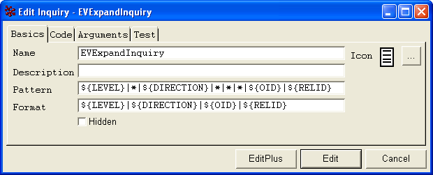
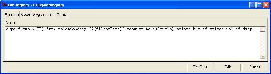
Expand Mode: Inquiry
This expand mode requires the name of the inquiry to use. See example below:
inquiry:My Inquiry
By default, the filter selector is not shown, unless specified through the variant suffix (inquiry-single or inquiry-multiple).
If the filter chooser is enabled, the values defined in the "TVC View" instance are interpreted as virtual filters and the selected filter(s) are passed to the inquiry for later processing. See example of view definition below:
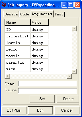
Arguments passed to the inquiry are:
| Name | Description |
|---|---|
ID |
The object-id for the object being expanded. |
USER |
The current user |
relId |
If the row being expanded has a relationship-id, this is also passed. |
view |
The name of the current view. |
filterList |
The list of filters (comma separated). |
rootId |
The id of the root object in the structure. |
parentId |
The id of the object used to start the structure browser instance for. |
levels |
The number of levels being expanded. |
Below are some pictures showing an example inquiry.
Expand Mode: JPO
The JPO expand mode requires the name + method of the JPO to be used as argument. See the example below how to define this:
jpo:MyJPO:theMethodToBeCalled
This JPO should be written according to the rules as described inside this chapter .
| Due to performance reasons we strongly recommend using the Java expand mode over using this mode. |
Expand Mode: Shadow
This expand mode requires additional arguments, in order to configure the shadow types and/or relationships. The syntax for this is:
shadow:<comma separated list of types>:<comma separated list of rel-types>
The relationship type list is optional. Both the types and relationship type lists accept symbolic names.
Example:
shadow:type_FeatureList,type_RequirementList
shadow:type_AType,type_AnotherType:relationship_Rel1,relationship_Rel2
shadow:relationship_Rel1,relationship_Rel2
1.3.3. Configuring a View
A View configuration is preferably configured in an XML file according to the rules as described within this document .
For legacy reasons we also provide the possibility to define the view configuration as a business object within the database. This approach is however not recommended and should only be used sparsely. See this document for further details.
1.4. Tables
This section describes available configuration possibilities when you create your own tables and/or modify existing tables in order to configure how the Structure Browser displays information.
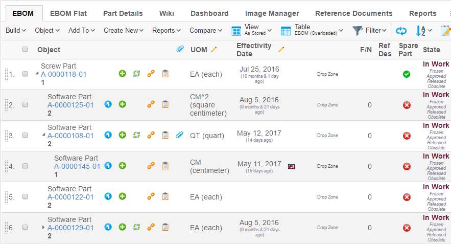
Figure 5. Structure Browser in action
1.4.1. Selected Row Counter
The selected row counter gives the user the count of the number of objects that have been selected. This features is applicable for all tables.
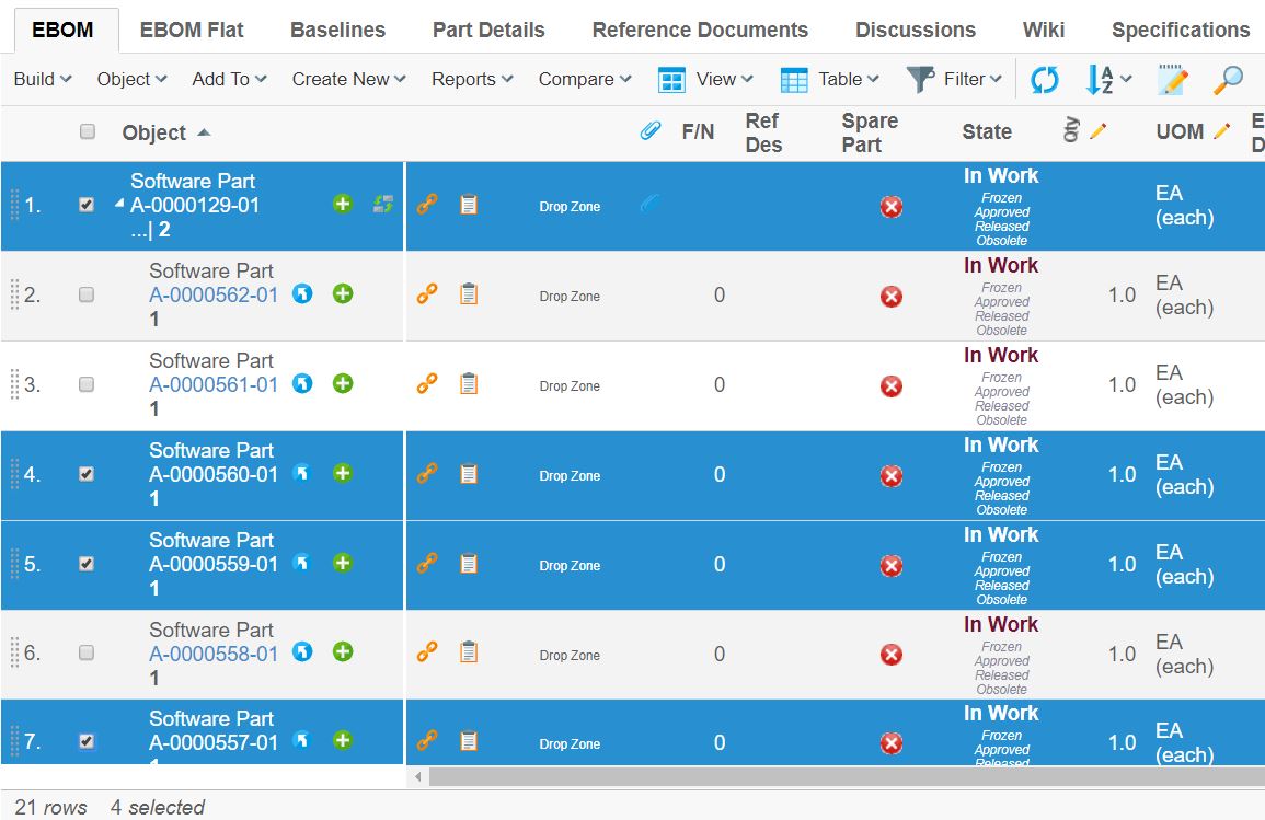
Figure 6. Selected row counter
1.4.2. Column Parameters
Tables consist of column definitions. Each column has a number of configurable parameters, which are described in the following table.
| Parameter | Description | Accepted Values/Examples |
|---|---|---|
Access |
The access tab can be used to assign which persons, roles, and groups who should have access to a specific column. The default value is "All", which means that all users will have access to the column. Note that if no explicit access has been defined on the column, the system assumes that all users should have access. |
Persons, roles, and groups. |
Alt |
This field defines a tooltip text that will be available when the column’s values are displayed as hyperlinks. The value can be either plain text or a string resource ID. Note that using a string resource ID requires that the "Registered Suite" setting have been defined. |
|
Applies To |
This property defines whether the expression applies to business objects or relationships. |
Business Objects Relationships |
Expression |
The select expression that should be used to retrieve the data that will be displayed in the column. Note that the "Applies To" parameter defines whether the expression applies to business objects or relationships. This parameter accepts select expression macros. See Using Select Expression Macros for more information. |
name
|
Heading |
This field defines the column heading. The value can be either plain text or a string resource ID. Note that using a string resource ID requires that the "Registered Suite" setting have been defined. |
Name Rev emxFramework.Basic.Name emxFramework.Basic.Revision |
Href |
This field defines which URL to request when the column’s values are displayed as hyperlinks. Note that the objected parameter is added to the URL by default and its value is the business object ID for the current row. Use the setting "Alternate OID expression" to configure which business object ID to send with the parameter. Also, note that directory macros are supported on this parameter. See Using Directory Macros for more information. |
EmxTree.jsp
|
Name |
The name of the column definition. |
Name Rev |
Settings |
Additional settings that can be used to configure the behaviour of the column. See Column Settings for more information. |
- |
1.4.3. Column Settings
Every column within a table can contain an arbitrary number of settings. Settings are made up of name-value pairs. The following table describes the settings that are recognized by the Structure Browser.
| Setting | Description | Accepted Values/Examples | ||||
|---|---|---|---|---|---|---|
Access Mask Access Expression Access Function Access Program |
These settings can be used to control user access to a table column. See Controlling Access to UI Components for more information |
- |
||||
Admin Type |
Defines the kind of admin type the selected values represents. Supported values are
|
attribute_UnitOfMeasure |
||||
Allow Multiple Edit |
This setting can be used to control if the column will have the multiple update icon present in the header. |
True / False (Default) |
||||
Allow Show More |
This setting is used to display conversions for those attributes that has a dimension (Matrix 10.7 feature) associated when using column type dimension. |
True (Default) / False |
||||
Allowed In Charts |
This setting can be used to disallow using a column within the chart tool. |
True (Default) / False |
||||
Alternate OID Expression |
This setting can be used to control which object ID is sent with the objectId parameter when the column’s data is displayed as a hyperlink. It can also be used to define what related id to modify when column is editable. An attribute called usesBusinessObject has been added to element to control if the selected ids is relationship ids. Note, editing of related multi value attribute is not supported. The value for this setting should be a valid select expression that returns object-ids. |
|
||||
Alternate OID Expression Uses Business Object |
This setting can used in combination with Alternate OID Expression to control if the selected ids is relationship ids when column is editable The value for setting is true or false. Default is true |
|
||||
Alternate Type expression |
This setting can be used to control which type icon is displayed in a
column when the The value for this setting should be a valid select expression that returns type names. |
|
||||
Alternate Policy expression |
This setting can be used to localize the related state configured through expression. The value for this setting should be a valid select expression that returns policy. |
|
||||
Always Visible |
This setting is used to disallow hiding the column. |
True / False (Default) |
||||
Auto Complete Handler |
This setting is used to define which autocomplete handler to use. This setting requires the column type to be set to autocomplete. See more details in the Autocomplete chapter for built-in column Data Handlers and Cell Renderers. |
|
||||
Auto Complete Settings |
Settings for autocomplete handler. See autocomplete chapter in TVC Core Admin guide for more details. |
|
||||
Calculate Average |
This setting can be used to calculate the average value of the cells within the column. |
True / False (Default) |
||||
Calculate Maximum |
This setting can be used to calculate the minimum value among the cells within the column. |
True / False (Default) |
||||
Calculate Median |
This setting can be used to calculate the median value of the cells within the column. |
True / False (Default) |
||||
Calculate Minimum |
This setting can be used to calculate the minimum value among the cells within the column. |
True / False (Default) |
||||
Calculate Standard Deviation |
This setting can be used to calculate the standard deviation of the cells within the column. |
True / False (Default) |
||||
Calculate Sum |
This setting can be used to calculate the sum of the cells within the column. |
True / False (Default) |
||||
Calculation Decimal Precision |
Default number of decimals when rounding results calculated within tables. This setting can be used to override the default setting from the AEF system properties. A negative value will force using the default AEF setting. |
An integer value |
||||
Card ID |
Defines the id of the card opened inside the side panel. If this value equals to "new" or is left unspecified, the side panel will always load a new card. See this chapter for more information regarding the side panel. |
new |
||||
Card Title |
Defines the title of the card opened inside the side panel. If this value equals to "auto" or is left unspecified, the title of the side panel is taken from the "title" of the loaded page inside the card. See this chapter for more information regarding the side panel. |
auto |
||||
Card Load Script |
This setting can contain a Java Script, which is launched each time the card is loaded. See this chapter for more information regarding the side panel. |
pageLoad() |
||||
Card Reloadable |
Defines if the card should be reloaded each time it is displayed, or if to launch the "Card Load Script" upon repeatedly loads. See this chapter for more information regarding the side panel. |
True / False |
||||
Card Width |
Defines the width of the side panel, when displaying the specified resource. See this chapter for more information regarding the side panel. |
250 |
||||
Cell Editable Expression |
This setting can be used to define an expression used to control edit access to a particular cell. See this chapter for more information. |
current == "Create" |
||||
Cell Showable Expression |
This setting can be used to define an expression used to control show access to a particular cell. See this chapter for more information. |
context.user.isassigned[A Role] |
||||
Cell Renderer Class |
Defines the class that responsible for rendering
the content of the cell. The value must be a fully qualified class name
of a class that inherits from
|
|
||||
Check From Access |
Whether to check modify access on the from-side of a relationship when rendering a cell in edit mode. If the value is true and the current user has modify-access on the from-side of the relationship the cell will be rendered as a form input field. |
True (Default) / False |
||||
Check To Access |
Whether to check modify access on the to-side of a relationship when rendering a cell in edit mode. If the value is true and the current user has modify-access on the to-side of the relationship the cell will be rendered as a form input field. |
True / False (Default) |
||||
Column Function |
This setting is used to render the cell at client side using defined function in value. Defined function will be executed with two arguments. one is JSON object which is containing cell values and another is cell HTML element. |
|||||
Column Icon |
This setting defines which image file to use when the "Column Type" setting is an icon. The value of this setting should be a relative path to an image file originating from the "common" directory. |
|
||||
Column Type |
This setting defines what type of column a particular column is. Accepted values are program, programHTMLOutput, checkbox, image and icon.
|
|
||||
Column Width |
This setting defines the width of the column header. However, the width might be changed dynamically, depending on the width of the content within any cells in this column. |
Any integer value greater than zero |
||||
Columns |
This setting applies to the input elements of type "textbox" and "textarea" when a column is rendered in edit mode. The value should be an integer defining the width of the input element. |
Any integer value greater than zero. |
||||
Data Handler Class |
This setting defines a custom data handler for a particular column.
|
The value must point to a Java class available in the classpath, which
implements the interface
|
||||
Decimal Format |
This setting defines a custom decimal format to use for the display values of numerical cells. See The optional init-param |
A string value pattern conforming to the java.text.DecimalFormat syntax Example: |
||||
Decimal Format Scale |
Scales a numerical cell value equal to (value * 10n) where n is the configured value. The scale will only apply if Decimal Format is present. |
Example (millions): -6 |
||||
Delimiter |
Defines a custom delimiter used for multi value attributes. |
| (Default) |
||||
Description |
Defines a description for the column. The description appears as a tooltip when the mouse is over the column header. |
|||||
Display Format |
Defines behaviour when the "Format" setting is set to user. |
|
||||
Display Separator |
Defines the separator that will appear when multiple values are rendered inside one cell. This is only applicable for the HTML view of the table, and will not affect an export or printer friendly view. |
Default value is the |
||||
Editable Editable Mask Editable Expression Editable Function Editable Program |
These settings can be used to control whether a user should have access to edit a column or not. Note that the user must have modify access on the business object on a particular row in the table to actually be able to edit the value of the cell. |
- |
||||
Excel Data Format |
Defines the format of the value when exported into Excel (Native) |
0.00 |
||||
Exclude From Report |
This setting defines if the column should appear in reports / exports of the table. |
True (default) / False |
||||
Finder |
Defines if the column should be searchable in the finder search form. |
True / False (default) |
||||
Finder Label |
Displayed in the search form to identify the search field. If omitted the label of the column is used. |
|||||
Finder Order |
A number value used to define in what order to display the fields in the search form. The column with the lowest order number is displayed first. |
Any integer value. |
||||
Finder Tooltip |
Additional information displayed when mouse cursor is hovering the search field. The tooltip also supports localization using string resources. |
|||||
Finder Type |
Defines the type of search field to use. |
|
||||
Fixed |
This setting can be used to lock a column to the left side in the table when scrolling horizontally. |
True – The column will be fixed (if all columns to the left of the column also have "Fixed" to true). False – The column will not be fixed. This is the default. |
||||
Format |
This setting can be used to override the default data type of the values in a column. It will affect how the values are displayed, sorted and edited. This is particularly useful when you have an attribute whose data type is a string but it actually contains something else, e.g., integers, dates. For instance, the data type of the attribute "Find Number" on an "EBOM" relationship is a string but usually you want the system to treat the values as integers. |
|
||||
Format For Edit |
This setting defines if the new value in column should be formatted before updating. This could be useful when OOTB JPO is used for updating column value. This allows user to control whether to format the new value or not. |
|
||||
Function |
The name of the method that will be invoked on the JPO defined by the "program" setting. |
getSomething |
||||
Groupable |
Defines if the column is groupable. By default, the groupable value is the same as the setting "Allowed In Charts" |
|
||||
Group Header |
Defines a group header for the column. Typically, a group header is used to group several columns together, with a common label. The setting need to be defined on all columns that are part of the group. The value can refer to a value from a string resource file, if the Registered Suite setting is defined. |
A string |
||||
Group Header Is HTML |
Defines if the group header is in HTML format. |
True / False (default). |
||||
Header Rotation Angle |
An integer specifying the rotation in degrees for the header.
Note that Header text will be shown in Tooltip in case of rotated header,
except when the |
An integer, default is 0. |
||||
Rotated Header Font |
The font to be used for rotated headers. The value should be a value acceptable by the
|
|
||||
Header No Wrap |
This setting defines whether or not the header text for a column may wrap or not. |
|
||||
Header No Wrap on Print |
This setting defines whether or not the header text for a column may wrap or not when the table page is generated in PDF. |
|
||||
Header No Wrap on Export |
This setting defines whether or not the table header text for a column may wrap or not when the table is exported to Excel.
|
|
||||
Hidden |
Whether a column should be hidden or not. |
|
||||
Icon Class |
Specifies the font icon to use by defining its CSS class(es). The setting "Column Type" must be set to "icon". Font Awesome is included by default. |
fa fa-tags |
||||
In Cell Edit |
If cells in the column can be edited using in-cell-edit |
|
||||
Input Type |
This setting defines the type of input element that will be rendered for a column in edit mode. The default value for this setting depends on what type of value is displayed. If the column has range values the default type will be "combobox", or when the expression of the column returns the value of a multiline attribute the default type will be "textarea", otherwise the default type is "textbox". |
|
||||
Link Type Icon |
Whether to add icons on links to business objects (i.e. when the mxLink is used). |
True (default) / False |
||||
Locked |
This setting defines if the column is "locked" in the table; e.g. if the user can re-arrange it or not.
|
True / False (Default) |
||||
Match Range On Object ID |
This setting can be used to specify that the range value should be matched against the object-id associated with the cell. By default, the range value is matched against the value of the cell. |
True / False (Default) |
||||
Match Range On Relationship ID |
This setting can be used to specify that the range value should be matched against the relationship-id associated with the cell. By default, the range value is matched against the value of the cell. |
True / False (Default) |
||||
Navigation Column Enabled |
Used to disable the use of certain columns as navigation column. |
True (Default) / False |
||||
No Wrap |
This setting defines whether the column’s values will be wrapped or not.
|
|
||||
No Wrap on Print |
This setting defines whether the column’s values will be wrapped or not when the table page is generated in PDF.
|
|
||||
No Wrap on Export |
This setting defines whether the column’s values will be wrapped or not when the table page is exported to Excel.
|
|
||||
On Edit |
This setting defines the value which can be applied when the table column is in edit mode. Supported values are:
|
|
||||
Popup Modal |
This setting applies when the "Target Location" is "popup". |
|
||||
Preserve Output |
Whether to preserve the values retrieved from the database or not. Preserve in this case means that HTML sensitive characters will not be escaped when displayed in the table, e.g., when an attribute contains HTML markup that should be displayed as such. Note that if "Column Type" is set to "programHTMLOutput" this setting will not have any effect. |
|
||||
Printable |
Defines if the column should be present in the printer friendly format of the table |
|
||||
program |
The name of the JPO to invoke on a column which "Column Type" setting is "program", "programHTMLOutput", or "checkbox". |
SomeJPO |
||||
Range Handler Class |
The name of a class, which provides the column with range values. The
class must implement the interface |
|
||||
Range Function |
The name of the method to invoke on the JPO that is used to retrieve accepted range values for a column when editing. |
getSomething |
||||
Range Program |
The name of the JPO that is used to retrieve accepted range values for a column when editing. |
SomeJPO |
||||
Registered Suite |
This setting defines which application the column belongs to. The value
should be the name of an application as defined in the
This setting will cause the system to send the "suiteKey", "emxSuiteDirectory", and "StringResourceFileId" parameters in the URL when the column’s values are displayed as hyperlinks. Note that this setting is required for the system to know which string resource file to use when the Heading or Alt of a column has been specified as a string resource ID. |
|
||||
Render As Multi Value |
Controls how multi value attributes are rendered in edit mode. |
|
||||
Render As Row Action |
As of TVC 2012.1.0, it is possible to configure the Structure Browser to provide a row-actions menu holding common actions that applies to a row. This setting can be used to move a column that otherwise would have been displayed in a separate column into this menu. Note that all columns cannot be moved, there are some requirements. |
|
||||
Rows |
This setting applies to the input elements of type "textarea" when a column is rendered in edit mode. The value should be an integer defining the height of the input element. "Show More" icon depends on "Rows" and "Text Length" settings. See this chapter for more information regarding the Show More Icon. |
Any integer value greater than zero. |
||||
Searchable |
This setting can be used to disallow using the column within the structure search function. |
|
||||
Show Alternate Icon |
This setting can configure a column to show a different icon than the current row’s object icon. The "Alternate Type expression" setting must be defined in order for the system to know which icon to display. |
|
||||
Show Object Image |
This setting defines whether to show the current row’s business object image in the column or not. This setting will be ignored when "Show Alternate Icon" or "Show Type Icon" is defined. |
|
||||
Show Type Icon |
This setting defines whether to show the current row’s business object type icon or not. |
|
||||
Sortable |
This setting defines whether a column should be sortable or not. |
|
||||
Sort Comparator |
This setting defines a custom comparator to be used
when sorting the data within the column. The value is a fully qualified
class that implements the |
|
||||
Sort Direction |
This setting can be used to configure that a column should be sorted by default. |
|
||||
Sort Order |
This setting can be used to configure in which order a column sorted in when sorted by default. The value for this setting should be an integer value where a lower value gets a higher priority. The default value is 1. |
Any integer value. |
||||
Sort Type |
This setting defines how the values of a column should be sorted. |
|
||||
Style Header |
Apply custom style information to the table header.
|
Example:
|
||||
Style Cell |
Apply custom style information to a table cell. Javascript is applicable for dynamic cell styles. Call print to add style information. Available JavaScript variables:
|
Examples:
OR (dynamical) |
||||
Style Cell Value |
Apply custom style information to a table cell value. JavaScript is applicable for dynamic cell value styles. Call print to add style information. Available JavaScript variables:
|
Examples:
OR (dynamic) |
||||
Style Calculation |
Apply custom style information to a table calculation. JavaScript is applicable for dynamic table calculation styles. Call print to add style information. Available JavaScript variables:
|
Examples:
OR (dynamic) |
||||
Target Location |
This setting defines the target frame when the column’s values are displayed as hyperlinks. Common values are "content", "popup", and "tableHiddenFrame", but there are other frames as well depending on in what context the table is shown.
|
sidepanel |
||||
Text Align |
Defines how the text should align in the cell. If the cell represents numeric values, the values are automatically right aligned, unless overridden by this setting.
|
center |
||||
Text Length |
Defines the maximum number of characters to appear in the cell. If the number of characters in a cell text exceeds this value the text is truncated and a tooltip is used to display the full text. If the value is set to 0 (zero), the text will automatically truncate to a length that fits within the column. If the column is made wider the text will automatically truncate to a higher length or, if not needed, not at all. "Show More icon" depends on "Text Length" and "Rows" setting. See this chapter for more information regarding the Show More Icon.
|
An integer value |
||||
Translate |
Defines whether values should be localized or not.
|
|
||||
Truncate Direction |
Defines truncate direction on column, If the number of characters in a cell text exceeds this text Length .
|
|
||||
Update Function |
The name of the method to invoke on the JPO that is used to update the value of a row in the column while editing. |
updateSomething |
||||
Update Program |
The name of the JPO that is used to update the value of a row in the column while editing. See Update Column Values for more information. |
SomeJPO |
||||
Use Rule |
This setting defines if to handle access rights according to the rule assigned to the attribute for the column.
|
True / False (default) |
||||
Use Transaction On Edit |
Defines if an update transaction should be started that surrounds the modification of the cells value. |
True / False (default) |
||||
Visible |
This setting defines whether a column should be visible or not. The user is able to define his/her own set of visible columns. |
|
||||
Visible In Edit Mode |
This setting defines whether a column should be visible in edit mode or not. |
|
||||
Visible In Flat Mode |
This setting defines whether a column should be visible in flat mode or not. |
|
||||
Visible In Read Mode |
This setting defines whether a column should be visible in read mode. |
|
||||
Visible In Structure Mode |
This setting defines whether a column should be visible in structure mode. |
|
||||
Window Height |
This setting applies when the "Target Location" is "popup" and defines the height of the popup window in pixels. The default value is 600. |
Any integer value greater than zero. |
||||
Window Width |
This setting applies when the "Target Location" is "popup" and defines the width of the popup window in pixels. The default value is 700. |
Any integer value greater than zero. |
||||
Publish |
This setting applies to publishing an event on the edit of the column. If the gadget has Subscribes to event, then that gadget will be automatically refreshed. |
Example: |
||||
Display Today’s Date |
This setting applies to the calendar whenever the user wishes to open a calendar with today’s date as the default. |
True / False (Default) |
||||
Draggable |
This setting applies to link column to make them draggable. This setting should be applicable in context of 3DDashboard only. |
|
1.4.4. Rotated Column Header
Column header rotation can now be achieved using pure CSS as opposed to the exisiting action call and generating an image. The rotated headers will render the column labels vertically. The existing method of generating rotated header using as an image can be achieved by using the below configuration in web.xml :-
<init-param>
    <param-name>tvc.structurebrowser.headerRotationLegacyMode</param-name>
    <param-value>true</param-value>
</init-param>
The default value for this setting is set to false.
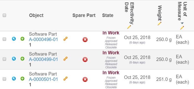
Figure 7. Rotated Column Headers
Column Header Rotation
Users can rotate the column headers through the column context menu. The headers can be either vertical or horizontal. This feature requires the setting tvc.structurebrowser.headerRotationLegacyMode to be set to false. The user selection for column header orientation will be remembered for every table.
1.4.5. Show More Icon
To show many rows within one cell we truncate the cell value using Show More icon. On clicking the "Show More" icon all the values present in cell display as tooltip. Show More icon depends on "Rows" and "Text Length" setting. Default value of "Rows" is 3. This value can be override through global parameter as shown below.
<init-param>
  <param-name>tvc.structurebrowser.defaultMultiLineRows</param-name>
  <param-value>2</param-value>
</init-param>
Example:
Single Value
Single Value is the cell value having single object seperated by new line character. "Show More" icon for single value can be controlled through global parameter like below:
<init-param>
    <param-name>tvc.structurebrowser.splitMultilineValue</param-name>
    <param-value>true/false</param-value> (1)
</init-param>| 1 | Default is 'True' |
"Show More" indicator for single value can be enabled at column level using "Rows" and "Text Length" setting, as shown below and the show more icon for single line text can be enabled if the user can provide zero in the Rows tag.
Configuration
<Column>
    <Expression>description</Expression>
    <Rows>3</Rows>
    <TextLength>30</TextLength>
</Column>| Without Show More Icon | With Show More Icon |
|---|---|
|
|
Multiple Values
Multiple Values are the cell values having multiple object.
"Show More" icon for multiple values can be enabled at column level using "Rows" setting like below:
Configuration
<Column>
    <Expression>from[Multiple Objects].to.name</Expression>
    <Rows>3</Rows>
</Column>
Figure 8. Multiple Values Show More
1.5. Filters
The Structure Browser uses filters often when expanding business object structures. Filters can be configured to only accept certain relationships and/or business objects or only expand in certain directions. For example, a filter may only accept relationships of type "EBOM" in the from direction.
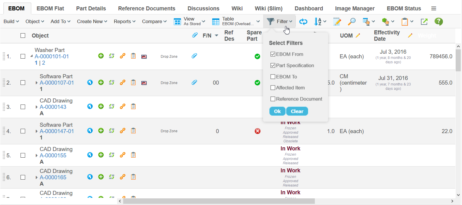
Figure 9. Structure Browser in action
Filters used by the Structure Browser are preferably defined in XML files as described within this document .
Below is an example definition of a filter.
<Filter appliesTo="relationship">
    <Label>EBOM From</Label>
    <From/>
    <TypePattern>
        <Type>relationship_EBOM</Type>
    </TypePattern>
</Filter>
Filters by default return object id as their output for further processing and it is set on the nodes of Structure Browser. Sometimes, it is necessary to get physical id instead of object id. tvc.core.structure.expand.filter.usePhysicalId=true can be set globally to enable this feature.
|
1.5.1. Clear Button
The clear button enables the user to clear all filters at once and gives the user the option to re-select the filters as per their desire. After clearing the existing filters and selecting new ones, the user will have to click on 'OK' button for the new filters to take effect. If a user refreshed the tab after clicking the 'Clear' button the last applied filters will be put into effect.
1.5.2. Behaviour when Selecting a Filter
The default behaviour when changing the current filter(s) in the structure browser is that the root node will be collapsed and expanded one level with the new filters.
Since 5.2.0, this behaviour is configurable so that when changing the current filter(s), the root node is not collapsed – e.g. one can continue browsing the structure but with other filters.
The setting to control this is called "tvc.core.structure.collapseRootNodesOnFilterChange" and the default value of this setting is *true*.
When the structure browser is configured to not collapse the root node upon changing the filters, it will still expand the selected rows (if any has been selected) with the new filters when changing the current filter(s).
As of TVC 6.0, one can define this behaviour individually for
each structure browser instance by providing a request parameter called
collapseOnFilterChange (must be a Boolean value). This is useful when
you want this behaviour in some places, but not for all structure
browser instances.
|
1.6. Toolbars
This section describes the available configuration options when creating and modifying toolbars displayed by the Structure Browser.
Toolbars are defined by Menus that contains Commands, where each Command defines an action available to the users. In addition, a toolbar can contain other Menus that are displayed as pull-down menus in the toolbar.
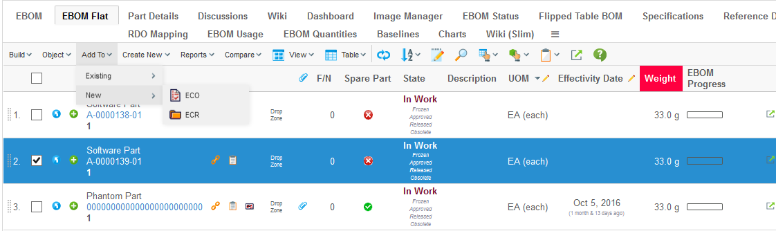
Figure 10. Structure Browser with a toolbar
The toolbar also contains other buttons for accessing built-in functions in the Structure Browser such as Exporting Data, Sorting, Changing Table etc.
The visibility of these buttons are controlled via the current Page Configuration.
1.6.1. Layout
The layout of the toolbar has as of version 2016.1.0 been improved in order to not occupy too much of the screen real estate.
The toolbar is designed to be displayed on one row, and buttons commonly used are accessible directly on the toolbar while other buttons are grouped together (ex: Object Actions, Table Actions etc).
| In certain views / modes, the toolbar may span over multiple rows. This is the case in for example the Grid Browser or in the Build Structure mode within the Structure Browser. |
It is possible to configure the layout to have the similar look as in previous releases. This is either done globally via the following init-parameter:
<init-param>
    <param-name>tvc.structurebrowser.render.toolbarLayout</param-name>
    <param-value>default</param-value>
</init-param>
Or per page config using this parameter
<Parameter name="toolbarLayout" value="default" />The possible values are
-
default
-
traditional
Below is an example screenshot when the layout has been changed to traditional.
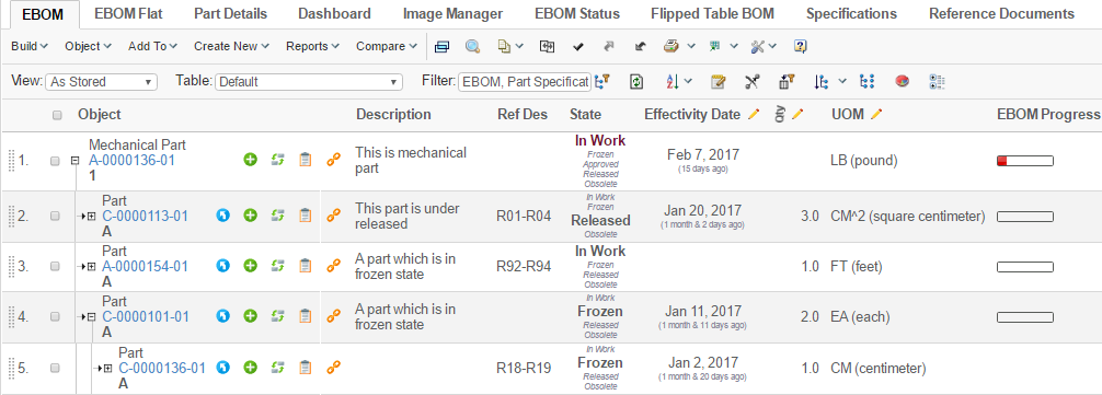
Figure 11. Traditional toolbar layout
1.6.2. IE9 Compatible Mode
Some old Enovia versions by default load internet explorer in compatibility mode 9. This is done using below setting in web.xml:
<filter>
  <filter-name>IECompatabilityFilter</filter-name>
  <filter-class>com.matrixone.apps.domain.util.IECompatabilityFilter</filter-class>
  <init-param>
     <param-name>http-equiv</param-name>
     <param-value>X-UA-Compatible</param-value>
  </init-param>
  <init-param>
     <param-name>content</param-name>
     <param-value>IE=9</param-valuel>
  </init-param>
</filter>
Some of the features of the toolbar are designed to work in modern browsers and will not work well with an older browser like IE9 or IE11 mode IE9. Global init-param tvc.structurebrowser.toolbar.renderIE9Compatible should be set to true to render toolbar in IE9 compatible mode:
<init-param>
    <param-name>tvc.structurebrowser.toolbar.renderIE9Compatible</param-name>
    <param-value>true</param-value>
</init-param>
1.6.3. User Customization
The commands in the toolbar can be rearranged by the user. For example, a user who often modifies data in the table may move the edit button to be the first command in the toolbar.
Commands can be moved within toolbar, from a group (e.g. the Printer Friendly in the Table Actions group) to the toolbar and between two groups. Commands the user have no interest of can be hidden by moving them to the "Unused Items" section.
The customization mode is accessed from the Settings icon located at the far right of the toolbar.
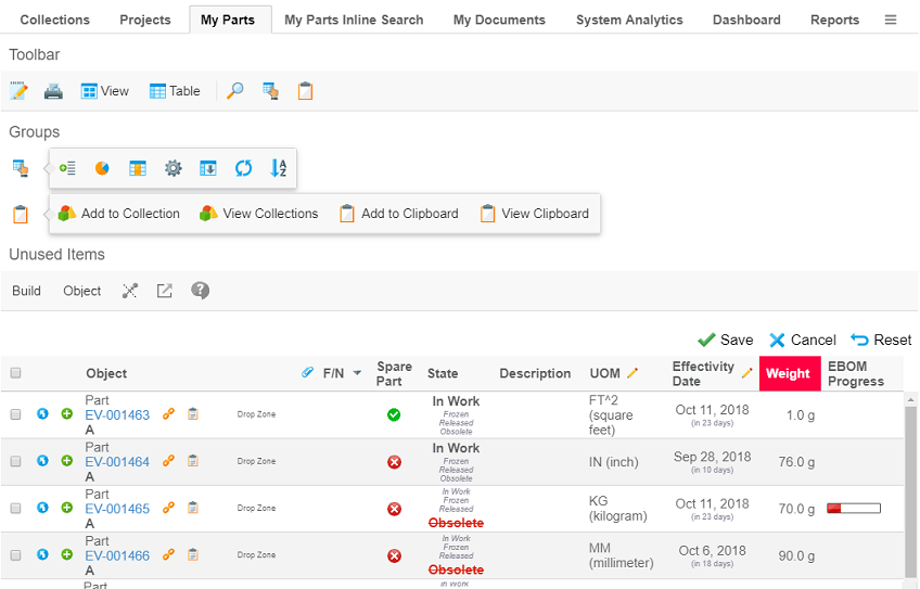
Figure 12. User customizing the toolbar
Customizations are, by default, stored per user and pageconfig. They are persisted across user sessions and devices. As the customizations are stored per pageconfig any customizations done at once place will also effect other pages using the same pageconfig. However pages with other pageconfigs will not be effect (might for example have different set of commands configured).
The pageconfig is by default used as the persistId, i.e. the key used to identify where the customizations are
applicable. It can be overridden using the parameter persistId in the pageconfig.
Using the same persistId across different pageconfigs might cause unexpected problems.
|
Example configuring a persistId:
<PageConfig>
    ...
    <Parameters>
        <Parameter name="persistId" value="ebom" />
    </Parameters>
</PageConfig>
The customization feature is enabled by default. It can be disabled either per pageconfig with the parameter
toolbarEditable or globally with the parameter tvc.core.toolbar.editable.
Example disabling customizations in pageconfig:
<PageConfig>
    ...
    <Parameters>
        <Parameter name="toolbarEditable" value="false" />
    </Parameters>
</PageConfig>
Example disabling customizations for toolbars globally:
<init-param>
    <param-name>tvc.core.toolbar.editable</param-name>
    <param-value>false</param-value>
</init-param>| The user customization feature is not available when using the traditional toolbar layout |
1.6.4. Orientation
The toolbar has either
-
horizontal orientation and is anchored above the table, or
-
vertical orientation and is anchored on the left hand side of the table.
Figure 13. Vertical toolbar anchored on the left hand side
By default the toolbar has horizontal orientation. The orientation can be configured in the pageconfig with the parameter toolbarOrientation.
Example changing orientation to vertical:
<PageConfig>
    ...
    <Parameters>
        <Parameter name="toolbarOrientation" value="vertical" />
    </Parameters>
</PageConfig>
When the toolbar has vertical orientation only the icon is displayed in order to preserve space. Menus without icons uses a default icon.
| Configure an icon on each menu in the toolbar to make it easier for user to distinguish them. |
| Not all items are suitable to be displayed in vertical orientation. For example the traditional view and table selector are not suitable. |
The toolbar can be rotated by the user. Rotating the toolbar is done from the Settings icon located at the far right (or at the bottom if in vertical orientation) of the toolbar.
The rotate feature is enabled by default. It can be disabled either per pageconfig with the parameter
toolbarRotatable or globally with the parameter tvc.core.toolbar.rotatable.
Example disabling possibility for users to rotate the toolbar in pageconfig:
<PageConfig>
    ...
    <Parameters>
        <Parameter name="toolbarRotatable" value="false" />
    </Parameters>
</PageConfig>
Example disabling possbility for users to rotate toolbars globally:
<init-param>
    <param-name>tvc.core.toolbar.rotatable</param-name>
    <param-value>false</param-value>
</init-param>| The rotate feature is not available when using the traditional toolbar layout |
1.6.5. Show View / Table Name
The current view and table is by default not displayed in the toolbar in order to save screen real estate.
It is possible to configure to show the current view and/or table name. This is either done globally via the following init-parameters:
<init-param>
    <param-name>tvc.structurebrowser.render.toolbarShowCurrentView</param-name>
    <param-value>true</param-value>
</init-param>
<init-param>
    <param-name>tvc.structurebrowser.render.toolbarShowCurrentTable</param-name>
    <param-value>true</param-value>
</init-param>
Or per page config using these parameters:
<Parameter name="showCurrentView" value="true" />
<Parameter name="showCurrentTable" value="true" />
Figure 14. Toolbar showing both view and table name
1.6.6. Combine Toolbar Menu
It is also possible to configure the toolbar to group all menus and commands into one group. This is shown in the image below.
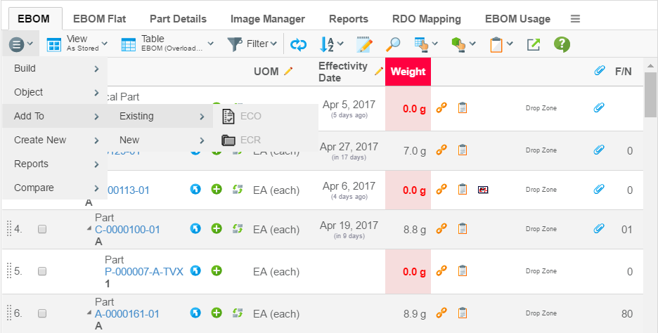
Figure 15. Toolbar with combined menu
You can either configure this globally via the following init-parameter:
<init-param>
    <param-name>tvc.structurebrowser.render.toolbarMenuCombined</param-name>
    <param-value>true</param-value>
</init-param>
Or per page config using this parameter
<Parameter name="combineToolbar" value="true" />1.6.7. Example Toolbar Menu
Below is an example of a toolbar menu definition.
<Menu xmlns="http://technia.com/TVC/Menu"
      xmlns:xsi="http://www.w3.org/2001/XMLSchema-instance"
      xsi:schemaLocation="http://technia.com/TVC/Menu http://products.technia.com/tvc/schema/latest/Menu.xsd">

    <Menu> (1)
        <Label>Menu Name</Label>

        <Command ref="tvc:command/Command1.xml" /> (2)
        <Command ref="tvc:command/Command2.xml" />
        <Command ref="tvc:command/Command3.xml" />
        <Command ref="tvc:command/Separator.xml" />
        <Command> (3)
            <Label>Edit Part [Popup]</Label>
            <URL action="initForm" submit="true" target="popup">
                <Param name="formName" value="tvc:form:tvx:enc/EditPart.xml" />
                <Param name="formMode" value="edit" />
                <Param name="renderMode" value="dialog" />
            </URL>
            <WindowWidth>800</WindowWidth>
            <WindowHeight>700</WindowHeight>
            <PopupModal>true</PopupModal>
            <RowSelectType>single</RowSelectType>
        </Command>
    </Menu>
    ...
</Menu>| 1 | Sub menu |
| 2 | Referencing externally defined command(s) |
| 3 | Inline definition of a command |
Please look into this document for further details regarding the XML configuration files.
1.6.8. Command Parameters
Each Command has a number of configurable parameters. The following table describes how these parameters can be configured and what effect the configuration will have on Commands in a toolbar.
| Parameter | Description | Accepted Values/Examples |
|---|---|---|
Access |
The access tab can be used to assign which persons, roles, and groups should have access to a specific command. The default value is "All", which means that all users will have access to the command. Note that if no explicit access has been defined on the command, the system assumes that all users should have access. |
Persons, roles, and groups. |
Alt |
This field defines a tooltip text for the command. The value can be either plain text or a string resource ID. Note that using a string resource ID requires that the "Registered Suite" setting have been defined. |
|
Href |
This field defines which URL to request when the command is executed. Note that directory macros are supported on this parameter. See Using Directory Macros for more information. |
emxTree.jsp ${COMMON_DIR}/emxTree.jsp ${ROOT_DIR}/tvc-action/navigate |
Label |
This field defines the command’s label. The value can be either
plain text or a string resource ID. Note that using a string resource ID
requires that the |
|
Name |
The name of the command admin object. |
|
Settings |
Additional settings for the command. See next chapter for more information. |
- |
1.6.9. Command Settings
Every command within a toolbar can contain an arbitrary number of settings. Settings are made up of name-value pairs. The following table describes how these settings can be configured and what effect they will have on Commands in a toolbar. Note that the names of the settings are case-insensitive while the values are case-sensitive.
| Setting | Description | Accepted Values/Examples |
|---|---|---|
Access Mask Access Expression Access Function Access Program |
These settings can be used to control user access to a command. See Controlling Access to UI Components for more information. |
- |
Action Type |
Can be used to define that a Command should be displayed as a separator within the toolbar menu. Only supported on Commands displayed in a toolbar. |
Separator – The Command will be displayed as a separator. If this setting isn’t defined or if it has a value different from Separator it will be rendered as a normal Command. |
Card ID |
Defines the id of the card opened inside the side panel. If this value equals to "new" or is left unspecified, the side panel will always load a new card. |
new |
Card Title |
Defines the title of the card opened inside the side panel. If this value equals to "auto" or is left unspecified, the title of the side panel is taken from the "title" of the loaded page inside the card. |
auto |
Card Load Script |
This setting can contain a Java Script, which is launched each time the card is loaded. |
pageLoad() |
Card Reloadable |
Defines if the card should be reloaded each time it is displayed, or if to launch the "Card Load Script" upon repeatedly loads. |
True / False |
Card Width |
Defines the width of the side panel, when displaying the specified resource. |
250 |
Confirm Message |
This setting defines a message that will be displayed to the user together with OK and Cancel buttons. If the user chooses OK the command will be executed otherwise not. The value can be either plain text or a string resource ID. Note that using a string resource ID requires that the "Registered Suite" setting has been defined. |
|
Font Icon |
Specifies the Font Icon to use by defining its CSS class(es). |
|
Popup Modal |
This setting applies when the "Target Location" is "popup". Note that when "Submit" is true the popup will always be modal. |
true:The popup will be modal. A modal popup will not allow the window that opened the popup to gain focus until the popup is closed. This is the default value. false:The popup will be modeless. |
Progress Message |
A progress message can be provided on commands to present a message while the action is in progress. The message is shown, if the "Show Progress" setting has been set to true. NOTE: The called action must turn off the progress message text once finished. This is accomplished by invoking a Java Script method called "hideProgress()" within the table frameset. |
Deleting objects, please wait… |
Registered Suite |
This setting defines which application the command belongs to. The value should be the name of an application as defined in the emxSystem.properties file when removing the "eServiceSuite" prefix. For instance, if the name of the application in emxSystem.properties is "eServiceSuiteEngineeringCentral" then the value for this setting should be "EngineeringCentral". This setting will cause the system to send the "suiteKey", "emxSuiteDirectory", and "StringResourceFileId" parameters in the URL when the column’s values are displayed as hyperlinks. NOTE: This setting is required for the system to know which string resource file to use when the Label or Alt of a command has been specified as a string resource ID. |
Framework InfoCentral EngineeringCentral ProgramCentral |
Row Select |
This setting defines the required row selections in the table when executing the command. |
none:No selection required. This is the default value. single:Exact one row must be selected. prevent:Force to uncheck the selected row. multiple:At least one row must be selected. |
Show Progress |
Defines whether or not the progress message should be shown or not. |
True / False (Default) |
Submit |
This setting defines whether the selections in the table should be submitted when executing the command. |
true:The current row selections will be submitted when executing the command. false:The current row selections will NOT be submitted. This is the default value. |
Submit OID |
This setting defines whether or not the object-id for the object used to launch the structure browser instance, should be sent within the URL of the command. |
True:The object id will be passed False: |
Target Location |
This setting defines the target frame when executing the command. Common values are "content", "popup", and "hiddenFrame", but there are other frames as well depending on in what context the table is shown. |
content:The page is displayed in the content frame. popup:The page is displayed in a popup window. card:The page is displayed inside the side-panel (see this chapter for more information how to use side panels). hiddenFrame:The page is displayed in a hidden frame (i.e., it will not be visible to the user). |
Visible In Edit Mode |
This setting defines whether a command should be visible in edit mode or not. |
true:The command will be visible in edit mode (default). false:The command will not be visible in edit mode. |
Visible In Flat Mode |
This setting defines whether a command should be visible in flat mode or not. |
true:The command will be visible in flat mode (default). false:The command will not be visible in flat mode. |
Visible In Read Mode |
This setting defines whether a command should be visible in read mode. |
true:The command will be visible in read mode (default). false:The command will not be visible in read mode. |
Visible In Structure Mode |
This setting defines whether a command should be visible in structure mode. |
true:The command will be visible in structure mode (default). false:The command will not be visible in structure mode. |
Window Height |
This setting applies when the "Target Location" is "popup" and defines the height of the popup window in pixels. The default value is 600. |
Any integer value greater than zero. |
Window Width |
This setting applies when the "Target Location" is "popup" and defines the width of the popup window in pixels. The default value is 600. |
Any integer value greater than zero. |
Add Enovia CSRF Token |
This setting defines whether Enovia OOTB CSRF token be added to href or not. |
true: Enovia OOTB CSRF token will be added to href. Default is false. |
1.6.10. Enable CSRF Token for OOTB command/JSP
Enovia OOTB CSRF protection can be extended to Enovia commands and JSPs when called from the TVC toolbar. This can be enabled by adding a setting Add Enovia CSRF Token to command which calls Enovia JSP or it can be added directly on Enovia command, if it is getting called from TVC toolbar. Once enabled, Enovia OOTB CSRF token is generated using Enovia APIs and appended to command action.
Using Enovia JSP in TVC Command
When TVC command calls Enovia OOTB JSP and Enovia JSP requires CSRF token, usually these JSPs are action JSPs which perform some database update and hence require Enovia CSRF token.
<Command>
	<Label>OOTB Action</Label>
	<URL href="${COMPONENT_DIR}/<OOT BJSP>.jsp"
	       submitParentOID="true" submitOID="true" submit="true" target="listHidden" />
	<Setting name="Add Enovia CSRF Token" value="true" />
	<RegisteredSuite>Components</RegisteredSuite>
</Command>1.7. Commands
The Structure Browser is commonly launched from Commands (for instance, a Command can be configured to launch the Structure Browser from the tree category of a certain business type). This section describes how to launch the Structure Browser from a Command and the available configuration possibilities when doing so.
1.7.1. Common URL Parameters for Structure Browser
This section describes the common URL query string parameters that can be used to configure the behaviour of the Structure Browser. While most parameters are optional there is one parameter called "view" that is required unless you use a page configuration object to configure the Structure Browser. See Using Page Configuration Objects for an alternative way to configure the Structure Browser.
Query string parameters appended to a URL consist of name-value pairs separated by an ampersand (&) while the entire query string is separated from the rest of the URL using a question mark (?). The following example is a relative URL to the JSP page /url/to/some/page.jsp where the query string parameters param1 and param2 have been appended. The value of param1 and param2 is value1 and value2 respectively.
/url/to/some/page.jsp?param1=value1¶m2=value2
The following table describes parameters that can be used to configure Structure Browser when launching it using one of the methods described below. Some methods require additional parameters, which are covered in the section describing a particular method.
Common URL parameters for configuring the Structure Browser:
| URL Parameter | Description | Examples |
|---|---|---|
pageConfig |
The name of the page-configuration. A page-configuration can be used instead of the common URL parameters to configure the behaviour of the Structure Browser. |
pageConfig=My Config |
view |
Required if pageConfig isn’t defined. The name of the view object that defines which table and filters to use. See Views for more information on how to manage views. |
view=Default View |
choosableViews |
This parameter defines the view objects that should be
selectable from the table page. Specify multiple view objects by
separating them with a pipe character |
choosableViews=Default View|Part View |
selection |
This parameter defines the selection mode on the table page. Accepted values are "none", "single", and "multiple". The default value is "none". |
selection=multiple |
counter |
This parameter defines whether a row number will be displayed as the leftmost column in the table. Accepted values are "true" and "false". The default value is "true". |
counter=false |
toolBar |
The name of the Menu admin object that contains the commands to be displayed in the toolbar. See Toolbars for more information. |
toolBar=PartToolBar |
contextMenu |
The name of the Menu admin object that contains the commands to be displayed/used as a context menu. |
contextMenu=MyContextMenu |
visible |
This parameter configures which items should be visible on the table page. Accepted values are listed in the next chapter. Separate multiple values with a pipe character ( |
visible=view|table|filter|reload|gothere |
header subHeader |
These parameters define the header and sub header that will be displayed on the table page. The values of these parameters can be either plain text or a string resource file ID. Note that when using a string resource file ID it is required that the "Registered Suite" setting has been defined on the command. The values can also contain select expression macros that will be evaluated on the current business object. The current business object refers to the objectId parameter that is sent with the URL. Note that you normally don’t add the objectId parameter yourself as it will be added automatically by the system, for instance, when executing a command on a business objects tree menu. |
or
|
edit |
This parameter configures whether the Structure Browser should be opened in edit mode by default when clicking on the command. |
true – The Structure Browser will be opened in edit mode. false – The Structure Browser will opened in read mode. This is the default value. |
PrinterFriendly |
This parameter configures whether the printer friendly button will be available or not. This function will create a printer friendly page of the structure browser in a separate popup window. |
PrinterFriendly=true |
Export |
This parameter configures whether the export button will be available or not. This function is similar to the export function of the emxTable.jsp page. |
Export=true |
addToCollection |
This parameter configures whether the "add item to collection" button will be available or not. |
addToCollection=true |
manageCollections |
This parameter configures whether the "manage collections" button will be available or not. |
manageCollections=true |
Visible Parameter
| Visible Value | Description |
|---|---|
view |
The view selector will be displayed on the page with which the user can choose among the selectable views defined with the "choosableViews" parameter. |
table |
The table selector will be displayed on the page with which the user can choose among the available tables as defined in the current view. |
filter |
The filter selector will be displayed on the page with which the user can choose among the available filters as defined in the current view. |
reload |
The reload button will be displayed on the page with which the user can reload the data in the table. |
edit |
The edit button will be displayed on the page with which the user can toggle edit mode. |
sort |
The sort button will be displayed on the page (but only if the current table has any sortable columns) with which the user can choose to sort on up to three columns at the same time. |
expand |
The expand button will be displayed on the page (but only in structure mode and when the filters allow recursive expansion) with which the user can expand the entire structure. |
gothere |
The gothere button will be displayed on every row in the table with which the user can choose to navigate a certain object (i.e., change the root object in the structure). |
structuresearch |
If either this value or "advancedfilter" is present, the search button will appear on the toolbar. |
disconnect |
The disconnect button will be displayed on the page with which the user may use to disconnect two objects. |
advancedfilter |
If either this value or "structuresearch" is present, the search button will appear on the toolbar. |
chart |
Whether the chart button should be visible or not. This function requires the TVC Graphical Reporting component. |
preferences |
Whether the user preferences function should be available or not |
columnfilter |
Whether the column filter function should be available or not |
clipboard |
Whether the clipboard functionality should be available or not. |
flatten |
Whether the flatten structure functionality should be available or not. |
datagroup |
Whether the data group functionality should be available or not. |
maximize |
Whether the maximize button should be visible or not. The maximize button can only be visible if the category tree is present, and the structure browser is shown in the content frame right to the category tree. |
promote |
Whether or not the promote button is available. |
demote |
Whether or not the demote button is available. |
trigger |
Whether the trigger validation button should be available in the toolbar or not (Only for V6R2009X or later). |
compare |
Whether the compare button should be available in the toolbar or not (Only for V6R2009X or later). |
wrap |
Whether the wrap or unwrap button should be available or not. |
| If some chart depends on promote or demote user can subscribe to the chart by command name. We are auto-publishing here, so no specific publish setting is required. |
1.7.2. Launching Structure Browser in Navigate Mode
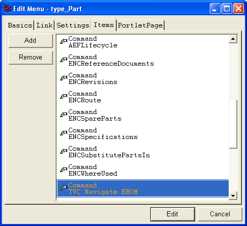
This is perhaps the most common way to launch the Structure Browser. To achieve this you need to create a Command object that will be used to launch the Structure Browser and add it to the Menu object that defines a certain business type’s tree category (e.g., the tree category Menu for business objects of type "Part" is called "type_Part").
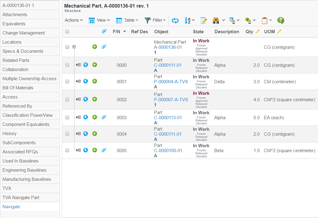
Figure 16. Structure Browser in action
When creating a command to launch the Structure Browser in navigate mode from a tree category, you will need to edit some of the configurable parameters and settings on that command in a specific way. The most important parameter is "Href", whose value must be a URL to the Structure Browser (the "Href" parameter configures which web-page to request on the server when clicking on a Command). The URL to the Structure Browser is:
${ROOT_DIR}/tvc-action/navigate
Moreover, the URL should contain query string parameters to configure the behaviour of Structure Browser (e.g., which view to use, which showInternalHelp to use, which buttons/choosers should be visible). See this chapter for more information on which parameters are available.
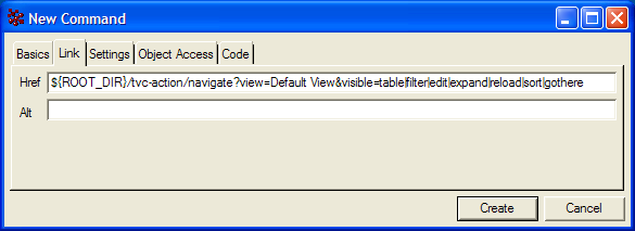
Figure 17. Creating a Command to launch the Structure Browser from a tree category with a view called Default View
The next step is to add some settings on the Command. They will configure how the Command behaves when clicking on it. The following table describes the required settings.
Required settings for a Command that launches the Structure Browser from a tree category
| Setting | Description | Accepted Values/Examples |
|---|---|---|
Registered Suite |
This setting defines which application the command belongs to. The value should be the name of an application as defined in the emxSystem.properties file when removing the "eServiceSuite" prefix. For instance, if the name of the application in emxSystem.properties is "eServiceSuiteEngineeringCentral" then the value for this setting should be "EngineeringCentral". This setting will cause the system to send the "suiteKey", "emxSuiteDirectory", and "StringResourceFileId" parameters in the URL when the column’s values are displayed as hyperlinks. Note that this setting is required for the system to know which string resource file to use when the Label or Alt of a command has been specified as a string resource ID. |
Framework InfoCentral EngineeringCentral ProgramCentral |
Target Location |
This setting defines the target frame when executing the command. The value should be set to "content" to ensure that the Structure Browser is loaded in the correct frame. |
content |
Figure 18. Configuring required settings on a Command that launches the Structure Browser from a tree category
Once the Command has been created you only have to add it to the Menu object representing the tree category of your choice. This will make it available to the users of the application. Note that you might have to reload any UI cache used by the Value Chain Portfolio applications to make the Command appear where you added it (the Application Exchange Framework usually maintains a cache of user interface objects like Menus and Commands. Please consult documentation of the AEF if you are uncertain on how to reload the UI cache).
Navigating Multiple Root Nodes
Normally when you launch the Structure Browser you’ll end up with a single root node that can be expanded or collapsed. However, the Structure Browser can also be used to navigate multiple root nodes at the same time.
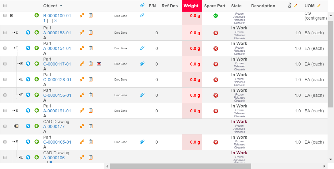
Figure 19. Navigating with multiple root nodes
This is the order in which the Structure Browser will try to load root nodes:
-
If the loader parameter is present. The value of this parameter can be one of:
-
A named data-set (see Core administration guide for details how to configure a data-set)
-
A class that implements the interface: com.technia.tvc.structurebrowser.actions.loader.TableBeanLoader
-
-
If an inquiry has been specified through the inquiry request parameter, root nodes will be loaded from the inquiry. See this chapter for more information on how to create an inquiry that loads root nodes into the Structure Browser.
-
If a JPO has been specified through the program request parameter and the value is formatted as:
<JPOName>:<MethodName>, root nodes will be loaded from the specified JPO and method. See Retrieve Table Rows for more information on how to create a JPO that loads root nodes into the Structure Browser. -
If the emxTableRowId parameter was sent with the request a root node will be inserted for each occurrence of the parameter.
-
If the objectId parameter was sent with the request a root node will be inserted for each occurrence of the parameter.
Navigating Shadow Structures
| This can also be configured per view. |
When a certain structure contains shadow or intermediate objects that only act as containers on behalf of their parents you sometimes don’t want these intermediates to be visible to the end user. The Structure Browser can easily be configured to skip intermediate objects of certain types. For example, when navigating a Product/Feature structure in ENOVIA™’s Product Central application you normally don’t want to display the intermediate "Feature List" objects to the end user.
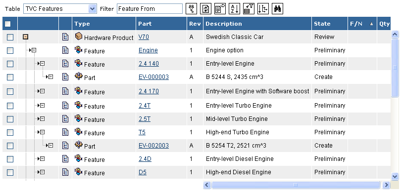
Figure 20. Skip intermediate objects
To enable this functionality you create your Command to launch the Structure Browser in the same way as described in this chapter except that you replace the URL with the following:
${ROOT_DIR}/tvc-action/navigateShadowStructure
You should also add at least one occurrence of the type URL parameter that configures which object types should not be displayed. Note that you can also add this parameter to the "TVC Custom Parameters" attribute when using a "TVC Page Configuration" object. See Using Page Configuration Objects for more information on how to create page configurations.
URL Parameter |
Description |
Examples |
type |
Configures which object types should not be displayed. Multiple occurrences allowed. |
|
Table 3, Additional URL parameters navigating shadow structures
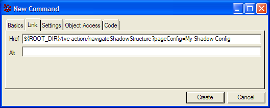
Figure 21. Example command for navigating shadow structures
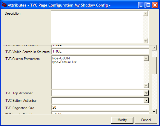
Figure 22. Example page configuration for navigating shadow structures
Expanding with a JPO
| This can also be configured per view |
When filters can’t be used to navigate structures you can create a JPO that will be invoked whenever a user clicks on the expand link in the Structure Browser. The JPO should then return the immediate children of the object being expanded. The following code snippet can be used as a template when creating a JPO:
/* Imports */
import java.util.Map;
import java.util.HashMap;
import java.util.List;
import matrix.db.Context;

/* Class */
public class ${CLASSNAME} {

    /* Constructor */
    public ${CLASSNAME} (Context ctx, String[] args) {}

    /* Expand a business object on behalf of the Structure Browser */
    public List expand(Context ctx, String[] args) throws Exception {
        Map params = (Map) JPO.unpackArgs(args);

        // Get the object and relationship IDs
        // from the row being expanded
        String objectId = (String) params.get("objectId");
        String relId = (String) params.get("relId");

        // The result should be returned
        // as a MapList instance
        List ret = new com.matrixone.apps.domain.util.MapList();

        // TODO:
        //
        // Add business logic here for expanding
        // the business object to the next level.
        // Add a HashMap to the MapList for each
        // child object and specify the following
        // keys:
        //
        //  * id = The business object ID.
        //  * id[connection] = The relationship ID.
        //  * from = Whether the relationship is
        //    in the from direction or not.
        //
        // Example:
        //
        // Map map = new HashMap();
        // map.put("id", <OID>);
        // map.put("id[connection]", <RELID>);
        // map.put("from", Boolean.TRUE);
        // ret.add(map);

        return ret;
    }
}
JPO Template for expanding through a JPO
To enable this functionality you create your Command to launch the Structure Browser in the same way as described in this chapter except that you replace the URL with the following:
${ROOT_DIR}/tvc-action/navigateJPO
You must also add a parameter to the URL that configures the name of the JPO and method that should be invoked to expand a certain business object.
URL Parameter |
Description |
Examples |
expandProgram |
Required. The name of the JPO and method that should be invoked. The value for this parameter should be formatted like:
|
expandProgram=MyExpandJPO:expand |
Table 4, URL parameters when expanding through a JPO
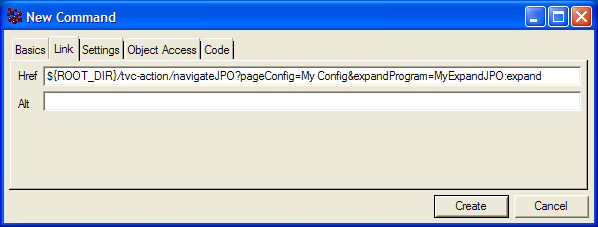
Figure 23. Use a JPO to expand the structure
1.7.3. Launching Structure Browser in Flat Table Mode
When launching Structure Browser in flat table mode you will need to provide the table rows to the Structure Browser in one of two ways. The perhaps easiest way to do this is to load the Structure Browser from an Inquiry while another way is to use a JPO (Java Program Object).
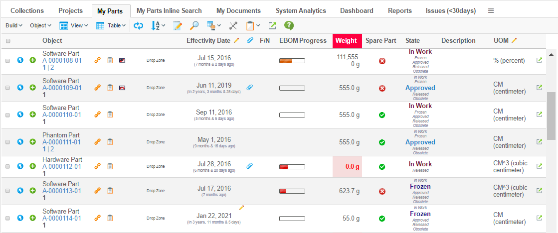
Figure 24. Structure Browser in action
To launch the Structure Browser in flat table mode you need to create a Command and add it to the Menu of your choice that is visible in your application (e.g., the example above used a Command that was added to the "My Desk" menu for Engineering Central). When creating the Command you will need to edit its "Href" parameter to one of two URLs, which one you choose depends on whether you will be using an Inquiry or a JPO to retrieve the rows of the table. The URLs are:
${ROOT_DIR}/tvc-action/execInquiryToTable
${ROOT_DIR}/tvc-action/execJPOToTable
${ROOT_DIR}/tvc-action/execCustomLoaderToTable
Moreover, the URL should contain query string parameters to configure the behaviour of Structure Browser (e.g., which view to use, which toolbar to use, which buttons/choosers should be visible). See this chapter for more information on which parameters are available.
On top of the common parameters you will also need to add a parameter describing which Inquiry, JPO or Custom Loader the Structure Browser should use to retrieve table rows. The following table describes these parameters.
URL Parameter |
Description |
Examples |
inquiry |
This parameter is required when retrieving table rows using an Inquiry. It defines the name of the inquiry that will be evaluated. |
inquiry=MyParts |
program |
This parameter is required when retrieving table rows using a JPO. It defines the name of the JPO that will be invoked. The value for this parameter should be formatted like:
|
program=TVC Utils:getPartsForUser |
loader |
This parameter is required when retrieving table rows using a Java class or by using data-sets (see this page for details). It the value defines the name of the Java class, it must point to a class implementing the interface:
If it is a data-set, then it will represent the name of the data-set. |
|
Table 5, configurable parameters when launching Structure Browser in flat table mode
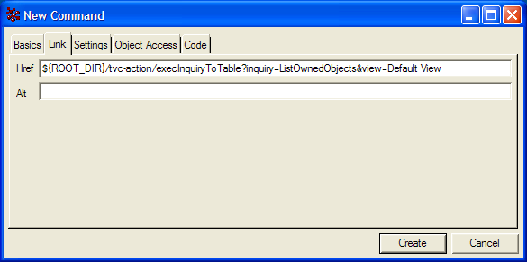
Figure 25. creating a Command to launch the Structure Browser in flat table mode using an Inquiry to retrieve table rows
Additionally you may need to configure other parameters and settings on the Command you create, for instance you may want to define the setting "Target Location" to control in which frame the Structure Browser is loaded. However, these settings depend on where you plan to use the Command (i.e., to which Menu you plan to add it). Please consult documentation of the AEF (Application Exchange Framework) and VCP (Value Chain Portfolio) applications in order to find out what and how you need to configure the Command in those cases.
Launching a flat table from selected objects
An alternative to using inquiries to populate a flat table is to let users select which objects should be included. If an existing table, Structure Browser or ENOVIA OOTB, has selectable rows, this can be achieved with the following URL:
${ROOT_DIR}/tvc-action/selectedItemsToTable
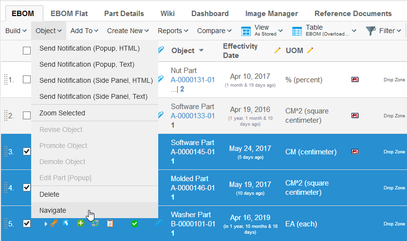
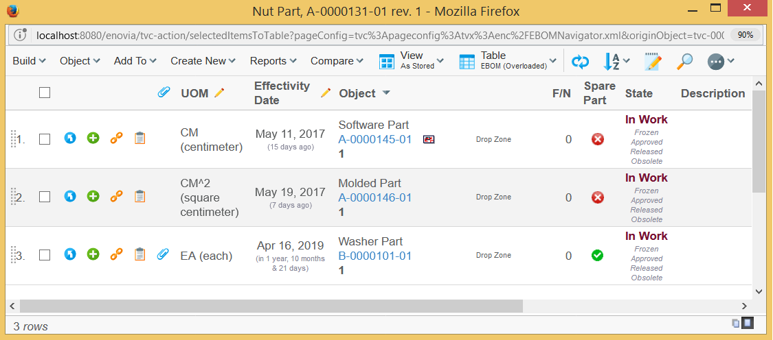
It is important that your command has the Submit setting specified (value set to true).
Also, the HREF needs parameters, or a page-configuration specified.
The target location should be set to popup.
Zoom Selected
When working within the structure browser, you might want to reduce the objects you’re interested in. This can be accomplished by the "Zoom Selected" command (which works in a similar way as go-there).
To enable this, add a command that has the following configuration:
<Command>
    <Label>Zoom Selected</Label>
    <URL action="/zoomInSelected"></URL>
    <SubmitForm>true</SubmitForm>
    <RowSelectType>multiple</RowSelectType>
    <TargetLocation>tableContentFrame</TargetLocation>
</Command>
Searching with an Inquiry
The Structure Browser includes a function that enables administrators to easily create simple but powerful search forms embedded on a flat table page. The search itself is powered by an Inquiry, which also defines the editable query parameters.
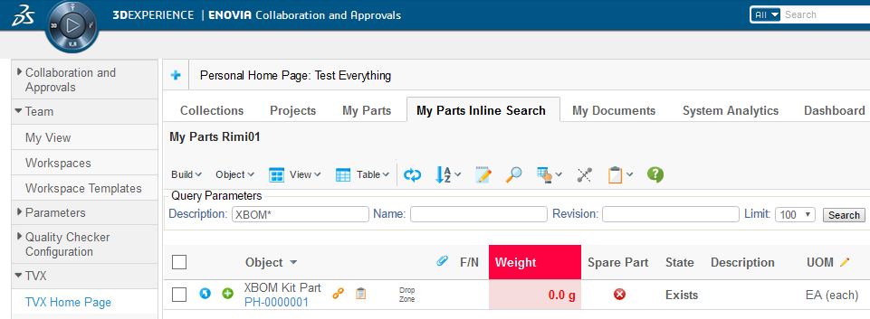
Figure 26. Search-form embedded on a flat table page
To use this function you create a Command and edit the "Href" parameter to the following URL:
${ROOT_DIR}/tvc-action/inlineSearch
Moreover, you’ll also have to add the inquiry URL parameter and specify the name of the Inquiry that will perform the search. For example:
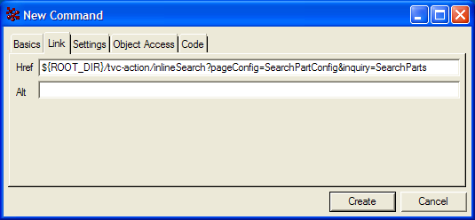
Figure 27. Command to launch a search
Create the Inquiry as described in this chapter. However, you’ll also need to specify which arguments should be editable query parameters using a special syntax. Also, you can specify a label, range values, default value, and how the parameters should be ordered on the table page.
First, the value of an argument that should be editable must be edit, followed by a comma-separated list of optional configuration parameters for that argument. The optional parameters are:
Parameter |
Description |
Examples |
label |
The label that is displayed on the table page. |
label=Current |
default |
The default value for the query parameter. |
default=Create |
range |
A valid range value. This parameter can be specified multiple times for multiple range values. |
range=Create,range=Peer Review |
order |
The order in which the parameter will be displayed on the table page. The value of this parameter must be a non-negative integer. The argument with the lowest order will be displayed first. |
oder=1 |
width |
The width of the input field |
width=5 |
Table 6, Available parameters for Inquiry arguments
The following images demonstrate how to create an Inquiry for this purpose. The Inquiry produces a search form with the following characteristics:
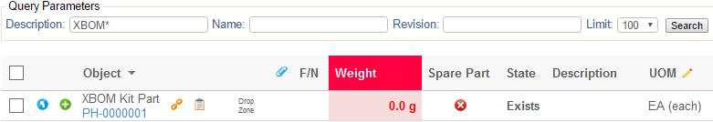
Figure 28. Example search form
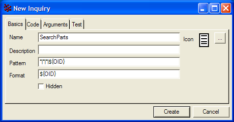
Figure 29. Example Inquiry (Basics)
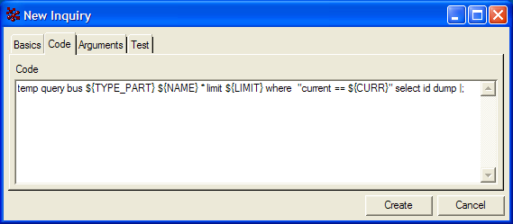
Figure 30. Example Inquiry (Code)
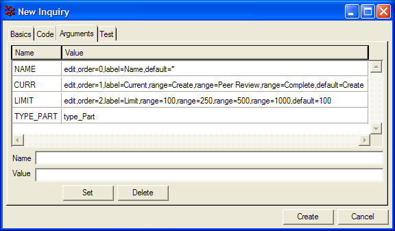
Figure 31. Example Inquiry (Arguments)
It is also possible to avoid loading the inquiry when the page is first entered. This is accomplished by adding a parameter to the URL called "load", the default value for this parameter is true. Setting this parameter value to false, will cause the inquiry not to be invoked.
1.8. Context Menu
Every table page can have a custom context menu attached, which will be visible when the user "right-clicks" on a row. If a row isn’t selectable, e.g. there is no checkbox (or radio button) the context menu won’t be available for that row either.
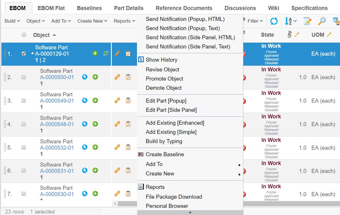
The context menu is a standard menu containing commands and/or other submenus.
The context menu used on a table page is configured in the page configuration object that is defining the behaviour of the table page. It is also possible to configure a separate context menu for a particular view.
The context menu is defined as below on the Page Configuration:
<PageConfiguration>
    <ContextMenu>the name of the menu</ContextMenu>
</PageConfiguration>
And similar on the View:
<View>
    <ContextMenu>the name of the menu</ContextMenu>
</View>
It is configurable to have row remain selected when we perform action through context click. This can either be done globally via init-parameter tvc.structurebrowser.rememberSelectedRow (default false) or by over ridding the page config parameter rememberSelectedRow:
<init-param>
    <param-name>tvc.structurebrowser.rememberSelectedRow</param-name>
    <param-value>true</param-value>
</init-param>
<Parameter name="rememberSelectedRow" value="true" />1.8.1. Dynamic Context Menu
The commands and menus within the right-click context menu can be configured to be enabled for a particular type of object and/or for an object in a particular state.
Any item within the context menu that is not valid for the object, which the context menu were opened for, will be "greyed" out. See example screenshot below:
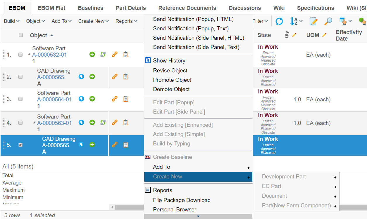
1.8.2. Configuring the Context Menu Items
Below is an example on how to configure this:
<Command>
    <Label>Build by Typing</Label>
    <Href>${TVC_ACTION}/buildByTyping</Href>
    <RowSelectType>single</RowSelectType>
    <SubmitForm>true</SubmitForm>
    <TargetLocation>popup</TargetLocation>
    <WindowWidth>800</WindowWidth>
    <WindowHeight>600</WindowHeight>
    <ValidFor>
        <Types>
            <Type>type_Part</Type>
            <Type>type_AnotherType</Type>
        </Types>
        <States policy="policy_DevelopmentPart">
            <State>state_Create</State>
            <State>state_AnotherState</State>
        </States>
        <States policy="policy_ECPart">
            <State>state_Preliminary</State>
        </States>
    </ValidFor>
</Command>| It is allowed to omit the "policy" value and just specify state names. If this is done, you cannot use symbolic names for the state names as these cannot be resolved unless the policy is defined. |
The context menu is evaluated against the row it is opened for the first time the context menu is opened. In the background, an AJAX call is performed to do the evaluation. This information will be cached on the client; e.g. the second time the context menu is opened for a row, the cached information will be used. This cache is cleared if the Structure Browser page is reloaded.
1.8.3. Configuring the Dynamicity of the Context Menu
It is possible to configure the dynamicity of the context menu both globally and per Structure Browser instance. To configure this globally, use the following init parameters:
<!-- Enable / Disable -->
<init-param>
    <param-name>tvc.structurebrowser.contextMenu.dynamic</param-name>
    <param-value>true | false</param-value>(1)
</init-param>| 1 | True is default |
<!-- Enable / Disable Caching -->
<init-param>
    <param-name>tvc.structurebrowser.contextMenu.cacheEnabled</param-name>
    <param-value>true | false | depends</param-value> (1)
</init-param>| 1 | Default is 'depends' |
The global parameter defines the default behavior but you can per Structure Browser instance override these by using a custom parameter:
<Parameter name="dynamicContextMenuEnabled" value="true | false" />
<Parameter name="contextMenuCachingEnabled" value="true | false | depends" />
If you have items within the context menu that is dependent upon the "state", the caching will be disabled automatically since an object could potentially be promoted or demoted after the information has been cached.
This would lead to that items in the context menu incorrectly would be enabled or disabled even though they should not. To override this and always cache or not cache, set the cache-enabled parameter to either "true" or "false" instead of "depends". This could be useful in cases where you have pages that does not allow the user to perform a promote/demote, then the caching results in a faster responding user interface.
1.9. Using the Search Function
In the Structure Browser, there is a built-in search function. This function can be re-used in many different use cases.
The search function contains functionality to define search forms, render the search form, perform the query and display the search result. Depending on the use-case, there is a need to add functionality that should be available from the search result page.
When launching the search functionality in the structure-browser, one way to configure the behaviour is to use request parameters. A more convenient way is to use a so-called Search Configuration, described below.
The search forms used by the search tool, are also described more detailed below.
1.9.1. Launching the Search Function
When creating a Command to launch the search dialog you will need to edit its "Href" parameter to a specific URL, you will also have to add settings on the Command to make it behave as expected. The URL to the search dialog is:
${ROOT_DIR}/tvc-action/beginSearch
You will also have to add additional parameters that control the behaviour of the search function. These parameters are:
- pageConfig
-
Defines the page configuration instance that will be used to control the search result page.
- searchForm
-
Defines which search form that should be used. (Note that this parameter can be added inside the TVC Custom Attribute for the used Page Configuration object)
- availableSearchForms
-
Defines the collection of available search forms. (Note that this parameter can be added inside the TVC Custom Attribute for the used Page Configuration object)
- findLikeType
-
Defines the types, for which there will be find-like forms available.
- defaultFindLikeType
-
Defines the default find like type. E.g. the find like form for this type will be the form that initially is displayed, unless a searchForm has been specified.
- searchHeader
-
The header that will appear in the search form
- searchSubHeader
-
The sub-header that will appear in the search form
- allowOpenCollection
-
If to allow opening a collection
- allowExecSavedQuery
-
If to allow executing a saved query.
- allowOpenClipboard
-
If to allow opening the clipboard
An alternative and better way of how to manage these parameters is to use a search
configuration object. By doing so, you just have to supply one
parameter, called searchConfig. This parameter should be the name of
a configuration object of type "Search Configuration". E.g.
${ROOT_DIR}/tvc-action/beginSearch?searchConfig=tvc:searchconfig/FindParts.xml
You are also required to add settings on the Command to make it behave as expected. The available settings are described in the section Command Settings. However, the most important settings are:
- Row Select
-
Configures whether the user has to select any rows to be able to execute the action. The value must be single, as the search dialog requires that exactly one row has been selected in the Structure Browser.
- Submit
-
Configures whether to submit the current row selections to the URL entered in the "Href" parameter. The value of this setting must be true as the search dialog for the built-in connect function depends on the current row selection.
- Target Location
-
Configures where to load the connect function. The value of this setting should be either popup or sidepanel, defining if the search page should be displayed in its own popup window, or in a sidepanel.
Below is an example command configuration showing an example launch of the search tool.
<Command>
    <Label>Add Document</Label>
    <URL action="beginSearch" target="popup">
        <Param name="searchConfig" value="tvc:searchconfig/AddDocument.xml" />
    </URL>
    <RowSelectType>single</RowSelectType>
    <WindowHeight>600</WindowHeight>
    <WindowWidth>800</WindowWidth>
</Command>
1.9.2. Search Configuration
Below is an example Search Configuration.
See also this document for more details regarding XML configuration files.
<?xml version="1.0" encoding="UTF-8"?>
<SearchConfig xmlns="http://technia.com/TVC/SearchConfig"
              xmlns:xsi="http://www.w3.org/2001/XMLSchema-instance"
              xsi:schemaLocation="http://technia.com/TVC/SearchConfig http://products.technia.com/tvc/schema/latest/SearchConfig.xsd">

    (1)
    <Header>Add Existing</Header>
    <SubHeader></SubHeader>

    <PageConfiguration>tvc:pageconfig:tvx:enc/BuildEBOM.xml</PageConfiguration> (2)

    (3)
    <AllowOpenCollection>TRUE</AllowOpenCollection>
    <AllowExecuteSavedQuery>TRUE</AllowExecuteSavedQuery>
    <AllowOpenClipboard>TRUE</AllowOpenClipboard>

    (4)
    <SearchForms>
        <SearchForm default="true" name="tvc:searchform:tvx:enc/FindParts.xml" />
        <SearchForm name="tvc:searchform:tvx:enc/FindDocs.xml" />
        <SearchForm name="tvc:searchform:tvx:enc/FindECO.xml" />
        <SearchForm name="tvc:searchform:tvx:enc/FindECR.xml" />
    </SearchForms>

    (5)
    <FindLikeTypes>
        <FindLikeType name="type_Part" />
        <FindLikeType name="type_DOCUMENTS" />
        <FindLikeType name="type_ECO" />
        <FindLikeType name="type_ECR" />
    </FindLikeTypes>
</SearchConfig>| 1 | Defines the header and sub-header on the search tool page. The header and sub-header as presented on the search result page is defined via the page configuration used. |
| 2 | Defines the page configuration that defines the search result page |
| 3 | Defines if the user may open objects from a collection / saved query / clipboard |
| 4 | Defines available search forms |
| 5 | Defines available find-like-type´s. Instead of defining a search form, you may use the find-like concept for simplicity. |
1.9.3. Configuring Search Forms
The search form is an XML configuration that defines the search fields allowing the user to enter search criteria.
The XML document has a simple syntax, where you just specify the fields you want to make searchable. A field typically corresponds to an attribute on an object, or a basic property. The search forms have been designed with the intent to make it very easy to add new kind of search forms without the need to do any extra programming. A search form does not only control how the form is displayed for the user, it also defines how the actual query is built up when the user performs his/her query.
There are some built-in fields, which handle more complex fields - for example the type-, revision-, and vault fields. In coming releases, there will be more built-in fields in order to support the same query possibilities as in AEF. The example below, illustrates how a search form typically is defined.
Sample Form
Below is a complete search form configuration. The next coming chapters will describe the details of it.
<?xml version="1.0" encoding="ISO-8859-1" standalone="yes"?>
<SearchFormConfig defaultLimit="150" viewName="My View">
    <DisplayName>Find Parts</DisplayName>
    <DisplayName locale="sv">Sök Artiklar</DisplayName>
    <DisplayName locale="de">Teile Suchen</DisplayName>
    <Fields>
        <TypeField>
            <DefaultValue>type_Part</DefaultValue>
            <SearchableType>type_Part</SearchableType>
            <Label>Type</Label>
            <Label locale="sv">Typ</Label>
        </TypeField>
        <NameField/>
        <RevisionField>
        <AnyRevision/>
        <LastRevision selected="true"/>
            <FirstRevision/>
            <LatestRevision policy="policy_ECPart" state="Release"/>
            <SpecificRevision value="A"/>
        </RevisionField>
        <OwnerField/>
        <VaultField/>
        <StateField>
            <Policy name="policy_ECPart" defaultStates="state_Release"/>
            <Policy name="policy_DevelopmentPart"/>
        </StateField>
        <More>
            <Field mapsTo="attribute_EstimatedCost" ignoreRanges="true"/>
            <Field mapsTo="attribute_EffectivityDate"/>
            <Field mapsTo="attribute_LeadTime"/>
            <Field mapsTo="attribute_Originator"/>
            <Field mapsTo="attribute_ProductionMakeBuyCode"/>
            <Field mapsTo="attribute_ServiceMakeBuyCode"/>
            <Field mapsTo="attribute_SparePart"/>
            <Field mapsTo="attribute_TargetCost"/>
            <Field mapsTo="attribute_UnitofMeasure"/>
            <Field mapsTo="attribute_Weight"/>
            <Field mapsTo="originated"/>
        </More>
    </Fields>
</SearchFormConfig>
Search Forms Elements
The root element within a search form is called "SearchFormConfig".
The attributes that can be used on this element are:
| Name | Description | Example | ||
|---|---|---|---|---|
viewName |
Defines the name of the "View" configuration that should be applied, when displaying the result of the query when using this form. May be used to explicitly force a particular view to be used when displaying the result for this form. |
My View |
||
saveQueryAllowed |
Defines if it should be possible to save the query for further use or not.
|
True (default) / False |
||
defaultLimit |
The default limit for the query. (Can later be changed by the user). |
A positive integer value |
||
useQueryTrigger |
Defines if a so-called query trigger should be used or not. |
True / False (default) |
||
discardHiddenTypes |
Defines if the query should return business objects, which type is marked as hidden. Setting this attribute to true, means that objects which type is hidden will be found as well. |
True / False (default) |
The sub-elements that are allowed inside the root element are
| Element Name | Description | Cardinality |
|---|---|---|
DisplayName |
Defines the name of the form in different languages (locales) |
At least one |
Script |
Can be used to declare custom JavaScript code that is inserted on the page that displays this form. This is useful for example, if custom JS code is used when to validate form field values etc. |
Zero or One |
Property |
Defines custom properties for the form. Currently, this feature is not used. |
Zero or more |
Where |
Declares a where clause that is always applied when performing the query, independent of what other criteria the user defines. |
Zero or One |
Fields |
This element is a container for the fields that is defined in the form |
Exactly one |
Form Fields
This section will explain the different fields that can be used inside a form, what kind of attributes each field supports and what kind of sub-elements that can be used inside each element.
TypeField
The type field is used to display the field containing what type(s) to base the query around. This field can also display a button, which opens up the type-chooser. The field will handle localized variants of the type names, when the field is not set to be manually editable.
The type field will populate the type pattern in the query.

Figure 32. the type field
The table below lists those attributes specific for the TypeField element.
| Name | Description | Example |
|---|---|---|
typeChooserEnabled |
A flag that indicates the visibility of the type chooser. |
True (default) / False |
displayHiddenTypes |
Defines if the type chooser should display hidden types or not. |
True / False (default) |
editable |
Indicates if the field is editable, or if the field is changeable only through selecting a type within the type chooser. In case of setting this value to true, the type field will not be able to handle localized names. |
True (default) / False |
expandableTypeTree |
Defines if the type chooser should be expandable or not. |
True (default) / False |
typeTreeExpansionDepth |
Defines the initial expand depth of the type chooser. This setting will be ignored, if the expandableTypeTree setting is set to false. |
1 (default) 2 3 4 |
typeTreeMaxExpandDepth |
Defines the maximum expand depth of the tree |
-1 (default, implies unlimited) 1 2 3 |
canSelectAbstractTypes |
If abstract types can be selected in the type tree. |
True (Default) / False |
The sub-elements that are allowed inside the TypeField element are
| Element Name | Description | Cardinality |
|---|---|---|
DefaultValue |
Defines the default-selected types. There should be one element per type. The type is entered between the start and end tag and can be a symbolic name. |
Zero or more |
SearchableType |
Defines what types that can be used for the query. There should be one element per type. The type is entered between the start and end tag and can be a symbolic name. |
One or more |
Label |
Defines the label for this field. See this chapter for details. |
Zero or more |
NameField
The name field is used to display the field where the user can enter a name pattern.
Figure 33. the name field
The entered value of this field will populate the name pattern of the query.
The sub-elements that are allowed inside the NameField element are
| Element Name | Description | Cardinality |
|---|---|---|
DefaultValue |
Defines the default-value for this field. There should be one element per value. The value is entered between the start and end. If this element is left out, the default value is an asterisk (*). |
Zero or more |
Label |
Defines the label for this field. See this chapter for details. |
Zero or more |
PasteArea |
Defines if the paste area should be enabled or not. This can be disabled globally if needed. |
Max one |
When the paste area is enabled, once clicked a popup is opened where content can be pasted from another application. Newlines are replaced with comma character.
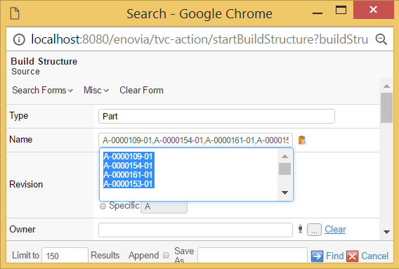
Figure 34. Paste area for the name field
Namefield is by default case sensitive while searching for results. It is possible to configure
this field to be case insensitive by setting tvc.structurebrowser.search.namepattern.caseinsensitive
to true in tvc.properties file.
|
Performance of TVC Structure Browser search is better when name field is case sensitive. |
RevisionField
The RevisionField will generate a field that allows the user to control the revision pattern in the query. The revision field has several sub-options that can be enabled/disabled.
Figure 35. Revision field
| Element Name | Description | Cardinality |
|---|---|---|
AnyRevision |
If present, the "Any" option will be available. |
Zero or One |
LastRevision |
If present, the "Last Only" option will be available. |
Zero or One |
FirstRevision |
If present, the "First Only" option will be available. |
Zero or One |
LatestRevision |
If present, the "Latest xxx" option will be available. This element requires the attributes "policy" and "state" to be defined. |
Zero or One |
LatestAndNextRevision |
If present, the option "Latest + Next revision" option will be available. This element requires the attributes "policy" and "state" to be available. |
Zero or One |
SpecificRevision |
If present, the option to specify a specific revision will be available. This element can have an attribute called value present, which contains the default value. |
Zero or One |
Label |
Defines a custom label for this field. See this chapter for details. |
Zero or more |
The AnyRevision, LastRevision, FirstRevision, LatestRevision,
LatestAndNextRevision and SpecificRevision elements all accepts the
attribute "selected" that denotes if the option is initially selected or
not.
|
OwnerField
The OwnerField will generate a field that allows the user to control the owner pattern in the query. The field is a text field where the user can define the owner. The icon to the right of the field can be used to populate the field with the name of the logged-in user.

Figure 36. the owner field
The sub-elements that are allowed inside the OwnerField element are:
| Element Name | Description | Cardinality |
|---|---|---|
DefaultValue |
Defines the default-value for this field. There should be one element per value. The value is entered between the start and end. If this element is left out, the default value is an asterisk (*). |
Zero or more |
Label |
Defines the label for this field. See this chapter for details. |
Zero or more |
| To make the default value equal to the name of the user currently logged in, the following attribute can be applied on the element: |
<OwnerField currentUserDefault="true"/>
OriginatorField
The originator field is similar to the owner field, excepts that it will base the query on the "Originator" attribute.
VaultField
The VaultField element will result in a field where the user can define the vault criteria for the query. The vault chooser is AEF compliant, e.g. it follows the same rules as the AEF vault chooser does.
Figure 37. the vault field
The vault field does not have any attributes that control the behaviour. The only nested element that is allowed inside this field is a Label element. The label element can be used to change the "Vault" text.
StateField
The state field controls what state and what policy the objects to be found has. The state field will, for each defined policy, show the available states, from which the user can make selection(s).
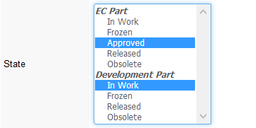
Figure 38. the state field
The sub-elements that are allowed inside the StateField element are:
| Element Name | Description | Cardinality |
|---|---|---|
Policy |
Defines a policy, which the field should work with. The Policy element must have a name attribute, which could either be the real- or symbolic- name of a policy. The element can also have an optional attribute called defaultStates, which contains a comma-separated list of the states, which are default selected (the names of the states can be symbolic names). |
One or more |
Label |
Defines the label for this field. See this chapter for details. |
Zero or more |
TextField
You can use the TextField in conjunction with the other fields in the form to return those business objects that contain the files that meet your criteria. The business objects must also meet any conditions set in the other field(s).
In the TextField, you can enter an exact string to search for, or you can use wildcards to select the information you are seeking. For example, enter "A String" to find objects with files that include this string
| Use of the TextField to perform a file search has additional setup requirements and limitations. Consult your System and/or Business Administrator to be sure that you can use this functionality. |
The table below lists those attributes specific for the TypeField element.
| Name | Description | Example |
|---|---|---|
format |
The format to base the search on. This can be left empty. |
Generic DOC |
The sub-element that are allowed inside the TextField element is:
| Element Name | Description | Cardinality |
|---|---|---|
Label |
Defines the label for this field. See this chapter for details. |
Zero or more |
RDOField
The RDO field will allow the user to find objects based upon design responsibility. Once this field has been defined and enabled, a read- only field with a chooser button will appear in the user interface. The user will, when clicking the chooser button, be allowed to find either an organization, such as a business unit, company or department, or a project to be used as input for the query.
This field has no attributes or sub-elements. The field will look like:
WhereField
The where-field allow the users to enter a custom where criteria. This field is only useful for users that have a good understanding of ENOVIA Queries and its syntax. When this field is in use, it will display a text area, whose size is configurable through the attributes: cols and rows.
| Name | Description | Example |
|---|---|---|
cols |
The number of columns within the text area. |
10 30 |
rows |
The number of rows within the text area. |
3 4 5 |
Search for Related Objects
A common use case is to limit the query and search for objects that is either directly related to another object, or indirectly (connected to an object, which is found in the structure of another object).
Let’s assume that you need to have a way to find business objects of type Documents, which only exists within the folder structure of a certain Project. Typically, if this kind of query is done using MQL; you would first expand the project and through that result find the document. The image below illustrates how the different entities are related.
Figure 39. Project and folder data model
To configure the search tool to support this use case, you need to use
the "built-in field" called RelatedWithField as the example below
illustrates.
<!-- ======================================================== -->
<!-- This field allows the user to only search for a document -->
<!-- within the folder structure of a selected Project -->
<!-- ======================================================== -->
<RelatedWithField relationship="relationship_VaultedDocumentsRev2" direction="to">
    <!-- =========================================================== -->
    <!-- The project folder structure needs to be expanded among the -->
    <!-- following relationships. Recurse is to end -->
    <!-- =========================================================== -->
    <Structure expandDepth="0" direction="from">
        <Relationship>relationship_ProjectVaults</Relationship>
        <Relationship>relationship_SubVaults</Relationship>
    </Structure>
    <FindRelated>
        <!-- =================================================== -->
        <!-- Display name defines the property to display in the -->
        <!-- field. The value is taken from the selected project -->
        <!-- =================================================== -->
        <Display><![CDATA[$<name>]]></Display>
        <!-- ================================================== -->
        <!-- You need a page configuration that defines how the -->
        <!-- query result is presented -->
        <!-- ================================================== -->
        <PageConfig>the name of the page configuration object</PageConfig>
        <!-- ============================================ -->
        <!-- Either let the user fill in a search form... -->
        <!-- ============================================ -->
        <Search allowOpenCollection="false" allowExecuteSavedQuery="false">
            <Form default="true">name of search form</Form>
            <Form>name of another search form</Form>
            <Type>type_ProjectSpace</Type>
        </Search>
        <!-- ============================================ -->
        <!-- or use the inquiry below, to simply load the -->
        <!-- project objects -->
        <!-- ============================================ -->
        <!--
        <Loader inquiry="tvc:inquiry:sb:search/GetProjects.xml"/>
        -->
    </FindRelated>
    <Label>In Project</Label>
</RelatedWithField>
The required attributes on the element RelatedWithField are relationship and
direction. These define how the object(s) being found are related to
the other object. The relationship attribute can either refer to a
relationship through its symbolic name or its real names. The
relationship attribute can be set to an asterisk (*).The direction
attribute is either "from" or "to". From means that the "related objects
found" is connected .
You may also use the optional attribute multipleAllowed to allow specifying
multiple related objects.
The element Structure defines how the related object should be
expanded (if it should be). The expandDepth and direction attributes
specified the expansion behaviour, together with the nested
Relationship elements.
The FindRelated element is used to define how the related object
should be found as well how those are displayed for the user. The
related object can either be found by using a nested search screen, or
you can load the objects directly through a data set, an inquiry or a JPO.
This is accomplished by either configure the Search element as in the
example below, or use a Loader element.
The element PageConfig defines the page configuration object, which
defines the behaviour of the page showing the query result.
The table below shows the requirements for the elements:
| Element Name | Attribute | Required | Sub Element | Required |
|---|---|---|---|---|
RelatedWithField |
relationship |
Yes |
FindRelated |
Yes |
direction |
Yes |
|||
multipleAllowed |
No (Default is false) |
|||
Structure |
expandDepth |
Yes |
Relationship |
Yes |
direction |
Yes |
|||
FindRelated |
Display |
Yes |
||
PageConfig |
Yes |
|||
"Search" OR "Loader" |
Yes |
|||
Search |
"Form" OR "Type" |
Yes |
||
Loader |
One of
|
Yes |
Field
The generic Field element is used for all other fields, which is used to populate the where-expression part of the query. These fields typically maps to a basic property or an attribute.
The generic Field element accepts following attributes.
| Name | Description | Example | ||
|---|---|---|---|---|
editable |
Boolean that indicates if the field is editable or not. |
True False |
||
hidden |
Boolean that indicates if the field is visible or not |
True False |
||
fieldSize |
Defines the size of the field. If the field is a text field, this will become the width of the field. If the field has range values, this will control the number of visible options visible default. |
20 30 40 |
||
maxLength |
Defines the maximum length of the entered value |
130 130 |
||
dataType |
Defines the data type, which the entered value to this field should be compatible with. |
string timestamp real integer boolean |
||
mapsTo |
Defines what the field maps to. This could be an attribute, or a basic field. If pointing to an attribute, symbolic names are allowed. |
attribute_AnAttribute My Attribute modified current |
||
multipleAllowed |
Indicates if the user may enter several values as input. (Currently, this is only applicable to range values.). |
True False |
||
defaultOperator |
Defines the default operator that should be selected initially. |
Name of operator See this chapter for more info. |
||
sortRangeValues |
A Boolean that indicates if we should sort the range values initially. |
True (Default) False |
||
operatorChooserVisible |
This flag indicates if the operator chooser should be visible or not. Note that if the operator should be invisible, a defaultOperator must have been defined explicitly. |
True (Default) False |
||
chooserURL |
Defines the (page context relative) URL of the page that displays any choosable values. |
/custom/MyPage.jsp |
||
ignoreRanges |
A boolean that could be used to force using range values that is defined on attributes. |
True False (Default) |
||
onVerifyField |
Defines a JavaScript function that should be invoked when the field is validated. The default behaviour is that the entered value is validated against the field’s data type.
|
|
||
FocusFirst |
Field which needs to be focused on tab load. It will work on Tab basis, so one tab should have only one field with FocusFirst. If there is not any field have, first input field will be focused automatically. |
True / False (Default) |
||
TooltipLabel |
This specifies the label for the tooltip. If specified the tooltip will be displayed with a title header. |
|
||
TooltipContent |
This specifies the content of the tooltip. This can be text or html for more advanced formatting. Please note that to use HTML, the CDATA tag needs to be used. |
Or with HTML content: |
Field with Custom Range Values
A Field that is mapped to an attribute with range values will get those ranges by default from the attribute definition (unless the element-attribute ignoreRanges is set to true).
However, often it is desired to have the opposite behaviour - e.g. when the attribute does not have any range values, but you might want to force the user to select a specific value in the search form dialog.
This can be accomplished by having nested Range elements. The example below illustrates how to use such a Range element.
<Field mapsTo="vault">
    <RangeValue suiteKey="Framework"
                value="eService Production"
                labelKey="emxFramework.Vault.eService_Production"
                selected="true"/>
    <RangeValue symbolicName="true"
                value="vault_TVCAdministration">
        <Label>TVC Vault</Label>
    </RangeValue>
</Field>Label
This element defines a localized label. The label could be defined in different languages, by using the attribute "locale" to define which locale the label is valid for.
The locale argument is a valid ISO Language Code. These codes are the lower-case, two-letter codes as defined by ISO-639. You can find a full list of these codes at a number of sites, such as:
Examples of label definitions
<Label>This is the default label<Label>
<Label locale="sv">This would be the label in Swedish</Label>
<Label locale="de">This would be the labe in German</Label>
...
Access Control
User access can be controlled for every field in a form, or any form itself. Only fields or forms that a user has access to will be shown in the user interface.
User access is defined within the AccessList element:
<?xml version="1.0" encoding="UTF-8"?>
<SearchFormConfig>
    <AccessList> (1)
        <Role name="role_Arole"/>
        <Group name="group_Name"/>
        <Person name="Test Everything"/>
    </AccessList>
    <Fields>
        <Field ...>
            <AccessList> (2)
                <Role name="..."/>
                <Group name="..."/>
                <Person name="..."/>
            </AccessList>
        </Field>
    </Fields>
</SearchFormConfig>| 1 | Access definition on form level |
| 2 | Access definition on field level |
When combining different types of access control, all users
that are either explicitly added to the Person element, OR are
assigned to any of the roles added to the Role element, OR are
assigned to any of the groups added to the Group element, will have
access.
|
If the AccessList element is left out, all users will have access to
the field or the form.
Operator Names
When you configure a default operator on a field, you should preferably use the operator name instead of the operator itself (even though the latter is possible). Specifying the operator might in some cases cause the query to become different than expected; this is due to that the same operator are used for different purposes.
For example matching the beginning of a string, ending of a string or contains uses all the same operator (~~ or ~=). See the table below for the operator names that is supported:
| Data Type | Operator Name | Query Operator |
|---|---|---|
Range |
RANGE_IS |
== |
RANGE_IS_NOT |
!= |
|
String |
STRING_ENDS_WITH |
~~ |
STRING_BEGINS_WITH |
~~ |
|
STRING_CONTAINS |
~~ |
|
STRING_NOT_CONTAINS |
!~~ |
|
STRING_ENDS_WITH_MATCH_CASE |
~= |
|
STRING_BEGINS_WITH_MATCH_CASE |
~= |
|
STRING_CONTAINS_MATCH_CASE |
~= |
|
STRING_NOT_CONTAINS_MATCH_CASE |
!~= |
|
STRING_IS_EXACTLY |
== |
|
STRING_IS_NOT |
!= |
|
Integer |
INTEGER_AT_LEAST |
>= |
INTEGER_AT_MOST |
⇐ |
|
INTEGER_NOT_EQUAL |
!= |
|
INTEGER_EQUAL |
== |
|
INTEGER_LESS_THAN |
< |
|
INTEGER_MORE_THAN |
> |
|
INTEGER_BETWEEN |
⇐ & ⇒ |
|
Decimal |
REAL_AT_LEAST |
>= |
REAL_AT_MOST |
⇐ |
|
REAL_NOT_EQUAL |
!= |
|
REAL_EQUAL |
== |
|
REAL_LESS_THAN |
< |
|
REAL_MORE_THAN |
> |
|
REAL_BETWEEN |
⇐ |
|
Date |
DATE_ON |
== |
DATE_ON_OR_AFTER |
>= |
|
DATE_ON_OR_BEFORE |
⇐ |
|
DATE_BETWEEN |
⇐ & ⇒ |
|
Boolean |
BOOLEAN_IS |
== |
BOOLEAN_IS_NOT |
!= |
Example:
<Field mapsTo="attribute_MarketingName"
       defaultOperator="STRING_CONTAINS"
       operatorChooserVisible="false"/>
Operators (String Fields)
The used operators for string fields can be configured. The screen shot below shows the list of all possible operators.
This can be changed through a TVC init parameter, as shown below:
<init-param>
    <param-name>tvc.structurebrowser.search.stringOperators</param-name>
    <param-value>
        case-insensitive
        <!--case-sensitive-->
        <!--all-->
    </param-value>
</init-param>
More
The "More" element can be used to group fields that can be used to specify the query more detailed.
The example below illustrates how to use the More element.
<SearchFormConfig ...>
    ...
    <Fields>
    ...
        <More defaultEnabled="false|true"> (1)
            <Field .../>
            <Field .../>
        </More>
    </Fields>
</SearchFormConfig>| 1 | Default is FALSE |
You can also specify whether or not the more fields should be displayed default when the form is loaded, by setting the attribute "defaultEnabled" on the "More" element to "true".
| You can only have one "More" section declared for each form defined. |
Type Specific Fields
A field in a form can be enabled for certain types only. For example, a form can be made quite generic, and when the user selects a different type - some fields might be enabled and some might be disabled depending on the selected type.
To specify this in the Search Form, just follow the example below:
<SearchFormConfig ...>
    ...
    <Fields>
        <Field mapsTo="attribute_Weight">
            <EnabledForType>type_Part</EnabledForType>
            <EnabledForType>type_AnotherTypeWithWeightAttribute</EnabledForType>
        </Field>
        <Field mapsTo="attribute_Title">
            <EnabledForType>type_DOCUMENTS</EnabledForType>
        </Field>
    </Fields>
</SearchFormConfig>
Configuring Find Like
When the Find Like functionality is used, the form that is created for a particular type is created dynamically based upon the available attributes for the type.
The search tool will be based upon this information create an XML file, following the same format as when a search form is defined. The search tool allows to plug-in so-called XSLT stylesheets that can be used to transform the generated XML before it is parsed into a form.
To define such a stylesheet, you need to configure a system parameter, according to this format:
<init-param>
    <param-name>tvc.structurebrowser.findlike.stylesheet.__SymbolicTypeName__</param-name>
    <param-value>__TheNameOfTheStylesheet__</param-value>
</init-param>
As an example, this could look like:
<init-param>
    <param-name>tvc.structurebrowser.findlike.stylesheet.type_Part</param-name>
    <param-value>type_Part.xsl</param-value>
</init-param>
<init-param>
    <param-name>tvc.structurebrowser.findlike.stylesheet.type_DOCUMENTS</param-name>
    <param-value>type_DOCUMENTS.xsl</param-value>
</init-param>
Then you need to make those files (type_Part.xsl and type_DOCUMENTS.xsl) available in the classpath, typically by putting them into the WEB-INF/classes folder of the application or into some JAR file.
For reference, below is an example stylesheet applicable for the Part type. This stylesheet will modify the revision field, add a state field the RDO field and a field that enabled querying for the description.
<?xml version="1.0" encoding="ISO-8859-1"?>
<xsl:stylesheet xmlns:xsl="http://www.w3.org/1999/XSL/Transform" version="1.0">
    <xsl:template match="@*|node()">
        <xsl:copy>
            <xsl:apply-templates select="@*|node()"/>
        </xsl:copy>
    </xsl:template>
    <xsl:template match="RevisionField">
        <RevisionField>
            <AnyRevision/>
            <LastRevision selected="true"/>
            <FirstRevision/>
            <LatestRevision policy="policy_ECPart" state="Release"/>
            <SpecificRevision value="A"/>
        </RevisionField>
        <StateField>
            <Policy name="policy_ECPart"/>
            <Policy name="policy_DevelopmentPart"/>
        </StateField>
        <RDOField/>
        <Field mapsTo="description"/>
    </xsl:template>
</xsl:stylesheet>
The fields within a find-like form are rendered in the following order:
-
Fields applying to basic fields (sorted according to their labels)
-
Fields applying to attributes (sorted according to their labels)
Search Result with Dynamic Columns
Normally when a search is performed, the result is displayed in the table as configured via the configurations made (page configuration and view). In some cases, the user might perform a search on a field that is not part of the table used to display the search result.
There are some configuration options available that can be used to enable dynamically generated search result tables. This can either be configured on a global basis and/or per use case.
Configure via Init Parameters
A number of new so-called TVC init parameters were added in order to control the behavior of this.
-
To enable the dynamically appending of columns globally, the following init parameter must be set to true (default is FALSE).
<init-param> <param-name>tvc.structurebrowser.search.appendQueryFieldsToTable</param-name> <param-value>true</param-value> </init-param> -
If you want to add fields that map to attributes only or if you want to add columns for all fields, you should set the following parameter to either true or false (default is TRUE).
<init-param> <param-name>tvc.structurebrowser.search.appendAttributeFieldsOnly</param-name> <param-value>true</param-value> </init-param> -
If you want to use a table that contains a set of columns that always should be shown (or no table at all, which might be the case if you add all query parameters as columns in the table) you should modify this parameter:
<init-param>
    <param-name>tvc.structurebrowser.search.defaultDynamicResultTable</param-name>
    <param-value>name of table</param-value>
</init-param>
The default value of this parameter is:
tvc:table//com/technia/tvc/structurebrowser/search/form/res/DynamicSearchResultTable.xml
You should not manipulate this built-in table; instead, point to your own custom table that defines your own columns.
The table can be an XML table or a System Table.
Setting this parameter to an empty string is OK if you don’t want to use a "template" and only base the result table on the used fields.
Configure per Form / Field
You can also per search form and per field within a form do additional fine-tuning.
-
To disable the dynamic append for one particular form (or enable if it has been disabled globally), you can in the XML definition do:
<SearchFormConfig appendQueryFieldsToTable="true"> ... </SearchFormConfig> -
To use a different "base/template table" when using a particular form, you can in the XML definition do:
<SearchFormConfig tableName="tvc:table:namespace/MySpecialTable.xml"> ... </SearchFormConfig> -
In case you want to prevent that a particular field is added as a table column, you can in the XML definition do:
<SearchFormConfig ...>
    ...
<Fields>
    <Field mapsTo="attribute_ABC"
           addFieldToResultTable="false">...</Field>
        ...
    </Fields>
</SearchFormConfig>
1.9.4. Auto Complete
The search tool takes advantage of the auto-completion capabilities. This is by default used for the following types of fields:
-
Type Field
-
Owner Field
-
Selecting the Design Organization (RDO)
The auto-completion feature can be disabled globally for all users, by applying the following init parameter:
<init-param>
    <param-name>tvc.structurebrowser.search.autoCompleteEnabled</param-name>
    <param-value>false</param-value>
</init-param>
Or, you can disable this on a field that supports auto-completion by doing:
<TypeField autoCompleteEnabled="false">
1.9.5. Support Library and its attributes in TVC search form
Previously, the clasification field in the TVC search form was not supported. We’ve now included support for it in the Tvc search form. The following is the configuration:
<ClassificationField id="classification">
            <Label>Classification Type</Label>
            <Library>
            <Type>type_GeneralLibrary</Type>
            <Name>Part Library</Name>
            <Revision>-</Revision>
            </Library>
</ClassificationField>
1.9.6. Configuring Dynamic Attributes
Dynamic attributes are on Interfaces which are applied to Business Object. When user want to search the Business Object on basis of dynamic attribute, below configuration should be used in the search form configuration.
<Interfaces>
    <Interface name="Material Compliance" enabledFor="type_Part"/>
    <Interface name="Part Family Reference" enabledFor="type_Part"/>
    <Interface name="Reported Part" enabledFor="type_Part"/>
    <Interface name="Change Information" enabledFor="type_ChangeOrder"/>
</Interfaces>
1.10. Managing Structures
This section describes how you can use the built-in functions in the Structure Browser to manage ENOVIA structures by connecting and disconnecting business objects. You enable these functions by creating Commands and adding them to the toolbar.
Over the years, many different functions have been added to the Structure Browser allowing the user to manage the structures in a vary of different ways. The sub-chapters will cover these areas:
-
Build Structure Split View
-
Build Structure Classic
-
Quick Connect
-
Create and Connect
-
Drag’n’Drop Connect / Re-arrange / Move
1.10.1. Build Structure (Split View)
Building structures using the split view version doesn’t require any selections from the source structure. When launching the command, a popup window that contains a search dialog will be visible. This dialog may look like the example below:
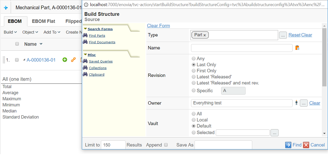
Figure 40. the new build structure.
The following URL is used to invoke the "split view" build structure function:
${ROOT_DIR}/tvc-action/startBuildStructure
The following URL parameters can be used to configure the build structure function.
| URL Parameter | Description | Examples |
|---|---|---|
buildStructureConfig |
Required. The name of the build-structure-configuration business object. A build-structure-configuration business object can be used instead of the common URL parameters to configure the behaviour of the build structure function. |
buildStructureConfig=tvc:buildstructureconfig/BuildEBOM.xml |
autoLoad |
If the value of this parameter is "true" the search form in the beginning of the build structure-function will be skipped. Hence, this parameter can be used together with "program", "inquiry", "queryName", "set", or "emxTableRowId" to automatically load the source table in the split screen. |
autoLoad=true |
program |
This parameter only applies when the "autoLoad" parameter is "true". The value of this parameter configures which JPO and method to use when automatically loading the source table. |
program=JPOName:MethodName |
inquiry |
This parameter only applies when the "autoLoad" parameter is "true". The value of this parameter configures which inquiry to use when automatically loading the source table. |
Inquiry=InquiryName |
queryName |
This parameter only applies when the "autoLoad" parameter is "true". The value of this parameter configures which saved the query to use when automatically loading the source table. Not that saved queries are workspace object, i.e., user specific. |
queryName=SavedQuery |
set |
This parameter only applies when the "autoLoad" parameter is "true". The value of this parameter configures which set to use when automatically loading the source table. Not that saved queries are workspace object, i.e., user specific. |
set=SetName |
emxTableRowId |
This parameter only applies when the "autoLoad" parameter is "true". The value of this parameter configures which objects should appear in the source table. Multiple occurrences possible. |
emxTableRowId=1.2.3.4.5 |
The next screen will show a split view, where one of the screens contains the search result (called source) and one showing the target structure (the one from which the build structure was invoked). The source and target may be positioned differently, depending on the configuration of the build structure function.
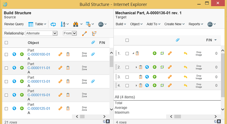
Figure 41. Build structure split view
The target structure will inherit the configuration, regarding toolbar/action bars/views/tables etc, from the structure from where the build structure function was invoked. The source table is configured from the request parameters taken from the request that launched the build structure function.
In the source screen, you will see a drop-down list where the relationship to be used can be selected as well as a drop-down list where the direction could be set.
There is also a button used to launch the connect function. Optionally, a replace function could be visible, and, if the source window is shown in navigation mode – a move button can also be available. These buttons are used to perform more advanced structure modifications.
The direction setting should be interpreted as "from" target to the source OR "to" target from the source.
When starting the connect wizard, another popup window will be shown. Depending on the configuration of the build structure function, the user may first be prompted to select a relationship type for each connection. This is shown in the next picture.
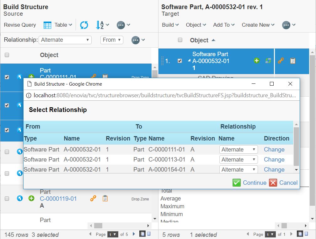
Figure 42. selecting relationship type
From this screen, the relationship type and the direction may be changed. When clicking next, the objects are connected with the specified relationships. If some objects could not be connected, an error is shown and the user may correct the error.
When the objects have been successfully connected, a screen where the user can edit the relationship attributes may be shown if the build structure function is configured so. This is shown in the next picture.
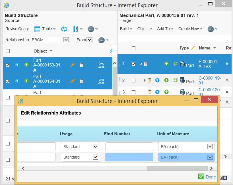
Figure 36 editing the relationship attributes
When the relationship attributes have been modified, the connect wizard ends. If some attributes could not be updated, due to some reason, an error message is shown and the user may correct the error.
When the connect wizard ends, the popup window is closed and the target structure is updated. The inserted objects within the target structure are highlighted.
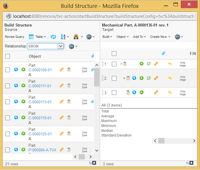
Figure 43. the updated target structure
The user may now select to either close the window or perform another connect / disconnect operation.
1.10.2. Build Structure (Classic)
Connecting business objects using the built-in function consists of three steps. The first step is to select a business object in the Structure Browser to which other objects will be connected. Then you need to use the search function to find business objects to which the selected business object will be connected. The final step is to connect the business objects while possibly editing relationship attributes.
Use the Commands and Menus installed with the TVC database schema for Structure Browser as templates when enabling this function. The name of the Command that launches the connect functionality is called "TVC Build EBOM Structure (R1) Search".
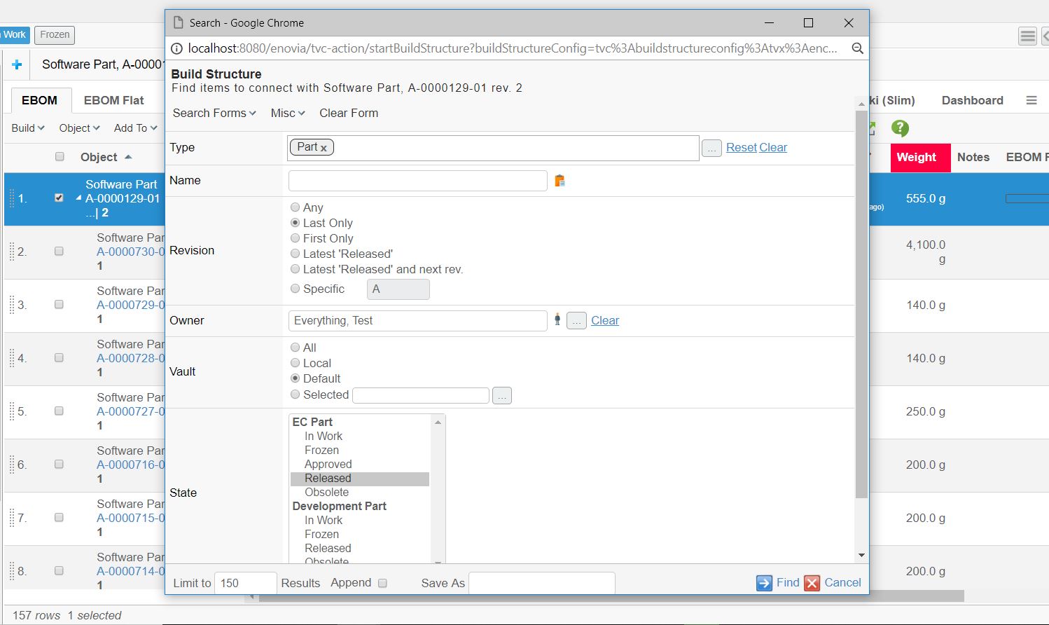
Figure 44. Connecting business objects using the built-in connect function
To utilize this function you will have to create a Command to launch the search dialog used to find business objects that should be connected. You will also have to create a Menu representing the displayed on the search result. This toolbar should contain one or more Commands for connecting the selected business objects.
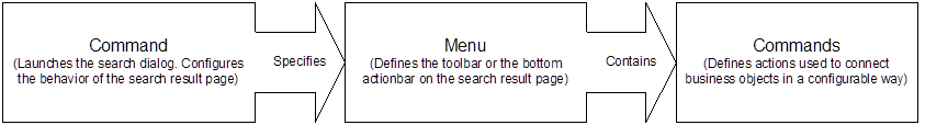
Figure 45. Commands and Menus required by the connect function
How to configure the search function is described more detailed here .
In addition to what applies to the general search function, you must ensure that the search result is configured to have a toolbar with the command that is used to launch the connect function. In the sample data provided, the menu that contains this command is called "TVC Build Structure 1 Toolbar". This menu contains two commands, one for revising the search, and one for performing the connecting.
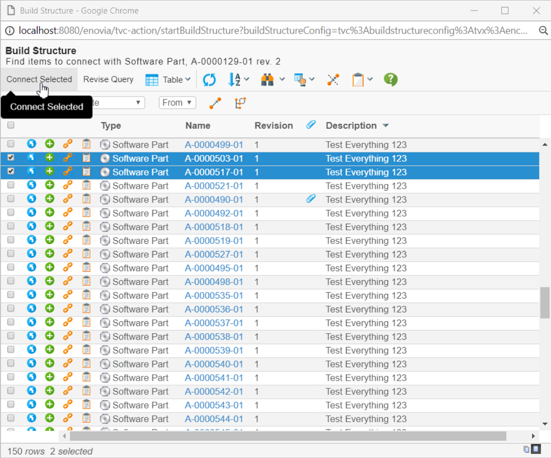
Figure 46. connection business objects using the built-in function
The value of the "Href" parameter on the Commands used to connect business objects should be the URL to the built-in connect function, which is:
${ROOT_DIR}/tvc-action/buildStructure
You also have the opportunity to add query string parameters to this URL to configure the behaviour of the connect function (e.g., whether the user should be able to change the relationship or edit the relationship attributes). The following table describes the available parameters.
| URL Parameter | Description | Examples |
|---|---|---|
direction |
The default direction when connecting objects (i.e., from or to). |
direction=from |
relationship |
The relationship to connect with by default. Note that this parameter is required when the user doesn’t have the opportunity to select relationship (i.e., when "selectableRels" is false). |
relationship=EBOM |
selectableRels |
Whether the user should be allowed to select which relationship to connect with. The default value for this setting is true. |
selectableRels=false |
allowedRels |
The relationships that the user should be allowed to select from when "selectableRels" is true. The default value for this parameter is that all available relationships between the selected business objects are allowed. |
allowedRels=EBOM&allowedRels=MBOM |
editAttributes |
Whether the user should be allowed to edit the relationship attributes. The default value for this setting is true. |
editAttributes=false |
allowReplace |
Whether the user is allowed to perform "replace" operations. |
allowReplace=true |
AllowMove |
Whether the user is allowed to perform "move" operations. |
allowMove=true |
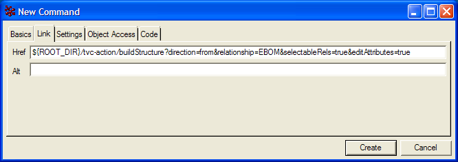
Figure 47. Creating a Command to connect business objects
You should also add settings on the Command to configure its behaviour. The available settings are described in the section Command Settings. The more important parameters are:
- Row Select
-
Configures whether the user has to select any rows to be able to execute the action. The value should be either single or multiple as the built-in connect function requires that at least one row has been selected among the search result when connecting business objects.
- Submit
-
Configures whether to submit the current row selections to the URL entered in the "Href" parameter. The value of this setting must be true as the connect function depends on the current row selections.
- Target Location
-
Configures where to load the connect function. The value of this setting should be popup, as the connect function should be loaded into a separate window in which the user will be able to interact with the process of connecting business objects (e.g., select relationship, change direction, edit relationship attributes) when this is enabled by the URL parameters or to display error messages for errors that might occur while connecting.
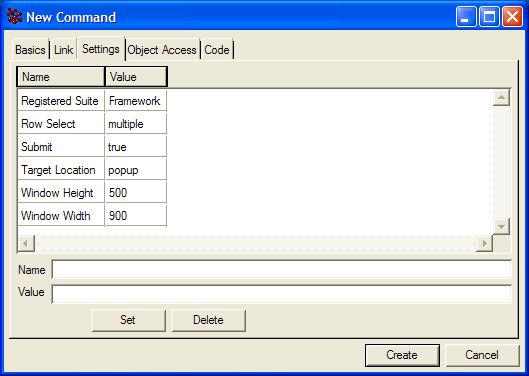
Figure 48. Configurable settings on a Command for connecting business objects
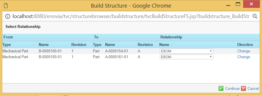
Figure 49. Selecting relationship when connecting with the built-in connect function
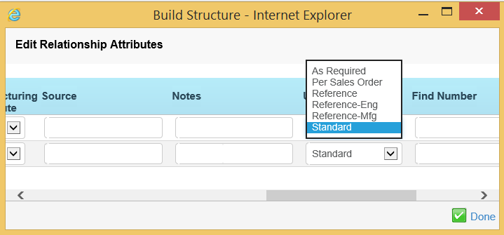
Figure 50. Editing relationship attributes when connecting with the built-in connect function
1.10.3. Quick Connect
As of release 2009.1, a new build structure mode has been added called quick-connect.
To use this feature, you need to add a command that has the following properties:
HREF   : ${ROOT_DIR}/tvc-action/quickConnect
PARAM  : searchConfig = <name of search config to use>
PARAM  : relationship = <real name or symbolic name of relationship to use>
PARAM  : direction=from|to [OPTIONAL. If omitted, from is assumed]
SUBMIT : true
TARGET : popup
Below is an example where the quick connect is invoked from a command in the context menu. The user can add an existing document to a folder.
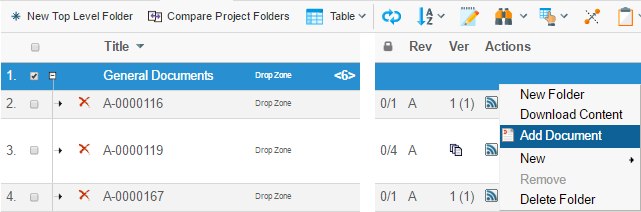
The command will open a search form, allowing the user to define the search criteria. From the search result, the user can select the object(s) to add, and once clicked the search result window is closed and the source view is refreshed.
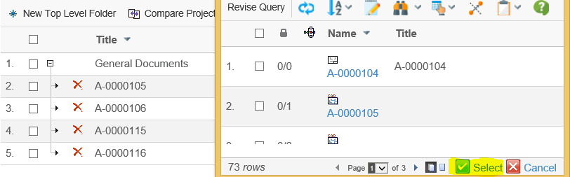
Quick-connect will also work in sidepanel. To configure this, you need to add following in Command definition:
<TargetLocation>sidepanel</TargetLocation>
1.10.4. Create and Connect
An action that can create and connect a new object has been added. This action will create a new business object, according to the parameters in the URL and connect it with the selected object(s) in the table.
There will not be any user interface shown for the create dialog. This function is intended to allow building up a structure quickly.
To use this feature, you need to add a command that has the following properties:
HREF   : ${ROOT_DIR}/tvc-action/createAndConnect
PARAM  : relationship = <real name or symbolic name of relationship to use>
PARAM  : direction=from|to [OPTIONAL. If omitted, from is assumed]
PARAM  : type = <the business type to use>
PARAM  : name = <name of number generator to be used>
PARAM  : revision = <revision> [OPTIONAL: If omitted, the first revision
                                          in sequence is used, according
                                          to the policy definition]
PARAM  : vault = <the vault to create the object in> [OPTIONAL: If omitted,
                                                      the same vault as the
                                                      object to connect with
                                                      is used]
PARAM  : policy = <the name of the policy to use>
PARAM  : owner = <name of owner> [OPTIONAL: The user creating the object
                                  will own the object, unless a trigger
                                  changes this]
PARAM  : expandRow = <TRUE or FALSE> [OPTIONAL: Default is TRUE]
PARAM  : addRow = <TRUE or FALSE> [OPTIONAL: Default is TRUE]
SUBMIT : true
TARGET : tableHiddenFrame
| The parameters "type", "vault", "policy" and "relationship" allow having symbolic names. |
| The number generator can either be a TVC Number Generator, or an ENOVIA generator. If you both have a TVC number generator and ENOVIA generator with the same name, add the parameter "skipTVCNumberGenerator" with value TRUE. In case no parameter is specified the TVC Number generator is used. |
| If you create a new document and you have the TVC Office Integration installed, you can also allow the user to check-in a file to the newly created object. Add the parameter "checkin" to the command, and assign the value "yes", "true" or "ask". The latter value will ask the user if s/he wants to check-in a file or not. |
If the checkin parameter is set to ask, you can add another parameter that can delete the document object if the user selects cancel. This parameter is called "deleteOnCancel" and should be set to true if this behaviour is wanted.
The parameters "expandRow" and "addRow" controls how the table should behave after the object has been created:
-
expandRow controls if the selected row should be expanded to show all children besides the newly created one.
-
addRow controls if the new object should be added as a new row or not.
1.10.5. Disconnecting Business Objects
To be able to disconnect objects with the Structure Browser you need to create a Command and add it to the toolbar displayed on the Structure Browser page.
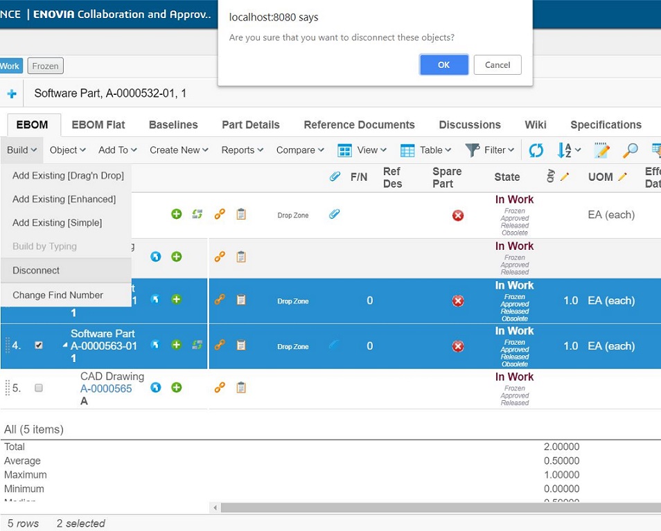
Figure 51. disconnecting objects with the Structure Browser
When creating a Command to disconnect business objects you will have to edit its "Href" parameter to the URL for the disconnect function, which is:
${ROOT_DIR}/tvc-action/disconnect
Note that you don’t have to add any query string parameters to this URL, as this will be taken care of by the Structure Browser when it’s added to the toolbar. However, you will have to add settings to the Command to make it behave as expected. The available settings are described in the section Command Settings for toolbars. The most important are:
- Row Select
-
Configures whether the user has to select any rows to be able to execute the action. The value should be either single or multiple as the built-in disconnect function requires that at least a row has been selected.
- Submit
-
Configures whether to submit the current row selections to the URL entered in the "Href" parameter. The value of this setting must be true as the disconnect function depends on the current row selections.
- Target Location
-
Configures where to load the disconnect function. The value of this setting should be tableHiddenFrame, as the disconnect function should be loaded into a hidden frame.
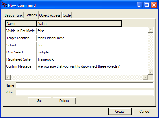
Figure 52. configurable settings on a Command for disconnecting business objects
1.10.6. Using Build Structure Configuration
A build structure configuration object act as a container for common URL parameters that you can use to configure the look and feel of the build structure function.
Example configuration below:
<?xml version="1.0" encoding="UTF-8"?>
<BuildStructure xmlns="http://technia.com/TVC/BuildStructureConfig" xmlns:xsi="http://www.w3.org/2001/XMLSchema-instance" xsi:schemaLocation="http://technia.com/TVC/BuildStructureConfig http://products.technia.com/tvc/schema/latest/BuildStructureConfig.xsd">

    <PageConfiguration>tvc:pageconfig:tvx:enc/BuildEBOM.xml</PageConfiguration> (1)

    <Header />(2)
    <SubHeader />
    <AllowOpenCollection>TRUE</AllowOpenCollection>(3)
    <AllowExecuteSavedQuery>TRUE</AllowExecuteSavedQuery>
    <AllowOpenClipboard>TRUE</AllowOpenClipboard>
    <SearchForms>(4)
        <SearchForm default="true" name="tvc:searchform:tvx:enc/FindParts.xml" />
        <SearchForm name="tvc:searchform:tvx:enc/FindDocs.xml" />
    </SearchForms>

    <Layout>Source - Target</Layout> (5)
    <RelationshipDirection>From</RelationshipDirection>(6)
    <AllowRelationshipChange>TRUE</AllowRelationshipChange>(7)
    <AllowRelationshipAttributeEdit>TRUE</AllowRelationshipAttributeEdit>(8)
    <AllowReplace>TRUE</AllowReplace>(9)
    <AllowMove>TRUE</AllowMove>(10)
    <Relationships>(11)
        <Relationship name="relationship_EBOM" />
        <Relationship name="relationship_SimilarPart" default="true"/>
        <Relationship name="relationship_Alternate" />
        <Relationship name="relationship_SparePart" />
        <Relationship name="relationship_PartSpecification" />
    </Relationships>
</BuildStructure>| 1 | Defines the page configuration that controls the search result page |
| 2 | Defines header and sub header on the search page |
| 3 | Defines if user may open a collection / execute saved queries / open the clipboard |
| 4 | Defines available search forms |
| 5 | Defines the layout of the split-screen. Possible values are |
| 6 | Defines if user may change the relationship direction |
| 7 | Defines if the user may change relationship type |
| 8 | Defines if user can edit relationship attributes after connect |
| 9 | Defines if the replace button should be visible |
| 10 | Defines if the move button should be visible |
| 11 | Defines available relationships |
See also this document for more details regarding XML configuration files.
1.10.7. Drag and Drop Connect
It is possible to drag and drop rows to connect objects from a search result displayed in the side-panel. One or more rows can be dragged from the side-panel to the main table and dropped in a row to create a connection.
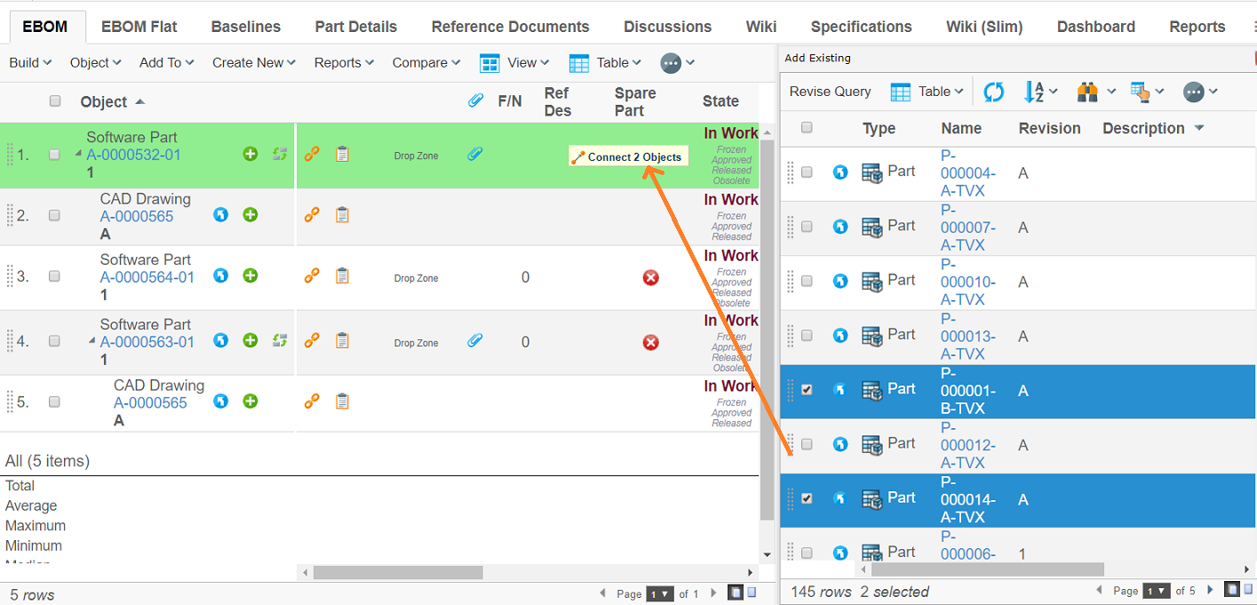
Figure 53. Dragging rows from the side-panel into the main table to connect objects
To enable this, the page configuration for both the main table and the side-panel must be correctly configured.
Views where rows should be draggable needs to include a parameter on the page configuration:
- drag:enabled
-
Enables rows in tables for this page configuration to be draggable. (true or false)
Example:
<?xml version="1.0" encoding="UTF-8"?>
<PageConfig>
    ...
    <Parameters>
        <Parameter name="drag:enabled" value="true"/>
    </Parameters>
    ...
</PageConfig>
On the page configuration where rows should be dropped, the page configuration needs to include information on which relationship, direction and table behaviour should be used when an object/objects is dropped on another.
- drop:enabled
-
Enables rows in tables for this page configuration to be droppable.
Accepted values are true or false
- connection:{dragtype}:{droptype}
-
Specifies which relationship,direction, and table behaviour should be used when an object is dropped on another. The value must contain this data, separated by a comma:
{relationship},{direction},{insert|refreshrow|refreshtable}or
{relationship},{direction},{insert|refreshrow|refreshtable},{droppable state 1}|{droppable state 2}|{droppable state n}|..."insert" creates a new row in the table, while "refreshrow" only updates the row and "refreshtable" updates entire table.
For example, dropping a document on a part would create a Part Specification relationship, and insert the document on a new row. To do this, set the name of the parameter to:
connection:type_DOCUMENTS:type_Part
and the value to:
relationship_PartSpecification,from,insert
or
relationship_PartSpecification,from,insert,Preliminary|Review
Example:
<?xml version="1.0" encoding="UTF-8"?>
<PageConfig>
    ...
    <Parameters>
        <Parameter name="drop:enabled" value="true"/>
        <Parameter name="connection:type_Part:type_Part"
                   value="relationship_EBOM,from,insert,Preliminary|Review"/>
        <Parameter name="connection:type_ECO:type_Part"
                   value="relationship_AffectedItem,to,refreshrow" />
        <Parameter name="connection:type_ECR:type_Part"
                   value="relationship_AffectedItem,to,refreshtable" />
        <Parameter name="connection:type_DOCUMENTS:type_Part"
                   value="relationship_PartSpecification,from,insert" />
    </Parameters>
    ...
</PageConfig>
If the user drags and drops objects that are not configured, an error message will be displayed:
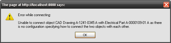
Figure 54. Error message for object connection not configured
Custom Drag Drop Handler
It is also possible to define your own custom logic to define what should happen when an object is dropped. To enable this, define the value of the connection parameter to include a java class instead of the connection info:
<Parameters>
    <Parameter name="drop:enabled" value="true"/>
    <Parameter name="connection:type_Part:type_Part" value="java:com.acme.dragdrophandler.MyDragDropHandler"/>
</Parameters>
The class needs to implement the interface
com.technia.tvc.structurebrowser.dragdrop.DragDropHandler. See code
example below:
import com.technia.tvc.core.TVCException;
import com.technia.tvc.core.db.BusinessObjectUtils;
import com.technia.tvc.core.db.select.Statement;
import com.technia.tvc.core.db.table.evaluator.SelectedData;
import com.technia.tvc.core.table.TableBean;
import java.util.Collection;
import java.util.LinkedList;

import com.technia.tvc.structurebrowser.dragdrop.DragDropHandler;
import com.technia.tvc.structurebrowser.dragdrop.ConnectMode;

public class EBOMConnectionHandler implements DragDropHandler {

    public ConnectMode getConnectMode() {
        return ConnectMode.INSERT;
    }

    public String[] getSelects(boolean dragged) {
        return null;
    }

    public String validate(SelectedData data, boolean dragged) {
        String state = data.getSelectValue(Statement.CURRENT);
        if (dragged) {
            if (state.equals("Obsolete")) {
                return "Obsolete objects cannot be inserted!";
            }
        } else {
            if (!(state.equals("Preliminary") || state.equals("Create"))) {
                return "You can only connect to a Part in Preliminary/Create state";
            }
        }
        return null;
    }

    public Collection<Connection> perform(DragDropContext ctx) throws TVCException {
        /*
         * Perform connection
         */
        String connId = BusinessObjectUtils.connect(ctx.getDropObjectId(), ctx.getDragObjectId(), "EBOM").getName();

        Collection<Connection> connections = new LinkedList<Connection>();
        connections.add(new Connection(connId, true, "EBOM"));
        return connections;
    }
}
See also the API docs within the developer documentation for further information.
| When drag and dropping from the clipboard the relationship and data id for the dragged object is not populated as this information doesn’t exists. |
Loading Search Form in Side Panel
To enable drag and drop from a search result within the side panel, you need to configure the command that opens the search dialog to be opened within the side panel.
The way to accomplish that is to use the new "Target Location" value called "sidepanel". Example:
<Command>
    <Label>Add Existing [Drag'n Drop]</Label>
    <URL action="beginSearch" submit="true">
        <Param name="searchConfig" value="tvc:searchconfig:tvx:enc/AddByDragDrop.xml"/>
    </URL>
    <TargetLocation>sidepanel</TargetLocation>
    <CardWidth>500</CardWidth>
    <CardTitle>Add Existing</CardTitle>
</Command>
You should not use the value "card" for the "Target Location" setting.
| When the search result is displayed in the side panel, some features have by purpose been disabled. You should also strive to use tables that are suited for the smaller space available for the side-panel rendered page. |
Configuring Drag Source Behaviour
It is possible to update the drag drop source table together with the target table refresh. You can remove the dragged object(s) from the source table, reload the whole table or simply apply an update to the dragged object(s) cell contents.
This can be enabled by adding the following setting to the page configuration of drag source table:
| Parameter | Description | Example |
|---|---|---|
drag:external |
Specifies behaviour when drag and dropping objects between tables. |
none (default) remove (dragged objects removed) refreshrow (dragged objects re-evaluated) refresh (source table refreshed. custom drag handler can manipulate drag source table and use refresh) |
Example:
<?xml version="1.0" encoding="UTF-8"?>
<PageConfig>
    ...
    <Parameters>
        <Parameter name="drag:external" value="remove"/>
    </Parameters>
    ...
</PageConfig>
This can be enabled globally with a system-parameter. Example:
<init-param>
    <param-name>tvc.structurebrowser.dragdrop.external</param-name>
    <param-value>refresh</param-value>
</init-param>
1.10.8. Drag and Drop Rearrange
Besides from connecting objects, it is also possible to rearrange/move objects using drag and drop. One or more rows can be rearranged simultaneously by dragging and dropping them between the desired rows.
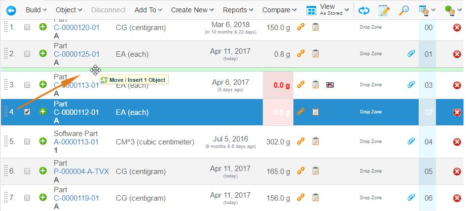
Figure 55. Rearranging objects using the Find Number column
rearrange:column |
Enables rows in tables for this page configuration to be rearranged using the specified column as the base. |
Value should be the name of the column which will be used for sorting. For example "Find Number" |
Example:
<?xml version="1.0" encoding="UTF-8"?>
<PageConfig>
    ...
    <Parameters>
        <Parameter name="rearrange:column" value="FindNumber"/>
    </Parameters>
    ...
</PageConfig>
Adding this setting will enable a rearrange column on all views in the page configuration. Clicking on the icon in this column will bring the user into a new view showing a flat table of the contents of the selected row. These objects can then be rearranged.
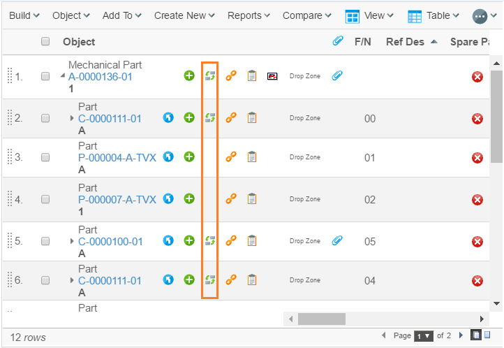
Figure 56. The rearrange column enabled
| The rearrange function can only handle columns containing integer values. |
If the page configuration also contains drag/drop connection settings, it is possible to drag objects from sidepanel(search results, clipboard) directly into a rearrange view. This will insert/connect objects in one action.
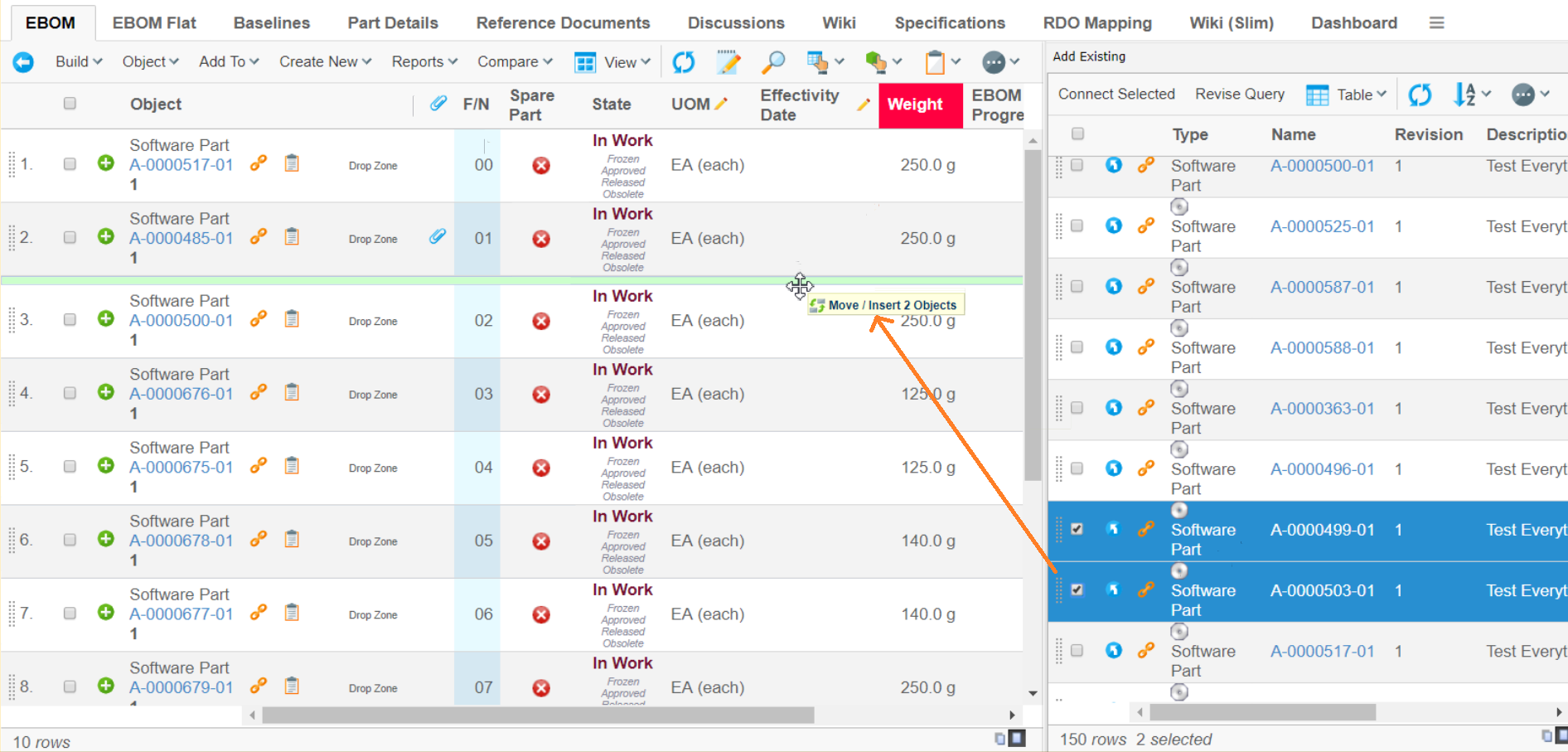
Figure 57. Inserting objects directly into rearrange views
1.10.9. Drag and Drop Move
When drag and dropping within a table the dragged object is by default connected to the node on which it was dropped on (in addition to where it previously was connected). It is also possible to move the dragged object, i.e. disconnect it from where it was previously used.
This can be enabled by adding the following setting to the page configuration:
drag:internal |
Specifies behaviour when drag and dropping objects within a table. |
copy (default) move move_reset (clears values on the relationship) |
Example:
<?xml version="1.0" encoding="UTF-8"?>
<PageConfig>
    ...
    <Parameters>
        <Parameter name="drag:internal" value="move"/>
    </Parameters>
    ...
</PageConfig>
This can be enabled globally with a system-parameter. Example:
<init-param>
    <param-name>tvc.structurebrowser.dragdrop.internal</param-name>
    <param-value>move</param-value>
</init-param>
Activate drag:enabled and drop:enabled to get the drag handles. The drag
and drop move feature conforms to the connection rules (describing what
objects that may be connected to what).
1.10.10. Drag Drop to Context Object
It is possible to enable a contextual drop zone above a table. The contextual drop zone connects the dropped object with the context object used to load the table (request objectId). Drag drop to context objects can be used to add rows to a flat table or root nodes to a structure table by drag and drop.
This can be enabled by adding the following setting to the page configuration:
- drop:contextual
-
Enable drop zone above table to drag drop connect objects to the context object. Allowed values are either true or false (default).
Example:
<?xml version="1.0" encoding="UTF-8"?>
<PageConfig>
    ...
    <Parameters>
        <Parameter name="drop:contextual" value="true" />
    </Parameters>
    ...
</PageConfig>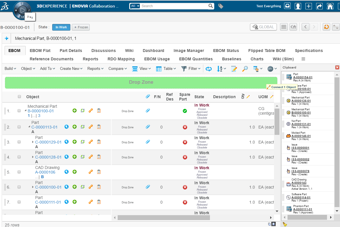
1.11. Post Processing
As of 6.3.0 support for post processing a table/structure upon the initial load was introduced. This feature is used for example by the data grouping feature, but could be used for other purposes as well.
The built-in post-processors are:
- group
-
Used for data grouping
- freeze
-
Used for "freezing" the structure, e.g. disable the expand/collapse buttons.
- expandAll
-
Performs an expand all
- uniqueObjects
-
Removes duplicate rows having the same object-id.
- uniqueRows
-
Removes duplicate rows having the same object-id and relationship-id values.
It is also possible to define a custom post-processor; this is described in detail in the developer documentation.
Post processors that should be used, are defined as a custom parameter of the page-configuration object used. See the example below:
postProcess=freeze,another,a-third...
The value is either the name of a built-in post-processor; or the class-name to a custom post-processor.
1.11.1. Removal of Duplicate Rows
In some cases, when the data in a Structure Browser page is loaded through an inquiry or similar, there might be cases when the same object appears multiple times. This is not always a desired result, and instead of having to write a lot of code within the inqury itself (or JPO) that loaded the data, there is an easier way to solve this situation.
A specific post processor has been implemented to provide this support.
Within the page configuration object, add the following parameter within the "Custom Parameters" attribute:
postProcess=uniqueObjects
In case you use XML files, use this syntax:
<Parameters>
    <Parameter name="postProcess" value="uniqueObjects"/>
</Parameters>
If you already use post processors; add them into the same
line but separate them with a comma character. The uniqueObjects
post-processor should normally be executed first, so this should appear
first in that string.
|