<GridBrowser>
    <ToolBar>The Name of Your Menu</ToolBar>
</GridBrowser>Grid Browser - Administration Guide : UI Configuration
21 March 2016
1. UI Configuration
This chapter defines how to configure the user interface for the Grid Browser, such as enabling a toolbar, context menu, toolbar context buttons and other buttons.
1.1. Toolbar
A toolbar can be made available within a Grid Browser page. To add a toolbar apply this to your configuration:
Any command that is invoked will, if the setting "Submit" is set to true, get all the selected rows and all selected elements/intersections available as request parameters.
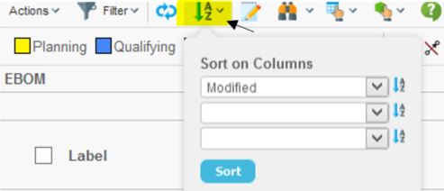
1.1.1. Parameters Submitted
The selected rows are submitted as traditionally using the "emxTableRowId" parameter. All elements that are submitted will be passed with the "element" parameter. In order to parse the values of both these parameters, one can take advantage of the following classes:
| Class | Parameter |
|---|---|
com.technia.tvc.core.db.aef.misc.TableRowIdParam |
emxTableRowId |
com.technia.tvc.gridbrowser.util.ElementParamUtils |
element |
Example code:
import com.technia.tvc.core.db.aef.misc.TableRowIdParam;
import com.technia.tvc.gridbrowser.util.ElementParamUtils;
import com.technia.tvc.gridbrowser.util.ElementParam;
...
ElementParam ep = ElementParamUtils.parseFromRequest(request);
ElementParam.Element[] e = ep.getElements();
for (int i=0; i<e.length; i++) {
    e[i].getRowObjectId();
    e[i].getRowRelId();
    e[i].getColObjectId();
    e[i].getColRelId();
    e[i].getConnectionId();
}
...
TableRowIdParam trip = new TableRowIdParam(request);
int count = trip.getRowCount();
for (int i=0; i<count; i++) {
    trip.getObjectIdAt(i);
    trip.getRelationshipIdAt(i);
}
In order to allow the user to select rows within the Grid Browser, one need to enable the checkboxes or radio buttons for each row. This is accomplished by applying the following to the configuration:
<GridBrowser>
    <UIFunctions>
        <SelectionMode>none|single|multiple</SelectionMode>
    </UIFunctions>
</GridBrowser>| The commands that are used in the toolbar can not be configured to detect if and how many elements from the intersections that have been selected, it will only control if and how many rows that have been selected. The number of selected elements has to be controlled after the command has been invoked. |
1.2. Toolbar Buttons
The toolbar can contain a number of so called context buttons. These are displayed to the right of the "mass-operation" actions (if present). See screenshot below:
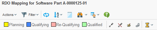
Figure 1. Toolbar buttons
1.2.1. Find / Search
The find/search functionality is enabled by:
<UIFunctions>
    <Find>true</Find>
</UIFunctions>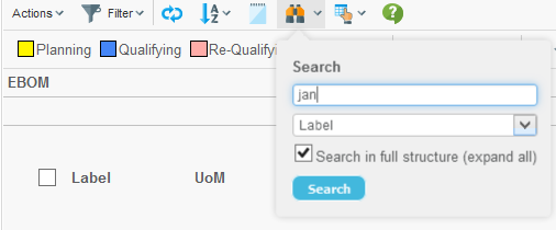
Figure 2. Find/filter.
1.2.2. Printer Friendly
The printer friendly functionality is enabled by:
<UIFunctions>
    <PrinterFriendly>true</PrinterFriendly>
</UIFunctions>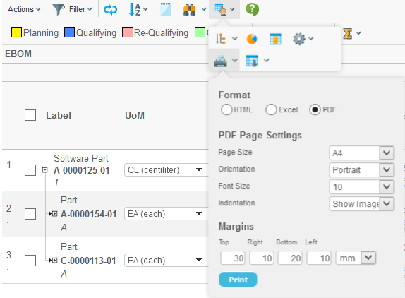
Figure 3. Printer friendly dialog
1.2.3. Export
The export functionality is enabled by:
<UIFunctions>
    <Export>true</Export>
</UIFunctions>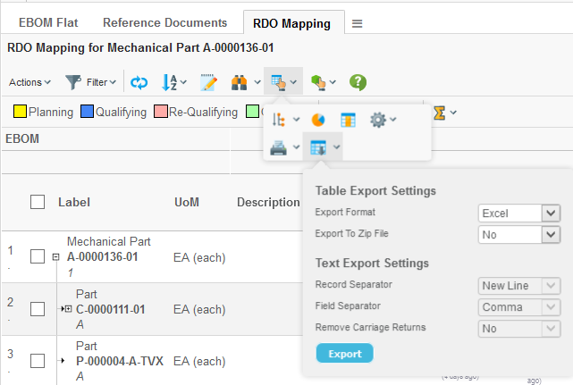
Figure 4. Export dialog
1.2.4. Preferences
The preferences functionality is enabled by:
<UIFunctions>
    <Preferences>true</Preferences>
</UIFunctions>
The preferences dialog is used to define the pagination settings.
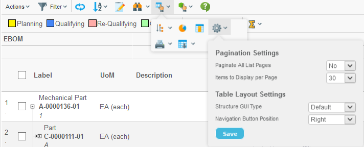
Figure 5. Preferences dialog
1.2.5. Help
A help button can be enabled within the Grid Browser. This is done by adding the help marker to the configuration, like:
<UIFunctions>
    <HelpMarker>topic-within-the-help-docs</HelpMarker>
</UIFunctions>
This requires that the "suiteKey" parameter is available in the URL that is starting the Grid Browser. If the suiteKey is not passed, you can manually define this within the configuration like:
<UIFunctions>
    <HelpMarker>topic-within-the-help-docs</HelpMarker>
    <SuiteKey>EngineeringCentral</SuiteKey>
</UIFunctions>
You can also specify your own Help URL if you are using a custom help documentation. This is done by:
<UIFunctions>
    <HelpMarker>topic-within-the-help-docs</HelpMarker>
    <HelpURL>HelpPage.html</HelpURL>
</UIFunctions>
Once the button has been enabled, it will be shown like below:
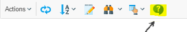
Figure 6. Help button.
1.2.6. Clipboard / Collection
The clipboard, the "add to collection" and "manage collections" functions can be made available. If all are enabled, the following will be available:
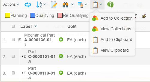
Figure 7. Clipboard and collection related functions.
<UIFunctions>
    <Clipboard>true</Clipboard>
    <AddToCollection>true</AddToCollection>
    <ManageCollections>true</ManageCollections>
</UIFunctions>
1.2.7. Promote / Demote
Promote and Demote is enabled by:
<UIFunctions>
    <Promote>true</Promote>
    <Demote>true</Demote>
</UIFunctions>
Once enabled the buttons will be shown like below:
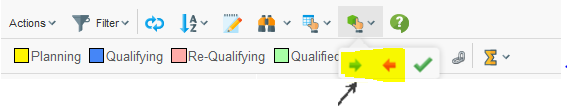
Figure 8. Promote and Demote.
1.2.8. Trigger Validation (V62009x or later)
The trigger validation button can be enabled by:
<UIFunctions>
    <TriggerValidation>true</TriggerValidation>
</UIFunctions>
Once enabled the button will be shown like below:
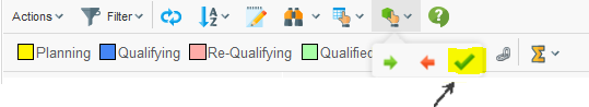
Figure 9. Trigger validation.
1.2.9. Comparison (V62009x or later)
The object comparison button can be enabled by:
<UIFunctions>
    <Compare>true</Compare>
</UIFunctions>
Once enabled the button will be shown like below:
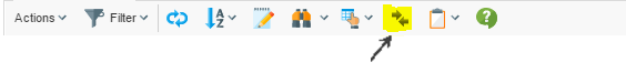
Figure 10. Object comparison.
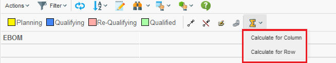
1.2.10. State Calculation
The state calculation tool allows the user to perform calculation based upon the data in the grid. When this tool has been enabled, a new button is available in the toolbar as shown below:
The calculation is performed based upon either the objects in the column- or the row- axis and will show the number of cells matching a particular state.
In the example below, there calculation was performed for the column axis (contained two objects). The columns represent the available states a cell could have, and the values are the number of objects on the row axis that fulfilled a particular state. The right most column (Total) shows the aggregated value for the columns on the current row.
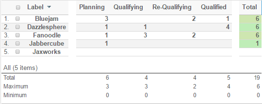
The calculation result is opened in a table above the original Grid Browser page. To go back to the Grid Browser page, simply click the go-back icon available in the top-left corner.
To enable the calculation feature, apply the following to your configuration within the UIFunctions section:
<UIFunctions>
    <StateSummary>true</StateSummary>
</UIFunctions>
1.3. Other Buttons
1.3.1. Filter Chooser
If you are displaying a structure on the row axis, and the structure is using filters for expanding the structure, you can enable the filter chooser that allows the user to choose the current active filter.
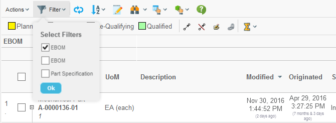
Figure 11. Filter chooser
If the filters have been configured to not allow combining different filters, the filters chooser becomes a drop-down list.
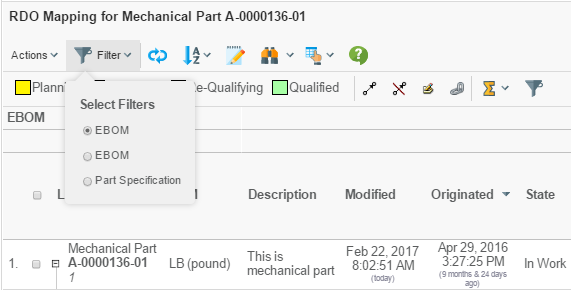
Figure 12. Filter chooser as drop-down
1.3.2. Reload
The reload button is used for refreshing the data in the Grid Browser from the database. This button is enabled by:
<UIFunctions>
    <Reload>true</Reload>
</UIFunctions>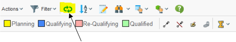
Figure 13. Reload button
| The reload button will not re-launch the data loaders used to populate the row- and column- axis. Only the data displayed inside the Grid Browser is reloaded. |
1.3.3. Expand All
If you are displaying a structure on the row-axis and the structure allows performing an expand all, the "expand all" button will be visible (if configured so).
<UIFunctions>
    <ExpandAll>true</ExpandAll>
</UIFunctions>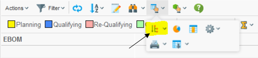
Figure 14. Expand all button
1.3.5. Toggle Edit Mode
If you have columns that are editable, you can enable the toggle-edit-mode button that allows the user to enter edit mode and perform in-cell-edit. This is enabled by:
<UIFunctions>
    <Edit>true</Edit>
</UIFunctions>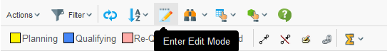
Figure 16. Toggle edit button
To configure the page to be editable directly when the page is loaded, one can add this:
<UIFunctions>
    <Edit>true</Edit>
    <InitiallyEditable>true</InitiallyEditable>
</UIFunctions>
1.3.6. Disconnect
If you are displaying a structure, you can enable the disconnect button that allows the user to disconnect items in the structure. This is enabled by:
<UIFunctions>
    <Disconnect>true</Disconnect>
</UIFunctions>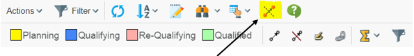
Figure 17. Disconnect button
1.3.7. Chart
This is enabled by:
<UIFunctions>
    <Chart>true</Chart>
</UIFunctions>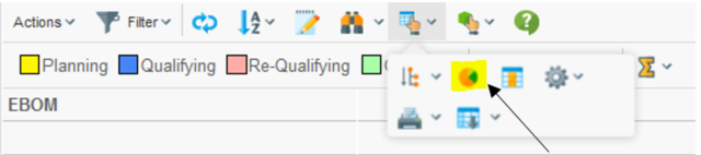
Figure 18. Chart button
1.3.8. Maximize
The maximize button can be used to extend the area, which the Grid Browser has available when displayed next to the category tree in an AEF application. This is enabled by:
<UIFunctions>
    <Maximize>true</Maximize>
</UIFunctions>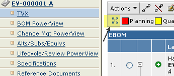
Figure 19. Maximize button
| The maximize button will only be enabled if the Grid Browser is shown in the content frame next to the category tree. |
1.4. Context Menu – Row Axis
It is possible to assign a context menu (available on right click) for the row axis objects. An example how this could look is shown below:
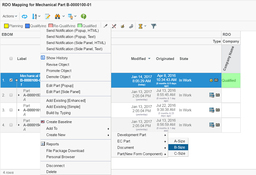
Figure 20. Context menu
The context menu is defined by:
<GridBrowser>
    <ContextMenu>The name of the context menu</ContextMenu>
</GridBrowser>
1.5. Table Columns – Row Axis
The objects on the row axis can contain additional columns showing meta-data related to these objects and/or connections.
These columns are defined within the "Rows" section of the Grid Browser configuration. Example:
<GridBrowser>
    <Rows>
        <Cols>
            <Col>
                <Header>Desc.</Header>
                <Expression>description</Expression>
                <AllowShowMore>true</AllowShowMore>
                <TextLength>10</TextLength>
                <Editable>true</Editable>
            </Col>
            <Col>...
            <Col>...
        </Cols>
    </Rows>
</GridBrowser>| The more columns you add, the less space is left for the intersections to the right. If the width of the left side exceeds the screen-size, the user will not be able to work with the intersections. Strive to use as few columns as possible. Some meta-data could be displayed within tooltips or you can look at this chapter, which describes how to load another structure browser instance with the objects from the row- or column- axis. |
1.5.1. Apply on Relationships
The expression defined within the column applies by default on the business object. To make it apply on the relationship, one can do this by:
<Col usesBusinessObject="false">
1.5.2. Settings
Settings can be defined by using two approaches. The example below illustrates how to set the "Text Length" setting:
<Col>
    <Setting name="Text Length" value="0"/>
    <!-- OR -->
    <Setting name="Text Length">0</Setting>
</Col>
<Col>
<TextLength>true</TextLength>
</Col>The end result is same.
For information about all the available settings, please look in the Structure Browser Administration Guide for more details.
For information about the XML elements that corresponds to a particular column setting, look into this document.
| Some of the settings are not supported. Especially the settings related to Calculations and Group Header. |
1.6. Row Actions – Row Axis
Actions that apply to the row-objects can be enabled by defining so called Row Actions.
The row actions are displayed in the last column on the left side, as the screenshot below illustrates:
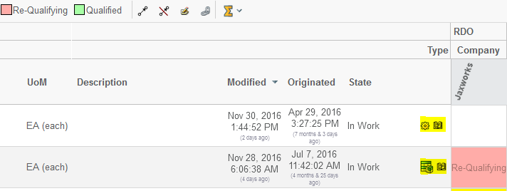
Figure 21. Row Actions
These can be used for quickly launching a particular action for the object on the row.
The configuration snippet below illustrates how to add these:
<GridBrowser>
    <Rows>
        <Actions>
            <Action>
                <IconType>smallicon</IconType>
                <Link>
                    <Href>emxTree.jsp</Href>
                    <TargetLocation>popup</TargetLocation>
                    <Modal>true</Modal>
                    <RegisteredSuite>EngineeringCentral</RegisteredSuite>
                    <WindowSize>800x600</WindowSize>
                </Link>
                <Label>Details Page</Label>
            </Action>

            <Action>
                <IconSrc>/tvc/structurebrowser/images/history.gif</IconSrc>
                <Link>
                    <Href>${ROOT_DIR}/tvc-action/showHistory</Href>
                    <TargetLocation>popup</TargetLocation>
                    <Modal>false</Modal>
                    <RegisteredSuite>EngineeringCentral</RegisteredSuite>
                    <WindowSize>600x500</WindowSize>
                </Link>
                <Label>History</Label>
            </Action>
        </Actions>
     </Rows>
</GridBrowser>
1.7. Row Counter
The counter showing the row number can be enabled or disabled through:
<UIFunctions>
    <RowCounter>true</RowCounter>
</UIFunctions>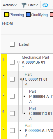
Figure 22. Row counter
1.8. Rotated Column Header
The header for the columns header can be rotated in an arbitrary angle. See screenshot below.
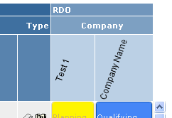
Figure 23. Rotated column headers.
This is configured on the "Columns" element, as shown below:
<Columns rotateHeader="true" headerRotationAngle="-70">
It is also possible to specify the vertical alignment of the column header. See configuration example below:
<Columns rotateHeader="true" rotatedHeaderAlignment="bottom | top | middle"/>
1.9. Custom Rendering
It is possible to customize the rendering of the Grid Browser. This is
accomplished by specifying the fully qualified class name to a class
that extends from com.technia.tvc.gridbrowser.render.GridBrowserRenderer.
This classname is registered within the configuration like shown below:
<GridBrowser>
    ...
    <Renderer>com.acme.gridbrowser.MyRenderer</Renderer>
</GridBrowser>
The capability of customize the rendering requires in many cases the need for having access to additional data from the intersections. A similar concept to datahandlers exists also in Grid Browser, however, in the Grid Browser this is called "Intersection Evaluator". To register a custom intersection evaluator, you can do so as shown below:
<GridBrowser>
    ...
    <Intersection>
    <Evaluator>com.acme.gridbrowser.MyEvaluator</Evaluator>
    ...
    </Intersection>
    ...
</GridBrowser>
The class name you register here must point to a class that extends from
com.technia.tvc.gridbrowser.model.IntersectionEvaluator.
There are several methods that can be overridden from this base class, but to solve the case when you need to select additional data from the intersection connections, you should override the following methods:
public void prepareIntersectionDataEvaluation(EvaluationInput input)
public IntersectionData getIntersectionData(EvaluatedData data)
The first method is used to specify the select statements you want to be evaluated over the connections. The latter method is used to return an object that holds these values. Note that the return value must be a class that extends the base class called "IntersectionData".
To use this data later on in your renderer, you will simply do something like shown below:
public class MyRenderer extends GridBrowserRenderer {
    ...
    protected void renderElementContent(ElementRenderContext ctx) {
        MyIntersectionData d = (MyIntersectionData)
        ctx.getElement().getIntersectionData();
        ...
    }
}