Graphic Reporting - Administration Guide : Dashboard
30 March 2016
1. Configuring the Dashboard
Dashboards consist of gadgets. There are different types of gadgets, each having their own configuration settings, as well as some standard settings that apply for all gadget types.
1.1. Commands
This section describes how to create a Command to launch a dashboard.
Commands can be created and modified with the Business Administrator and MQL thick clients; however, it is recommended that you use the Business Administrator if you are not familiar with MQL (Matrix Query Language).
The most important parameter when creating a Command to launch the dashboard is the "config" parameter, whose value must follow the standard syntax of a TVC XML resource.
${ROOT_DIR}/tvc-action/dashboard?config=tvc:dashboard/MyDashboard.xml
Or, if using an XML to define the command:
<Command>
    <Label>Dashboard</Label>
    <URL action="dashboard">
        <Param name="config" value="tvc:dashboard/MyDashboard.xml" />
        <Param name="showHelpIcon" value="true" />
    </URL>
</Command>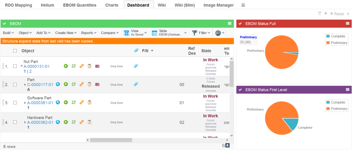
1.1.1. Parameters
| Name | Description | Example |
|---|---|---|
config |
Defines the dashboard configuration to use |
|
searchform |
Defines the search form controlling what data to display in the dashboard. If specified a search panel will be shown to the left where the user can specify the data that is of interest. For example, display only products for a specific season, show parts in a certain state or something else which can be specified using a standard search form. Read the Dashboard Search chapter for more details. |
|
searchOnLoad |
Perform a search when the dashboard is loaded with the default search criteria defined in the search form. |
|
openOnLoad |
Controls if the search panel is displayed when the dashboard is loaded. |
|
showHelpIcon |
Controls if the help icon should be displayed on the dashboard or not. By default, it is false. |
|
1.2. Configuration
The dashboard definition is stored in a directory called "dashboard" among the XML resources (somewhere under /WEB-INF/tvc in your application directory).
If you omit the domain in the resource name, the location of the dashboard definition is:
/WEB-INF/tvc/dashboard
If the dashboard definition is stored in a domain, for example acme (tvc:dashboard:acme/MyDashboard.xml) then the resource location is:
/WEB-INF/tvc/acme/dashboard
If you omit the domain in the gadget reference (see the Import element in 4.2.2.3) resource name, the location of the dashboard definition is:
/WEB-INF/tvc/gadgets
If the gadgets reference definition is stored in a domain, for example acme (tvc:gadgets:acme/MyGadgets.xml) then the resource location is:
/WEB-INF/tvc/acme/gadgets
Please look into this document for more details regarding XML configuration files and format.
1.2.1. Configuration hierarchy
The dashboard definition contains the following main areas:
- Title
-
Defines the breadcrumb value)
- Layout
-
Defines the layout of the dashboard, how many columns, and their span
- Library
-
Defines all the gadgets that should be available on the dashboard
- DefaultView
-
Defines the default view when the user has not yet personalized the dashboard. This means which gadgets are visible, in which column, and their size
1.2.2. Dashboard configuration
The dashboard is defined in XML. The root element must be <Dashboard>.
Below you find child element definitions.
Child Elements Dashboard
| Element Name | Description | Example |
|---|---|---|
Title |
Defines the breadcrumb value. Macros @{value} & @{count} are available to display the text and quantity of the drilled down section. |
|
Layout |
Contains the layout of the dashboard in the form of Column elements. |
|
Library |
Contains all the gadget definitions that should be available on the dashboard. |
|
DefaultView (Optional) |
Contains the definition of the default layout of the dashboard. Sets up which gadgets are added by default, where, and their size. This is optional. |
|
Filters |
Contains definitions of the available filters (filtering unavailable if missing) |
|
Loader |
The loader element enables one shared loader among several gadgets to retrieve the business objects or connections to base the gadgets for. Supported loader types are:
Note that you can still override the dashboard loader element with specific gadget loaders. |
Or
Or
Or
Or
Or
|
Child Elements Layout
A dashboard is built up using columns. When defining the layout of the dashboard, columns need to be added and have their weight set. The weight attribute defines how many columns the gadget should span.
| Element Name | Description | Example |
|---|---|---|
Column |
Sets the title of the dashboard |
<Column weight="1" /> |
Defining the layout of a dashboard containing 3 columns where the first column takes up half the space would for example look like this:
<Layout>
    <Column weight="2" />
    <Column weight="1" />
    <Column weight="1" />
</Layout>
And the result:
Child Elements Library
The library is where all the gadgets are defined. These will be available to be added to the dashboard by the user, or added by default as setup in the DefaultView section of the configuration.
| Element Name | Description | Example |
|---|---|---|
Table |
Contains a table gadget definition. |
|
Chart |
Contains a chart gadget definition. |
|
Frame |
Contains a frame gadget definition |
|
HTML |
Contains an html gadget definition |
|
Import |
Points out a referenced gadgets definition for reuse purposes |
|
Each gadget has some settings that apply only for the specific gadget, but there are some common settings used for all gadgets:
| Setting Name | Description | Example |
|---|---|---|
Label |
Defines the label of the gadget. If no label is defined, it is generated by default. |
|
Description |
Defines the description of the gadget. |
|
Color |
Defines the default color of the container of the gadget. This can be changed by the user for specific instances of the gadget. Gray is the default color. |
Possible Values:
Example:
|
Height |
Defines the height of the gadget in pixels. The height of the gadget can be set globally by init param.
300 is the default value. |
|
Image |
Defines the image to use when displaying the gadget in the library. |
Possible values:
Example:
|
Subscribes |
This will register a gadget with TVC Broker and listen to publish an event. Whenever publish event occurs, it will refresh the gadget with updated data. |
Example: |
Child Elements Table
The table element defines a table gadget. A table gadget displays a TVC Structure Browser table.
| Setting Name | Description | Example | ||
|---|---|---|---|---|
Action |
Defines the name of a tvc-action to be used when loading a table. We can use below predefined tvc-action’s to load contextual objects at drill down in gadgets into a TVC Structure Browser table gadget.
|
<Action>execInquiryToTable</Action> <Action>loadDashboardObjects</Action> <Action>loadDashboardObjectsNavigate</Action> |
||
PageConfig |
Defines a TVC Page configuration to be used. See this document for more information. |
|
||
Loader |
If defined, adds the request parameter "loader" with the value specified.
To use a loader, the action must be one of:
|
|
||
Inquiry |
If defined, adds the request parameter "inquiry" with the value specified. Note: This request parameter might not be used, depending on what action you load. To use a loader, the action must be one of:
|
|
Example:
<Table id="mytablegadget">
    <Label>My Table Gadget</Label>
    <Description>This is my table gadget</Description>
    <Color>Red</Color>
    <Height>500</Height>
    <Action>execCustomLoaderToTable</Action>
    <Loader>dataset:tvc:dataset/MyLoader.xml</Loader>
    <PageConfig>tvc:pageconfig:/MyPage.xml</PageConfig>
</Table>
Child Elements Chart
The chart element defines a chart gadget. This gadget displays charts.
| Element Name | Description | Example |
|---|---|---|
ChartConfig |
Defines a TVC Chart configuration. This can be used to display tvc charts. See this document for more information. |
|
DataProvider |
Defines a data provider. Data providers can create other types of charts than default tvc charts. Pointing to different ones will render different charts. Possible values can be either a custom java class, or a preconfigured chart provider. Please see this chapter for information on the pre-configured chart providers. DataProvider can also be defined by init-param
If no dataprovider is specified, the default is |
Or
|
Inquiry |
Defines a TVC Inquiry to retrieve the business objects or connections to generate the chart for. |
<Inquiry>tvc:inquiry/MyObjects.xml</Inquiry> |
Expression |
Defines a select expression used to generate the sections of the chart. Multiple expressions can be defined to support multilinedate and multiline charts Label attribute can be used to define labels for each expression. |
|
Format |
Defines the format to represent a user in chart. Supported values for format would be user, email. This formatting will apply only to the valid cases of an enovia user found in expression viz. owner, originator etc. |
|
SumExpression |
Defines a select expression used to sum the values of each section. If not defined the logic will sum the object count. |
|
ValueHandler |
Implement custom logic for section values and count. Please see this chapter for information on Value Handlers. |
|
AlternateOIDExpression |
This setting defines the object id’s to load into a chart based on a select expression over the contextual object ids. This is equal to defining a select loader. |
|
OIDExpression |
This setting is used to control which object ID to use on drill down |
|
Loader |
Defines the loader to retrieve the business objects or connections to generate the chart for. Supported loader types are:
|
Or
Or
Or
Or
Or
|
SortByComparator |
Defines a com.technia.tvc.core.chart.Value java.util.Comparator to sort the values in a chart |
|
SortByValueMapping |
Defines the sort order of values |
|
SortByValueCount |
Defines if to sort the values raising or falling by count |
Or
|
Dashboard |
Defines the dashboard configuration to use when a section in a chart is clicked and a "drill-down" is performed (Not supported by gvis) |
|
GroupOther |
Group the least frequent values as "Other" by defining the number of values to be displayed before grouping Set default count by init-param
|
|
Top |
Remove the least frequent values by defining the number of values to be displayed Set default count by init-param |
|
Example:
<Chart id="mychartgadget">
    <Label>My chart gadget</Label>
    <Description> This is my chart gadget</Description>
    <Color>Grey</Color>
    <Height>250</Height>
    <Image>@PieChart</Image>
    <DataProvider>com.technia.tvc.graphicreporting.dashboard.provider.GenericPieProvider</DataProvider>
    <Inquiry>tvc:inquiry:tvx:dashboard/MyOpenIssues.xml</Inquiry>
    <Expression>attribute[Priority]</Expression>
    <Dashboard>tvc:dashboard:tvx:dashboard/IssuesByPriority.xml</Dashboard>
</Chart>
Child Elements Frame
A frame gadget can be used to contain any URL specified. This is a very generic gadget, and not all URL’s might be suitable to put in a gadget, so it should be used with caution.
| Element Name | Description | Example |
|---|---|---|
URL |
Defines the URL to populate the gadget. Needs attribute "action" or "href" to specify the url. |
Or
|
Param |
The Param element can be used inside the URL to define parameters to the URL |
|
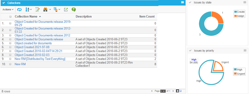
Example showing the tvc collections page in a gadget:
<Frame id="collections">
    <Label>Collections</Label>
    <Description>My Collections</Description>
    <Color>blue</Color>
    <Height>500</Height>
    <Image>@Table</Image>
    <URL action="showCollections">
        <Param name="portalMode">true</Param>
    </URL>
</Frame>
Child Element DefaultView
The default view is an optional element that can be used to define a default layout of a dashboard. When a user first launches a dashboard, the gadgets and their location defined in this will be the active view. Users can then personalize the view by adding, removing, moving or resizing gadgets.
| Element Name | Description | Example |
|---|---|---|
Column |
The column element defines a column in the default view. The column can contain Gadget elements, or be empty |
Or |
Gadget |
The Gadget element defines the gadget to add to the column in the default view. The attribute "ref" should contain the gadget id. The attribute "span" defines the number of columns that the gadget should fill up. |
|
Example:
<DefaultView>
    <Column>
        <Gadget ref="collections" span="2" />
    </Column>
    <Column/>
    <Column>
        <Gadget ref="my-open-issues-status-pie" span="1" />
        <Gadget ref="my-open-issues-priority-pie" span="1" />
    </Column>
</DefaultView>
This will make the collections gadget span 2 columns, nothing in the middle column, and put 2 chart gadgets in the last column:
Child Element Filters
| Element Name | Description | Example |
|---|---|---|
Filter |
The filter element defines a filter group to be applied to the dashboard data. The filter must contain a label and an expression or a handler definition. |
Or |
Label |
Defines the header of the filterable values. Strings or resource keys are supported. |
OR
|
Expression |
Defines the expression to be used for dividing the data into filterable groups. |
OR
|
Handler |
Defines a filter handler to be used for full control of the filterable data groups. See this chapter for more details on filter handler implementation. |
|
Default |
Defines what filter options to be initially selected. Use either Include or Exclude elements to define the select value defaults. |
OR |
1.2.3. Chart Providers
There are three categories of providers that can be used, along with the available configuration options. They represent three different chart frameworks. Providers whose names end with "ofc" are "Open Flash" charts. Providers whose names end with "gvis" are "Google Visualization" charts. Providers whose names end with "jqplot" are "jqPlot" charts.
All providers use the inquiry and expression elements to retrieve the data.
Open Flash Chart Providers
All providers that end with "ofc" are "Open Flash" charts. These charts require the Adobe Flash Player to be installed in the browser.
Available Open Flash Chart providers
| Provider Name | Description/Configuration options | Example |
|---|---|---|
pie-ofc |
Open Flash pie chart. |
|
bar-ofc |
Open Flash bar chart. |
|
line-ofc |
Open Flash line chart. |
|
Common Open Flash Chart settings
These are the settings that works for all the different Open Flash providers
| Element Name | Description | Example |
|---|---|---|
RotateLegend |
Define if legends should be rotated. Default is false |
|
YAxisSteps |
Specify detail of Y axis values. The highest value of Y will be divided with this value to determine the steps between each value shown: |
|
DateFormat |
If the expression for the chart returns a date value, the x axis can be configured to show the date on a given format. This will also determine how detailed the data is: |
|
ColorMappings |
Define custom colors to be used for specific chart values. Each mapping is separated with a pipe "|" |
|
ColorMappingsExpressions |
Defines expressions to be used for setting custom colors to chart values. Each mapping is separated with a pipe "|" |
|
Colors |
Overrides the default color series |
|
Open Flash Pie Chart Settings
These are the extra settings that can be used for Open Flash Pie Charts
| Element Name | Description | Example |
|---|---|---|
Fade |
Enable/Disable the fade animation. |
|
Bounce |
Enable/Disable the bounce animation. |
|
GradientFill |
Enable/Disable gradient |
|
Open Flash Bar Chart Settings
These are the extra settings that can be used for Open Flash Bar Charts
| Setting Name | Description | Example |
|---|---|---|
Pop |
Enable/Disable the pop animation. |
|
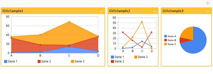
Google Visualization Chart Providers
All providers that end with "gvis" are "Google Visualization" charts. These chart types does not require any browser plugin.
Available Google Visualization Chart providers
| Provider Name | Description/Configuration options | Example | ||
|---|---|---|---|---|
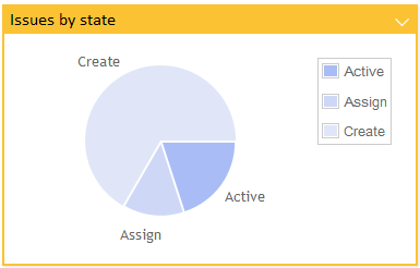
pie-gvis |
Google Visualization pie chart. |
|
||
bar-gvis |
Google Visualization bar chart. |
|
||
column-gvis |
Google Visualization column chart. |
|
||
line-gvis |
Google Visualization line chart. |
|
||
map-gvis |
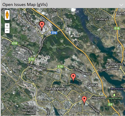
Google Visualization maps.
|
|
Google Visualization Column Chart Settings
These are the extra settings that can be used for Google Visualization Column Charts
| Element Name | Description | Example |
|---|---|---|
AdditionalExpression |
The additional expression will divide a column into a stack or group of columns |
|
AdditionalReturnExpression |
The return expression is used if the return of the additional expression differs |
|
isStacked |
To control the stacked or grouped behavior use the GVis option "isStacked" (true is default) |
|
Google Visualization Line Chart Settings
These are the extra settings that can be used for Google Visualization Line Charts
| Element Name | Description | Example |
|---|---|---|
Legend |
Specifies the legend to be used. |
|
Google Visualization Map Settings
These are the extra settings that can be used for Google Visualization Line Charts
| Element Name | Description | Example |
|---|---|---|
MarkerContent |
Specifies the content of the marker tooltip. A marker is the pin being shown in a map where an object was created or modified. This content can contain macros and basic HTML. |
|
Google Visualization Extra Settings
The Google Visualization charts can be further configured using options documented for each chart type here:
- pie-gvis
-
http://code.google.com/apis/visualization/documentation/gallery/piechart.html
- bar-gvis
-
http://code.google.com/apis/visualization/documentation/gallery/barchart.html
- column-gvis
-
http://code.google.com/apis/visualization/documentation/gallery/columnchart.html
- line-gvis
-
http://code.google.com/apis/visualization/documentation/gallery/linechart.html
- map-gvis
-
http://code.google.com/apis/visualization/documentation/gallery/map.html
To use these options, add the element "GVisOptions" to the configuration. Separate multiple options using the "|" character. For example:
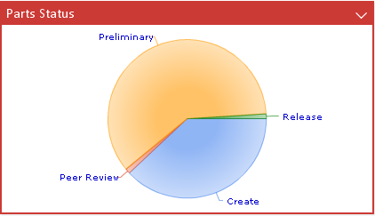
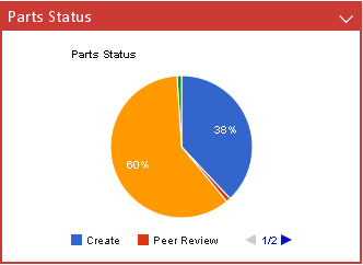
<Chart id='my-parts-status-pie-gvis'>
    <Label>Parts Status</Label>
    <Description>Part Status Pie Chart</Description>
    <Color>red</Color>
    <Height>250</Height>
    <Image>@PieChart</Image>
    <DataProvider>pie-gvis</DataProvider>
    <GVisOptions>legend=bottom|title=Part Status|pieSliceText=percentage|is3D=false</GVisOptions>
    <Inquiry>tvc:inquiry:tvx:dashboard/MyParts.xml</Inquiry>
    <Expression>current</Expression>
</Chart>
jqPlot Chart providers
All providers that end with "jqplot" are "jqPlot" charts. These chart types does not require any browser plugin.
Available jqPlot Chart providers
| Provider Name | Description/Configuration options | Example |
|---|---|---|
pie-jqplot |
jqPlot pie chart |
|
bar-jqplot |
jqPlot bar chart |
|
line-jqplot |
jqPlot line chart |
|
bubble-jqplot |
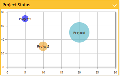
jqPlot bubble chart This chart requires two extra expressions to get values for "x" and "y" axis. For examples check bubble chart settings. |
|
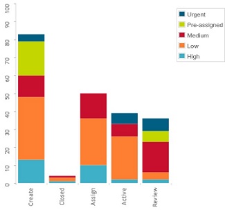
stackbar-jqplot |
jqPlot stack bar chart |
|
donut-jqplot |
jqPlot donut chart |
|
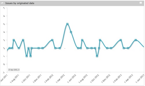
date-jqplot |
jqPlot date chart. This chart requires expression to evaluate into a date or timestamp. Enovia date format is supported |
|
multilinedate-jqplot |
jqPlot multiline date chart. This chart requires expression to evaluate into a date or timestamp. Enovia date format is supported. |
|
multiline-jqplot |
jqPlot multiline chart |
|
Common jqPlot Chart settings
These are the settings that works for all the different jqPlot providers
| Element Name | Description | Example | ||
|---|---|---|---|---|
Options |
Control the options map. Note that settings specified in the options element are added to the default options for the chart type. This makes it possible to override specific options without having to control all of them in your configuration. See http://www.jqplot.com/ for more details on available options.
|
|
||
Resources |
Include jQPlot resources. Available values:
Defaults:
|
|
||
ColorMappings |
Define custom colors to be used for specific chart values. Each mapping is separated with a pipe "|" |
|
||
ColorMappingsExpressions |
Defines expressions to be used for setting custom colors to chart values. Each mapping is separated with a pipe "|" |
|
||
Colors |
Overrides the default color series |
|
||
ShowGrid |
Set to true if chart should have a "grid" as background. Default is false. |
|
||
TextLength |
Defines the maximum number of characters to appear in the legend. If the number of characters in a legend text exceeds this value then the text is truncated and a tooltip is used to display the full text.
|
|
||
Expression |
Defines a select expression used to generate the sections of the chart. Multiple expressions can be defined to support multilinedate and multiline charts Label attribute can be used to define labels for each expression. |
|
||
SeriesExpression |
Defines a select expression used in multi dimensional chart to generate series or stack within the chart. |
|
||
SeriesTop |
Defines number of series to be displayed after which less frequent series will be removed. |
|
||
SeriesGroup |
Defines number of series to be displayed before least frequent values are grouped as "Other". |
|
jqPlot Bar Chart Settings
These are the extra settings that can be used for jqPlot Pie Charts
| Element Name | Description | Example |
|---|---|---|
RotateLegend |
Define if legends should be rotated. Default is false |
|
RotateLegendAngle |
Set what angle to use when enabling "RotateLegend" |
|
BarDirection |
Defines the orientation of bar direction. Valid values are horizontal and vertical, default value is vertical |
|
jqPlot Line Chart Settings
These are the extra settings that can be used for jqPlot Line Charts
| Element Name | Description | Example |
|---|---|---|
RotateLegend |
Define if legends should be rotated. Default is false |
|
RotateLegendAngle |
Set what angle to use when enabling "RotateLegend" |
|
EnableZoom |
Enables the user to zoom parts of a chart. Default is false. |
|
jqPlot Bubble Chart Settings
| Element Name | Description | Example |
|---|---|---|
BubbleXExpression |
Expression for getting "x" axis data values. |
|
BubbleYExpression |
Expression for getting "y" axis data values. |
|
1.2.4. Value Handler
Value handlers are used to implement custom chart section values and counts. The value handler tells what to select, if it should be selected from business objects or connections and how to use the selected data to populate a value and a count.
Example listing the amount of related objects by current state:
public class QtyByType implements ValueHandler {
    private static final SymbolicName ATTR_QTY =
        new SymbolicName("attribute_Quantity");

    private static final Statement QTY =
        new StatementBuilder().attribute(ATTR_QTY).toStatement();

    private static final Statement TO_CURRENT =
        new StatementBuilder().to().current().toStatement();

    private static final Statement TO_ID =
        new StatementBuilder().to().id().toStatement();

    public void populateValue(Gadget gadget,
                              DashboardContext context,
                              ValueMap values,
                              SelectedData selectedData) {
        BigDecimal count = null;
        if (!StringUtils.isOnlyWhitespaceOrEmpty(selectedData.getSelectValue(QTY))) {
            count = new BigDecimal(selectedData.getSelectValue(QTY));
        }
        values.add(new TextValue(selectedData.getSelectValue(TO_CURRENT.getStatement())),
                selectedData.getSelectValue(TO_ID), count);
    }
    public Collection<String> selects(Gadget gadget) {
        return Arrays.asList(new String[]
            { TO_ID.getStatement(), TO_CURRENT.getStatement(), QTY.getStatement() });
    }
    public boolean isBusinessObjectSelect(Gadget gadget) {
        return false;
    }
}
1.2.5. Filter Handler
Filter handlers are used to define custom filtering logic. You could use it to group several values into one filter, make one value be part of several filter alternatives, custom data group labels or to control sorting of the filters.
To sort the filters implement the Comparator interface.
Example grouping on originated date grouped by
-
All times
-
→ Hour
-
1 hour → 1 day
-
1 day → 1 week
-
etc
public class FilterHandlerExample implements FilterHandler, Comparator<SelectValue> {
    private static final long MINUTE = 1000 * 60;
    private static final long HOUR = MINUTE * 60;
    private static final long DAY = HOUR * 24;
    private static final long WEEK = DAY * 7;
    private static final long MONTH = DAY * 30;
    private static final long YEAR = DAY * 365;
    private static final String MORE_THAN_YEAR = "1 year ->";
    private static final String LAST_MONTH_TO_YEAR = "1 month -> 1 year";
    private static final String LAST_WEEK_TO_MONTH = "1 week -> 1 month";
    private static final String LAST_DAY_TO_WEEK = "1 day -> 1 week";
    private static final String LAST_HOUR_TO_DAY = "1 hour -> 1 day";
    private static final String LAST_HOUR = "-> 1 hour";
    private static final String ALL_TIMES = "All times";
    private static final Collection<String> SELS = Arrays.asList(new String[]
        { Statement.ORIGINATED.getStatement() });
    private static final Map<String, Integer> SORT_ORDER = new HashMap<String, Integer>();

    static {
        SORT_ORDER.put(ALL_TIMES, 0);
        SORT_ORDER.put(LAST_HOUR, 1);
        SORT_ORDER.put(LAST_HOUR_TO_DAY, 2);
        SORT_ORDER.put(LAST_DAY_TO_WEEK, 3);
        SORT_ORDER.put(LAST_WEEK_TO_MONTH, 4);
        SORT_ORDER.put(LAST_MONTH_TO_YEAR, 5);
        SORT_ORDER.put(MORE_THAN_YEAR, 6);
    }

    public Collection<String> selects() {
        return SELS;
    }

    public Collection<String> filterAs(SelectedData selectedData, Locale locale) {
        List<String> filterAs = new ArrayList<String>();
        Date d = DateUtils.parse(selectedData.getSelectValue(Statement.ORIGINATED.getStatement()));
        long current = System.currentTimeMillis();
        long delta = current - d.getTime();
        if (delta <= HOUR) {
            filterAs.add(LAST_HOUR);
        } else if (delta <= DAY) {
            filterAs.add(LAST_HOUR_TO_DAY);
        } else if (DAY < delta && delta <= WEEK) {
            filterAs.add(LAST_DAY_TO_WEEK);
        } else if (WEEK < delta && delta <= MONTH) {
            filterAs.add(LAST_WEEK_TO_MONTH);
        } else if (MONTH < delta && delta <= YEAR) {
            filterAs.add(LAST_MONTH_TO_YEAR);
        } else if (YEAR < delta) {
            filterAs.add(MORE_THAN_YEAR);
        }
        // A value could be part of multiple filter alternatives
        filterAs.add(ALL_TIMES);
        return filterAs;
    }
    public int compare(SelectValue o1, SelectValue o2) {
        return SORT_ORDER.get(o1.getSelectValue()) - SORT_ORDER.get(o2.getSelectValue());
    }
}
1.2.6. Enovia tables in dashboard
To enable listing of contextual objects at drill down in gadgets when TVC Structure Browser is not available ENOVIA OOTB tables are supported by configuration.
| Type | Name | Description | ||
|---|---|---|---|---|
Action |
dashboardListOOTB |
The TVC action to call for populating contextual drill down data into an ootb table |
||
Parameter |
table |
The table name to base the table on.
|
Example configuration:
<Frame id='issues-list-ootb'>
    <Label>Issues List OOTB</Label>
    <Description>Displays a list with all context issues.</Description>
    <Color>red</Color>
    <Height>500</Height>
    <Image>@Table</Image>
    <URL action="dashboardListOOTB">
    <Param name="table">IssueList</Param>
    </URL>
</Frame>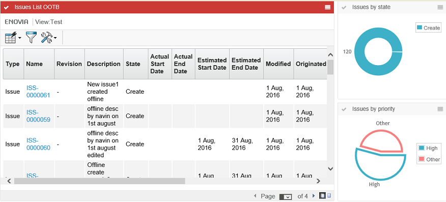
1.3. Loading drill down objects into a dashboard table gadget
When there is a dashboard configured with at least one table gadget in it. Also, there is a loader defined in the dashboard definition but not in the table gadget definition. By default, the table gadget will be loaded with the objects retrieved by the parent dashboard loader into a TVC Structure Browser table gadget in the flat mode. There might be cases the user wants to load the objects into a TVC Structure Browser table gadget in the navigation mode. In such a case, the user can make use of the predefined tvc-action loadDashboardObjectsNavigate to load objects into a TVC Structure Browser table gadget in the navigation mode.
When there is a drill-down dashboard configured with at least one table gadget in it. By default, the objects at drill down in gadgets are loaded into a TVC Structure Browser table gadget in the flat mode. There might be cases that the user wants the objects at drill down in gadgets are to be loaded into a TVC Structure Browser table gadget in the navigation mode. In such a case, the user can make use of the predefined tvc-action loadDashboardObjectsNavigate to load objects into a TVC Structure Browser table gadget in the navigation mode.
User can use below predefined tvc-action’s to load contextual objects at drill down in gadgets into a TVC Structure Browser table gadget.
-
loadDashboardObjects: Display contextual objects at drill down into a TVC Structure Browser table in the flat mode. This action is considered by default if there is no
Actionelement configured in the table gadget. -
loadDashboardObjectsNavigate: Display contextual objects at drill down into a TVC Structure Browser table in the navigation mode.
The example below illustrates how user/admin can construct the gadget restriction:
<?xml version="1.0" encoding="UTF-8"?>
<Gadgets>
    <Table id="CO-table">
        <Label>Change Order</Label>
        <Description>Change Order</Description>
        <Height>600</Height>
        <Color>Yellow</Color>
        <PageConfig>tvc:pageconfig:launchpad:changeprocess/ChangeObjects.xml</PageConfig>
        <Action>loadDashboardObjectsNavigate</Action>
    </Table>
</Gadgets>
1.4. Loading context object into dashboard tables
The loader defined on the dashboard level will be used for loading objects into a table-gadget when there is no loader definition found in the gadget. There might be cases where the user wants to show information about the source/context object by overriding the loading of objects retrieved by the dashboard loader. Through configuration, now it is possible to load context/source object into a table-gadget even when there is a loader defined on dashboard level.
User can use below predefined tvc-action(s) to load context/source object into a TVC Structure Browser table gadget.
-
loadContextObjectToDashboard : Loads context/source object into a TVC Structure Browser table in
flat mode. -
loadContextObjectToDashboardNavigate : Loads context/source object into a TVC Structure Browser table in
navigation mode.
The example below illustrates how user/admin can construct the gadget restriction:
<?xml version="1.0" encoding="UTF-8"?>
<Gadgets>
    <Table id="CO-table">
        <Label>Change Order</Label>
        <Description>Change Order</Description>
        <Height>600</Height>
        <Color>Yellow</Color>
        <PageConfig>tvc:pageconfig:launchpad:changeprocess/ChangeObjects.xml</PageConfig>
        <Action>loadContextObjectToDashboardNavigate</Action>
    </Table>
</Gadgets>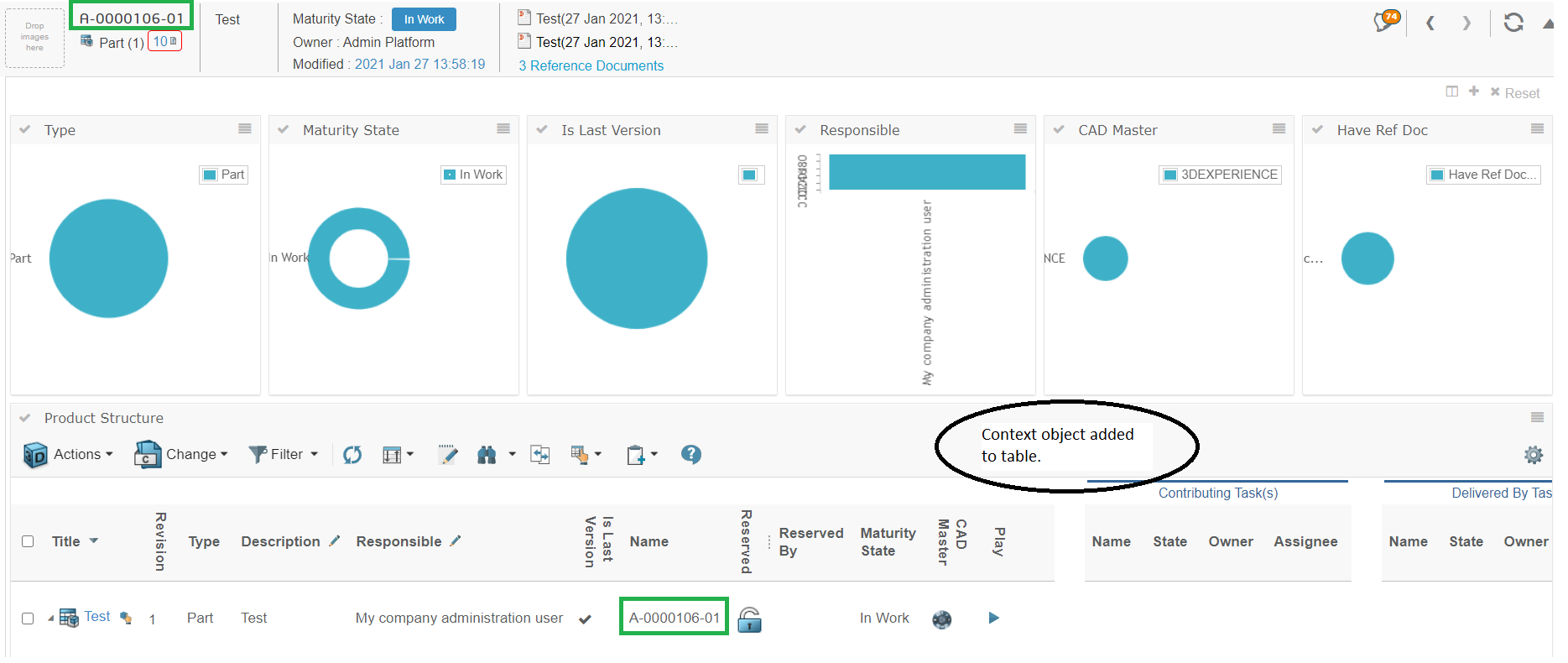
Figure 1. Loading context object into dashboard tables
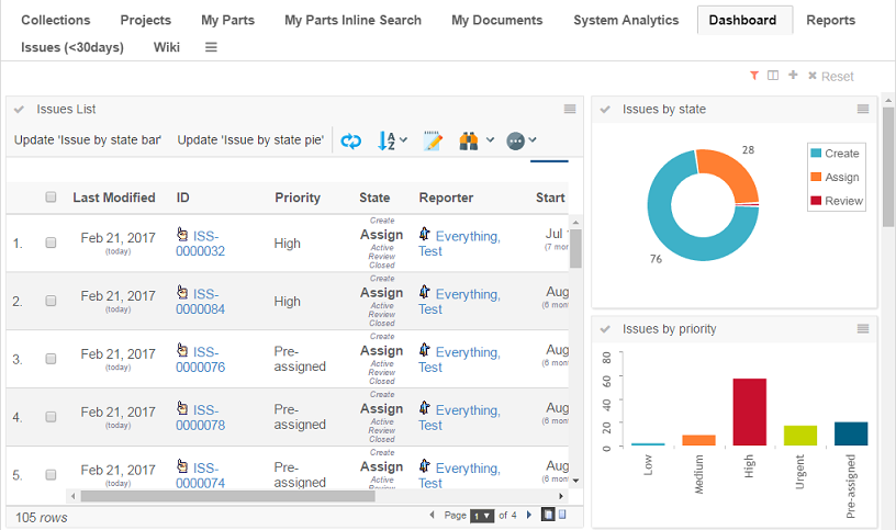
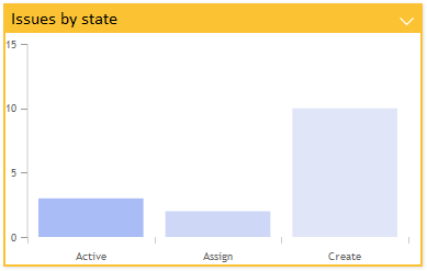
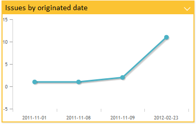
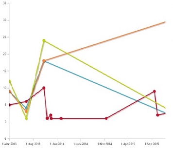
1.4.1. Multi Dimensional Chart
Multi dimensional chart can be implemented using SeriesExpression or multiple Expressions. When SeriesExpression is used, chart data elements are segregated into multiple series based on value of SeriesExpression, when multiple Expression are used each expression represents a series.
Example Configuration:
Using mutiple Expression
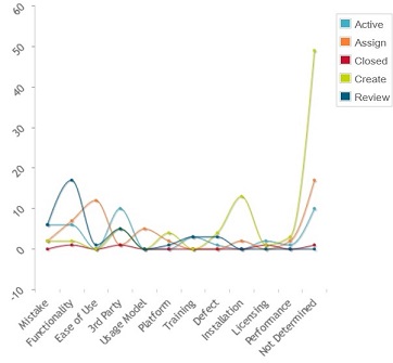
<Chart id="jqplot-issues-by-originated-line">
        <Label>Issues by State dates</Label>
        <Color>gray</Color>
        <Height>500</Height>
        <Image>@LineChart</Image>
        <DataProvider>multilinedate-jqplot</DataProvider>
        <Expression label="tvc.graphicreporting.dashboard.issue.create">state[Create].start</Expression>
        <Expression label="tvc.graphicreporting.dashboard.issue.review">state[Review].start</Expression>
        <Expression label="tvc.graphicreporting.dashboard.issue.active">state[Active].start</Expression>
        <Expression label="tvc.graphicreporting.dashboard.issue.assign">state[Assign].start</Expression>
        <RotateLegendAngle>-45</RotateLegendAngle>
        <EnableZoom>true</EnableZoom>
    </Chart>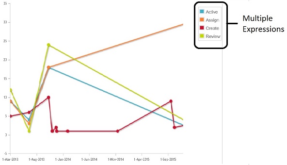
Using Series Expression
    <Chart id="jqplot-issues-by-state-stackbar">
        <Label>Issues by Priority and state</Label>
        <Description>Issues by state displayed in a bar chart</Description>
        <Height>500</Height>
        <Image>@ColumnChart</Image>
        <DataProvider>stackbar-jqplot</DataProvider>
        <Expression>current</Expression>
        <SeriesExpression>attribute[Priority]</SeriesExpression>
        <DisplayTooltip>true</DisplayTooltip>
        <RotateLegend>true</RotateLegend>
    </Chart>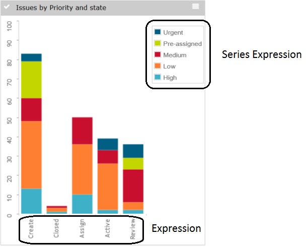
Below table lists down valid series configuration for different multidimensioanl charts
| Chart | Configuration |
|---|---|
StackBar Chart |
SeriesExpression - Series Expression can be used to define stacks in Stack Bar chart. |
MultiLine Chart |
SeriesExpression - Series Expression can be used to segregate data elements into multiple lines, each line represents unique SeriesExpression value. Multiple Expression - Multiple Expression can be defined and each expression will be treated as a series or line. |
MultiLine Date Chart |
SeriesExpression - Series Expression can be used to segregate data elements into multiple lines, each line represents unique SeriesExpression value. Multiple Expression - Multiple Expression can be defined and each expression will be treated as a series or line. Note: Expression should be of type date/timestamp. Supports Enovia date format. |
Multi Value Handler
Like Value handlers, Multi Value handlers are used to implement custom chart section values, series and counts. The multi value handler tells what to select, if it should be selected from business objects or connections and how to use the selected data to populate a value, a sreies and a count.
Example listing the amount of related objects by current state and type:
public class QtyByTypeAndState implements MultiValueHandler {
    private static final SymbolicName ATTR_QTY =
        new SymbolicName("attribute_Quantity");

    private static final Statement QTY =
        new StatementBuilder().attribute(ATTR_QTY).toStatement();

    private static final Statement TO_CURRENT =
        new StatementBuilder().to().current().toStatement();

    private static final Statement TO_TYPE =
        new StatementBuilder().to().type().toStatement();

    private static final Statement TO_ID =
        new StatementBuilder().to().id().toStatement();

    public void populateValue(Gadget gadget,
                              DashboardContext context,
                              MultiValueMap values,
                              SelectedData selectedData) {
        BigDecimal count = null;
        if (!StringUtils.isOnlyWhitespaceOrEmpty(selectedData.getSelectValue(QTY))) {
            count = new BigDecimal(selectedData.getSelectValue(QTY));
        }
        values.add(new TextValue(selectedData.getSelectValue(TO_CURRENT.getStatement())), selectedData.getSelectValue(TO_TYPE.getStatement()),
                selectedData.getSelectValue(TO_ID), count);
    }
    public Collection<String> selects(Gadget gadget) {
        return Arrays.asList(new String[]
            { TO_ID.getStatement(), TO_CURRENT.getStatement(), QTY.getStatement(), TO_TYPE.getStatement() });
    }
    public boolean isBusinessObjectSelect(Gadget gadget) {
        return false;
    }
}
1.5. Drilldowns
Drilldowns can be enabled to display another dashboard based on the objects of a clicked section of a chart or a table in a dashboard. The data in the gadgets of the dashboard drilled down into would be based on the objects of the section in the previously clicked dashboard. Drilldowns could be performed multiple times in a row. To navigate in the structure of drilldowns and to be able to return to a previous dashboard in the hierarchy breadcrumbs are available in the top left corner.
Drill downs are not supported for gvis charts.
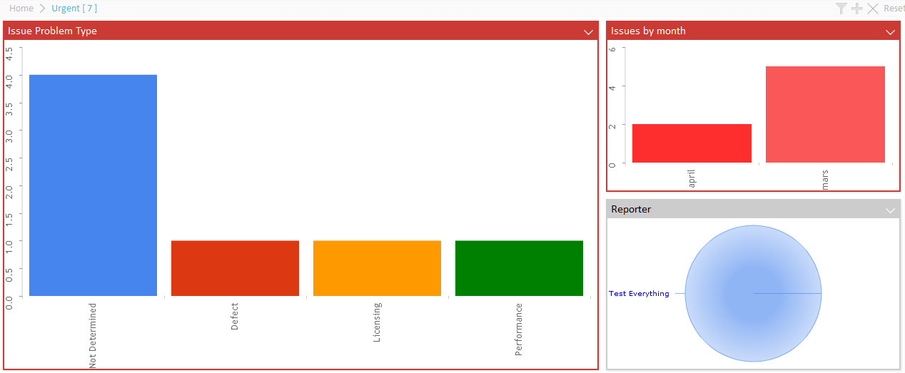
1.5.1. Bread crumb
To enable drilldown navigation breadcrumbs are available to the top left. The breadcrumbs are configurable and macros for the drilled down section text value and quantity exist.
1.5.2. Drilldowns from Charts
To enable drilldown from a chart simply add the Dashboard element defining the dashboard configuration to be used for the drill down.
Dashboard |
Defines the dashboard configuration to use when a section in a chart is clicked and a "drill-down" is performed. |
|
1.5.3. Drill Down from Table Pages
When you load a table in a gadget, you can configure a column to support drill-down. E.g. when clicking on something in the table, you can open a nested dashboard showing some other information.
In the example below, a dashboard has been configured to display issues. Each issue has a column showing the project, which the issue is related to. Clicking the project name brings up another dashboard with information around the clicked project.
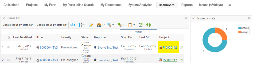
To configure a table-column to support drill down, you configure it as shown below:
<Column>
    <Name>project</Name>
    <Label>Project</Label>
    <Href>emxTree.jsp</Href>
    <TargetLocation>popup</TargetLocation>
    <Expression>from[Issue].to.name</Expression>
    <AlternateOIDExpression>from[Issue].to.id</AlternateOIDExpression>
    <AlternateTypeExpression>from[Issue].to.type</AlternateTypeExpression>
    <ShowAlternateIcon>true</ShowAlternateIcon>
    <ColumnType>dashboard</ColumnType>
    <Setting name='DashboardConfig'>tvc:dashboard:tvx:dashboard/Project.xml</Setting>
</Column>
As an alternative to specify the dashboard configuration to be used when clicking a value in this column as a setting, is to specify this on the page-config level using the syntax shown below:
<PageConfig>
    ...
    <Parameters>
        <Parameter name="dashboardconfig.project">tvc:dashboard:tvx:dashboard/Project.xml</Parameter>
    </Parameters>
</PageConfig>
E.g. using a parameter starting with "dashboardconfig." and ending with the column name.
This makes it possible to reuse the same table in different context’s, but just configure the dashboard config on the page-config level.
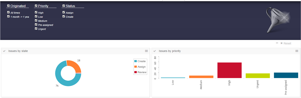
1.6. Search
Search can be enabled to make it possible for the user to specify which data to display in the dashboard. This makes it possible for the user to easily filter out the data of interest.
A standard search form is used to specify what the user is able to search on. For example, the user can specify the type of object, that the object must be in a certain state, is related to a specific ECO or some other criteria that be specified with a search form. Exalead is used the background to perform the search.
| This dashboard search requires Exalead. |
See the parameters chapter for details on how to activate the search and specify which search form to use.
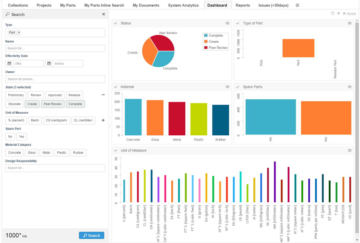
Search form configuration used in the above screen shot:
<?xml version="1.0" encoding="UTF-8"?>
<SearchFormConfig
        xmlns="http://technia.com/TVC/SearchFormConfig"
        xmlns:xsi="http://www.w3.org/2001/XMLSchema-instance"
        xsi:schemaLocation="http://technia.com/TVC/SearchFormConfig http://products.technia.com/tvc/schema/latest/SearchFormConfig.xsd"
        defaultLimit="1000">
    <Fields>
        <TypeField>
            <DefaultValue>type_Part</DefaultValue>
            <SearchableType>type_Part</SearchableType>
        </TypeField>
        <NameField />
        <Field mapsTo="attribute_EffectivityDate">
            <IndexField>PART_EFFECTIVITY_DATE</IndexField>
        </Field>
        <OwnerField />
        <StateField>
            <Policy name="policy_ECPart" />
            <Policy name="policy_DevelopmentPart" defaultStates="Create" />
        </StateField>
        <Field mapsTo="attribute_UnitofMeasure">
            <IndexField>UNIT_OF_MEASURE</IndexField>
        </Field>
        <Field mapsTo="attribute_SparePart">
            <IndexField>SPARE_PART</IndexField>
        </Field>
        <Field mapsTo="attribute_MaterialCategory" editable="true">
            <IndexField>MATERIAL_CATEGORY</IndexField>
        </Field>
        <Field multipleAllowed="true">
            <Label>Design Responsibility</Label>
            <IndexField>REL_DESIGN_RESPONSIBILITY</IndexField>
            <AutoCompleteHandler>dataset</AutoCompleteHandler>
            <AutoCompleteSettings>{
                "handler" : {
                    "dataset" : "tvc:dataset:tvx:enc/Organizations.xml"
                }
            }</AutoCompleteSettings>
        </Field>
    </Fields>
</SearchFormConfig>
The <IndexField> - which is a child element to <Field> - is used to specify
where the data is indexed in Exalead. The field name specified in the element
needs to match the data you are intrested in searching. A number of fields have
sensible default values. For example, the <TypeField> searches by default in
the field TYPE. Override the default value using the <IndexField>.
| The config.xml bundled with the Exalead installation contains information about what data that is indexed and the name of each field. |
Auto complete is supported for fields in the search form. This makes it easier
for users to find a user, specify a type or find a related object to filter on.
Use the element <AutoCompleteHandler> to specify which handler to use or
<AutoCompleteSettings> to take full control of the auto complete feature.
More information about auto complete is
available in the core guide.
Make sure that no <Loader> is specified in the dashboard or gadget
configuration. It will have priority over objects found using the search.
The defaultLimit attribute on the root element is used to limit the
maximum number of objects that the search returns.
1.6.1. Field types
Supported field types:
-
Field. Typically used to search on attributes and basics. Buttons are displayed in the UI in case the attribute contains range values. Otherwise a freetext field is displayed. Use auto complete to make it easier for users to specify the relevant criteria.
-
NameField. Built-in field searching on the name of the object.
-
OwnerField. Built-in field searching for the owner of the object. Uses auto complete with the user handler by default.
-
StateField. Built-in field searching for the state of the object. Each state is presented with a button in the UI.
-
TypeField. Built-in field used to specify the type of object to search for. Uses auto complete with type handler by default.
1.6.2. Drilldowns
The objects matching the users search criteria is added to the top-most dashboard. It’s possible to drilldown in the data in the standard way for dashboards. When a new search is performed the drilldown is reset and the top-most dashboard is displayed with the search result.
| When using drill down the id of every object is sent to the client in order to keep track of what object that is related to each piece in the chart. Exalead can return you big sets of data and users might experience that it gets slower when used in combination with drilldowns. In order to mitigate the problem try to use drilldown in as few gadgets as possible and reduce the original set of objects. |
1.7. Path Support
In 3dexperince, more and more of the data model is moving towards path-based. Change Process is one good example and there is a need to be able to visualize the path-based data model by config only.
The path related object/relationship information can be used to generate charts. This can be done using the path query dataset in chart config. A path is a kind of relationship. It is a way for one object to point to another object using a virtual path.
The path query dataset requires input. It can either use the input from a loader defined as a child element OR it can use the input as provided by the caller (typically from request parameters such as "emxTableRowIdParam" passed from selected rows in a table/structure page OR the "objectId" parameter which is used to pass the object id of one or more objects).
Below example generates a chart based on the state of Change Orders related to parts owned by the user. In this case, the loader must point to Path Query which will return change order id’s and the Expression should point to selects on those change order id’s, in this case, current.
The path query loader internally calls the nested query loader. Then it will get all the parts that are created by the context user. Now the parts retrieved from query loader acts as input for path query dataset. Finally, the path query dataset fetches the Change Orders associated with the retrieved parts.
<?xml version="1.0" encoding="UTF-8"?>
<Gadgets xmlns="http://technia.com/TVC/Dashboard" xmlns:xsi="http://www.w3.org/2001/XMLSchema-instance"
	xsi:schemaLocation="http://technia.com/TVC/Dashboard http://products.technia.com/tvc/schema/latest/Gadgets.xsd">
	<Chart id="CO-State">
		<Label>CO State's</Label>
		<Description>CO State</Description>
		<Expression>current</Expression>
		<Loader>dataset:tvc:dataset:launchpad:changeprocess/ChangeObjects.xml</Loader>
		<Color>Blue</Color>
		<Dashboard>tvc:dashboard:launchpad:changeprocess/ChangeDrillDown.xml</Dashboard>
	</Chart>
</Gadgets>
Below is the loader definition used in the above example.
<PathQuery>
	<PathType>Proposed Activity.Where</PathType>
	<PathSelect>owner.to[Proposed Activities].from.to[Change Action].from.id</PathSelect>
	<Query>
		<ExpandType>true</ExpandType>
		<FindLimit>0</FindLimit>
		<TypePattern>
			<Type>type_Part</Type>
		</TypePattern>
		<VaultPattern>
			<Vault>eService Production</Vault>
		</VaultPattern>
		<Where>owner == context.user</Where>
	</Query>
</PathQuery>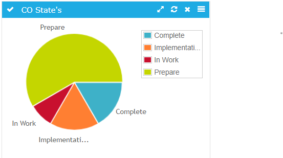
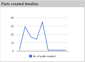
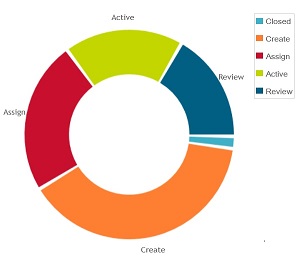
Figure 2. Pie chart showing CO’s grouped by state
Settings:
| Name | Description | Default |
|---|---|---|
PathType |
Type of Path to search for |
|
PathSelect |
expression to get the respective id |
id |
QueryKind |
how the query will operate on subpath |
containsany |
vault |
Vault to search for |
|
where |
Where clause to use |
|
ElementInquiry |
name of the inquiry to the elements for query |
The table below describes the various combinations of configuring path query with nested loaders and a short description about each. For the full range of nested loader combinations please refer to the Data Sets
| Nested Loader | Description | Example |
|---|---|---|
Expand |
Performs an expansion. The way the expansion is done, is configured through child elements. |
The below example is useful to display only the change objects associated with the level one EBOM connected children part objects. |
Query |
Performs a temp query. The query parameters are configured as child elements. |
Below example can be used to get all the |
Inquiry |
Executes an inquiry. Either the inquiry is defined "inline" in the XML, or reference of an existing inquiry. |
Below example can be used to get all the |
Select |
Performs a "select" to retrieve the desired objects. |
The below example is useful to display only the change objects associated with the level one EBOM connected children part objects. |
Java |
Defines a loader implemented in Java. |
Below example can be used to get all the |
Java Program Object |
Executes a Java Program Object. |
Below example can be used to get all the |
DataSetRef |
Includes the content from another data-set. |
|