${ROOT_DIR}/tvc-action/menuBasedTabPage/foo.jsp?menu=tvc:menu:core:imagemanager/ImageManagerTabs.xml
Core - Administration Guide : Image Manager
21 March 2016
1. Image Manager
As of release 2012.3, a new feature called "Image Manager" was added. This functionality adds a number of tools allowing the user to upload, browse and edit images uploaded to any Enovia object.
The complete Image Manager can be added with the command called "TVC Image Manager" or with the following href.
This will add the three tabs "Upload", "Browse" and "Edit".
You can also use each part of the Image Manager separately, see next chapter.
| If any of the image manager actions is launched outside of an Enovia object context you need to pass the objectId parameter. |
1.1. Configuration
The Image Manager consists of a number of different parts, each can be used individually with its corresponding TVC action.
1.1.1. Image Upload
The upload page can be launched with the following action.
${ROOT_DIR}/tvc-action/imageManagerUpload
This will launch a page that allows you to upload new images to the object you are in context of. Any previously uploaded images will also be displayed.

If you have the TVC File Manager installed this page will include a drop zone allowing you to drag and drop files from your computer (Note: This does not use the standard applet based drop zone from the TVC file manager so it cannot be configured with drop zone handlers etc.) Since this drop zone is html5 based it will only work in browsers that supports this, see Browser Requirements below for more information.
There is also a button allowing you to open a standard file browser to select images from your computer.
The images will be uploaded to a connected "Image Holder" object, see this section for more information.
1.1.2. Image Browsing
The image browsing page can be launched with the following action.
${ROOT_DIR}/tvc-action/imageManagerSlideShow
This will launch a "gallery" with thumbnails of all the images currently uploaded to the object. This gallery allows you to browse/view all images in various ways.

There are a number of request parameters you can use to configure the gallery when launching this action. NOTE: All string values needs to be inside apostrophes.
| Parameter Name | Description | Default | Values |
|---|---|---|---|
transition |
Defines what transition to use when browsing to the next/previous image. |
‘fade’ |
‘fade’, ‘flash’, ‘pulse’, ‘slide’, ‘fadeslide’ |
responsive |
Sets if gallery should be responsive to browser window size or not. |
true |
true, false |
imageCrop |
Defines how the main image will be cropped inside its container. By default all images will be scaled to fill the stage, centered and cropped. |
true |
true, false, ‘height’, ‘width’, ‘landscape’, ‘portrait’ |
maxScaleRatio |
Defines how much an image can be scaled. |
3 |
Any number |
height |
Sets the gallery height, either fixed or relative. The default value 0.5625 will set a 16/9 ratio. Setting it to 400 will set the height to 400 pixels. |
0.5625 |
Any number |
width |
Sets the gallery width. By default the width will be fetched from the containing element. You can use a number to set it to a fixed width. |
‘auto’ |
‘auto’ or any number |
showCounter |
Toggles the counter. |
true |
true, false |
lightbox |
Attach a lightbox (to zoom in) when users clicks an image. |
true |
true, false |
| This gallery also works on most new smart phones and tablets. If used from TVC mobile it needs to be launched into a new browser tab. Se TVX for an example. |
1.1.3. Image Editing
The image editing page can be launched with the following action.
${ROOT_DIR}/tvc-action/imageManagerEdit
This will launch a page displaying all uploaded images with a menu containing some image editing commands.

The "Set as primary" command will set the selected image as "primary".
The "Delete Image" command will delete the selected image.
The "Annotate" command will launch the image annotation page for the selected image. See next chapter for more detailed information about this.
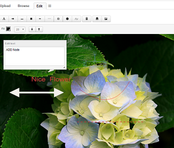
1.1.4. Image Annotation
The image annotation page can be loaded directly for an image with the following action.
${ROOT_DIR}/tvc-action/imageManagerAnnotate
This action needs the following parameters when loaded
| Parameter Name | Description |
|---|---|
objectId |
Enovia Object ID for the object containing the image |
imageName |
File name of the image to annotate. (Object can contain multiple images) |
This will launch the image together with a toolbar of commands that allows you to annotate the image with text and different shapes. The annotation will be saved in the database (both annotation data and as a flattened image) so you can load an existing annotation for later editing/viewing. For detailed information on how the annotations are saved, see this chapter.

| The annotation also page works on most new smart phones and tablets. If used from TVC mobile it needs to be launched into a new browser tab. Se TVX for an example. |
As of release 2016.3.0 user can add curved line, dashline as well as double headed arrow on the image.
1.1.5. Multiple objects/image holders
The Image Browsing and Image Editing pages can be loaded with images from several objects at the same time. You can do this in two different ways, either by sending several object ids as request parameters or by using a related object expression to load the other objects.
| Parameters | Example | Description |
|---|---|---|
objectId |
|
Will load images from all objects passed as request parameters. |
relatedImageExpression |
|
Will use the expression to find objects to load images for. |
1.2. Images and annotations data model
The TVC Image Manager uses the Enovia data model for uploading images to a related object of the type "Image Holder". Each image that is uploaded will be checked in to this related object together with several resized smaller versions of the image.
If one of these images is annotated and saved an object of the type "TVC Image Annotation" will be connected to the Image holder. This is connected with the relationship "TVC Image Annotation" containing an attribute "TVC Annotated Image" that specifies the name of the annotated image. The annotation object will have an attribute containing the annotation data so it can be loaded and edited again. It will also contain a checked in file that is a flattened jpg of the annotated image for use in reports and other places.
So the image original that is being annotated will be kept unchanged and not modified.
By default the annotated image is displayed in view annotation mode only. To preview annotation in upload, browse and edit tabs of Image Manager following tvc property setting has to be configured.
tvc.core.imageManager.previewAnnotation=true
URL parameter previewAnnotation=false can be passed in "Image Upload", "Image Browse" and "Image Editing" tabs if preview annotation is not required in any of them.
URL parameter previewAnnotation’s default value is true and it is obeyed only when global annotation property setting is enabled.