TVC 2018.6.0 Release Information
28 December 2018
Table of Contents
1. Core
1.1. 3DDashboard
TVC can run inside a widget in 3DDashboards with limited support. As an administrator you can login to 3DDashboards and add a custom widget, the widget can then be configured through the widget preferences in the administrators dashboard or through json configuration file. As configurations are listed automatically in preferences UI admin is responsible for setting up and distributing proper/working configurations.
After a dashboard has been configured the administrator can share this to the users.
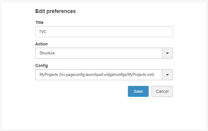
The available actions in widget preferences is:
| Property | Description | Path |
|---|---|---|
Structure |
When selectig structure a list of pageconfigs will be available for the user to choose from |
/tvc-action/navigate |
Flat |
When selectig flat a list of pageconfigs will be available for the user to choose from |
/tvc-action/execCustomLoaderToTable |
Grid |
When selectig grid a list of gridbrowserconfigs will be available for the user to choose from |
/tvc-action/gridLoad |
Dashboard |
When selectig dashboard a list of dahsboardconfigs will be available for the user to choose from |
tvc-action/dashboard |
Figure 1. Widget Conf
Note, certain pageconfigs that is available might be intended for contextual view and does not have a loader defined in the pageconfig parameters. These can throw error when the widget is loaded.
The widget preferences can also be configured through the server side json configuration file.
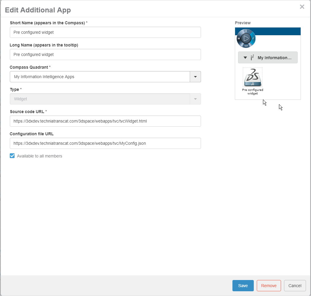
Figure 2. Dashboard Conf
A basic configuration could look like this
{
	"title": "Helium",
	"path": "/goto/p/helium/demo/home/Default",
	"parameters": "embed=true",
	"custom": "true"
}| Property | Description | Default Value |
|---|---|---|
title |
Title of the widget |
TVC |
path |
The path used in context of 3dspace |
|
parameters |
Additional parameters appended to the url |
|
custom |
Stating that this widget is custom configured through the json file |
false |
appname |
Name of the 3dspace application |
3dspace |
id |
id used by widget |
Uniquely generated |
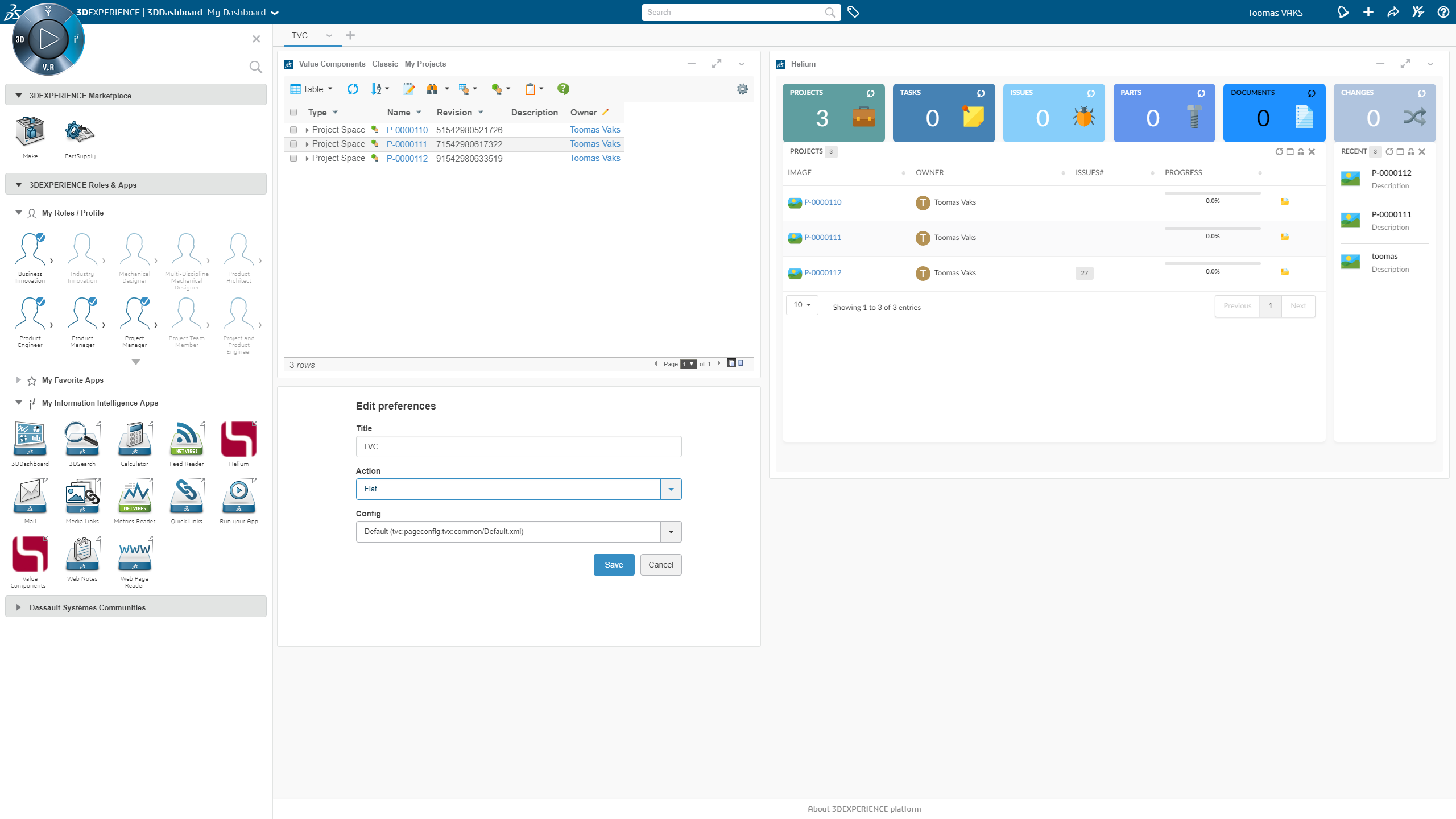
Figure 3. Dashboard View
2. Structure Browser
2.1. Toolbars
2.1.1. User Customization
The commands in the toolbar can be rearranged by the user. For example, a user who often modifies data in the table may move the edit button to be the first command in the toolbar.
Commands can be moved within toolbar, from a group (e.g. the Printer Friendly in the Table Actions group) to the toolbar and between two groups. Commands the user have no interest of can be hidden by moving them to the "Unused Items" section.
The customization mode is accessed from the Settings icon located at the far right of the toolbar.
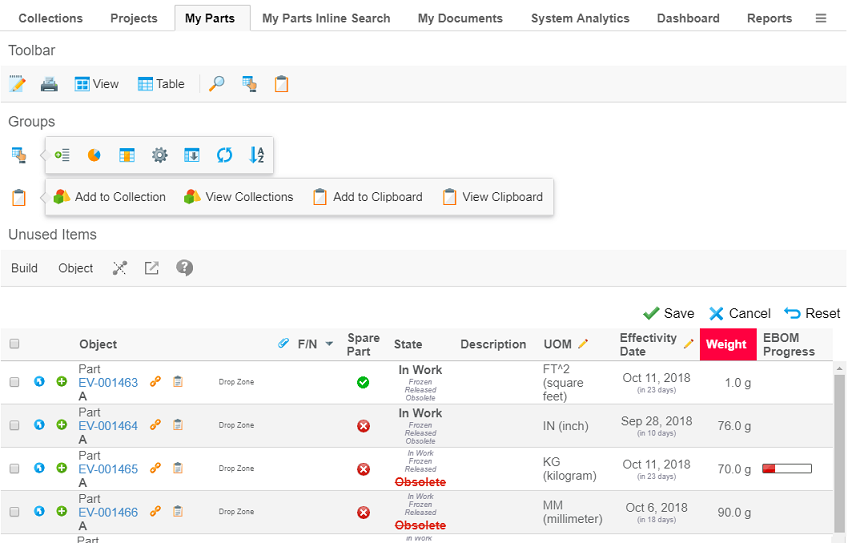
Figure 4. User customizing the toolbar
Customizations are, by default, stored per user and pageconfig. They are persisted across user sessions and devices. As the customizations are stored per pageconfig any customizations done at once place will also effect other pages using the same pageconfig. However pages with other pageconfigs will not be effect (might for example have different set of commands configured).
The pageconfig is by default used as the persistId, i.e. the key used to identify where the customizations are
applicable. It can be overridden using the parameter persistId in the pageconfig.
Using the same persistId across different pageconfigs might cause unexpected problems.
|
Example configuring a persistId:
<PageConfig>
    ...
    <Parameters>
        <Parameter name="persistId" value="ebom" />
    </Parameters>
</PageConfig>
The customization feature is enabled by default. It can be disabled either per pageconfig with the parameter
toolbarEditable or globally with the parameter tvc.core.toolbar.editable.
Example disabling customizations in pageconfig:
<PageConfig>
    ...
    <Parameters>
        <Parameter name="toolbarEditable" value="false" />
    </Parameters>
</PageConfig>
Example disabling customizations for toolbars globally:
<init-param>
    <param-name>tvc.core.toolbar.editable</param-name>
    <param-value>false</param-value>
</init-param>| The user customization feature is not available when using the traditional toolbar layout |
2.1.2. Orientation
The toolbar has either
-
horizontal orientation and is anchored above the table, or
-
vertical orientation and is anchored on the left hand side of the table.
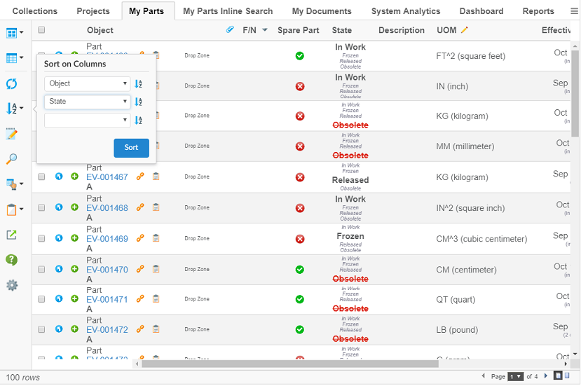
Figure 5. Vertical toolbar anchored on the left hand side
By default the toolbar has horizontal orientation. The orientation can be configured in the pageconfig with the parameter toolbarOrientation.
Example changing orientation to vertical:
<PageConfig>
    ...
    <Parameters>
        <Parameter name="toolbarOrientation" value="vertical" />
    </Parameters>
</PageConfig>
When the toolbar has vertical orientation only the icon is displayed in order to preserve space. Menus without icons uses a default icon.
| Configure an icon on each menu in the toolbar to make it easier for user to distinguish them. |
| Not all items are suitable to be displayed in vertical orientation. For example the traditional view and table selector are not suitable. |
The toolbar can be rotated by the user. Rotating the toolbar is done from the Settings icon located at the far right (or at the bottom if in vertical orientation) of the toolbar.
The rotate feature is enabled by default. It can be disabled either per pageconfig with the parameter
toolbarRotatable or globally with the parameter tvc.core.toolbar.rotatable.
Example disabling possibility for users to rotate the toolbar in pageconfig:
<PageConfig>
    ...
    <Parameters>
        <Parameter name="toolbarRotatable" value="false" />
    </Parameters>
</PageConfig>
Example disabling possbility for users to rotate toolbars globally:
<init-param>
    <param-name>tvc.core.toolbar.rotatable</param-name>
    <param-value>false</param-value>
</init-param>| The rotate feature is not available when using the traditional toolbar layout |
2.2. Related Object Edit
The setting Alternate OID Expression can now also be used to define what related id to modify when column is editable. An attribute called usesBusinessObject has been added to element to control if the selected ids is relationship ids. an example configuration could look like this:
    <Column>
        <Label>Issue Description</Label>
        <Name>issuedesc</Name>
        <Expression>to[Issue].from.description</Expression>
        <AlternateOIDExpression usesBusinessObject="true">to[Issue].from.id</AlternateOIDExpression>
        <Editable>true</Editable>
    </Column>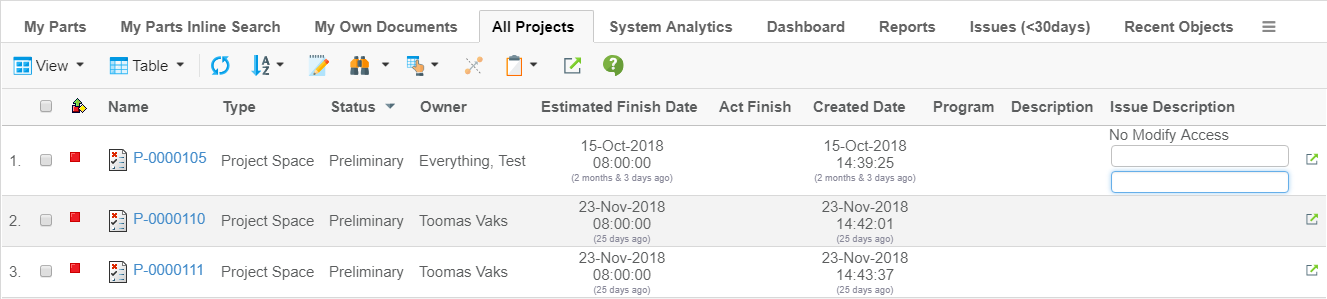
Figure 6. Related Object Edit
2.3. Row height truncation
2.3.2. Activation
Row truncation will not activate unless needed. E.g. if the configured value is N, truncate will only happen when N+1 < rows. Previously it truncated already at N rows (Nth row hidden behind an extra click but row still taking the same height).
- Configuration
<Column>
    <Expression>from[Multiple Objects].to.name</Expression>
    <Rows>3</Rows>
</Column>
Figure 7. Show More
2.4. Manage Collection(s)
While distributing collections, user can notify other users with whom he/she is distributing a collection by using the following configuration. The default setting is true.
This can be disabled at the global level by using the following setting:
in tvc.properties setting
tvc.structurebrowser.collections.distribute.notify = false
Or as init-parameter:
<init-param>
    <param-name>tvc.structurebrowser.collections.distribute.notify</param-name>
    <param-value>false</param-value>
</init-param>
Title and content of mail can be controlled through string resource property file, below is the key of title and content:
tvc.structurebrowser.collections.notify.content = User {0} has shared a collection {1} with you.
tvc.structurebrowser.collections.notify.title = Shared Collection {0}
2.5. Forms
2.5.1. Create New
The Create New button inclusive with forms can as of this release be configured. The configuration can be global or local for a specific form. Local form configuration will take precedence over the global default.
Global Configuration
The global setting will control if the button should be included by default and is used for all forms without local configuration. The global default is configured using system parameter (web.xml or tvc.properties). Read more on system configuration here.
Setting Name
tvc.structurebrowser.form.showCreateNew
tvc.properties
tvc.structurebrowser.form.showCreateNew = true (default is false)
Web.xml
<init-param>
    <param-name>tvc.structurebrowser.form.showCreateNew</param-name>
    <param-value>true</param-value>
</init-param>
Local Configuration
For specific forms, The Create New button can be controlled by a request parameter.
Param Name
showCreateNew
Example:
<Command>
    <Label>Create/Connect Part(Sidepanel)</Label>
    <URL action="initForm" submit="true" target="card">
        <Param name="formName" value="tvc:form:tvx:enc/CreateConnectPart.xml" />
        <Param name="renderMode" value="sidepanel" />
        <Param name="showCreateNew" value="true" />
    </URL>
</Command>
2.6. Path Column
Additional support for path column type with following settings to support to display the icon for path object.
| Setting | Value | Description | Required |
|---|---|---|---|
IconClass |
String |
CSS class for the icon |
No. |
ColumnIcon |
String |
path for the icon image |
No. |
Alt |
String |
Static Info as tooltip for column icon or icon class |
No. |
3. Graphic Reporting
3.1. jqPlot Charts
Long texts of legend or label in jqplot charts will now be truncated and the full text will be shown on a tooltip. This is a configurable setting and the configuration is as mentioned below. The global setting can be controlled through below configuration.
