TVC 2014.1.0 Release Information
28 March 2014
1. General
1.1. Quality and efficiency
To improve configuration quality and raise development efficiency XML schema files have been published for TVC Configuration files, e.g. commands, pageconfig, gridbrowser configs etc. The schemas are used to make sure that the configurations are valid and to get auto completion and documentation in your IDE.
Details on how to use them is described in XML Based Definitions.
1.1.1. Configuration quality
Most development tools like Eclipse and other IDE’s has a good built in validation support for XML using XML schema files (xsd). Using the IDE validation features gives developers direct feedback on mistakes in their configurations both highlighted as an error icon in the project structure as well as detailed described looking at the file contents. A project without validation errors ensures configuration quality.
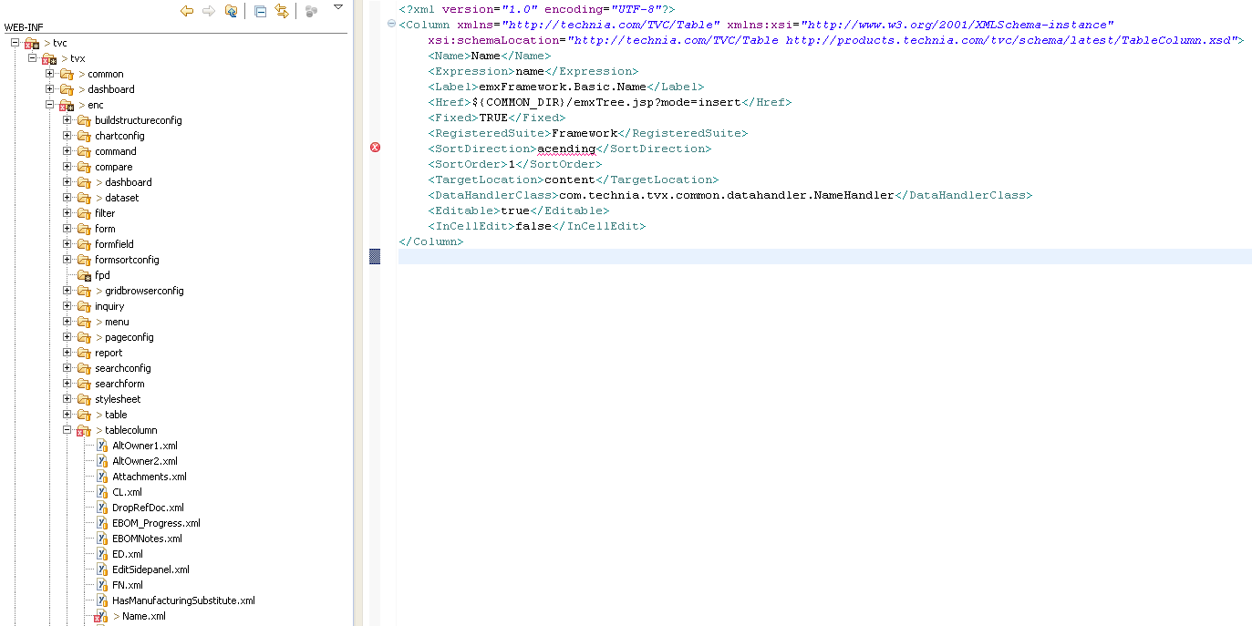
In the validation example below, validation points out a typo and highlights that "acending" is not a valid value for the sort direction element. By clicking the error icon, information on how to solve the problem appears in a tooltip.
1.1.2. Development efficiency
XML editors with a good XML schema support usually leverage auto completion and XML schema documentation directly in the editor. This removes the need for looking at examples, copy pasting from old configurations or searching admin guides for information as you get the information as you type. A developer with auto completion and the right documentation at an instant is much quicker than a developer that have to complete his tasks by trial and error and searching admin guides and old examples.
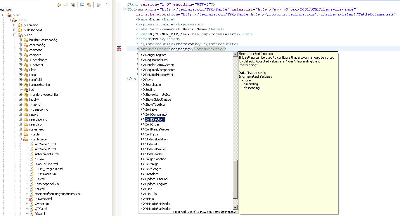
In the auto completion example below the developer gets a list of all valid elements in his current context complete with documentation description and valid values.
1.1.3. How to enable XML schemas
To enable the power of xml schemas you need a good editor that supports validation, auto completion and documentation. Eclipse is one tool that could be used for this purpose. To let the tool know what schema to be used for a certain xml file some attributes, exemplified below in bold, have to be added to the root element. TVC xml schema files are published on the web. For more information on settings up schema with TVC see the xml based definitions documentation.
<?xml version="1.0" encoding="UTF-8"?>
<Column xmlns="http://technia.com/TVC/Table"
        xmlns:xsi="http://www.w3.org/2001/XMLSchema-instance"
        xsi:schemaLocation="http://technia.com/TVC/Table http://products.technia.com/tvc/schema/latest/TableColumn.xsd">
    ..
</Column>2. Core
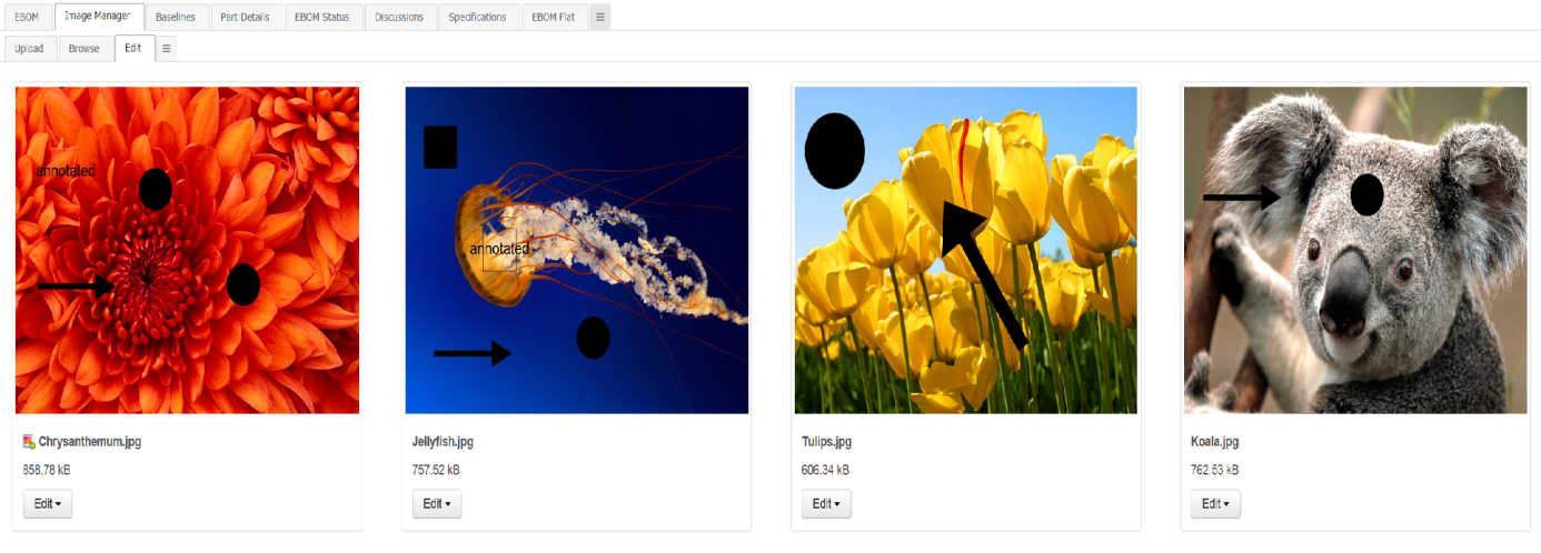
2.1. Image Annotations
Annotations can be configured to be displayed by default in the Image Manager.
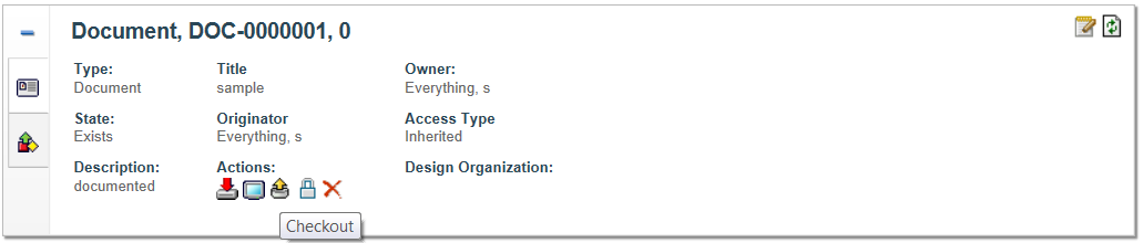
2.2. Document actions in top panel
Document actions, previously available as a column in Structure Browser tables, can be configured to be accessed in the top panel.
2.3. Relationship to relationship utility class
A utility class – RelToRelUtils - for assisting in every day programming with rel-to-rel in Enovia is available. You can connect a relationship to another relationship, relationship to object, disconnect a relationship between two other relationships and much more.
Example of how to make a rel-to-rel relationship:
Relationship fromRel = new Relationship("1.2.3.4");

BusinessObject toObject =
BusinessObjectUtils.newBusinessObject("5.6.7.8");

RelToRelUtils.connect(fromRel, toObject, "Some relationship");3. Structure Browser
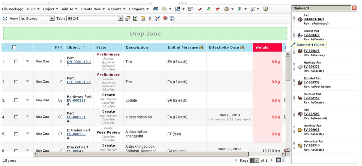
3.1. Drag and drop to context object
It’s now possible to drag and drop to the object you are in context of. When needed a drop zone slides down above the table. Objects dropped here it will be connected to the object in context. The existing configuration applies regarding what type of objects that can be dropped where.
<?xml version="1.0" encoding="UTF-8"?>
<PageConfig>
    ...
    <Parameters>
        <Parameter name="drop:contextual" value="true" />
    </Parameters>
    ...
</PageConfig>
3.2. Refreshing source table when drag and dropping
When drag and dropping between tables it’s possible to control if the source table (where you drag objects from) should be refreshed.
This is useful for instance when you want to display objects which are not connected to a part.
Example removing the dragged row:
<?xml version="1.0" encoding="UTF-8"?>
<PageConfig>
    ...
    <Parameters>
        <Parameter name="drag:external" value="remove"/>
    </Parameters>
    ...
</PageConfig>
3.3. Edit Saved Searches
Saved searches can now be loaded into the search form (previously you could only execute them directly). This makes it possible to edit the search criteria of the saved search before executing it.
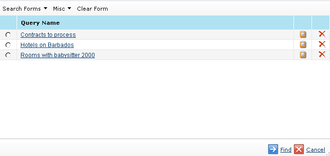
The search data is now stored in a structured way to make it possible to load it into the search form. Any searches that previously have been saved are no longer available.
3.4. Remember grouping
Data grouping done by users in Structure Browser tables are remembered between sessions.
4. Grid Browser
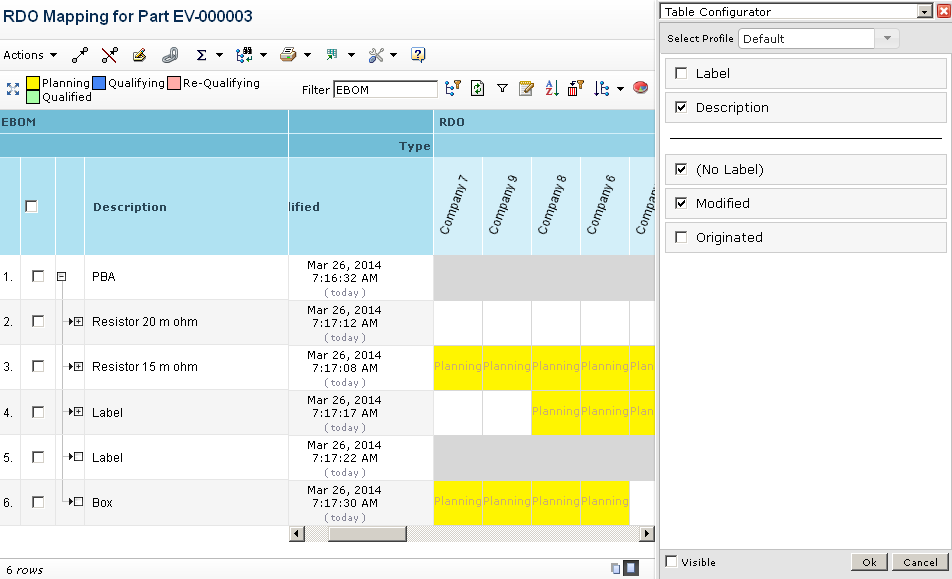
4.1. Table Configurator
The table configurator, previously only found in Structure Browser, has been added to the Grid Browser. It’s possible to change the order of columns, which ones should be visible and the position of the separator between the fixed and scrollable columns. Columns in the scrollable section will be displayed along with the intersections making it easier to display the desired information.
5. Graphical Reporting
5.1. Gadget Interaction
Sometimes when an action is performed in a gadget there is a need to reload/manipulate one of the other gadgets. For example if you promote/demote issue state in one gadget you want to reload the other chart gadgets displaying issue state.
The API has been opened up in order to make this possible. Read the developer documentation for more details on how to use it.
7. Collaboration
TVC Collaboration is a new feature in core added in this release. It will be a part of TVC Core but installed separately, just like the TVC Wiki functionality.
For 2014.1 this is released as "limited availability". That means you will not be able to install it with your current license, you have to contact Technia first to get access to it. So the new feature is free but you will need to obtain a special license for it. In one of the coming releases it will be fully released and you will then be able to install it with your existing license.
The admin guide will be available for download for more detailed descriptions then the ones on this release bulletin.
The first release has two major features. One is the ability to discuss around any object inside of Enovia and the other is the ability to receive instant notifications around discussions you are participating in or discussions around objects you are the owner of.
7.1. Discussions
The discussion functionality allows you to discuss around any type of object in Enovia. The discussion functionality is located in a side panel on the right side of the page content. This allows the users to discuss around an object while still being able to navigate around the different pages of an object.
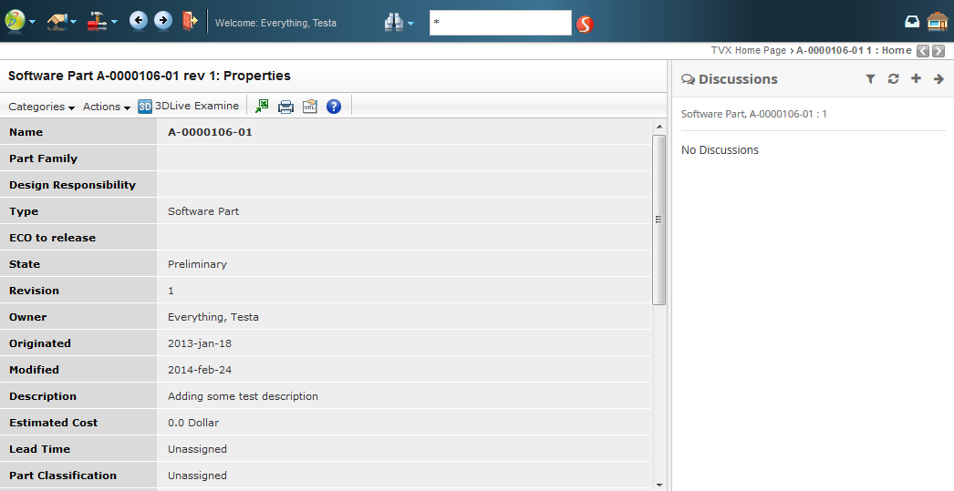
Discussion panel in the right side of the page content
When you enable discussions for one or more object types the users will be able to start discussions. You specify the types in a configuration file and then the side panel will automatically be enabled allowing users to discuss.
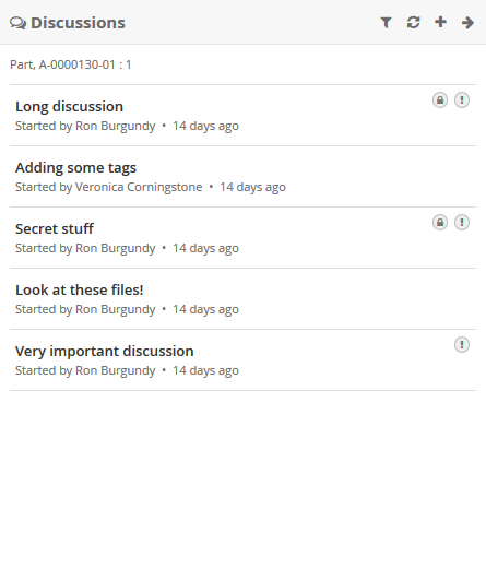
Discussion panel content containing a number of discussions
The discussions have support for setting subject, message, recipients (privacy), tags, importance and attaching files. Below is a screenshot of how a discussion could look like when loaded.
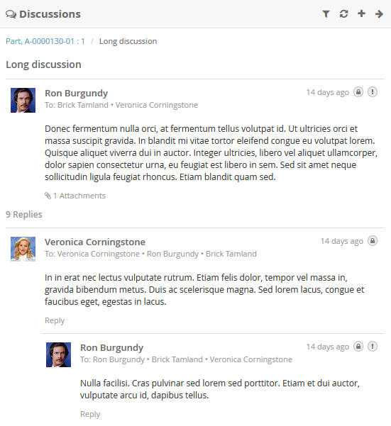
Discussion panel content showing a discussion
7.2. Notifications
Whenever a user creates a discussion around an object you are the owner of or if someone replies to a discussion/message you have created then the system will instantly send a notification to inform you about that.
Depending on what browser the users are running there are two different types of notifications. One is displayed "inside" the browser window and the other one is displayed "outside" of the browser window.
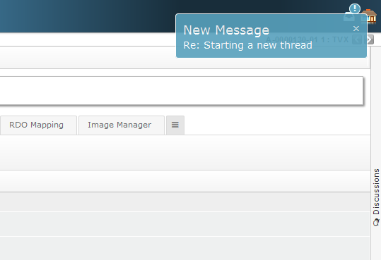
Figure 1. Inline notification
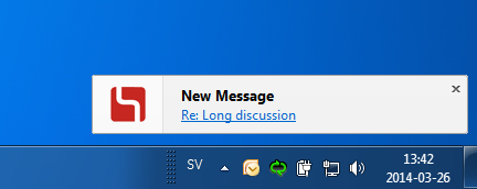
Figure 2. Web notification
After receiving a notification the user can read all the details using the "notification panel" that is located in the global top toolbar. That panel will show the 10 latest notifications with the ability to view the details by clicking on them.
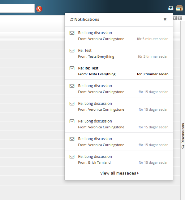
Figure 3. Notification panel showing latest notifications
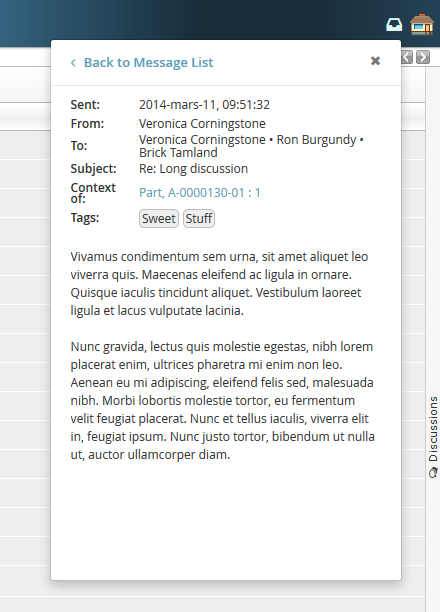
Figure 4. Notification panel showing the details of a notification
7.3. My Space
In order to have a good way of looking at more than the 10 latest notifications we have added something called "My Space". That currently has two functionalities. The first is something called "Inbox" which is similar to how an email inbox works. It allows the user to see all notifications and preview them in a bigger and better way. The second functionality is a profile page that allows the users to set some preferences and upload an Avatar picture to use when discussing.
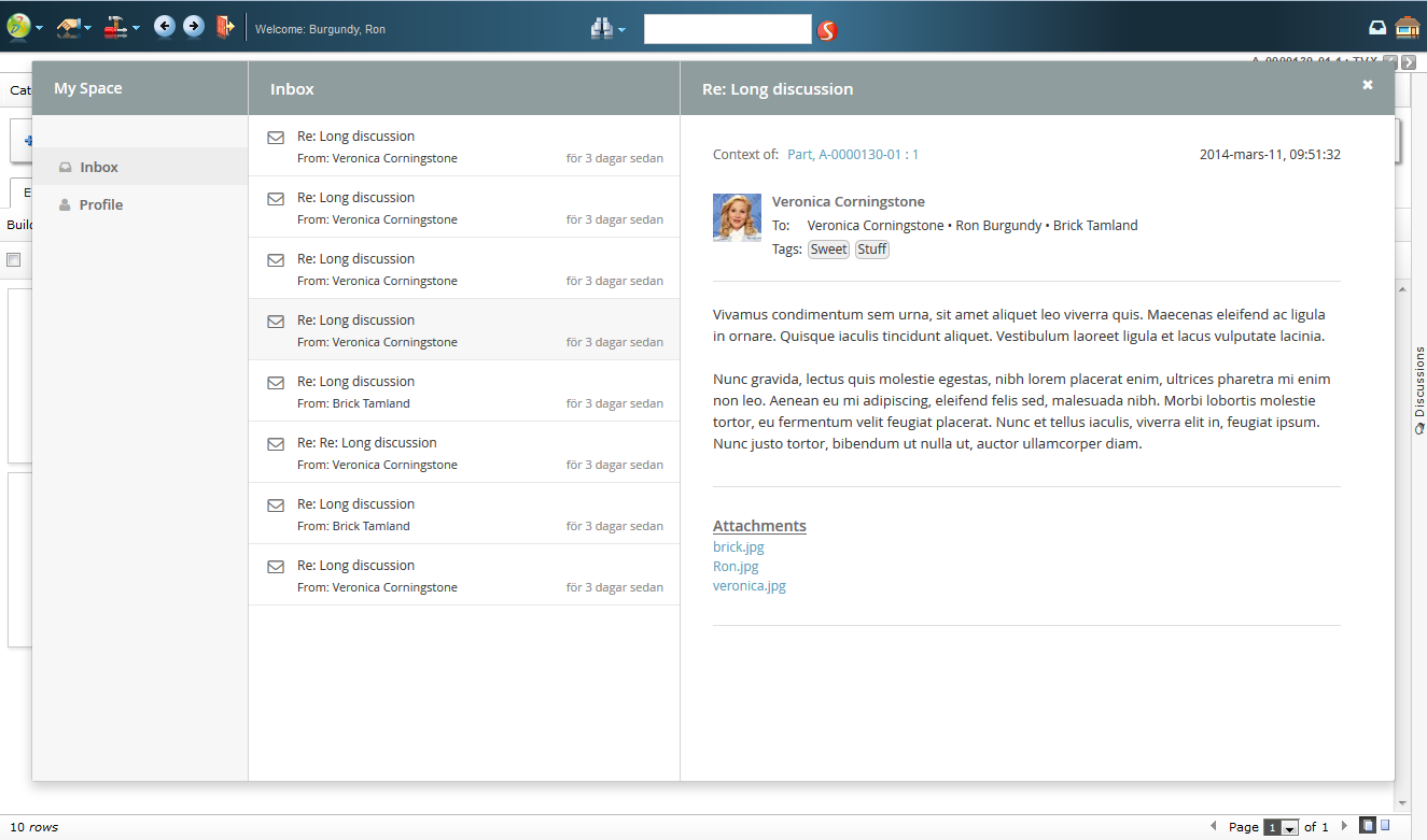
Figure 5. Inbox
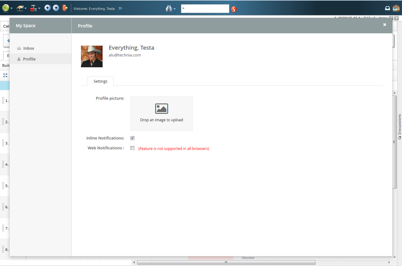
Figure 6. Profile page