TVC 2012.2.0 Release Information
15 June 2012
1. General
1.1. Support for Category Menu (ENOVIA 2012 and later)
As of ENOVIA 2012 and later, the user interface does not have the left hand tree containing the functions available for a particular object. Instead, these functions have been moved into a category menu.
TVC has now support for the category menu in the following places.
-
Core
-
Top Panel
-
Tabbed Pages
-
-
Wiki
-
Grid Browser
-
Structure Browser
-
Structure pages
-
Flat table pages
-
Forms in Content Mode
-
-
Report Generator
-
Graphic Reporting
-
Dashboard
-
Gantt Chart
-
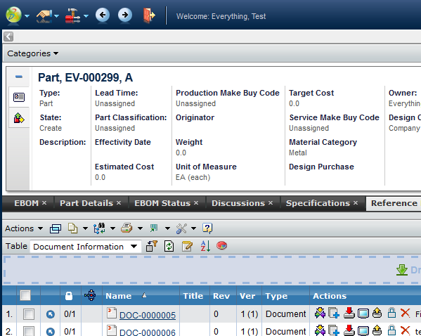
Below are some example screenshots showing how the category menu appears in different pages.
Figure 1. Top panel with category menu
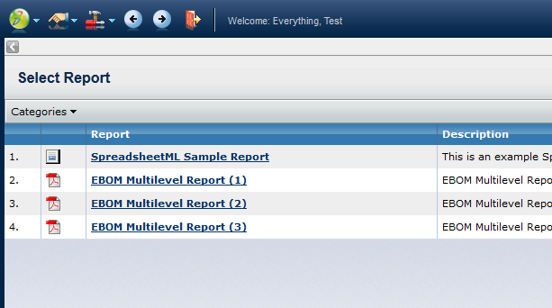
Figure 2. Report Generator List Page with Category Menu
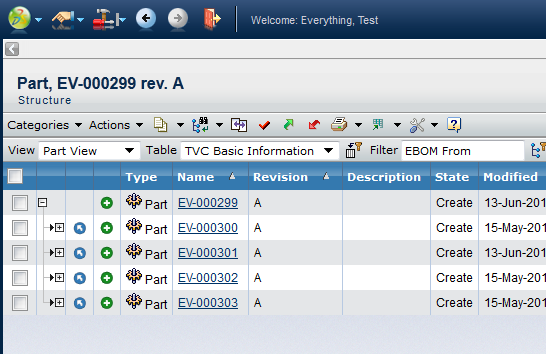
Figure 3. Structure Browser with Category Menu
1.1.1. Disabling the Category Menu
The category menu will appear if the request parameter called "categoryTreeName" is available in the request (passed by default by ENOVIA). There are two options available for disabling the category menu even though it is being passed.
-
Per request: Add another request parameter called "disableCategoryMenu" and set this to true.
-
Globally: Add an init-parameter in TVC called "tvc.core.db.aef.useCategoryMenu" and set this to either true or false. Default is "auto-detect", meaning that TVC will query the "emxSystem.properties" file for the property "emxFramework.LegacyUI".
1.1.2. Important Note about Commands within the Category Menu
There is a bug with the ENOVIA toolbar implementation that results in that the ID of the object is not passed correctly to all toolbar-commands. When you have commands in this menu having a HREF that doesn’t contain a reference to a JSP page (like the example below), then the parameters are not added to the HREF as it should.
${ROOT_DIR}/tvc-action/someAction?param=value&anotherParam=value
The work around for this bug is to add a bogus page reference to the HREF as shown below:
${ROOT_DIR}/tvc-action/someAction/abc.jsp?param=value&anotherParam=value
                                  ^^^^^^^
E.g. adding something ending with .jsp will cause the ENOVIA toolbar to add the required parameters. Note that you need an additional slash character before the actual "jsp page" name.
This doesn’t have any impact on TVC itself, since the only important token is what appears after the "tvc-action/" string up to the next slash. The added JSP page is ignored.
NOTE: Commands in the category menu calling TVC should not have the setting "Submit" set to TRUE. This will cause other irrelevant parameters to be passed into TVC possibly overloading parameters typically defined in configuration objects used by the different TVC components (for example page-configurations, grid browser configurations etc.). This setting was not used by ENOVIA in previous releases when the left-hand category tree was used, so all commands need to be reviewed to ensure that they don’t have this setting applied.
2. Structure Browser
2.1. Configurable Data Handler and Cell Rendering
In many cases when someone needs to show information in a table cell that requires some logic or special formatting that cannot be solved by just creating a table column in a table and apply some settings, one needs to implement a Data Handler and/or a Cell Renderer in Java to accomplish the task.
To reduce this need, there is a pre-defined column-type in TVC Structure Browser as of this release called "configurable", which allows specifying XML within the expression of the column to define the rules for what to display and how to display some data. This column-type will not remove the need for implementing Data Handler or Cell Renderers in tables in all cases, but it will definitely reduce the need for it in some cases.
To enable this column feature, you must first of all define some properties on the Column itself, as shown below (example in XML format):
<Column>
    <Name>name</Name>
    <Label>The column label</Label>
    <ColumnType>configurable</ColumnType>
</Column>
If you use tables defined in the database, you have to specify the column type through the settings tab using the setting "Column Type" and set the value to "configurable".
The next thing to do is to define the logic of this column. This is done through the "expression" of the column and the format of this logic is XML. Below is a simple example on how this is constructed.
<Column>
<Name>name</Name>
<Label>The column label</Label>
<ColumnType>configurable</ColumnType>
<Expression><![CDATA[
<type is="Part">
<if test=">attribute[attribute_Weight]< > 100">
<bold>
<select statement="name"/>
<text>:</text>
<select statement="revision"/>
</bold>
</if>
<else>
<select statement="name"/>
<text>:</text>
<select statement="revision"/>
</else>
</type>
<type is="DOCUMENTS">
<select attribute="attribute_Title"/>
</type>
]]></Expression>
</Column>There are several possibilities and for a complete list of capabilities, please look into the documentation.
2.2. Excel Export Enhancements
Some enhancements have been made to the Excel Export from the Structure Browser.
-
Alternate row colours
-
Improved formatting of Table Calculations
-
Possibilities to define format of content. Example:
<Column>
<Name>Weight</Name>
<Expression>$<attribute[attribute_Weight]></Expression>
<Label>Weight</Label>
<Editable>true</Editable>
<ExcelDataFormat>#.##</ExcelDataFormat>
</Column>E.g. a new setting called Excel Data Format on a table column
specifies the Excel formatting rules.
-
Export of primary image for columns having the column type set to "primaryimage". NOTE: Due to limitations in Excel, only PNG or JPEG images can be exported.
2.3. Manual Entered Date Values
For cells having date values, the user can now in edit mode or in mass-edit mode manually enter the date value instead of opening the calendar.
The user can enter the date in many ways, below is a list of supported formats:
-
Locale specific format (regional)
-
ISO 8601 format (YYYY-MM-DD)
-
A number (1-31), which will just set the date to the current year and month and use the entered value as day of month.
-
Use some predefined constant:
-
today
-
tomorrow
-
yesterday
-
next week
-
last week
-
next month
-
last month
-
next year
-
last year
-
2.4. Resize Behaviour
Some enhancements regarding resizing a column have been made such as being able to decrease the width regardless of the size of the cell content. The size can however not be lesser than the width of the header.
2.5. Right Click Menu Option – Quick Group
A new right click option has been added to group the data for a particular column.
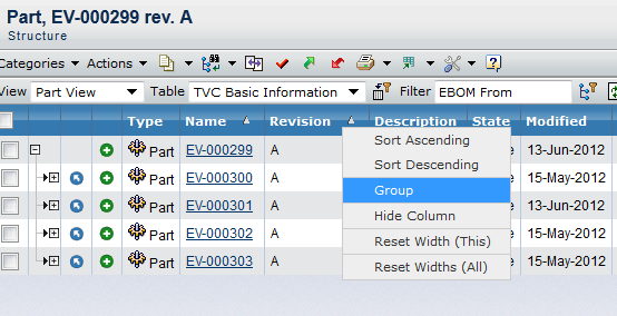
Figure 4. Quick Group
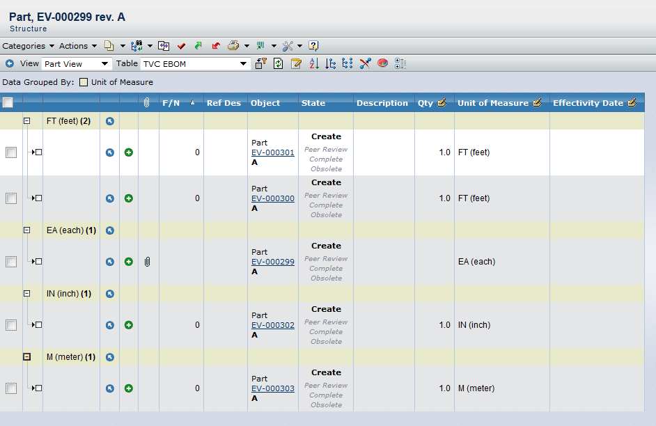
Figure 5. Data Group Result
3. Graphic Reporting
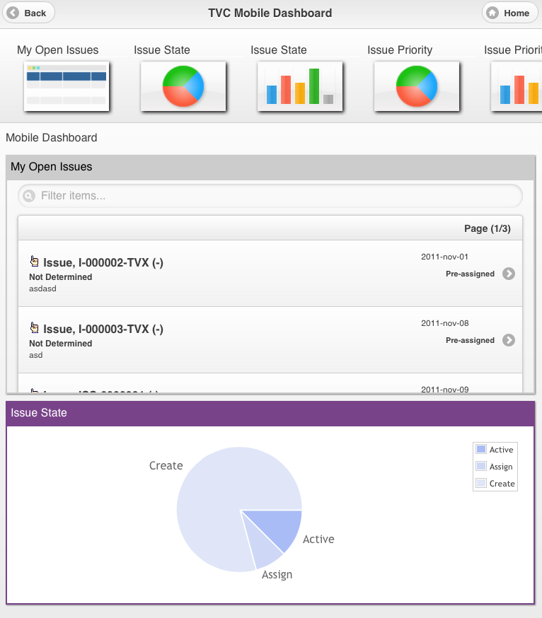
3.1. Dashboard
3.1.1. ENOVIA OOTB Table
When clicking a chart, the dashboard now has support for displaying these objects in an ENOVIA OOTB table. E.g. you do not need to have the TVC Structure Browser installed for this use case.
Figure 6. ENOVIA Table in Gadget
4. File Manager / Office Integration
4.1. Delete Version
A new icon has been added allowing the user to delete the active version. See screenshot below
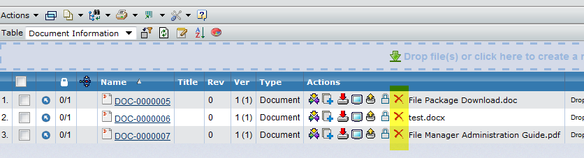
Figure 10. Delete version
This icon will not appear if the user doesn’t have delete access. The icon can also be disabled via the setting "Show Delete Version" on the column.
You also disable the delete version in all views via the global TVC init parameter called "tvc.office.ui.showDeleteVersion".
5. Grid Browser
5.1. Formatting of Labels
Some new configuration options have been added to the Label. For example being able to define max number of character to be displayed and max number of characters before a new line is forced.
<Label>
<Line formatters="nowrap,left">$<type></Line>
<Line formatters="bold,nowrap,left">$<name></Line>
<Line formatters="italic,left">$<revision></Line>
<Line maxChars="40" maxCharsPerLine="5">$<description></Line>
</Label>7. XBOM Manager
7.1. XBL
7.1.1. One Click Compare against Original Object
A new action has been added that allows the user to compare a baseline with the object the baseline was created for, without the need for the user to select anything in an intermediate dialog.
The comparison will be made with the default settings, but can be overridden via request parameters.
7.1.2. Customization of Baseline List in Side Panel
The list of baselines shown in the side-panel, can be configured via the XBL configuration.
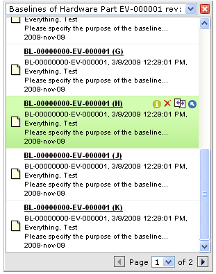
Figure 11. Baseline list
This is configured within the baseline configuration.
<Configuration>
    ...
    <ListConfig orderBy="originated" sortOrder="ascending">
        <ShowTypeIcon>false</ShowTypeIcon>
        <Action>delete</Action>
        <Action>details</Action>
        <Action>compare</Action>
        <Action>navigate</Action>
        <Row style="bold underline"><![CDATA[$<name> ($<revision>)]]></Row>
        <Row style="normal"><![CDATA[$<attribute[attribute_TVCXBLPurpose]>]]></Row>
        <Row style="normal "><![CDATA[$<originated>]]></Row>
    </ListConfig>
E.g. you can configure the sort order and what to sort against. Moreover, you can configure what to display per baseline and what actions that should be available per baseline.
8. Mobile Access
8.1. Remember User Name
The user name can now be remembered on the login screen.
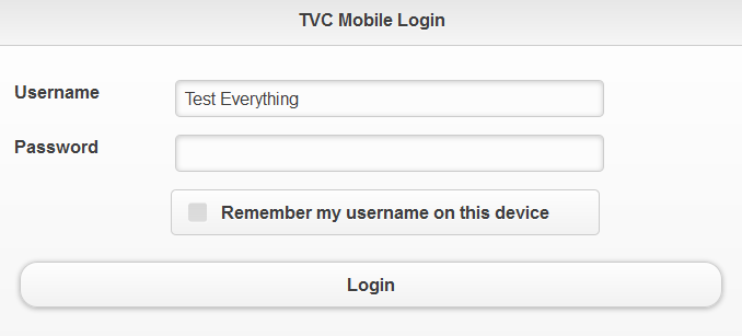
Figure 12. Login Screen
8.2. Themes
As of this release, there are two themes available in the Mobile Access by default. They are called light (default) and dark.
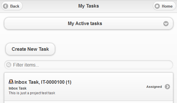
Figure 13. Light Theme
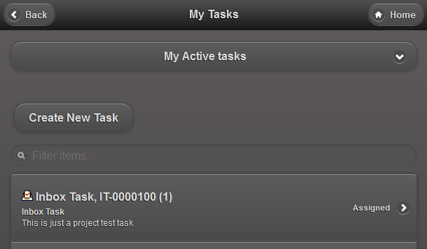
Figure 14. Dark Theme
8.4. Table Pages
8.4.1. Navigate Mode
Support for navigating a structure has been added
Figure 16. Structure Navigation in Mobile
8.4.2. Pagination
Pagination support in table pages has been added.
There are two types of pagination modes used in TVC Mobile Access tables, "append" and "replace". The append pagination is default for flat tables and replace pagination is default in navigate mode. (Navigate mode cannot have append pagination)
The append pagination mode gives you the ability to append the next page of objects in the bottom of the table while keeping the previous page(s) visible as well.

Figure 17. Append pagination button in bottom of table with multiple pages
The replace mode replaces the current page with the next/previous page.

Figure 18. Replace pagination buttons above and below table
8.5. Forms
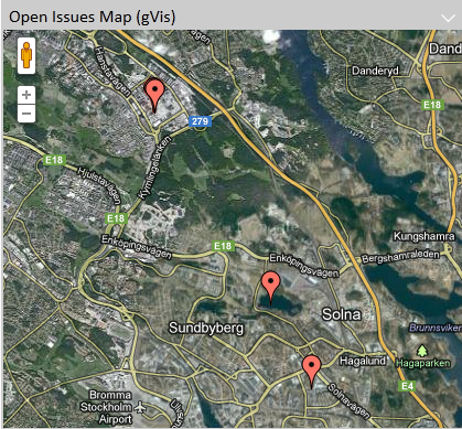
8.5.1. Geo-Tagging Support
A "GeoLocationField" can be used to store the location of the user at the time when the form is committed, for example when creating an issue. This field is an extension of the regular Field that is used for attributes and basics. As such, it needs a MapsTo element in order to know where to store the longitude and latitude values.
This field is never shown in the user interface, it is always hidden.
<GeoLocationField>
    <MapsTo>attribute_TVXGeoLocation</MapsTo>
</GeoLocationField>