TVC 2010.3.0 Release Information
12 November 2010
1. General
1.1. API Changes
1.1.1. Classes Moved from Graphic Reporting to Core
All classes that previously were located within the package
com.technia.tvc.graphicreporting.chart has as of this release been
moved to the com.technia.tvc.core.gui.chart package.
The reason for this change is that there is a need of using the functionality these classes provided in other places than in the Graphic Reporting component. For example for the Report Generator this means that you can embed charts within a PDF report without the need of having the Graphic Reporting component installed.
This change only requires you to modify the import statements in the code, nothing else is needed as the methods and constructors have the same signatures as previously.
1.2. Installer
The TVC installer has been slightly changed.
You will not need to specify the ENOVIA Studio home directory anymore. The installation will instead use the MQL executable found under the ENOVIA Server Home directory instead.
On Windows, the MQL executable is found under
$ENOVIA_SERVER_HOME/bin/winnt and on UNIX, the MQL script is found
under $ENOVIA_SERVER_HOME/scripts/.
2. Core
2.1. Top Panel
A refresh button has been added to the top panel form allowing the user to force a refresh of the content within the form. See screenshot below:
Also, the top-panel now also supports having JPOs within a field for producing content.
There are some new settings available on a top-panel field, such as:
| Element | Setting Name | Description |
|---|---|---|
|
Max Length |
Specifies the max length of an editable input field. |
|
Max Rows |
Specifies the max number of rows to display in the field. |
3. Structure Browser
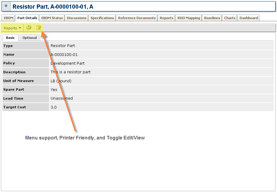
3.1. Forms
Forms now have a new rendering mode for usage in content frames, for example as details pages. This mode has support for menus, a printer friendly view, and toggling edit/view mode.
3.2. Table Configuration (Column Configuration)
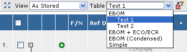
The table configuration (column configuration) tool has been enhanced. The user is now able to create several different profiles of one table; e.g. the user can give a particular table configuration a name. Such a profile will appear within the table chooser, for easier change between tables or custom table profiles.
Below is a screenshot showing the new UI for the table configuration tool.
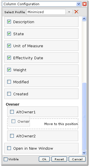
Figure 1. Table Configuration
The table chooser displays the available profiles.
Also note that the button that opens the table configuration tool has been moved and is located directly after the table-chooser.
Excel™ Export ~~~~
The Excel™ export has been improved. Previously, the Excel™ export was made as a HTML file, which contained Excel™ specific markup. This approach had a number of limitations and problems.
The native Excel™ export is by default the used format; but this can be changed through init-parameters.
There are also new API methods within a TableCellRenderer that can be used to customize the rendering of a cell, when exported into native Excel™. The new methods are:
public void exportHeader(SpreadsheetExportCellHeaderContext ctx) {
    // Perform export of header here
}

public void exportCell(SpreadsheetExportCellContext ctx) {
    // Perform export of cell content here
}
The benefits with the new native Excel™ export are:
-
Better control over formatting of the content
-
Better API for creating the content by custom code.
-
-
No warning appears in Excel™ when opening the exported file
-
Problems with the freeze panes in some Excel™ versions is gone
-
Group Headers are exported
-
Header rotation is supported
-
Header wrapping setting is supported
-
Table Calculations are part of the exported file
| Since the Grid Browser is based upon the Structure Browser, this enhancement will also affect the Grid Browser Excel™ export. |
3.3. Rotated Column Header
A new setting has been added that allows rotating the column header text.
The setting is called Header Rotation Angle. The value should be an
integer between 0 and 360. The text will be rotated clockwise.
This setting is also supported in the new native Excel™ export.
Screenshot below illustrates how it looks like in the web UI.
Figure 2. Rotated header in web UI
Below is a screenshot from Excel™
Figure 3. Rotated header in native Excel™ export
| Excel™ can only rotate the header between -90 and +90 degrees. If you have a different value, it will be converted into an angle that is compatible with Excel. |
3.4. Header Wrapping
Two new settings have been added to support specifying if the header text of a column should be wrapped or not when creating an export or a printed version of the Structure Browser instance.
The settings are:
| Setting Name | XML Element | Description |
|---|---|---|
Header No Wrap On Print |
|
This setting defines whether or not the header text for a column may wrap or not when the table page is generated in PDF. |
Header No Wrap On Export |
|
This setting defines whether or not the table header text for a column may wrap or not when the table is exported to native Excel. |
3.5. SVG Rendering
Support in the Structure Browser for rendering information in SVG format has been added.
Rendering the data into SVG requires programming a Java class that is plugged into the Structure Browser framework. There are example implementations of this within the TVX (TVC Sample Configuration) module.
Shortly, in order to use the SVG rendering capabilities, you need to define the Display Mode setting on a view, like the example below:
<DisplayMode>svg:com.mycompany.MySVGRenderer</DisplayMode>
Example screenshot below of a SVG rendered Structure Browser instance.
4. Graphic Reporting
4.1. Dashboards
A new feature called dashboards has been added to the Graphic Reporting component.
A dashboard is a user interface that consists of gadgets. Each user can configure their dashboard by adding or removing gadgets. The gadgets are added from a predefined library of gadgets that’s been made available to a particular dashboard. Any user can also rearrange the dashboard by moving gadgets (drag and drop), changing their colors or sizes. The dashboard user interface also supports drill downs, i.e., a user can click on a link in a gadget (perhaps a slice in a pie chart or a link in a table or form) to zoom in on that data set. A user can also maximize gadgets temporarily so that they consume all available screen real estate.
Below is a screenshot of a Dashboard example:
Figure Dashboard in action
The dashboard is configured in XML and defines the default look of the dashboard and also defines the gadget library from which the user can pick up new gadgets from.
There are several gadgets available for displaying different kind of charts. It is also possible to load a structure browser instance into a gadget, as well as loading a custom URL into a gadget.
Below is a screenshot showing the dashboard with the gadget library opened, from which the user can pick new gadgets that will be displayed within the dashboard.
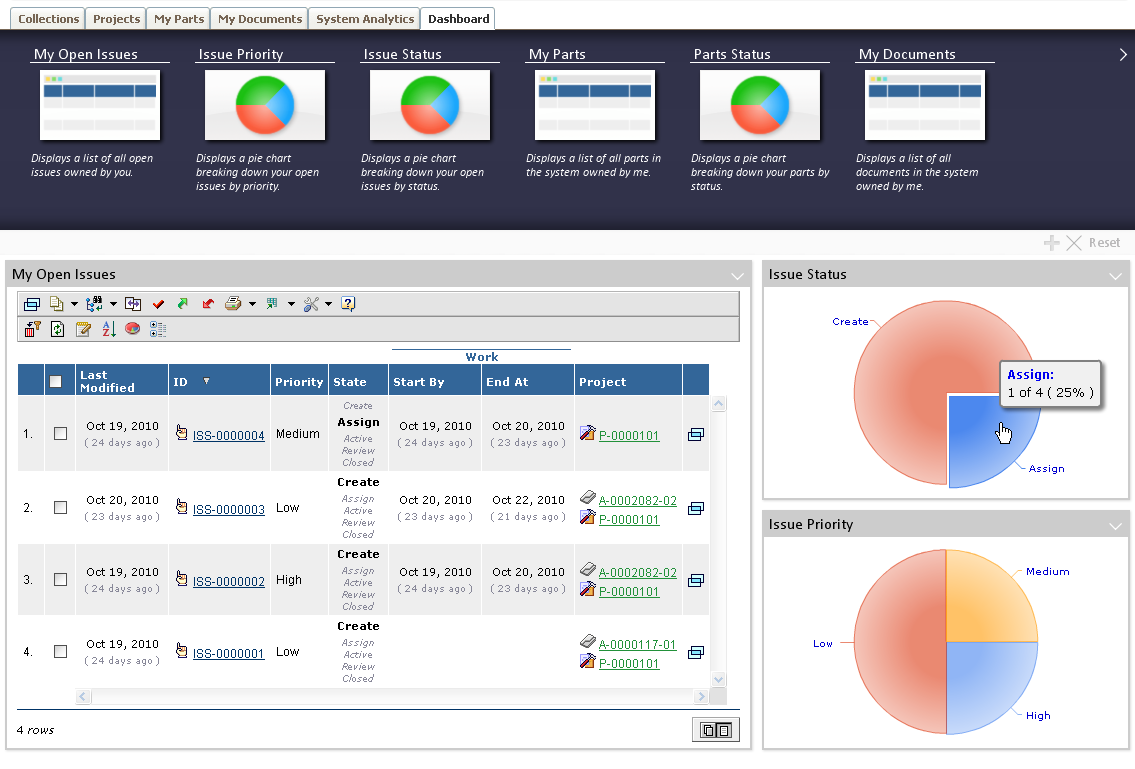
Figure Dashboard with gadget library opened
| The dashboard feature is currently not supported in Internet Explorer 7 in this release due to technical reasons. We intend to include support for this platform in the near future and a new patch release will be available when so is done. |
5. Office Integration
5.1. Drop Zone
A new feature called drop zone has been introduced in this release, which allows the user to drag files from his/her local file system into the webpage in order to check-in the file to an existing document object, or in some places create a new document into which the file will be checked in.
| The drop zone feature is not supported on Mac OS-X and Linux. |
5.1.1. Above Table
A drop zone can be added above a table that typically displays a set of documents related to an object. When dropping files into this area, a new document object will be created and connected to the related object and the file (or files) will be checked in to the newly created object.
Below is a screenshot illustrating the drop zone above a table page.
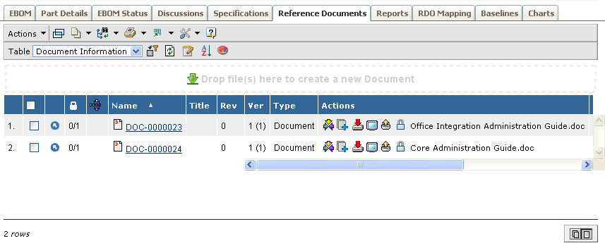
Figure Drop zone above table
The drop zone above a table is configured via parameters in the page configuration used.
5.1.2. Table Column
There is a new column type available called "dropzone" that can be used to allow the user to drop files into existing documents or into a folder object in a Structure Browser table. In the latter case, the dropped file(s) will be checked-in to new document objects that are created and connected to the folder.
When the drop zone column is enabled in the table, it will look like the example screenshot below:
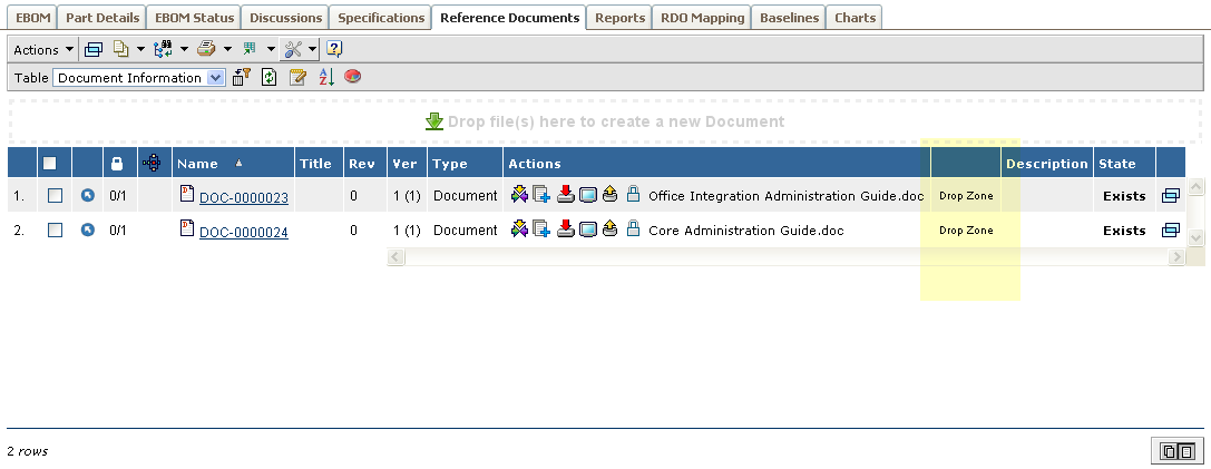
Figure 4. Drop zone in table column
Or in a table page showing folders and documents:
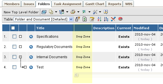
Figure 5. Drop zone in table column for folders
There are many settings that can be used on a column whose column-type is set to "dropzone"; see the admin guide for further details.
5.2. Attachments in Side Panel
The feature for displaying related objects in the side panel within a Structure Browser instance has been slightly changed.
Previously, only the files were shown in the side panel. As of this release, the document object will also be shown, which means that the user can check-in new files to the document as well as showing basic information about the document object in the side panel or open the object page in a popup window.
See screenshot below:
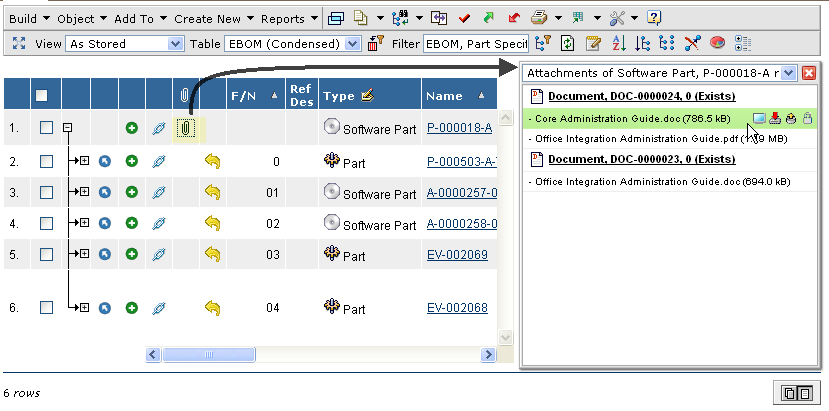
Figure 6. Related files in side panel
6. Grid Browser
6.1. Excel™ Export
The Excel™ export has been enhanced. The generated Excel™ file is now a native Excel™ file compatible with Excel™ 97 and upwards.
The look of the generated Excel™ file is now closer to how it looks in the web UI.
7. Report Generator
7.1. Apache FOP Version
As of this release, the bundled versions of Apache FOP are:
-
1.0
-
The latest version of Apache FOP. This version is as of this release the default version used.
-
If you have compatibility problems with old reports developed for FOP 0.20.5, you can configure those reports to use the old FOP version by setting the "useLatestFOP=false" property of the report(s) having the problem. * 0.20.5 ** Legacy version of Apache FOP that is bundled with TVC Report Generator. This version is kept to support old reports that aren’t 100% compatible with the XSL-FO standard.
| We strongly discourage using this version of FOP as it is very old and has a number of issues and limitations. Any new report should be created using the latest FOP version. |
E.g. the version 0.94 has been replaced with version 1.0.
NOTE: As mentioned above, the default version of FOP is now 1.0 (previously it was 0.20.5). This can be overridden per report or globally. See the admin guide for details how to configure the used FOP version.
8. XBOM Manager
8.1. Editable Baselines (XBL)
The XBL (XML Baselining) feature now supports edit. You can configure an XBL to be editable, and the user can then modify the meta-data of the objects/connections and/or the structure.
Operations that are supported in edit mode are:
-
Edit of meta-data. Note that some restrictions exist, such as what kind of properties you actually can edit. Typically attributes and/or basic information on a connection or object can be modified but not complex edit logic that can be customized in standard structure browser pages through using Updaters etc.
-
Disconnect objects
-
Connect
-
Build Structure
-
Quick Connect
-
-
Replace
If the baseline is editable (and the user has modify-access to the baseline object according to the policy), there will also be some additional functions available in the UI, such as:
-
Create Version
-
At any time, the user can make a version of the baseline in order to save a snapshot of the baseline.
-
-
List Version
-
Shows a list of all created versions of the baseline
-
-
Show Changelog
-
Creates a PDF containing a list of all changes made to the baseline
-
8.2. XBL Configuration Options
A number of new configuration options have been added to the XBL configuration, many of them are related to the edit capabilities, but there are also some others that can be useful.
For example:
-
When creating a new XBL, one can define what type of object the baseline will have as well as what policy it will get. The latter is useful if you need to apply certain access rules to a baseline
-
The UI settings such as header and sub-header are configured within the XBL configuration now.
9. MCAD Optimizer
9.1. Filters
A couple of CAD system specific filters have been added to the default set of filters in the navigate views.
9.2. Related Objects Column
If several versions of a related object are connected the only version displayed in the related objects column is the last one.
E.g. situation occurs for example when checking in a new drawing version without checking in a new model version. When viewing the model earlier the related object column shown both drawing versions, now just the last one.