<init-param>
    <param-name>tvc.core.collectLogFiles.customDirectories</param-name>
    <param-value>c:/temp/logs|d:/temp/logs</param-value>
</init-param>TVC 2010.1.0 Release Information
19 March 2010
1. General
1.1. Supported Platforms
As of this TVC release, the lowest ENOVIA/Matrix version supported is 10.7.1.
If you are running on an older platform, you should not upgrade to this release.
Also, support for Internet Explorer 6.0 has been dropped.
1.2. Java 5 / API Enhancements
As of this release, entire TVC has been compiled with Java 5. The API has also been enhanced to take advantage of features in the Java 5 language.
If you have implemented any class that uses the TVC API, you must re-compile them against the new JAR files in this release.
| This also applies to the Office Integration / File Manager. E.g. the users must have a JRE >= 1.5.0 installed. Previously, the requirement was JRE >= 1.4.2. |
2. Core
2.1. Collect Log Files
The administrative tool for collecting log-files on the application server can now be configured to include files in a custom configured directory. To add a directory (or directories) to include files from, you can use the init-parameter as shown below:
E.g. the value of this parameter is a "pipe separated" list of directory names.
| Only the files in any custom specified directory will be included, sub-directories will not be included. |
3. Structure Browser
3.1. Column Configuration Tool
The column configuration tool has been enhanced to support using drag’n’drop to re-arrange the columns and/or a group of columns. Also, the display of a column group has been changed in order to increase usability.
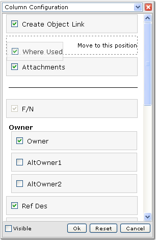
A reset button has been added that allows the user to reset the columns regarding order, visibility and the position of the frozen column separator according to the table that is used.
3.2. Dynamic Context Menu
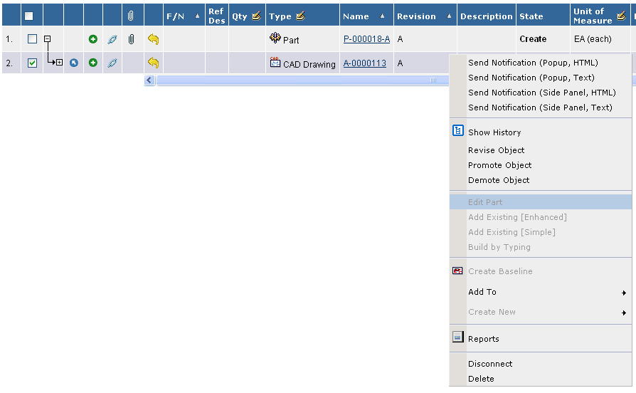
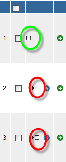
The commands and menus within the right-click context menu can now be configured to be enabled for a particular type of object and/or for an object in a particular state.
Any item within the context menu that is not valid for the object, which the context menu were opened for, will be "greyed" out. See example screenshot below:
3.2.1. Configuring the Context Menu Items
For XML based commands and menus, this is configured as the example below illustrates.
<Command>
    <Label>Build by Typing</Label>
    <Href>$\{TVC_ACTION}/buildByTyping</Href>
    <RowSelectType>single</RowSelectType>
    <SubmitForm>true</SubmitForm>
    <TargetLocation>popup</TargetLocation>
    <WindowWidth>800</WindowWidth>
    <WindowHeight>600</WindowHeight>
    <ValidFor>(1)
        <Types>
            <Type>type_Part</Type>
            <Type>type_AnotherType</Type>
        </Types>
        <States policy="policy_DevelopmentPart">
            <State>state_Create</State>
            <State>state_AnotherState</State>
        </States>
        <States policy="policy_ECPart">
            <State>state_Preliminary</State>
        </States>
    </ValidFor>
</Command>| 1 | New element |
For commands and menus that are defined in the database, this is controlled via two settings:
"Valid For Type" and "Valid For State". The formats of these settings are shown below:
Valid For Type = <type>|<type>|<type>
Valid For State = <policy>:<state>,<state>|<policy>:<state>,<state>
Example:
Valid For Type=type_Part|type_AnotherType
Valid For State=policy_DevPart:state_Create|policy_ECPart:state_Preliminary
| It is allowed to omit the "policy" value and just specify state names. If this is done, you cannot use symbolic names for the state names as these cannot be resolved unless the policy is defined. |
The context menu is evaluated against the row it is opened for the first time the context menu is opened. In the background, an AJAX call is performed to do the evaluation. This information will be cached on the client; e.g. the second time the context menu is opened for a row, the cached information will be used. This cache is cleared if the Structure Browser page is reloaded.
3.2.2. Configuring the Dynamicity of the Context Menu
It is possible to configure the dynamicity of the context menu both globally and per Structure Browser instance. To configure this globally, use the following init parameters:
<!-- Enable / Disable -->
<init-param>
    <param-name>tvc.structurebrowser.contextMenu.dynamic</param-name>
    <param-value>true | false</param-value>
</init-param>
<!-- Enable / Disable Caching -->
<init-param>
<param-name>tvc.structurebrowser.contextMenu.cacheEnabled</param-name>
<param-value>true | false | **depends**</param-value>
</init-param>The global parameter defines the default behavior but you can per Structure Browser instance override these by using a custom parameter:
dynamicContextMenuEnabled = *true* | false
contextMenuCachingEnabled = true | false | *depends*
If you have items within the context menu that is dependent upon the "state", the caching will be disabled automatically since an object could potentially be promoted or demoted after the information has been cached.
This would lead to that items in the context menu incorrectly would be enabled or disabled even though they should not. To override this and always cache or not cache, set the cache-enabled parameter to either "true" or "false" instead of "depends". This could be useful in cases where you have pages that does not allow the user to perform a promote/demote, then the caching results in a faster responding user interface.
3.3. User Help
The TVC Structure Browser now has a built-in user help page. Unless you have configured the TVC Structure Browser to use another help page (using the HelpMarker parameter), the internal TVC help page will be displayed.
The internal help page contains general information on how to use the TVC Structure Browser features.
The help page is found from the icon shown below:

If you have defined the HelpMarker parameter, this will take precedence over the internal user help. If the HelpMarker is not set, TVC Structure Browser will show the help button and link to the internal help. This can however be disabled in two ways:
-
Globally through an init parameter:
<init-param> <param-name>tvc.structurebrowser.internalHelpEnabled</param-name> <param-value>true | false</param-value> </init-param> -
Per Structure Browser instance (the value of the global parameter defines the default value) through a "custom parameter"
showInternalHelp=true|false
There is support for customizing this internal help page such as providing custom translations or build custom help pages by reusing the existing help pages (and the help framework) without having to touch the pages inside the TVC Structure Browser. See the admin guide for further information on how-to customize this.
3.4. Go There – From Clipboard
In a few releases back of TVC, there was a feature within the clipboard list page that allowed the user to navigate an object within the clipboard; e.g. making the selected object from the clipboard the root object in the current structure. This was removed since that feature was considered unsafe as the user could navigate an arbitrary object from any structure browser page and potentially see connections that should not be visible.
This feature can as of this release be enabled again (it will be disabled default) through setting an init parameter:
<init-param>
    <param-name>tvc.structurebrowser.clipboard.goThere</param-name>
    <param-value>true | false</param-value>
</init-param>
3.5. Forms – Create / Edit
In the Structure Browser, a new feature has been added that allows the administrators to define forms that allow the users to create and modify business objects. These forms are defined as XML documents.
Forms can be configured to be used in several different modes. The current built-in modes are Create and Edit. When used from a structured view, it can be used for allowing doing create and connect.
Below is a sample screenshot of a form page.
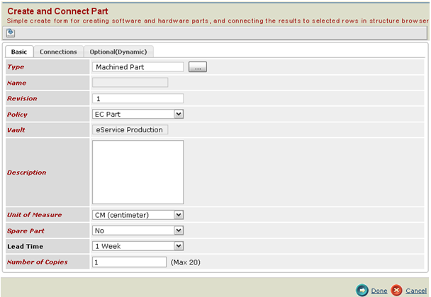
Some of the standout features of these forms are:
-
Tabs - Dividing the form fields into logical groups
-
Configurability – The forms are defined in XML and fields can be reused among several forms.
-
Templates - Save a form and Load a saved Form.
3.6. Chart – Default Color Scheme
It is now possible to define your chart colors for charts created from the Structure browser.
You set your colors with an init-param:
<init-param>
    <param-name>tvc.structurebrowser.chart.colors</param-name>
    <param-value>rgb(255,0,0),rgb(0,255,0),rgb(0,0,255)</param-value>
</init-param>
If the number of colors you define are less than the number of (e.g.) slices in a pie chart, the colors are reused as many times as needed.
4. Grid Browser
4.1. Grid Calculation
A new tool has been added in the Grid Browser that allows the user to perform calculation based upon the data in the grid. When this tool has been enabled, a new button is available in the toolbar as shown below:
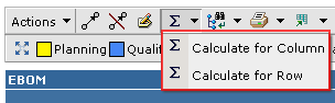
The calculation is performed based upon either the objects in the column- or the row- axis and will show the number of cells matching a particular state.
In the example below, there calculation was performed for the column axis (contained two objects). The columns represent the available states a cell could have, and the values are the number of objects on the row axis that fulfilled a particular state. The right most column (Total) shows the aggregated value for the columns on the current row.
The calculation result is opened in a table above the original Grid Browser page. To go back to the Grid Browser page, simply click the go-back icon available in the top-left corner.
To enable the calculation feature, apply the following to your configuration within the UIFunctions section:
<UIFunctions>
<StateSummary>true</StateSummary>
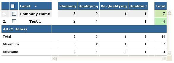
</UIFunctions>4.2. Header Rotation
Support for rotating the header in an arbitrary angle has been added. See screenshot below.
This is configured on the "Columns" element, as shown below:
<Columns rotateHeader="true" headerRotationAngle="-70">It is also possible to specify the vertical alignment of the column header. See configuration example below:
<Columns rotateHeader="true" rotatedHeaderAlignment="bottom | top | middle"/>
5. Office Integration / File Manager
5.1. File Rename
In previous versions of TVC Office Integration, you were not able to upload a file with a different name, e.g. renaming a file. This limitation has been removed as of this release.
When the user tries to upload a file with a different name, a warning message appears (default behaviour) in order to confirm the file rename, see screenshot below.
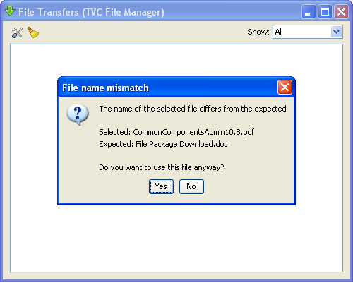
Note: This behaviour can be configured. E.g. it is possible to disable the possibility to rename a file, enable it without the warning message or enable it but show the warning message. The latter is the default. To configure this, use one of the two options below:
Using an init parameter:
<init-param>
    <param-name>tvc.office.fileRenameEnabled</param-name>
    <param-value>warn | yes | no | true | false</param-value>
</init-param>
Using the TVCOfficeConfiguration.xml configuration file:
<OfficeIntegration>
    <Client fileRenameEnabled="warn | yes | no | true | false"/>
</OfficeIntegration>
5.2. Remove Entry after Successful Upload
A new option in the preferences dialog has been added in order to allow specifying if the entry that represents the file being uploaded in the user interface should be removed after an upload has been successfully completed.
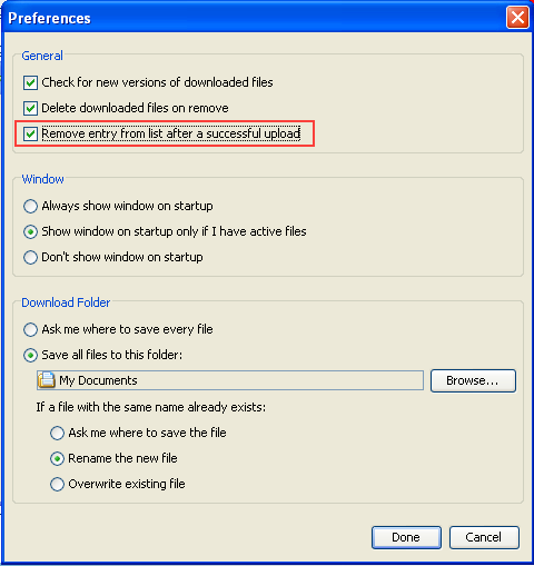
When checked the entry will be removed and the file transfer window will be minimized.
5.3. Trigger Execution – Filename Matching
When a trigger has been defined to execute for a particular file-name, the matching were previously done case-sensitive. This resulted in that the trigger sometimes weren’t executed. As of this release, the file matching will be done case-insensitive.
5.4. Open for View – Makes file Read Only
When downloading a file for view, the file is marked read-only in order to prevent the user from trying to modify it.
5.5. Trigger Registration
An easier way of registering the built-in triggers has been added. In some cases when the built-in triggers have been disabled, one might want to enable one of the built-in triggers. Previously, one had to use/remember the fully qualified class-names of the built-in triggers to be used.
<OfficeIntegration useBuiltInTriggers="true">
    <Triggers>
        <ReasonForChangeTrigger/>
        <DefaultPropertyTransferTrigger/>
        <!-- ... possible other triggers ... -->
    </Triggers>
</OfficeIntegration>

== Report Generator

Charts from Graphic Reporting
~~~~~~~~~~~~~~~~~~~~~~~~~~~~~

If you have both the TVC Report Generator and the TVC Graphic Reporting
component installed, you can take advantage of the pre-configured charts
from the Graphic Reporting component inside the Report Generator.

To include a chart in a PDF report, you can use the following construct
within the stylesheets to accomplish this:

```xml
<fo:block>
    <fo:external-graphic border-width="0" content-width="15cm">
        <xsl:attribute name="src">
                       matrix://chart/tvx:enc/EBOMStatus.xml?objectId=<xsl:value-of
                       select="/report/meta-data/basic[@key='id']"/>
        </xsl:attribute>
    </fo:external-graphic>
</fo:block>
The URL that is constructed should start with
matrix://chart/${NAME_OF_CONFIG}?${PARAMS}
The ${NAME_OF_CONFIG} is the name of the chart configuration to be
used.
The ${PARAMS} are arbitrary parameters that you need to pass to the
chart in order to be able to produce an image. Typically, you need to
pass the object-id.
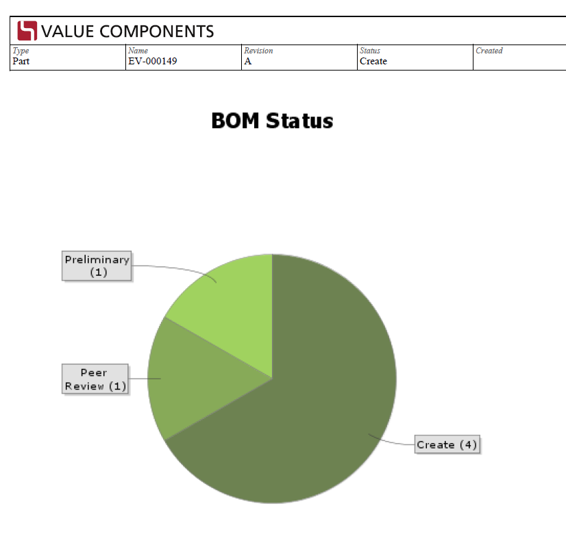
Below is an example of an included chart from the Graphic Reporting component within a PDF document.
6. XBOM Manager
8. MCAD Optimizer
8.1. Expandable nodes
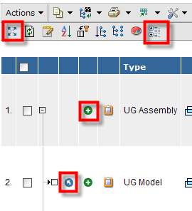
In navigate mode a check is made disabling expand for structure nodes without sub-nodes. This way the user won’t have to click a node to tell there are no sub-nodes present.
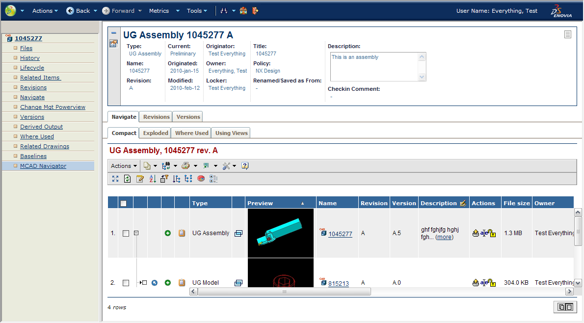
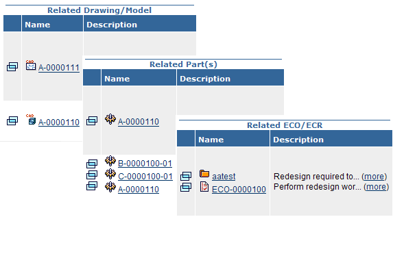
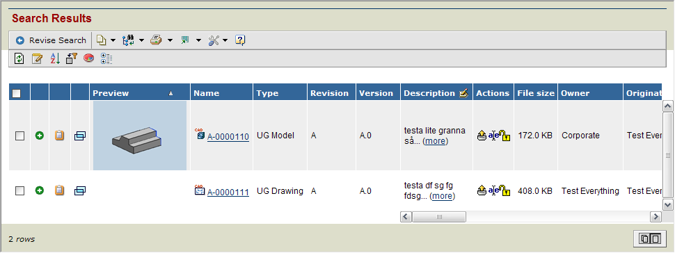
8.2. Related objects
Related object popup and description has been added. Related drawing and model has been merged into the same column and related ECO and ECR has been added. Other related object data such as attribute values supported.
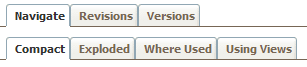
8.3. Tabs
A couple of tabs has been added representing the different choosable views in navigate. The navigate by views is still available in the “Using Views” tab.
8.4. Activated features
The features Maximize, Data Grouping, Add to clipboard (single) and Navigate (go there) are activated and supported.
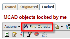
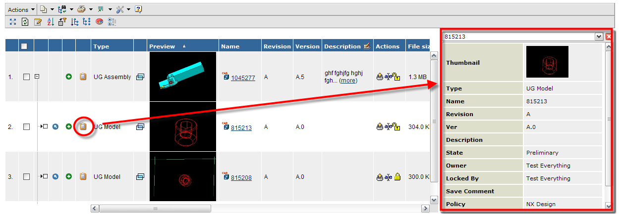
8.7. Side panel details
A details form view in the side-panel fired from an icon in the table. The form view uses web forms and is configurable. This enables the user to view all details of an object in the structure without getting out of navigate context.
8.8. Legacy JPO cleanup
The schema installer cleans unused legacy programs, with the names “'TVCIEFShow*Link” and “TVCMCADOptimizer “, from the database. Customer customizations will no longer accidentally point to obsolete code and compilation of all programs in db will not error on these programs.